> For the complete documentation index, see [llms.txt](https://learn.squirrel365.io/llms.txt). Markdown versions of documentation pages are available by appending `.md` to page URLs; this page is available as [Markdown](https://learn.squirrel365.io/components-functions-and-connections/overview/dataviz/progress-bar.md).
# Progress Bar
{% hint style="success" %}
**Who can use this feature?**
All Squirrel365 plans include the Progress Bar component.
For more details, see our [**pricing comparison matrix**](https://squirrel365.io/pricing/).
{% endhint %}
{% hint style="info" %}
Squirrel 1.12 introduced a “Quick Set-up” tab on many property panels. The properties described on this page are available on the “All Properties” tab of the property panel. For more details on “Quick Set-Up” properties see [this article](https://squirrel365.io/knowledgebase/quick-set-up-property-panel-tabs/)
{% endhint %}
The Progress Bar allows a value to be displayed in a “thermometer” format:

### Progress Bar Properties
The **Progress Bar** component properties are organized into **LAYOUT & POSITIONING,** **GENERAL**, **STYLING** and **DYNAMIC VISIBILITY** sections.
This guide will describe all sections besides the [**Layout & Positioning**](/components-functions-and-connections/overview/layout-and-positioning.md) and [**Dynamic Visiblity**](/getting-started/core-concepts/dynamic-visibility.md) sections, as these are generic to each component. A separate guide and tutorial for each can be found by clicking the links above.
The component properties are set and edited using different methods, some have multiple methods, some just one. See this [Set Property Values](https://squirrel365.io/knowledgebase/set-property-values/) article for more information on using the different methods.
#### GENERAL:

* **Orientation** – this property sets the progress bar to either display vertically or horizontally.
* **Value** – this is the value displayed, it must be bound to a single cell in the spreadsheet.
* **Number Format / Decimal places** – these properties control the format used to display the value
* **Min / Max** – these properties set the upper and lower bounds for the progress bar.
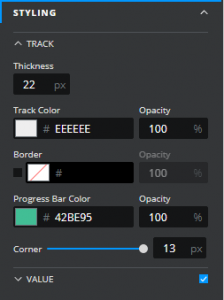
#### STYLING:
The appearance of the **Progress Bar** can be altered to suit a theme or particular style by using the **STYLING** properties, these are in two sections:
**TRACK**
* Thickness – controls the overall width of the progress bar
* **Track Colour / Opacity** – control the color and opacity of the progress bar’s main track
* **Border** – these properties control whether a border is visible and if it is, its color, opacity, and width
* **Progress Bar**
* **Color / Opacity** – control the color and opacity of the progress bar’s indicator
* **Corner** – controls the extent of the rounding at the end of both the progress bar’s main track and its indicator
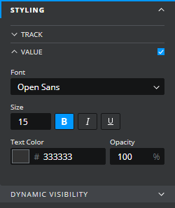
**VALUE**
By default the progress bar displays a numerical value alongside the track, this can be switched off by de-selecting the checkbox at the top right of the “Value” section of the styling section.
* **Font Size** – controls the font used to display the value
* **Text Colour / Opacity** – control the color and the opacity of the value