> For the complete documentation index, see [llms.txt](https://learn.squirrel365.io/llms.txt). Markdown versions of documentation pages are available by appending `.md` to page URLs; this page is available as [Markdown](https://learn.squirrel365.io/components-functions-and-connections/overview/input-controls/date-picker.md).
# Date Picker
This component provides a convenient graphical interface for a user to select a date:
### Date Picker Properties
The properties are organized into **LAYOUT & POSITIONING, GENERAL,** **STYLING**, and **DYNAMIC VISIBILITY** sections.
This guide will describe all sections besides the [**Layout & Positioning**](/components-functions-and-connections/overview/layout-and-positioning.md) and [**Dynamic Visibility**](/getting-started/core-concepts/dynamic-visibility.md) sections, as these are generic to each component. A separate guide and tutorial for each can be found by clicking the links above.
For more information on property panels, see the article on how to [Set Property Values](https://squirrel365.io/knowledgebase/set-property-values/)
***
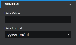
#### GENERAL
* **Date Value** – This property is the value in the spreadsheet that is linked to the selected date. It must be bound to a cell in the spreadsheet. The value in the bound cell will change when the selection in the date picker is changed and vice versa.
* **Date format** – This gives the format that the date picker will use to insert the value into the spreadsheet cell
{% hint style="info" %}
When live, values inserted in the spreadsheet **will be registered as Text values**. Using the **=DATEVALUE() formula** and referencing the **Date Value** cell will easily convert this to its **Date** format.
{% endhint %}
***
#### STYLING
The **STYLING** properties are used to control the appearance and behavior:
* **Display type** – this controls how the date picker is displayed in the project:
* **Popup** – in this mode, only an input box will appear in the project, and clicking on it will display the full date picker
* **Inline** – in this mode the full date picker will be permanently displayed in the project
* **Font / Size / Text Color / Opacity** – these properties affect the textual display of the data in the input box (similar settings for the selection portion of the date picker are controlled by properties in the “date picker panel” section below)
* **Show icon** – this checkbox controls whether the calendar icon is shown at the right-hand end of the input box.
* **Icon Fill** **/ Opacity** – these control the color and opacity of the calendar icon at the right-hand end of the input box (if shown)
***
#### DATE PICKER PANEL
These properties affect the main date selection interface.
* **Background / Opacity** – Control the color and the opacity of the background
* **Border / Opacity** – Control the color and the opacity of the border
* **Weight** **/ Line style** – Control the width and style of the border
* **Individual Weight** - selected this property to apply different widths to each of the component's borders. Each of these individual inputs can be manually edited or bound to the spreadsheet.
* **Corners** – This property determines the corner radius of the button border. Use the slider to amend this property, or type a numerical value into the property field.
* **Individual Corners** - selected this property to apply different radii to each of the component's corners. Each of these individual inputs can be manually edited or bound to the spreadsheet.
* **Font / Size / Text Color / Opacity** – Control the respective aspects of the text
* **Selected Highlight / Opacity** – Control the color and opacity of the selected date
* **Hover Highlight / Opacity** – Control the color and opacity of a date that the cursor hovers over
* **Today Highlight / Opacity** – Control the color and opacity of today’s date
* **Effect** – choose between **None** and **Drop Shadow** from the dropdown box.