> For the complete documentation index, see [llms.txt](https://learn.squirrel365.io/llms.txt). Markdown versions of documentation pages are available by appending `.md` to page URLs; this page is available as [Markdown](https://learn.squirrel365.io/components-functions-and-connections/overview/input-controls/value-input.md).
# Value Input
{% hint style="success" %}
**Who can use this feature?**
All Squirrel365 plans include the Value Input component.
For more details, see our [**pricing comparison matrix**](https://squirrel365.io/pricing/).
{% endhint %}
{% hint style="info" %}
Squirrel 1.12 introduced a “Quick Set-up” tab on many property panels. The properties described on this page are available on the “All Properties” tab of the property panel. For more details on “Quick Set-Up” properties see [**this article**](https://squirrel365.gitbook.io/learn/how-tos/set-property-values)
{% endhint %}
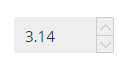
The **Value Input** allows a user to either type in a value or alter it using up and down arrows.
***
## Value Input Properties
The **Value Input** properties are organized into **LAYOUT & POSITIONING, DATA INSERTION,** **STYLING**, and **DYNAMIC VISIBILITY** drawers.
This guide will describe all sections besides the [**Layout & Positioning**](/components-functions-and-connections/overview/layout-and-positioning.md) and [**Dynamic Visiblity**](/getting-started/core-concepts/dynamic-visibility.md) sections, as these are generic to each component. A separate guide and tutorial for each can be found by clicking the links above.
The component properties are set and edited using different methods, some have multiple methods, some just one. See this [Set Property Values](https://squirrel365.io/knowledgebase/set-property-values/) article for more information on using the different methods.
***
### DATA INSERTION

* **Value** – This property is the value that is controlled by the value input. This should be bound to a cell in the spreadsheet. The value in the spreadsheet will update and be updated by the component’s value.
* **Step Size –** the size of the change in the value caused by the up/down arrow buttons (if enabled)
* **Enable limits** – determines if there are limits to the values that can be input
* **Min / Max** – These properties determine the minimum and maximum values the user can enter using the component.
***
### STYLING
The appearance of the slider can be altered to suit a theme or particular style by using the **STYLING** properties.

**Hide Up / Down arrows** – this determines whether the component shows up and down arrows which allow the user to click to increase or decrease the value
VALUE
These properties apply to the value displayed by the component
* **Font** – The fonts used for the labels.
* **Size** – The size of the font of the labels.
* B I U – Apply Bold, Italic, and Underline text styling to the Value Input. When any of these is toggled on, the button is blue:
Bold Italics Underline selection panel
* **Text Colour** – The color of the text of the labels.
* **Opacity** – This opacity of the text of the labels.
* **Number format** – This property determines how the displayed value is formatted. Note:
* selecting **Number**, **Percentage**, or **Currency** provides an extra option to set the number of decimal places displayed
* selecting **Currency** also provides an option to set the currency character and in the case of a custom character whether it should come before or after the number
* when **Percentage** is selected the component treats the value in the cell as fractional, i.e. 0.1 to represent 10%, 0.5 to represent 50%, etc. However, the other values in the property sheet (**Min**, **Max**, and **Step Size**) should be treated as percentages, ie 10 for 10% and 50 for 50%.
#### BACKGROUND
These formatting properties apply to the handle of the slider

* **Fill –** the color of the body of the component
* Opacity – the opacity of the body of the component
* **Border** – the color of the outline of the component
* Opacity – the opacity of the outline of the component
* **Corners** – This property determines the corner radius of the value input border. Use the slider to amend this property, or type a numerical value into the property field.
* **Individual Corners** - selected this property to apply different radii to each of the component's corners. Each of these individual inputs can be manually edited or bound to the spreadsheet.
#### PADDING
These formatting properties apply to the **Value Input** padding.
* **Padding** – This property defines the space between the dropdown label and the dropdown border.
* **Individual Padding** - selected this property to apply different amounts of padding to each of the component's edges. Each of these individual inputs can be manually edited or bound to the spreadsheet.
***
### INTERACTIVITY
**Highlight text on selection** - Enabled by default. With this option enabled all text in the input field becomes highlighted when the input receives focus.
DYNAMIC DISABLED STATE
Control when the component should have a disabled state using [**Conditional Logic**](/how-tos/conditional-logic.md).