> For the complete documentation index, see [llms.txt](https://learn.squirrel365.io/llms.txt). Markdown versions of documentation pages are available by appending `.md` to page URLs; this page is available as [Markdown](https://learn.squirrel365.io/components-functions-and-connections/overview/layout-and-containers/container.md).
# Container
{% hint style="success" %}
**Who can use this feature?**
All Squirrel365 plans include the **Container** component.
For more details, see our [**plan comparison matrix**](https://squirrel365.io/pricing/).
{% endhint %}
The purpose of the **Container** is to group several objects into one object. While grouping components will allow them to move across the main canvas as a single unit, the **Container** component is a more versatile way to group components and can act as a 'mini-canvas'.
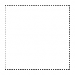
A container is represented on the canvas by a dashed rectangle:
***
## Container Properties
The **Container** properties consist of **LAYOUT & POSITIONING**, **GENERAL** and **DYNAMIC VISIBILITY** drawers. This guide will describe the general properties only; the dynamic visibility properties are generic to each component and a separate guide and tutorial on dynamic visibility can be found [**here**](https://squirrel365.gitbook.io/learn/getting-started/dynamic-visibility).
***
### GENERAL
* **Background** - Set a background colour for the container.
* **Padding –** The internal padding for the container.
* **Enable Scrollbars** – Turns on scrollbars when content overflows the container bounds. When enabled the Scroll X and Scroll Y properties appear.
* Scroll X and Scroll Y - Set the pixel position of the top(Y)-left(X) corner of the viewport.