> For the complete documentation index, see [llms.txt](https://learn.squirrel365.io/llms.txt). Markdown versions of documentation pages are available by appending `.md` to page URLs; this page is available as [Markdown](https://learn.squirrel365.io/getting-started/finding-your-way-around.md).
# Finding your way around
### Workspace
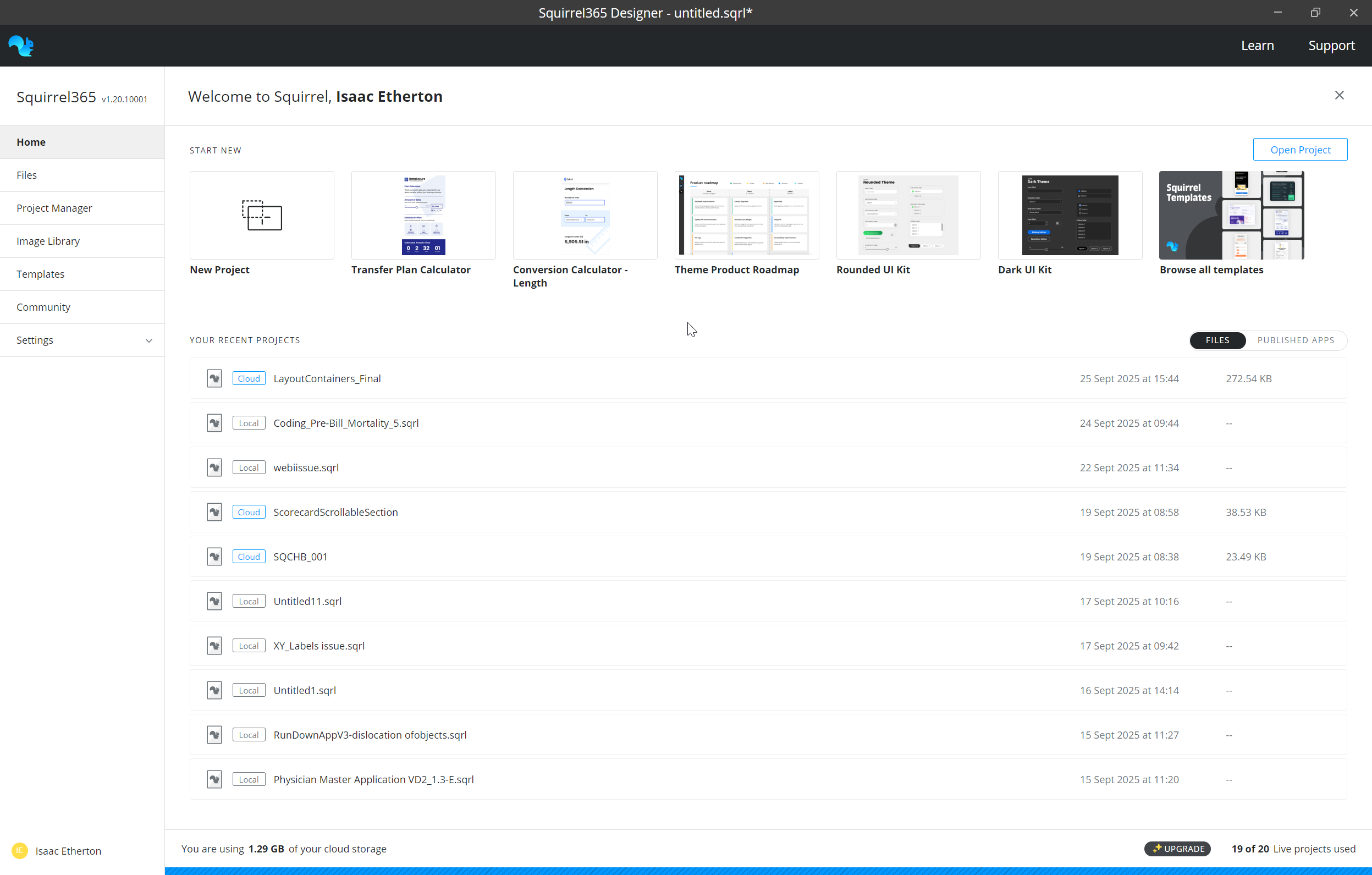
When you first launch/login to Squirrel365 you will be presented with the **Home page** of your workspace.
From here you can start a new project, browse files, access published apps via the project manager and manage assets and settings. We'll briefly cover some of the key areas of the workspace here.
The **Start New** section contains a quick start 'New project' tile to create a blank project, along with some pre-suggested templates.
Under **Your Recent Projects** you'll find a list of recently opened or published projects. You can switch between recently opened **files** or recently published **apps** using the toggle in the top right.
#### Files
File explorer allows you to browse and manage your cloud-saved projects. If a project has multiple versions, the 'Versions' option will be available in the **More Options** dropdown, allowing users to view and restore previous versions.
#### Project Manager
The **Project Manager** contains a list of all your published apps. For more information on the Project Manager, see [this article](/publishing-and-sharing/using-the-project-manager.md).
### Designer
When you start a new project, or open an existing one, you are taken in to the **Designer** this is where you build your apps.
#### Overview
* **Main Canvas** - This is where you build the interface for your app
* **App Menu Bar** - The location of the standard menu, file name and mode and display toggles
* **Sidebar** - Access the Component Library, Component Tree (the list of components added to your project), Connections, Functions, Project Settings and more from here.
* **Property panel** - Used to style and configure components
* **Spreadsheet panel**- Contains the data and logic used by the app.
### Quick start
#### To add a component to the canvas
1. click on the plus icon in the sidebar to open the component library
2. Browse the library and select the component you want
3. Add by clicking on a component and then on the canvas area where you want it added
{% hint style="info" %}
You can also double click a componet or drag and drop from the component library onto the canvas.
{% endhint %}
#### Styling the component
With the component selected, the property panel displays all of the styling and configuration options for that component.
1. Select a component either by clicking on it on the canvas or selecting it in the Component Tree
2. Update a property such as the font size or colour to see that reflected in the component.
Binding properties to the spreahdseet
Any where you see the bind icon you can use the spreadheet to drive the value for that property.