# Introduction

Welcome to the Squirrel learn space - a library of everything you need to know about Squirrel365.

## Build web apps without code.

Squirrel enables anyone to build and publish fully functional applications without writing any code.

Welcome to the Squirrel365 Help Documentation, which contains everything you need to know about using Squirrel. This includes everything from understanding core concepts to step-by-step guides on each product feature.

### New to Squirrel?

<table data-view="cards"><thead><tr><th></th><th></th><th data-hidden></th><th data-hidden data-card-target data-type="content-ref"></th><th data-hidden data-card-cover data-type="files"></th></tr></thead><tbody><tr><td><strong>Find your way around</strong></td><td>Start here... learn the basic and core concepts</td><td></td><td><a href="/pages/mjBDcAfWh0qzE36oXWpe">/pages/mjBDcAfWh0qzE36oXWpe</a></td><td><a href="/files/JDuTeffbOcCvZByA59Zs">/files/JDuTeffbOcCvZByA59Zs</a></td></tr><tr><td><strong>Step-by-step tutorials</strong></td><td>Try our tutorials to teach you how to use Squirrel</td><td></td><td><a href="/pages/bPAPbwnYkf2p6LBh8mes">/pages/bPAPbwnYkf2p6LBh8mes</a></td><td><a href="/files/aIexOymvt9Z7lPrRqUKo">/files/aIexOymvt9Z7lPrRqUKo</a></td></tr><tr><td><strong>Templates</strong></td><td>Explore and customise our templates to suit your own project</td><td></td><td><a href="https://marketplace.squirrel365.io/templates">https://marketplace.squirrel365.io/templates</a></td><td><a href="/files/qrigl1KyI5VeNm3yOQQ5">/files/qrigl1KyI5VeNm3yOQQ5</a></td></tr></tbody></table>

### Detailed guides for...

<table data-view="cards"><thead><tr><th></th><th></th><th data-hidden></th><th data-hidden data-card-target data-type="content-ref"></th><th data-hidden data-card-cover data-type="files"></th></tr></thead><tbody><tr><td><strong>Components</strong></td><td>Guides for each of the building blocks of Squirrel</td><td></td><td><a href="/pages/lspphwd09ZBfgb9LBqjR">/pages/lspphwd09ZBfgb9LBqjR</a></td><td><a href="/files/T2WMoy4gaqZp2SQs5yjs">/files/T2WMoy4gaqZp2SQs5yjs</a></td></tr><tr><td><strong>Functions</strong></td><td>Details on function types and how they can boost your project</td><td></td><td><a href="/pages/9CG02T0xlvRgbpsJLxiG">/pages/9CG02T0xlvRgbpsJLxiG</a></td><td><a href="/files/LuxzihP8uokl3Zf3ZwqV">/files/LuxzihP8uokl3Zf3ZwqV</a></td></tr><tr><td><strong>Connections</strong></td><td>Connect and integrate with other tools</td><td></td><td><a href="/pages/M0KVRoLywwTRyQppwVrZ">/pages/M0KVRoLywwTRyQppwVrZ</a></td><td><a href="/files/li8jXEVPRndgVeTT6unJ">/files/li8jXEVPRndgVeTT6unJ</a></td></tr><tr><td><strong>Spreadsheet</strong></td><td>Learn about the 'brains' behind your projects</td><td></td><td><a href="/pages/U9c0ONw6ypO0i8wE6maS">/pages/U9c0ONw6ypO0i8wE6maS</a></td><td><a href="/files/G0UtewGmmsaQxKI5xH1p">/files/G0UtewGmmsaQxKI5xH1p</a></td></tr><tr><td><strong>Publishing &#x26; sharing</strong></td><td>How to publish, share and manage projects</td><td></td><td><a href="/pages/4jPPGwyebGgBBtfrqL06">/pages/4jPPGwyebGgBBtfrqL06</a></td><td><a href="/files/dzV2aWaL9fcyfFzTfQuK">/files/dzV2aWaL9fcyfFzTfQuK</a></td></tr><tr><td><strong>Add-ons</strong></td><td>How to install and manage add-on functionality</td><td></td><td><a href="https://marketplace.squirrel365.io/add-ons">https://marketplace.squirrel365.io/add-ons</a></td><td><a href="/files/srbtkVmkSyq4BPJGCTUy">/files/srbtkVmkSyq4BPJGCTUy</a></td></tr></tbody></table>

### Need more help?

<table data-view="cards"><thead><tr><th></th><th></th><th data-hidden></th><th data-hidden data-card-target data-type="content-ref"></th><th data-hidden data-card-cover data-type="files"></th></tr></thead><tbody><tr><td><strong>Community</strong></td><td>Be inspired by the Squirrel community. Ask questions and join the chat.</td><td></td><td><a href="https://community.squirrel365.io/c/ask-for-help/">https://community.squirrel365.io/c/ask-for-help/</a></td><td><a href="/files/t6ntSAWwsH5n7fZXhaQP">/files/t6ntSAWwsH5n7fZXhaQP</a></td></tr><tr><td><strong>Support</strong></td><td>Technical problem? Log a bug on our support site.</td><td></td><td><a href="https://squirrel365.io/support/">https://squirrel365.io/support/</a></td><td><a href="/files/p4DXkK4U8mDAuXccsAv3">/files/p4DXkK4U8mDAuXccsAv3</a></td></tr></tbody></table>


# Finding your way around

### Workspace

When you first launch/login to Squirrel365 you will be presented with the **Home page** of your workspace.&#x20;

<figure><img src="/files/P7EEAeoLxApGd04wLK1W" alt=""><figcaption></figcaption></figure>

From here you can start a new project, browse files, access published apps via the project manager and manage assets and settings. We'll briefly cover some of the key areas of the workspace here.

The **Start New** section contains a quick start 'New project' tile to create a blank project, along with some pre-suggested templates.&#x20;

Under **Your Recent Projects** you'll find a list of recently opened or published projects. You can switch between recently opened **files** or recently published **apps** using the toggle in the top right.

#### Files

File explorer allows you to browse and manage your cloud-saved projects. If a project has multiple versions, the 'Versions' option will be available in the **More Options** dropdown, allowing users to view and restore previous versions.

#### Project Manager

The **Project Manager** contains a list of all your published apps. For more information on the Project Manager, see [this article](/publishing-and-sharing/using-the-project-manager).

### Designer

When you start a new project, or open an existing one, you are taken in to the **Designer** this is where you build your apps.&#x20;

#### Overview

<figure><img src="/files/fdWVOiTObe9bVG341Lzx" alt=""><figcaption></figcaption></figure>

* **Main Canvas** - This is where you build the interface for your app
* **App Menu Bar** - The location of the standard menu, file name and mode and display toggles
* **Sidebar** - Access the Component Library, Component Tree (the list of components added to your project), Connections, Functions, Project Settings and more from here.
* **Property panel** - Used to style and configure components
* **Spreadsheet panel**- Contains the data and logic used by the app.&#x20;

### Quick start

#### To add a component to the canvas

1. click on the plus icon in the sidebar to open the component library
2. Browse the library and select the component you want
3. Add by clicking on a component and then on the canvas area where you want it added

{% hint style="info" %}
You can also double click a componet or drag and drop from the component library onto the canvas.
{% endhint %}

#### Styling the component

With the component selected, the property panel displays all of the styling and configuration options for that component.&#x20;

1. Select a component either by clicking on it on the canvas or selecting it in the Component Tree
2. Update a property such as the font size or colour to see that reflected in the component.

Binding properties to the spreahdseet

Any where you see the bind icon you can use the spreadheet to drive the value for that property.


# Core concepts


# Data Binding

Data binding is one of the fundamental building blocks of Squirrel. It is simply the linking of component properties to data contained in one or more spreadsheet cells.

As data in the spreadsheet updates, any component properties bound to that data will also update.

Each component in Squirrel has properties that can be set by binding to data in the spreadsheet; be sure to browse the properties of each component to see what you can do.

Follow along using these step-by-step instructions to see how you can easily incorporate data binding into your Squirrel projects.

### Step-by-step:

1. Open up the spreadsheet in a new Squirrel project.
2. In cell **A1**, add the value **14**.
3. In cell **B1**, add the value **53**.
4. Add a pie chart component to the canvas and ensure that it is selected.
5. In its properties panel, expand the **DATA** drawer.
6. Move your cursor over the Values property and click on the data binding icon that appears above.

<figure><img src="/files/g2YnwIrVLFzdIljJJ8Bz" alt=""><figcaption></figcaption></figure>

{% hint style="info" %}
Move your cursor over any property field. If the data binding icon appears directly above the field, then this property can be bound to data in the spreadsheet.
{% endhint %}

7. The spreadsheet will open in binding mode, and it will fill the central area of the Squirrel interface. The header is blue and contains a range field, as well as confirm and cancel buttons.

<figure><img src="/files/PGuFzBTe7eE3JpQpHHTC" alt=""><figcaption></figcaption></figure>

{% hint style="warning" %}
While in binding mode, the spreadsheet cannot be edited; data cannot be changed, added or removed.
{% endhint %}

8. You can select the data in two ways:
   * Click on cell **A1**, with the mouse button down, click and drag the blue bounding box until it also includes cell **B1**.
   * Type **Sheet1!A1:B1** into the range field at the top of the spreadsheet.
9. Click the Confirm button.
10. Check that the Values property of the pie chart contains the cell addresses and that the pie chart has been updated to show these new values.

That’s how we can quickly and easily bind a component property to data in the spreadsheet. But there is more that we can do to make this even more dynamic:

11. Add a spinner control to the canvas and ensure that it is selected.
12. Expand the **DATA INSERTION** drawer in the properties panel.
13. Click the data binding icon above the **Value** field.
14. Select cell **A1** and click the confirm button.
15. Add a second spinner control to the canvas.
16. This time, bind the **Value** property to cell **B1**.
17. Change to **Preview** mode.
18. Change the values of the spinners by typing in new values or clicking the spinner buttons and watching the pie chart component react to the new values.

That’s the end of this tutorial on Data Binding. Although this is a very simple example, you can begin to see how binding data to component properties can start to make your projects come alive. Then, you can take it a step further by adding control components into that mix to produce powerful, interactive applications.


# Data Insertion

Data insertion is the copying of data from one area of the spreadsheet into another. Typically, it is used by control components (for example, a push button, a radio button, or a dropdown box), where the user’s choice determines which data is copied and pasted into a different cell or a range of cells. This copied data can then be used by other functions or even bound to the properties of other components.

The data mover function is also used to insert and/or move data behind the scenes.

Binding other components to the copied data means that they will update in response to the user’s selection.

Follow this Step-by-step guide below to see how you can easily incorporate data insertion into your Squirrel projects:

### Step-by-step:

Many components in Squirrel have data insertion properties; these are mostly control components, but the text input component also inserts data. There is also some variation in how these components handle data insertion, so the following sections will cover the different methods.

#### Text Input

This is possibly the simplest form of Data Insertion; text added to a text input component by the user is inserted into a single cell in the spreadsheet.

1. Add a text input component to the canvas and select it.
2. Expand the **DATA INSERTION** drawer in the properties panel.
3. Bind the **Destination** property to an empty cell.

<figure><img src="/files/ynR43fTK0ElHSFcXQgXN" alt=""><figcaption></figcaption></figure>

4. Switch to **DEBUG** mode and show the spreadsheet (if not visible).
5. Type a word or value into the text input component and press Enter.
6. The cell bound to the destination property of the text input component updates accordingly.

{% hint style="info" %}
In the spreadsheet, change the colour of any Destination cell(s) to yellow; this will remind you that the content of these cells will change during runtime and not to use them for other purposes.
{% endhint %}

#### Single Data Insertion

Some components, such as Buttons or Checkboxes, allow just one set of data (the contents of one cell or a range of cells) to be copied into another area of the spreadsheet.

1. In cell **A1** of the spreadsheet, add MoveThis.
2. Add a pushbutton component to the canvas and select it.
3. Expand the **DATA INSERTION** drawer in the properties panel.

<figure><img src="/files/MhAFt7igj5K5LvPzxqJk" alt=""><figcaption></figcaption></figure>

4. Bind the Source property to cell **A1**.
5. Bind the **Destination** property to an empty cell.
6. Switch to **DEBUG** mode and show the spreadsheet (if not visible).
7. Click the pushbutton component.
8. The cell bound to the destination property of the pushbutton component will now also contain MoveThis.

#### Series Data Insertion

Some components, such as radio buttons, dropdowns, or list boxes, allow for one *or* more sets of data (the contents of one cell or a range of cells) to be copied into another area of the spreadsheet.

1. In the spreadsheet, add Option 1 to cell **A1**, Option 2 to cell **A2**, Option 3 to cell **A3,** and Option 4 to cell **A4**.
2. Add a radio button component to the canvas and select it.
3. In the **GENERAL** drawer of the properties panel, click the data binding icon above the List items property.
4. Select cells **A1** to **A4** or type **Sheet1!A1:A4** into the range field and click the **Confirm** button.
5. The radio button labels will correspond to the contents of cells **A1** to **A4**.
6. Expand the **DATA INSERTION** drawer of the properties panel.

<figure><img src="/files/cFkRO99TqB2kOe2HFgCj" alt="" width="281"><figcaption></figcaption></figure>

7. In the **Series** property field, a default series (Series 1) is already selected.
8. Rename this series if you wish by entering a new name in the Name property field.
9. Select a **Type** from the dropdown list. The following sections describe what each type is and how to use it:
10. **Position** – Each button of the component is identified by a position value. The first button is position 1, the second is position 2, and so on. Clicking each button will place its position value into the destination cell.
    * No source is required.
    * Bind the destination property to an empty cell in the spreadsheet.
    * Switch to **DEBUG** mode.
    * Select one or more radio buttons.
    * Clicking the first button will insert a 1 into the destination cell, clicking the second will insert a 2, and so on.
11. **Label** – This is the text alongside each button. Clicking each button will copy its label into the destination cell.
    * No source is required.
    * Bind the destination property to an empty cell in the spreadsheet.
    * Switch to **DEBUG** mode.
    * Select one or more radio buttons.
    * Clicking the first button will insert Option 1 into the destination cell, clicking the second will insert Option 2 into the destination cell, and so on.
12. **Value** – This type requires one source value per button in the radio button component. Selecting a radio button will copy the corresponding value into the destination cell.
    * In the spreadsheet, add 5 into cell **B1**, 6 into cell **B2**, 7 into cell **B3,** and 8 into cell **B4**.
    * Click the data binding icon above the Source property.
    * Select cells **B1** to **B4** or type **Sheet1!B1:B4** into the range field and click the **Confirm** button.
    * Bind the destination cell to an empty cell in the spreadsheet.
    * Switch to **DEBUG** mode.
    * Select one or more radio buttons.
    * Clicking the first one will insert 5 into the destination cell, clicking the second will insert 6 into the destination cell, and so on.
13. **Row** – This type requires one source row of data per button in the radio button component. The corresponding row will be copied into a destination row.
    * In the spreadsheet, add data to four rows (see image below).
    * Click the data binding icon above the Source property.
    * Move the mouse cursor to the start of the topmost row and click so that the row is selected and then drag down to select all four rows.
    * Click the **Confirm** button.
    * Click the data binding icon above the destination property.
    * Move the mouse cursor to the start of an empty row and click so that the row is selected.
    * Click the **Confirm** button.
    * Switch to **DEBUG** mode.
    * Selecting one or more radio buttons.
    * Clicking the first one will insert the topmost row into the destination row, clicking the second will insert the second row into the destination row and so on.

<figure><img src="/files/75Yju2DocAYdTmkXvkSa" alt=""><figcaption></figcaption></figure>

* **Column** – This type works in the same way as the Row type, but as the name suggests, instead of the data being in rows, the source and destination properties must be bound to columns.
* **Status List** – This type returns a comma-separated list of 0s and 1s; the number of items in the list relates to the number of buttons in the radio button component. The selected button is denoted by a 1, the unselected buttons are represented by a 0.
  * No source is required.
  * Bind the destination property to an empty cell in the spreadsheet.
  * Switch to **DEBUG** mode.
  * Selecting Option 1 will add 1,0,0,0 into the destination cell, selecting Option 2 will add 0,1,0,0 into the destination cell, and so on.
* To add another **Data Insertion** series, click the plus button above the Series property field.

<figure><img src="/files/20N1V8flD8LyEVfizyG7" alt=""><figcaption></figcaption></figure>

11. Then follow steps 8 to 10.
12. Both **Data Insertion** series will be actioned when interacting with the radio button.

You can now use the inserted data; bind it to component properties, use it to determine what components should be visible on the canvas, use it to trigger other actions, and so on.

*itThat’s the end of this tutorial on Data Insertion. Try experimenting with the different components to see how they handle data insertion and how you can use that within your projects. If you haven’t already used the Data Mover function, that also can be used to move data around the spreadsheet.*


# Dynamic Visibility

Dynamic visibility is one of the core 3 concepts in Squirrel365. It allows your project to show and hide components in response to user interactions and/or data conditions. Use dynamic visibility to show a pop-up information screen, hide a component until it is required, switch between different visual representations of data, and many other scenarios.

<figure><img src="/files/wgH7XWwUuQgRkaK49EXs" alt=""><figcaption></figcaption></figure>

Each component that can be added to the canvas has dynamic visibility properties that are configured in the same way. The component will be visible when the condition evaluates to true. The condition is made up of two **value** fields and an **operator.**&#x20;

For example, in the above image the the component would be visible when the content of the first **Value** property  is **equal** to the the second **Value** property. Leaving both value property fields empty will ensure that the component is always visible, as the first and second **Value** properties are equally empty.

By binding 1 or more of the **Value** properties to cells in the spreadsheet, and using spreadsheet formula logic, the visibility of objects can be changed dynamically.

Clicking on the operator <img src="/files/HvdtmEhSk1LTr0LYpOJ9" alt="" data-size="line"> brings up a list of the available options which include:

* equals (=)
* not equal (<>)
* less than (<)
* less than or equal to (<=)
* greater than (>)
* greater than or equal to (>=)
* is empty
* is not empty

You can configure multiple conditions for Dynamic Visibility. Clicking  <img src="/files/iaAflP1ReuQbrYIbliDk" alt="" data-size="line"> will generate another set of inputs for defining a new rule. Additionally, a delete option will appear, allowing you to remove the rule.  [Learn more about Conditional logic](/how-tos/conditional-logic)

{% hint style="info" %}
Dynamic visibility is only applied when your project is running i.e. in **Debug** mode, **Preview** mode, or as a published project. It is not applied in **Design** mode; instead, use the eye icon next to objects in the **Component Tree** to hide and show objects during project development.
{% endhint %}


# Dynamic Visibility Tutorials

Below are a set of three tutorials that describe different ways to use dynamic visibility. Each tutorial  includes step-by-step instructions to easily follow along.

## Dynamic Visibility: The Basics

### Step-by-step:

1. Add a component to your canvas and make sure that it is selected. In the properties panel, expand the **DYNAMIC VISIBILITY** section.&#x20;
2. Set the first **Value** by clicking on the **Bind Data** icon above the left **Value** field:

<figure><img src="/files/2neIngzjiGHRkNcAd6UG" alt=""><figcaption></figcaption></figure>

3. Select a single empty cell in the Spreadsheet and click the **Confirm** button.
4. Next, set the second **Value** property by entering a word or number you wish to use into the right **Value** input field. The value can be anything:
   * Boolean value
   * Word
   * Number
   * Phrase

<figure><img src="/files/wZuT9yKVTlcAlZ3bcgYX" alt=""><figcaption></figcaption></figure>

5. The component will compare the contents of the cell bound to the first **Value** property to see if it matches the second Value property.

{% hint style="info" %}
The comparison is case sensitive; ensure that the first **Value** will be in the same format as the second **Value,** e.g., ALL CAPS, Leading Caps, etc., as ‘TRUE’ will not equal ‘True’.
{% endhint %}

6. Enter Debug mode by clicking the **DEBUG** button.

The component will **not** be visible because the empty cell bound to the first Value property does not equal the second Value entered in the property field.

7. Change back to **Design** mode.
8. In the spreadsheet, select the cell that you bound to the first Value property and enter the exact value that you entered into the second Value property.
9. Enter **Debug** mode again.

This time, the component remains visible because the first **Value** property and the second **Value** property are equal.

This is the simplest demonstration of **Dynamic Visibility**, but we can take this basic concept much further and start to configure component visibility based on user and data-driven interaction i.e,. show a component based on a user’s selection, or show a component once a data value reaches a specified threshold.

## Dynamic Visibility using Data Insertion

### Step-by-step:

1. For this example, you’ll need two components: a control component and a display component. Add a **Radio Button** component and a **Text Label** component to the canvas.&#x20;
2. Open the **Spreadsheet** and add the number 1 into cell **A1**, 2 into **A2,** and 3 into **A3**.&#x20;
3. Set the **Radio Button** component properties:
   1. Properties Panel > **GENERAL** > List Items > bind to cells A1, A2 and A3 (click on cell A1 and drag the mouse until the selection also includes cells A2 and A3)
   2. Properties Panel > **DATA INSERTION** > Series 1 > Type > Label > Destination > bind to C2
4. Select the Text Label component:
   1. Properties Panel > **LABEL TEXT** > Add some text to the label e.g., “Now you see me…” or “BOO!”
   2. Properties Panel > **DYNAMIC VISIBILITY** > Value 1 , bind to C2.
   3. Properties Panel > **DYNAMIC VISIBILITY** > Value 2 > input the number 2.
5. Enter debug mode by clicking the **DEBUG** button.
6. Interact with the **Radio Button** component. Note that the **Text Label** is only visible when option 2 of the radio button component is selected (when the value of **C2** is equal to 2).

## Dynamic Visibility using Formulas

### Step-by-step:

1. For this example, you’ll need two components: a control component and a display component. Add a **Slider** component and a **Text Label** component to the canvas.&#x20;
2. Select the Slider component:
   1. Properties Panel > **GENERAL** > Value field bind to **A1**.
3. Open the Spreadsheet and select cell **B1**. Enter the following formula:

> **=IF(A1>75,1,0)**

{% hint style="info" %}
This formula calculates that if the value of **A1** (the slider input) is greater than 75, then the value of cell **B1** is 1; otherwise, the value of **B1** is 0.
{% endhint %}

3. Select the **Text Label** component:
   1. Properties Panel > **LABEL TEXT** > Text To Display amend to LOW STOCK!
   2. Properties Panel > **TEXT STYLING** > Amend the properties of the text field to make it look like a warning label.
   3. Properties Panel > **DYNAMIC VISIBILITY** > Value 1 field bind to B1.
   4. Properties Panel > **DYNAMIC VISIBILITY** > Type 1 into the Value 2 field.
4. Enter **Debug** mode by clicking the **Debug** button.
5. Interact with the **Slider** control, as the slider moves above 75, the LOW STOCK! The warning **Text Label** will display.

*That’s the end of this tutorial on Dynamic Visibility. Hopefully, you’ve been inspired to try it in some of your projects. If you’ve done something fabulous using Dynamic Visibility, do get in touch; we love seeing how ingenious Squirrel creators can be!*


# Adding components

### Adding a component

The Component library is where you will find all the UI elements you can add to your project. Open  it by clicking on the 'add icon' <img src="/files/Czm8CHfc76yMHtRmiS4l" alt="" data-size="line">  in the side bar.&#x20;

<figure><img src="/files/Dm51EG9QDx8TmrVb4O4n" alt=""><figcaption><p>An example view of the Component Library (v1.19), displaying the default Grid View, expanded drawers and components in the drawers.</p></figcaption></figure>

To add a component to your app select it in the component library and then click on the canvas in the desired location.

{% embed url="<https://files.gitbook.com/v0/b/gitbook-x-prod.appspot.com/o/spaces%2FkLBGzn2hXrIMe50klQCv%2Fuploads%2FoFLm0hFrBIuT87ZCiKRs%2Fadd_component.mp4?alt=media&token=d9449e00-c8e5-4827-a63c-cbccbd74156a>" %}

{% hint style="info" %}
Other methods for adding components to the canvas include double clicking (which will drop it in a default location) or drag and drop from the library to the canvas
{% endhint %}

The components are grouped into categories librayr&#x20;

Select the desired component and move the cursor over the canvas area.&#x20;

### Grouping Components

Components can be grouped on the canvas. When grouped, these components can be moved together on the canvas, as a single layer in the Component Tree.

{% hint style="info" %}
v1.19 Introduced changes to Grouping and its functionality in the product. For more information, check out [this article](/the-designer/changes-to-grouping-in-v1.19).
{% endhint %}

Components can be grouped in a few ways:

#### 1. Ctrl + G

<figure><img src="/files/xXADbQTW29ivkIEwXPXl" alt=""><figcaption></figcaption></figure>

#### 2. Right-click menu

<figure><img src="/files/0K02snWft86sxUPyHNWI" alt=""><figcaption></figcaption></figure>

#### 3. Arrange Menu

<figure><img src="/files/xbymqb08jYPE7p8MjSxZ" alt=""><figcaption></figcaption></figure>

### Arranging Components

Components can be arranged on the canvas based on their positions and size. When multiple components are selected, the arrange menu will be enabled.

<figure><img src="/files/J5aMhuHIt8Baml1d0QzM" alt=""><figcaption><p>From left to right: Align Left, Alight Center, Align Right, Align Top, Align Middle, Align Bottom, Distribute Horizontally, Distribute Vertically, Make Same Size, Make Same Height, Make Same Width</p></figcaption></figure>

{% hint style="info" %}
When arranging components, the arrangement will be based on the first selected component.&#x20;

This is identifiable by the thicker blue bounding box around the component.
{% endhint %}

<figure><img src="/files/lOPf8F2ClO3GnXHu3x6z" alt=""><figcaption></figcaption></figure>


# Styling and configuring components

Learn how to use the properties panel in Squirrel365 to style your components and connect them to your spreadsheet data.

When you select a component on the app canvas, a panel opens on the right side of the screen. This is the **properties panel**, and it's where you do all your configuration — from changing colours and fonts to connecting a chart to live data. Understanding how it's organised will help you work faster and get to the settings you need without hunting around.

<figure><img src="/files/OM7IENA6tS7JohdGl7mw" alt=""><figcaption></figcaption></figure>

### How the properties panel is organised

At the top of the panel you'll usually find a **Quick Setup** section. This contains the settings you're most likely to need first — the essential options for getting a component working without having to dig into every detail. Start here when you add a new component to your canvas.

<figure><img src="/files/REeyh5whlesKUJW2fpUS" alt="" width="254"><figcaption></figcaption></figure>

If you need to go beyond the basic setup the **All Properties** tab contains everything you can configure, divided into collapsible **sections**. Each section groups related settings together. For most components you'll see sections covering appearance, position and size, data, and behaviour. Click a section heading to expand or collapse it.

{% hint style="info" %}
Different components have different sections in their properties panel. A chart has sections for series, axes, and legends. A text box has sections for font, colour, and alignment. The sections always reflect what's relevant to that specific component.
{% endhint %}

### Styling your components

Styling properties control how a component looks. Depending on the component, you'll find options for:

* **Colours** — background fill, border colour, font colour, and in charts, series colours
* **Fonts** — typeface, size, weight, and alignment for any text the component displays
* **Size and position** — exact pixel dimensions and coordinates, or drag handles on the canvas
* **Borders and padding** — control spacing and edges

You can type values directly into number fields, use the up and down arrows to nudge values, or interact with the component directly on the canvas by dragging its edges and corners. Both approaches update the same underlying properties, so mix and match however feels natural.

For colour fields, clicking the colour swatch opens a colour picker where you can choose a colour visually, enter a hex code, or set opacity.

### Connecting components to your data

Some properties control what a component does and what data it shows. This is achieved using data binding, which connects a component to values in your spreadsheet.

<figure><img src="/files/4AXiZe2X4BJN5nNzkDys" alt="" width="250"><figcaption></figcaption></figure>

When a property is bound to the spreadsheet it is indicated by the blue spreadsheet icon and the spreadsheet cell reference in the input field. Data binding is one of the core concepts in Squirrel365. Read the [**Data Binding**](/getting-started/core-concepts/data-binding) article to learn more about it.

To bind a component to data:

1. Select the component on the canvas.
2. In the properties panel, find the property that you want to connect to the spreadsheet.
3. Hover or place your cursor inside the property and look for a small spreadsheet icon above it. Clicking it switches the field from a manual value to a binding.
4. The spreadsheet bind mode will appear
5. Select the spreadsheet cell reference or range you want to pull from and click confirm

Once a binding is set, the component updates automatically whenever the spreadsheet data changes. This is how Squirrel365 keeps your app in sync with your data without any extra steps.

Some components — such as charts — have more complex data structures with separate fields for categories, series values, and labels. These are all set within the relevant section of the properties panel, following the same binding approach.

### Changing properties for multiple components at once

You can select more than one component on the canvas and edit their properties at the same time. What appears in the properties panel depends on what you've selected.

If your selection contains components of the **same type** — two line charts, or three text labels — the panel shows all the properties those components share. Any change you make applies to all of them at once, which is useful for matching colours, fonts, or data settings across similar components quickly.

If your selection contains components of **different types**, the panel shows only the properties that every component has in common regardless of type — such as layout and positioning, and dynamic visibility. You won't see type-specific settings until you narrow your selection.


# Publishing your App

After building your Squirrel365 app the final step is to publish it so that it can be shared and used outside of the Squirrel365 Designer<br>

### Publishing to the Cloud

Projects are published and hosted on the Squirrel365 cloud. From there they can easily be shared via a link or embedding a webpage (See the [Project Manager tutorial](https://squirrel365.io/knowledgebase/using-the-project-manager/) for more information about sharing your projects.)&#x20;

#### Publishing an App

To publish a project:

1. Enter **Preview** mode
2. Select the **Publish** button in the top right of the preview screen
3. Give the Project/App a name&#x20;
4. Click **publish**

<figure><img src="/files/bGZ68w12BAZ9BUcJtXne" alt=""><figcaption></figcaption></figure>

### Viewing published Apps

After publishing your app the **Project Manager** will load.

To open your App in a browser hover over the thumbnail image and click **Open in Browser.**

<figure><img src="/files/HF0x6BlA8OJbYx2HmGOe" alt=""><figcaption></figcaption></figure>

The Project Manager is where you can change the status of your apps (make them live or draft), get  share links and the embed code, access previous versions and more.&#x20;

Find out more about managing your published projects see [Using the Project Manager](/publishing-and-sharing/using-the-project-manager)&#x20;


# Intro to the Designer

A guide to the Squirrel365 designer interface — the canvas, component panel, object browser, spreadsheet, and properties panel.

The Squirrel365 designer is where you build your apps. It's a browser-based environment made up of a few distinct areas, each with a specific role. Once you know what each area does and how they connect, the whole interface starts to feel intuitive. This article walks you through each part.

<figure><img src="/files/fdWVOiTObe9bVG341Lzx" alt=""><figcaption></figcaption></figure>

### The canvas

The **main canvas** is the large central area where you design your app. You drag and drop components onto it, position them visually, and resize them by dragging their edges and corners. What you see on the canvas is a close representation of what your published app will look like.

You can scroll around the canvas and zoom in and out to work on specific areas.&#x20;

Click any component to select it, and drag a selection box across multiple components to select several at once.

The canvas has it's own set of properties which are accessed by clicking in an empty space on the canvas, the void or the component tree to select it.&#x20;

<figure><img src="/files/dh8jzRfO8sQv8Jsxcf6M" alt="" width="250"><figcaption></figcaption></figure>

#### Main canvas size&#x20;

**Width** - The width of your app in pixels

**Height** - The height of your app in pixles

**Canvas size** - Select from a number of pre-canned app/device sizes. This will update the values in the Height and Width properties.

**Enable responsive canvas** - When checked this option allows your app to dynamically re-size based on the size of the device or browser window that it is being viewed in. Use with layout containers to build responsive apps.

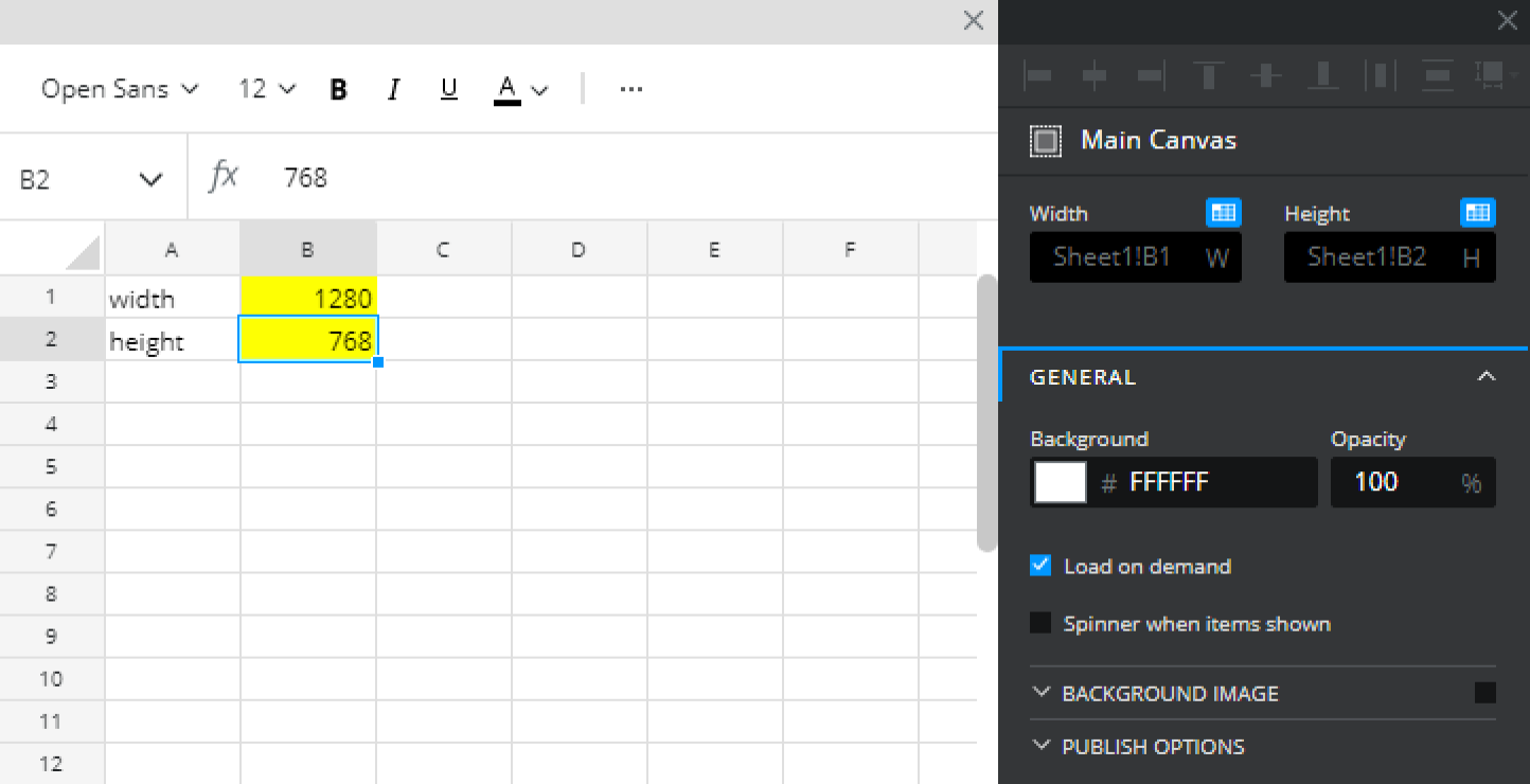
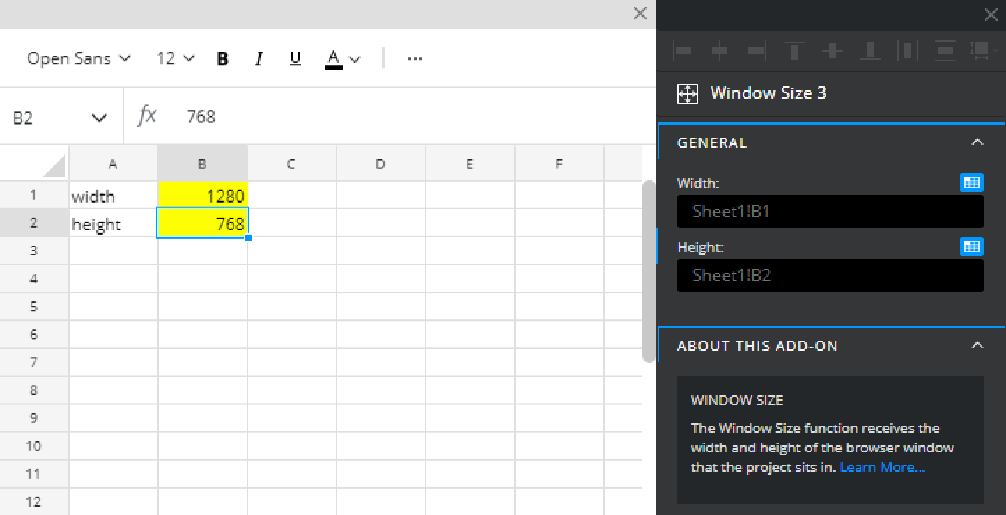
**Insert browser size into spreadsheet** - Turns on the option to receive the users browser dimensions at runtime. Bind the width and height properties to cells in the spreadsheet that you want to inject this data into.&#x20;

#### GENERAL

Set background color, padding and optionally specify a background image. Note you have to enable the backgroudn image with the subsection checkbox.

### The app menu

The main app menu runs across the top of the designer. It gives you access to project-level controls: file operations, undo and redo, view settings and preview mode. It also shows the name of the project you're currently working on and the save status.

The preview button lets you test your app without leaving the designer. Preview mode runs your app with live data, so you can check that your bindings are working and your layout looks right before you publish.

### The sidebar

The sidebar sits on the left side of the designer. It's your library of everything you can add to your project, components, functions, connections and custom components. Its also provides access to project settings and a link to the marketplace.

<figure><img src="/files/ZrmEOEk9K5WrU7t97crG" alt="" width="563"><figcaption></figcaption></figure>

#### Component Library (add component)

The component library is your list of everything you can add to your canvas — charts, tables, input controls, display components, and more. Components are grouped by category to make them easier to find.

To add a component to your canvas, click it in the panel and then click where you want it to appear on the canvas. Once placed, you can move and resize it freely.

#### Component Tree

The component tree, also on the left side of the designer, shows all the visual components that currently exist in your project.

Clicking a component in the list selects it on the canvas and opens its properties in the properties panel. This is useful when components are stacked on top of each other and are hard to click directly.

#### Custom Components

Lists the Custom Components you have saved to your library. A small thumbnail of each custom component is displayed. Add them to your project by dragging and dropping them from the Custom Component library. Read the [**Custom Component article**](/the-designer/custom-components) for more information about creating and using custom components.

#### Functions panel

Lists any background processing functions you've added to your project. These have no visual presence on the canvas but they do work, such as calculations and data transformations. You add and remove functions from this section.

#### Connections panel

Lists any external data connections you've set up. Like functions, connections have no canvas presence — they run in the background and make data available for your components to bind to. You add and remove connections here too.

#### Project settings

The Project Settings modal is the place where project or app level preferences are configured and saved. It includes options relating to publishing, performance, customization, and PWAs. The article on [**Project Settings**](/the-designer/project-settings) covers this in more detail.

#### Marketplace

Link to the marketplace where you can get add-ons and templates.

### The spreadsheet

The spreadsheet runs along the bottom of the designer. It's the data layer of your app — the logic engine that sits behind what users see on the canvas.

If you're familiar with Excel or Google Sheets, the spreadsheet will feel natural. You can write formulas, reference data from your connections, perform calculations, and control what values get sent to your components. Squirrel365 evaluates the spreadsheet continuously, so changes flow through to your app in real time.

Bindings in the properties panel point to cells or ranges in this spreadsheet. That's what keeps your components in sync with your data.

### The properties panel

The properties panel sits on the right side of the designer. It's empty when nothing is selected, and populates with the settings for whichever component, function, or connection you have selected. All styling and configuration, colours, data bindings, behaviour settings, is done here. The article on [**styling and configuring components**](/getting-started/styling-and-configuring-components) covers this in more detail.


# The Spreadsheet

This is an overview page of the Squirrel spreadsheet, its uses as well as navigation to articles on the spreadsheet and its uses.

Squirrel365 is built with the spreadsheet as the "brains" of the project. It is where the data is stored, manipulated, and bound to components on the canvas. It looks, feels and works just like any other spreadsheet tool.&#x20;

### Spreadsheet basics

When cells are selected, a blue box identifies the selection, and clicking and dragging will select a range of cells, highlighting the selected area in a larger blue box.

<figure><img src="/files/gSiY6Vu5hgU9xvUG3czx" alt=""><figcaption><p>Left: a single cell selection, Right: a range selection</p></figcaption></figure>

#### Add/ Remove Rows and Columns

Rows and Columns can be added and removed from the spreadsheet in its entirety. This can be done in a few ways:

* **Select the Row** - by right-clicking on any of the row numbers, a menu will appear to "Insert Row" or "Delete Row"
* **Select the Column** - by right-clicking on any of the column letters, a menu will appear to "Insert Column" or "Delete Column"
* **Select the cell** - by right-clicking in a cell, a menu will appear and give options to insert/delete a Row or insert/delete a Column.

{% hint style="info" %}
**Inserting** a row or a column will insert before the selected range i.e. the selected row will shift down and a row will be added; the selected column will shift to the right and a column will be added
{% endhint %}

#### Copy/Cut/Paste

Cells can be copied (Ctrl+C) or cut (Ctrl+X) and pasted (Ctrl+V) throughout the spreadsheet.

When a cell contains a formula or is bound to a component, **Copying** and **Cutting** cells will have different behaviors when pasted into their destination.

**Copying** - When you copy cells that have components bound to the the bindings are unaffected. If the copied cells contained a formula then the pasted formula will update cell references based on its new location

i.e. A1 has the formula =B1+1. If copied and pasted into A3, the pasted formula will be B3+1.

**Cutting** - When you cut and paste cells the content is essentially 'moved'. Formulas will retain their original cell references and any components bound to that cell will update to the new cell location.

#### Named Ranges

Named ranges can be set in the Squirrel spreadsheet, very similar to Excel and Onedrive. A single cell or range can be selected and then can be labeled using the input at the top-left of the spreadsheet. After being entered, the named range will be added to the dropdown.

<figure><img src="/files/0AnhViCmXMWWbPNdJgGi" alt=""><figcaption></figcaption></figure>

{% hint style="warning" %}
Once a named range has been made, it cannot be deleted or edited. Squirrel is exploring enhancements to named ranges in a future build.&#x20;
{% endhint %}

### Formatting

The spreadsheet offers basic formatting options that allow for easy customization of cells, including font size, color, borders, alignment, and number formatting.

<figure><img src="/files/V5FNtAVYOo9ihJdbPFlt" alt=""><figcaption></figcaption></figure>

**Font** - to apply a font to the spreadsheet cell, select the desired cell and expand the dropdown to adjust the font

{% hint style="info" %}
At present, there is only one font available - Open Sans. This is subject to improvements in future iterations of Squirrel.
{% endhint %}

**Font Size** -  applies and changes the font size of the data in the selected cell(s)

**B&#x20;*****I*****&#x20;U** - applies **Bold**, *Italic*, and Underline formatting to the selected cell(s)

**Font Color** - applies a font color to the selected cell(s). After selecting, Quick Apply is enabled by just selecting the option and not the dropdown

**Cell Fill** - applies a color fill to the selected cell(s). After selecting, Quick Apply is enabled by just selecting the option and not the dropdown

**Cell Borders** - applies border options to the selected cell(s). Select the dropdown for more border options.

**Left/Centre/Right Alignment** - applies left/right alignment to the data within the selected cell(s).&#x20;

**Top/Middle/Bottom Alignment** - applies top/bottom alignment to the data within the selected cell(s)

**Text Wrapping** - enabled text wrapping for data within the selected cell(s).

**Number Formatting** - applies number formatting to the data within the selected cell(s).&#x20;

**Increase/ Decrease Decimals** - increments/ decrements the number of decimal places for a number value in the selected cell(s).

### Formulas

#### Available Functions.

As the basis of project calculations, the spreadsheet has standard formula capabilities with 300+ functions available to use.

For more details on available functions and formulas in Squirrel, check out the [**Supported Spreadsheet Functions**](https://learn.squirrel365.io/spreadsheet/supported-spreadsheet-functions) article.

#### Creating Formulas

Inserting a formula into a cell is very similar to other spreadsheet tools. To start writing a formula, enter "=" after selecting a cell. The formula bar has autofill capabilities with a dropdown filtering to matching functions as you type.

<figure><img src="/files/WfuoN4ESIgHHWny70s19" alt=""><figcaption><p>After entering a formula and finding the correct formula, click or navigate with arrow keys to select and hit "Tab" to auto complete</p></figcaption></figure>

After a formula has been entered, a tooltip will populate with steps and information required for the formula to be calculated.

<figure><img src="/files/GpbLVSOdRr8wlHGSkU9g" alt=""><figcaption></figcaption></figure>

#### Identifying cells containing formulas

If a cell contains a formula, a small blue indicator will appear in the top left corner to identify this cell as having a formula in it.

<figure><img src="/files/XEV9nRNtbmoGeeUNrZnA" alt=""><figcaption></figcaption></figure>

Occasionally, you may notice this indicator turns grey. This state indicates that the value in that cell did not require recalculating after the last change to the spreadheet. &#x20;

## Looking for some in particular?

{% content-ref url="/pages/6SCFFLblujHurQXbIylR" %}
[Broken mention](broken://pages/6SCFFLblujHurQXbIylR)
{% endcontent-ref %}

{% content-ref url="/pages/9gXPFot0Pm8FwwdGYIGb" %}
[Supported Spreadsheet Functions](/the-designer/overview/supported-spreadsheet-functions)
{% endcontent-ref %}

#### Something else?

Not find what you're looking for? Reach out to the [**Squirrel Community**](https://community.squirrel365.io/c/ask-for-help/) and post your questions there!


# Supported Spreadsheet Functions

The spreadsheet functions that Squirrel supports are listed in the following configurable table. You can simply scroll through the table to see which ones are available in Squirrel or filter down by category, level of support in Excel, Google, and Squirrel, or even type in the search box for free-form search in the function names.

{% embed url="<https://cloud.squirrel365.io/viewer/1CD28E327BF94752B53CE9DC9D0F53F0>" %}
*As you might have guessed the function support navigator above was itself created in Squirrel!*
{% endembed %}


# Impact Analysis

This article describes Impact Analysis, its feature and functionalities.

### What is Impact Analysis?

Impact Analysis is a functionality that allows for quick and easy navigation around the spreadsheet to find cell references and cell bindings. Spreadsheets can quickly become complex and detailed, and with components interconnected with bindings and data insertion, it's often difficult to keep track of what is pointing where.

### How does Impact Analysis work?

Impact Analysis can be triggered by right-clicking on a single cell. The context menu will appear and there will be two options at the bottom:

1. Inspect Bindings
2. Inspect Cell References

Both options will be greyed out if nothing is pointing to this cell, i.e. no other cells that reference this cell, or nothing has been bound to this cell.

{% hint style="info" %}
It is important to note that Impact Analysis only functions when selecting a single cell. You cannot select a range and right-click to analyse. However, you can select a single cell within that range to perform any analysis.
{% endhint %}

#### Inspect Bindings

Inspect Bindings is available to select when a cell has a component, function or connection property bound to it, either as a single cell or as part of a range.&#x20;

<figure><img src="/files/djlNs3JnQARzsK1SymQQ" alt=""><figcaption></figcaption></figure>

{% hint style="info" %}
If a cell hasn't been bound to any component, function or connection, then the 'Inspect Bindings' property will be disabled.
{% endhint %}

After the 'Inspect Bindings' option has been selected, the spreadsheet will change to the Impact Analysis panel. This panel will display all available components, functions or connections that have been bound to this particular cell. There are a few things to note:

<figure><img src="/files/mi3ZB6qBUzuGUOB7YreK" alt=""><figcaption></figcaption></figure>

1. **Identifier** - this section identifies which cell is being inspected
2. **Search objects** - this bar allows for specific object searching. This can return items based on component/function/connection type, or by custom name.
3. **Filter** - this section allows for filtering of the listed items into different categories, as well as a count of how many of each there are.
4. **Components list** - this section lists the components/functions/connections that are associated with the inspected cell. The list will update when filtered or searched.

When an item in the list is selected, it will be highlighted in blue, and the Component Tree will automatically navigate to the chosen component. The Properties Panel will then highlight the specific property that has been bound to that cell.

<figure><img src="/files/NdPxCcWdGzEufULPS3Dt" alt="" width="287"><figcaption></figcaption></figure>

#### Inspect Cell References

Inspect Cell references is the second option in the list. This aspect of Impact Analysis allows you to navigate through the spreadsheet to find other cells and formulas that point to, or are pointed to by, this specific cell.

Once selected from the spreadsheet context menu, the spreadsheet will switch to the Cell References panel and will become uninteractable. There are a few things to note:

<figure><img src="/files/FOmsJjAP3sOEyOjOGJJ3" alt=""><figcaption></figcaption></figure>

<figure><img src="/files/ZIp5iKiXCvCieWE3lnOw" alt=""><figcaption></figcaption></figure>

1. **Identifier** - this section identifies which cell is being inspected
2. **Cell Value** - this identifies the current value of the cell.
3. **References** - this list identifies the list of cells that the analysed cell points to
4. **Referenced by** - this list identifies the list of cells that the analysed cell is being referenced by.

In this example above, we can see that cell B2 references **C2**, and is being referenced by cell **B3**.

When either of these options is selected, the spreadsheet below will update and now analyse the selected cell. For example, if Sheet1!B3 was selected, then the spreadsheet will point to cell B3 and analyse the cell references of that specific cell:

<figure><img src="/files/iXaxG7AY0pKodoXipRkD" alt=""><figcaption></figcaption></figure>


# Spreadsheet best practice

This article describes our recommended best practices to utilise the Squirrel Spreadsheet to its full potential and keep your data organised

## Best practices for setting up your spreadsheet

When creating your Squirrel project, it’s natural to focus on the canvas and visual design—after all, you want your project to look great! However, it's equally important to keep the underlying spreadsheet well-organized. A cluttered, chaotic spreadsheet can quickly become a nightmare to troubleshoot and even harder to hand off to someone else.

To ensure your project remains easy to manage and understand, here are some key tips for maintaining a clean and efficient spreadsheet:

### Using Color Fill on Cells

<figure><img src="/files/8hm4Y0dSkZDnQmwgAPpO" alt="" width="415"><figcaption></figcaption></figure>

It is highly recommend to apply a fill color to cells that involve interactivity or data insertion. These cells often appear ‘empty’ in the spreadsheet, making it easy to accidentally add data that could later be overwritten by new insertions. A simple color fill helps prevent this confusion and keeps your spreadsheet organized.

### Create a Key

<figure><img src="/files/mlENxPPAjCdReL1mWQ0y" alt="" width="375"><figcaption></figcaption></figure>

If there’s a chance you’ll need to hand off your project to someone else, creating a key is essential. A well-designed key will explain the meaning behind each color fill and highlight how to identify formulas. This will undoubtedly save the next user a lot of time and frustration, making the spreadsheet much easier to navigate.

### Organize the Spreadsheet by Tabs

<figure><img src="/files/0aDgrO1AuhQOPx6cRKLd" alt="" width="375"><figcaption></figcaption></figure>

It’s tempting to quickly place information in the first available spot in your spreadsheet, but this can lead to a messy mix of component styling, controls, and data. Before you know it, you might struggle to determine if your label-based menu controls are affecting your total cost values.\
To avoid this, organise your Squirrel project by creating separate tabs for styling, functions/controls, and data. If your project involves a large amount of data, feel free to add more tabs as needed. This simple structure keeps everything clear and easy to manage.

#### Styling Tab

<figure><img src="/files/twm3CASLWkUSm7cOmmAn" alt="" width="375"><figcaption></figcaption></figure>

The styling tab is just what it sounds like—a dedicated space to store all your color settings for components. By binding all your colors to this single location, any changes you make can be updated easily in one place. This not only simplifies updates but also ensures consistency across your project.\
Additionally, having all your colors centralized makes it easier to use them in formulas.

#### Control Tab

<figure><img src="/files/5ATAuRBvWoimStHAbIvl" alt="" width="563"><figcaption></figcaption></figure>

The control tab is where all the interactivity in your project resides. Any element that responds to changes on the canvas should be placed here, keeping your project’s interactive components organized.

#### Data Tab

<figure><img src="/files/BnW8gwETEy7xja68rky9" alt="" width="563"><figcaption></figcaption></figure>

The data tab is where all the information you want to display in your Squirrel project is stored. If you have a large amount of data, consider organizing it across multiple data tabs to maintain clarity and manageability.

### Grouping and Labeling Data Inside the Squirrel File

<div align="center"><figure><img src="/files/dVpbcms4wt1wlDVqbcaN" alt="" width="287"><figcaption></figcaption></figure></div>

Lastly, group and label your data within your Squirrel spreadsheet for better organization. For instance, if you have a label-based menu in your control section, keep all related labels and interactivity together, clearly identifying it as the label-based menu control.\
To enhance clarity, add a title or description above or beside each section of data. Grouping can be accomplished by leaving a row or column gap around the data, but using a border around each section makes it more visually prominent and easier to navigate.


# Working with Containers

This article describes the Container component, its purpose and properties.

{% hint style="success" %}
**Who can use this feature?**

All Squirrel365 plans include the **Container** component.

For more details, see our [**plan comparison matrix**](https://squirrel365.io/pricing/).
{% endhint %}

The purpose of the **Container** is to group several objects into one object. While grouping components will allow them to move across the main canvas as a single unit, the **Container** component is a more versatile way to group components and can act as a 'mini-canvas'.

This guide will not describe the dynamic visibility properties of the container, as these are generic to each component; a separate guide and tutorial on dynamic visibility can be found [**here**](https://squirrel365.gitbook.io/learn/getting-started/dynamic-visibility).

A container is represented on the canvas by a dashed rectangle:

<figure><img src="https://addons.squirrel365.io/learn-assets/uploads/2020/09/container1-150x150.png" alt=""><figcaption></figcaption></figure>

***

### Adding objects to a container

#### Within the Component Tree

Click on the object that you want to add to the **Container** and drag the mouse cursor until it is positioned over the container object. When a blue bounding box appears around the container object, release the mouse button, and the object will be added to the container object:

<img src="https://addons.squirrel365.io/learn-assets/uploads/2020/09/container2.gif" alt="" width="375">

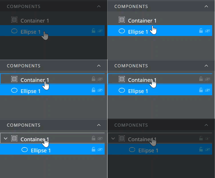
When dragging an object into a **Container** that already contains other objects, the blue bounding box will appear around the container object, but a black line also appears below or above the objects already in the container. This indicates where the object will be placed in the layer stack of the container object:

![](https://addons.squirrel365.io/learn-assets/uploads/2020/09/container3.gif)

####

#### On the Canvas

To add an object to a **Container** on the canvas, select the object with the mouse, hold down the CTRL button (CMD+⌘ Mac), and move the object until it is positioned over the container. The container outline will change to a solid blue border, release the mouse button and the CTRL button:

![](/files/WtX5gwL37hxHUqfW4jvf)

***

### Selecting a container or objects inside a container

#### Within the Component Tree

Simply click on the **Container** or its contents to select either.

#### On the Canvas

Single-click the **Container** to select it:

![](https://addons.squirrel365.io/learn-assets/uploads/2020/09/container4-298x300.png)

Double-click anywhere on the **Container**; the handles of the selection disappear from the container and a name tab appears at the top. Now single-click any of the objects inside of the container to select.

![](https://addons.squirrel365.io/learn-assets/uploads/2020/09/container5-289x300.png)

Double-click outside of the **Container** (or on an empty area of the container) to deselect items inside of the container or the container itself.

***

### Resizing a **Container**

Set a container’s position, either in the properties panel or by selecting it on the canvas, and adjust its size by grabbing and moving the selection handles.

The container’s size can also be set by binding it to position values contained in the spreadsheet.

{% hint style="info" %}
If the size of the container is reduced, objects within that container will not change position or size. They may therefore be hidden from view, or partially hidden:
{% endhint %}

![](https://addons.squirrel365.io/learn-assets/uploads/2020/10/container9.gif)

***

### Repositioning a **Container**

Set a container’s position either in the properties panel or by selecting the container and dragging it with the mouse. It can also be repositioned by binding to position values contained in the spreadsheet.

Objects inside the container will move with the container.

***

### Positioning items inside the container

#### In the Component Tree

When adding an object to a container by dragging and dropping it inside the component tree, the object will be placed into the container at the same position as it was on the canvas i.e. if it was at X position: 10, Y position: 10, it will be container X position 10 and container Y position 10.

{% hint style="info" %}
If an object is dropped into a **Container** but is not visible, likely, its position is likely outside of the bounds of the container. Change the position of the object using the property panel so that it is positioned inside the container, or increase the size of the container until it is large enough to show the object.
{% endhint %}

#### On the Canvas

When dragging objects into the container on the canvas, the objects will be placed at the position where the mouse button is released.

#### Container Clipping

v1.19 introduced the ability to disable clipping of components when they lie outside the bounds of the container they are in. Under the **View** menu, select 'Container Clipping'.

{% hint style="info" %}
'Container Clipping' is only active in **Design Mode**. As soon as you enter Debug or Preview mode, the container clipping will resume and items will now hide when set outside the bounds of the container.
{% endhint %}

<figure><img src="/files/L1Bhqs1HmlbDcaVbySpn" alt="" width="563"><figcaption></figcaption></figure>

***

### Removing objects from a **Container**

#### Within the Component Tree

Click and drag the object, either up above the **Container**, or below the last item in the container, until the black line indicates that the object is outside of the container.

![](https://addons.squirrel365.io/learn-assets/uploads/2020/10/container10.gif)

#### On the Canvas

Double-click on any part of the **Container**. A name label will show above the container, and its border will become a solid blue line. Click the object inside the container and hold down the CTRL button (CMD+⌘ Mac) while dragging the object outside of the container bounds. Release the CTRL button (CMD+⌘ Mac) and mouse buttons.

***

### Deleting a **Container** and/or objects from a **Container**

#### Within the Component Tree

Click to select either the container or the object and press the delete key.

#### On the Canvas

To delete a **Container**, single-click to select the container. Press delete.

{% hint style="warning" %}
Deleting a **Container** will delete all of its contents
{% endhint %}

To delete an object inside a **Container**, first double-click the container, then single-click the object. Press delete.


# Container Transitions

Use visibility transitions on containers in Squirrel365 to move between screens, so your app navigates the way a mobile app does instead of switching instantly.

Mobile apps move between screens rather than swapping them out instantly. A settings screen slides in from the right, a filter panel rises from the bottom, and closing them reverses the movement. That motion is a large part of what makes an app feel like an app.

Visibility transitions on containers bring that behaviour to Squirrel365. You build each screen of your app as a container, control which one is showing with dynamic visibility, then add a transition so the change is animated rather than abrupt.

<figure><img src="/files/g5kD26H64qnL5H65v2Sj" alt=""><figcaption></figcaption></figure>

### Building screens with containers

Squirrel365 does not have a separate screen component. Instead, you use a container as a screen: size it to fill the canvas, put the components for that part of your app inside it, and give it a dynamic visibility condition that decides when it should be on show.

A typical app has one container per screen, all bound to the same cell. Writing a different value into that cell from a button brings one container forward and sends the others away. Add a visibility transition to each container and you have navigation that moves.

Because containers layer over one another rather than pushing each other aside, the incoming screen simply covers the one behind it. This is exactly how a modal or a slide over panel behaves on a phone.

{% hint style="info" %}
Visibility transitions can be set on any container, but they are built for showing and hiding whole areas of your app. Using one to add decorative movement to a small container, or to animate something that is not really a change of might produce strange results.
{% endhint %}

### Adding a transition to a container

1. Select your container on the canvas.
2. In the property panel, open the **Dynamic visibility** section and set up your show condition.
3. Below the condition, expand the **Visibility transitions** sub section. It is collapsed by default.
4. Choose an option from **Transition on show**. Instant is selected to begin with, which means no animation.
5. If you choose **Slide in**, pick a direction using the arrow buttons.
6. Adjust **Easing** and **Duration** if you want to change how the movement feels.

The **Transition preview** shows what your settings will look like. The white outline is the canvas, the blue panel is your container, and the label above tells you exactly what the transition does, for example "Slide in from right". The preview replays whenever you change a setting, and again when you hover over it.

<figure><img src="/files/OVIDJ8g6Z2g56YOcl3nN" alt="Visibility transitions sub section expanded in the property panel, showing Transition on show set to Slide in with the direction arrows and the transition preview." width="251"><figcaption></figcaption></figure>

To see the transition happen in your app, switch to Debug mode or Preview mode.

### Choosing a direction

The arrow buttons set the direction the container **travels**, not the edge it comes from. Selecting the left arrow moves the container leftwards, which means it enters from the right side. The preview label describes the finished result.

### Setting a different transition on hide

By default, hiding a container simply reverses whatever you set for showing it. A container that slides in from the right slides back out to the right, using the same easing and duration. This is controlled by the **Reverse transition on hide** checkbox, which is ticked to begin with.

Reversing suits most navigation, because a screen that arrived from the right should leave the same way. Clear the checkbox when you want the two halves to behave differently. A second set of controls appears, with its own **Transition on hide**, direction, easing and duration, so you can have a panel slide in gently and then disappear instantly when it closes.

<figure><img src="/files/t781nPZGEjPIOflXVbN3" alt="Visibility transitions with Reverse transition on hide unchecked, showing both the show and hide control sets." width="250"><figcaption></figcaption></figure>

### Properties

<table data-search="false"><thead><tr><th>Property</th><th width="382.58203125">Description</th><th>Default</th></tr></thead><tbody><tr><td>Transition on show</td><td>How the container appears. Instant shows it straight away with no animation. Fade in brings it up from transparent. Slide in moves it into position from off screen.</td><td>Instant</td></tr><tr><td>Direction</td><td>Which way the container travels as it slides in. Only available when Transition on show is set to Slide in.</td><td>Left</td></tr><tr><td>Transition preview</td><td>An animation of your current settings, with a label describing the result. Replays on change and on hover.</td><td>Not applicable</td></tr><tr><td>Easing</td><td>How the movement is paced. Linear keeps a constant speed. Ease in starts slowly, Ease out finishes slowly, and Ease in-out does both. Ease sits between them.</td><td>Ease in</td></tr><tr><td>Duration</td><td>How long the transition takes, in seconds.</td><td>0.5</td></tr><tr><td>Skip transition on initial show</td><td>Stops the transition running the first time the app loads. The container is simply there, and transitions normally from then on.</td><td>Unchecked</td></tr><tr><td>Reverse transition on hide</td><td>Hides the container by reversing the show transition. Clear it to set the hide behaviour separately.</td><td>Checked</td></tr><tr><td>Transition on hide</td><td>How the container disappears. Only available when Reverse transition on hide is cleared.</td><td>Slide out</td></tr></tbody></table>

### Tips and common uses

**Your opening screen.** The container that is visible when your app first loads will animate in before the viewer has done anything, which looks like a glitch. Tick **Skip transition on initial show** on that container so it is simply there from the start.

**Navigation between screens.** Slide in from the right to go forward and leave Reverse transition on hide ticked, so going back retreats to the right. A duration of around 0.3 seconds keeps it feeling responsive rather than sluggish.

**Modals and dialogs.** Slide up from the bottom to open, which reads as a new task starting. Many apps close a modal instantly rather than animating it away, so clear Reverse transition on hide and set Transition on hide to Instant if you want that.

**Notifications and messages.** Slide in to draw attention, then fade out rather than sliding, so the message dissolves quietly instead of pulling the eye back to it.

**Keep them short.** Transitions are there to explain a change, not to be the change. Anything much beyond half a second starts to feel like waiting.

**Be consistent.** Use the same direction and duration for every screen at the same level of your app. Movement that changes from screen to screen is more distracting than no movement at all.


# Changes to Grouping in v1.19

This article describes the changes made to grouping in v1.19.

In version 1.18, Squirrel introduced significant changes to how groups and containers are managed in the designer. The new [Alignment options](https://learn.squirrel365.io/components/layout-and-positioning#alignment) within the Layout and Positioning section established a new origin point (0,0) as soon as components were grouped. However, this change led to some unforeseen issues that impacted many existing projects. In response, the team has been working hard in version 1.19 to address these enhancements from a different perspective.&#x20;

<figure><img src="/files/cMvRnu05T8nUAMqh0kR0" alt=""><figcaption><p>v1.19 grouping functions similarly to v1.18, with a few changes.</p></figcaption></figure>

### What's changed?

#### Groups

Groups now operate differently than they did before. They are used at design time to help organize your project, keeping the Component Tree tidy and allowing multiple objects to be moved as a whole on the Canvas.  When components are grouped, the height, width, X and Y properties are calculated based on the objects within the group.&#x20;

{% hint style="info" %}
NB: You can move the group by inputting new X and Y positions but they cannot be bound to the spreadsheet.\
\
Properties that can be bound (dynamically changed at runtime) such as height and width, positioning, and dynamic visibility, are exclusive to the Container grouping method.
{% endhint %}

#### Containers

Containers hold all the power when it comes to grouping components. Components can either be placed into Containers by selecting and placing a Container on the canvas and placing them within, or via the newest method.

When components are grouped, the properties panel will have an option to 'Convert to Container':

<figure><img src="/files/FQ9e539X7EdgYzaRRT1z" alt="" width="272"><figcaption></figcaption></figure>

This will automatically turn the selected group on the canvas into a Container. All components within will keep their relative position (only if not bound), and their X, Y properties will update accordingly.

If a component is bound or has alignment settings applied, a prompt modal will appear to confirm this is the action you wish to take:

<figure><img src="/files/nO4ucMncofHGqkUn3IBy" alt="" width="515"><figcaption></figcaption></figure>

Clicking **Continue** will convert the current selected group into a container, and all components within will adjust their positions relative to the new 'parent' container object.

<figure><img src="/files/yp4SttU4d6RQuNfZUQ74" alt=""><figcaption><p>Components bound to the spreadsheet, or with horizontal or vertical alignment applied, will adjust their position when converted from the group to a container to be relative to the new parent container.</p></figcaption></figure>


# Custom Components

This article describes how to create and use Custom Components.

### Overview

When you've spent time configuring and styling a set of components — a slider with a label, a button with a status indicator, a polished input form — Custom Components let you save that combination as a single reusable item. Place it in any project, and if you ever need to update it, all instances across your apps can pick up the change.

This saves you from rebuilding the same thing repeatedly and keeps your apps consistent.

<figure><img src="/files/yClkHSyydrcJUB6UK7K4" alt="A Custom Component instance selected on the canvas showing the purple selection border and the Linked Properties panel on the right"><figcaption></figcaption></figure>

{% hint style="info" %}
Custom Component instances are identifiable on the canvas by a **purple border**, compared to the standard blue border used on regular components. They also carry a distinctive icon in the component tree.
{% endhint %}

***

### Creating a Custom Component

{% hint style="warning" %}
You cannot create a Custom Component if the selection contains a Canvas, an existing Custom Component, a Repeat Container, a Data Grid, a Scenario, or a grid area component.
{% endhint %}

Select one or more components on the canvas, then convert them into a Custom Component using any of the following methods:

* Right-click selected components in the **component tree** and choose **Create Custom Component**
* Right-click selected components on the **canvas** and choose **Create Custom Component**
* With eligible components selected, click the **cube icon** in the top-right corner of the properties panel header — the icon highlights purple on hover and displays the tooltip **Create Component**

All three methods open a **name modal**. Enter a name for your component and click **Continue** to proceed, or **Cancel** to return to the canvas without creating anything.

Once named, the original components are replaced by a Custom Component instance and the designer automatically enters **Edit Mode**.

{% hint style="info" %}
When you create a Custom Component any bindings will be automatically removed when you enter the edit mode.  Instead you will have to create "Linked Properties" as described [below](#linked-properties).
{% endhint %}

***

### Edit Mode

Edit Mode is a dedicated workspace for modifying a Custom Component's internal layout and defining its configurable interface. The normal designer menu bar is replaced by a **purple header bar** containing Edit Mode controls.

<figure><img src="/files/i9hJeX8bwlUnX8k4regI" alt="Edit Mode showing the purple header bar with back arrow, template name, and Update button — the canvas displays only the template&#x27;s internal components"><figcaption></figcaption></figure>

**EDIT MODE HEADER**

**Back arrow** — exits Edit Mode and returns to the main project. If unsaved changes exist, you are prompted with a dialog offering **Discard and Exit** or **Update Component** before leaving.

**Component name** — the name of the Custom Component is displayed inside the purple header. Double-click the name to rename it inline.

**Update button** — saves the current state of the component to the cloud, and closes Edit Mode. The button is active only when unsaved changes exist.

**ENTERING EDIT MODE**

Beyond the creation flow, Edit Mode can be entered at any time by right-clicking an instance in the **component tree** and selecting **Edit Custom Component**, by right-clicking an instance on the **canvas** and selecting **Edit Custom Component**, or by navigating to the new **Asset Library > Components** page in the Squirrel manager.

{% hint style="info" %}
If the selected instance is on an older version of the component, you will be prompted to update it before Edit Mode opens.
{% endhint %}

**EDITING INTERNAL COMPONENTS**

While in Edit Mode the canvas displays only the custom component's contents. Add, remove, and configure components exactly as you would on a normal canvas. The spreadsheet panel is not available in Edit Mode.

***

### Linked Properties

Linked Properties are the configurable interface of a Custom Component. They are named properties defined on the **Component Canvas** that instances can bind spreadsheet data to. Define Linked Properties in the properties panel while in Edit Mode.

<figure><img src="/files/hQrrfvGwg6Dl9zkEnPeH" alt="The template properties panel in Edit Mode showing the Linked Properties section with the Add a Property button"><figcaption></figcaption></figure>

**CREATING PROPERTIES**

Select **Add a property** in the Linked Properties section of the properties panel. An input field appears — enter a descriptive name for the property, such as `Title` or `Primary Colour`. Each property is assigned a unique identifier internally, so renaming a property later does not break any existing bindings. Repeat to add as many properties as the component requires.

{% hint style="warning" %}
Deleting a linked property, which has been used in a component, will stop the binding from working
{% endhint %}

The **Links** number column indicates how many times this linked property has been used.  Clicking on the number will display a list of the components where the property has been bound.

<figure><img src="/files/HPG5uRGMbmEiyC2oS5Ox" alt=""><figcaption></figcaption></figure>

**LINKING TO COMPONENTS**

1. With a Linked Property defined, select a component in the component tree to view its individual properties.
2. Hover over any bindable property input — the bind button turns purple to indicate it can be connected to a Linked Property.
3. Click the purple bind button to open a list of available Linked Properties.
4. Select a property from the list to create the link.

When all links are configured, click the purple Update button to save the changes and exit Edit Mode.

{% hint style="info" %}
A single Linked Property can be connected to multiple internal component properties at once. For example, a `Primary Colour` property can simultaneously control the fill colour of a button and the text colour of a label.
{% endhint %}

***

### Custom Component Properties

The following properties are available in the properties panel when a Custom Component instance is selected on the canvas.

<figure><img src="/files/yClkHSyydrcJUB6UK7K4" alt="The Custom Component instance properties panel showing the LINKED PROPERTIES section with the Create properties button and DYNAMIC VISIBILITY controls"><figcaption></figcaption></figure>

**LAYOUT & POSITIONING**

**Position** and **Size** — standard X, Y, Width, and Height controls for placing and sizing the instance on the canvas.

**LINKED PROPERTIES**

Lists every Linked Property defined in the custom component. Each property has an input field where you can bind a spreadsheet cell or range — data flows from that range through to the connected internal components.&#x20;

**CREATE PROPERTIES**

The **Create properties** button enters Edit Mode for this custom component directly from the properties panel. Any changes made in Edit Mode affect all instances of the item across every project.

**DYNAMIC VISIBILITY**

Standard conditional show/hide controls for displaying or hiding the instance based on data conditions.

***

### Placing Custom Components

Saved Custom Components are available from the **Custom Components** section of the side bar. Click the section to browse all custom components saved to your account.

<figure><img src="/files/EYXLk9JvNO6FhsC5pJpn" alt="The Custom Components library panel in the designer showing a grid of template thumbnails with names"><figcaption></figcaption></figure>

Single-click a custom component to add an instance to the canvas, or drag it directly to a specific position. Each instance placed is independent and can be positioned, sized, and configured with different spreadsheet bindings.

{% hint style="info" %}
The Custom Components library is **personal to your account** in the current release. Shared team libraries are planned for a future update.
{% endhint %}

***

### Updating Custom Components

When a Custom Component is edited and saved, a new version is created. Any instances in the currenlty open file will wil be updated to the latest version.

{% hint style="info" %}
Updates to other Squirrel files that use the Custom Component are not applied automatically. You will be notified when opening a file if any Custom Components have updates available, and can choose when to apply them.
{% endhint %}

<figure><img src="/files/6ph7xaZ9bzpOoz8K5Gsh" alt="The master update modal — opened via right-click → **View all Component Updates** — listing every out-of-date component with individual and bulk **Update** buttons"><figcaption></figcaption></figure>

**UPDATE INDICATORS**

A **purple dot** indicator appears on the properties panel of any instance where a newer version of the custom component is available. Right-clicking the instance also reveals a **View all Component Updates** option, which opens the master update modal listing every out-of-date component in the current project.

**UPDATING INSTANCES**

**Update Component** — available in the right-click menu on a selected instance. Updates the selected instance to the latest version, or optionally all instances of that custom component in the project.

**Update all components** — available in the master update modal. Updates every out-of-date Custom Component in the current project at once.

***

### Detaching an Instance

Detaching breaks the link between an instance and its source component, converting it back into an editable container of independent components.

Right-click an instance on the canvas or in the component tree and select **Detach Instance**. The instance is converted to a **container** that holds all of the original internal components. The components retain their names and positions, and the container keeps them grouped for easy layout management.  However, all linked property bindings are removed.

{% hint style="warning" %}
Detaching cannot be undone. The source component is not affected, and all other instances of that custom component remain linked.
{% endhint %}

***

### Managing Custom Components

Custom Components are saved to your Asset Library. These can be browsed and managed from **Asset Library → Components** in the Squirrel home page.&#x20;

<figure><img src="/files/lWG04xfiiuclSW9Fz5q0" alt="The Asset Library → Components page titled &#x22;Explore your custom components&#x22; showing the component grid with thumbnails and names"><figcaption></figcaption></figure>

Clicking the **more menu** **`...`** provides access the following options.

* **Rename** — updates the display name of the custom component. The name change is reflected across the library and in the properties panel of all instances.
* **Edit Component** — opens the custom component in Edit Mode in a clean workspace, without needing to open a project that uses it first.
* **Delete** — removes the custom component from the asset library.

{% hint style="warning" %}
Deleting a custom component **does not** remove existing instances from projects. Those instances remain on their respective canvases but are no longer linked to a source component and cannot receive future updates.
{% endhint %}


# Testing your App

### View Modes

The designer has three view modes DESIGN, DEBUG and PREVIEW. The default mode is Design. This is where you build your app. You can add components to the canvas, style them and configure their properties and set up your spreadsheet, adding data and formulas.&#x20;

In design mode components are not interactive. They can be selected and resized but their interactivty is disabled. When it comes to testing your app, to see how it will function and behave you need to use one of the other view modes.

#### Debug

Debug acts as a means to "test" a project. When in this mode, components can be interacted with on the canvas, and display the set styling for each of their states. In addition to this, the spreadsheet is still visible. allowing you to see what is happening in the spreadsheet while interacting with the components.

<figure><img src="/files/MVmRCdc0wIkFRNuZcmin" alt=""><figcaption></figcaption></figure>

#### Preview

Preview mode allows you to view and interact with the project as if it were published. When in this mode, the spreadsheet is hidden, but the components can be interacted with.

<figure><img src="/files/FnREBB0eA5Eux8mGvEtX" alt=""><figcaption></figcaption></figure>

### View responsive behaviour in Preview

Preview mode has a Mobile/ Device Mode for all responsive projects. For projects that have the 'enable responsive canvas' option ticked, preview mode lets you test how your app will behave across different devices. This can be especially useful to check the behavior of your app based on the Layout & Positioning settings on components.

<figure><img src="/files/xe0DdOtUaxQ9lNv12gzh" alt=""><figcaption></figcaption></figure>

1. Desktop
2. Tablet
3. Mobile
4. Rotate
5. Switch void color

#### Desktop/ Tablet/ Mobile

Toggle between desktop, tablet and mobile to see how your project displays at these common breakpoints.

#### Rotate

In either **Tablet** or **Mobile** mode, the Rotate option will become available.

#### Switch void color

This option changes the void colour behind the canvas between black and white. This is useful to provide contrast when your app has a light or dark background.


# Saving a Project

This article describes how to save a project

## Saving a new project

By default, Squirrel saves project files securely to the cloud. Users on a paid plan can optionally choose to save the file to their local machine. \
For projects saved to the Cloud saved project sThis enables 'versioning' of your file to become available (if on a Creator or Builder plan).

{% hint style="info" %}
For information on file 'versioning', view [this article here](/the-designer/version-history).
{% endhint %}

<figure><img src="/files/vcEqJUhDPb5yqwrAF42T" alt=""><figcaption><p>The new Save As modal, offering options to name the project, create folders, or to save to your local environment.</p></figcaption></figure>

Within this modal, you can name a project, create folders within the file storage, or opt to save to your local environment.&#x20;

* **Project name** - an input field to enter the name of the cloud-stored project
* **New Folder** - select this button to create a folder to organize your projects within the file explorer
* **All Files** - a list of all existing save files
* **Cancel** - Select to cancel the current save. Alternatively, select the "X" in the top right corner.
* **Save** - Saves the project to the cloud, **not** to your local environment
* **Save Local** - opens your local File Explorer, allowing you to save the file to your computer

### Saving a project version

If you are looking to save over an already cloud-saved Squirrel project, you will be prompted with a modal to add a description to the saved version.

{% hint style="info" %}
For more information on viewing and restoring project versions, see [this article](/the-designer/version-history#restoring-save-versions).
{% endhint %}

<figure><img src="/files/SOuJv8fwpvM6sTAfGBcS" alt="" width="552"><figcaption></figcaption></figure>

If you do not wish to add descriptions to saved versions again, select the 'Don't ask for description again' checkbox to disable it, then click 'Save version'.

### Autosave

{% hint style="success" %}
**Who can use this feature?**

The **Autosave** functionality can be used by those with the **Creator** and **Builder** subscription plans.

For more details, see our [**pricing comparison matrix**](https://squirrel365.io/pricing/).
{% endhint %}

{% hint style="info" %}
The Auto-save feature is only available to **cloud-saved projects**. Any projects saved locally will not trigger auto-save. For more information, see [**this article**](/the-designer/saving-a-project)
{% endhint %}

The project will trigger an auto-save whenever 50 actions have been made in the designer, be it selections, property changes, or spreadsheet updates. You can track if an autosave has triggered from the top bar above the canvas:

<figure><img src="/files/1KgJkg0hpbgo2PvJ9Kmn" alt="" width="264"><figcaption></figcaption></figure>

Selecting the <img src="/files/OtiJnZWdNVCeVlixmhK6" alt="" data-size="line"> icon at the top of the designer will display the save status of the project. Any cloud-saved project, by default, will have auto-save enabled on its first manual save.

From this pop-out menu, you can opt to turn Autosave off, view Version History to restore older versions, and check/uncheck 'Don't ask for description' when manually saved.


# Version History

This article describes how to acces and restore previous versions of Squirrel projects, both saved manually and through autosave.

## What is a file version?

Any cloud-saved project will auto-save project versions after a certain number of interactions. If you need to regress to a previous version, you can access and restore it at any point.

File versions are also saved when a manual save is triggered, either through the Save or Save As options under the File menu.

### View the version history of saved projects

The Designer home page allows you to view a version of an unopened project.

1. Open Squirrel and navigate to the Home Page
2. Select 'Files' from the left side panel - will will be presented with a list of all saved projects.

{% hint style="info" %}
All projects in the 'Files' list are cloud-only saved projects. To access a local project, select the 'Open Local File' at the top-right.
{% endhint %}

3. Hover over a project and select the '...' More Options button towards the right side - this will open a context menu.
4. Click 'Versions' at the bottom of the list - a modal will appear

<figure><img src="/files/LhA8DbgSnlrCcRCHUOqC" alt="" width="486"><figcaption></figcaption></figure>

From here, you can select any auto-save version to open. Here you can select the "..." More Options button to **Restore**, **Delete**, or **edit the description** of the auto-save.&#x20;

### Restoring save versions

#### Through the 'Files' page

1. Navigate to the 'File' section of the Start page
2. Select the "..." More Options button and click Versions
3. Select one of the project versions in the 'Version History' modal - the modal will move to the bottom left of the window.
4. Click through each of the versions to preview them at each stage

<figure><img src="/files/YoUoR0c3XrnrV3RniKjP" alt="" width="563"><figcaption></figcaption></figure>

5. Click 'Restore this version' to load the project, or hit cancel to load the latest version.

#### Via the 'Autosave' menu

1. Select the <img src="/files/OtiJnZWdNVCeVlixmhK6" alt="" data-size="line"> icon at the top of the Designer window
2. Click 'Version History' - a modal will appear:

<figure><img src="/files/os3NuaYUDj4bPYkRJovH" alt="" width="485"><figcaption></figcaption></figure>

3. View and select any autosaved version from this modal to preview on the canvas.
4. Select 'Restore this version' to load the project.

### Restoring save versions after a crash

Should the Designer crash, upon the next opening, you will be prompted to restore the last saved version of the project.

<figure><img src="/files/KIlzAtykWCeOyPVj8xMj" alt="" width="518"><figcaption></figcaption></figure>

{% hint style="warning" %}
These crash autosave files **do not** appear in the file version history. This will instead restore the last autosaved version found in the 'Version History'
{% endhint %}


# Project Settings

The Project Settings modal is the place where project-level preferences are configured and saved. It includes options relating to publishing, performance, customization, and PWAs.&#x20;

## Publish Options

The Publish options panel contains all publish properties that were originally located in the options available when publishing your project from the Preview mode.

To access the publish settings, select **Publish options** from the project settings menu.

<figure><img src="/files/vwBRvMrzfgZX2TqPVN7Z" alt="" width="557"><figcaption></figcaption></figure>

#### Project Name

The project name is how the project will be identified and labeled in both the Project Manager and when viewed in the browser. Any value entered into this area will be carried across to the publishing modal, accessed in Preview mode.

### Project Formatting

#### Background

When viewed in the browser, the background color selected here will color the rest of the webpage that is not the project frame. This can be selected from the color picker that shows when selecting the colored square, or by entering the desired hex code within the input field.

You can preview how this will look on the webpage within the small display to the right of the properties.

#### Position

A radio option to decide where to position the project frame on the webpage. The options available are '**Top middle**' and '**Top left**'.

You can preview how this will look on the webpage within the small display to the right of the properties.

#### Scaling

A dropdown option that will determine how the project scales to the webpage.&#x20;

The default selection, '**None**' will apply no scaling to the project, and will display as the pixel width and height determined by the canvas.&#x20;

Selecting '**Fit to width**' will scale the project frame, expanding the width of the project to match that of the browser width.&#x20;

Selecting '**Fit to Window**' will scale the project to always fit within the confines of the browser, applying spacing to either the top/bottom or left/right sides of the project, whichever is greater.

### Loading the project

#### Loading indicator

With this radio option, there is the option to enable or disable the **Loading Indicato**r for the project as it generates in the browser. By default, this is set to '**On**'.

#### Indicator Color

With functionality similar to the background color, the Indicator color can be set using the color picker or by entering a hex color code into the input field.

The spinner styling can be previewed in the small display to the right of the properties.

### Security and Accessibility

#### Expiry Date

With each published project, an **Expiry Date** can be set so that the project will become unavailable after a certain amount of time. Once the date has been met, or surpassed, the project shall display the "Sorry, this project is no longer available" message on the webpage.

#### Password Protect

A project can be password protected by selecting and checking the '**Password Protect**' option. Once selected, an input will display where the selected password can be entered.&#x20;

<figure><img src="/files/DaHfFB0J5y3AKwJQve2C" alt=""><figcaption><p>The passowrd can be set and reviewed by selecting the 'eye' icon at the end of the input field.</p></figcaption></figure>

## **Advanced**

The Advanced panel provides additional options for fine-tuning the performance of your project along with some other advanced settings.

To access the advanced project settings select **Advanced** from the project settings menu.

<figure><img src="/files/DeRoEUEKZCKpFHnYv6sp" alt="" width="563"><figcaption></figcaption></figure>

### Changing the default load behavior

#### Load hidden items on demand

By default, the option to '**Load hidden items on demand**' is enabled. This ensures the published project loads in the browser as quickly as possible with components only loading as they become visible (and therefore active).

Disabling this option may increase the initial load time. It will load/render all components (including hidden ones). The setting does not impact connectors or functions, it only relates to dynamic visibility.

#### Show spinner while items load

Enabling '**Show spinner while items load**' will display a loading spinner in the pace of hidden content while it is loading.&#x20;

### Saving a copy of the .sqrl file with the published version

Tick the option to '**store a copy of the SQRL file in the cloud**' if you want to save a copy of the .sqrl file with the published project. This will enable you to download the .sqrl used to publish the project from the project manager at a later date.

### Google Tag Manager

Optionally add a GTM container ID to include Google Tag Manager code and load tags that have been configured in GTM in your published app.

#### Your tags, your responsibility

When you add a GTM container ID to a Project, your container is loaded in the viewer's browser each time the Live Project runs, and any tags you have configured in your own Google Tag Manager account fire there.

Squirrel365 has no visibility of, or control over, the contents of your container. We don't see which tags you've added, what they collect, or where that data is sent — and data collected by your tags travels directly from the viewer's browser to the tag provider, it doesn't pass through Squirrel365.

That makes you, not Squirrel365, the data controller for anything your tags collect. Before publishing a Project with a container ID, make sure that:

* **you're entitled to use the container** — and, if you're building the Project for a client, that they've agreed to the tags you're adding;
* **viewers are told about the tracking** — through a privacy and cookie notice that covers the Project itself, not just your main website;
* **non-essential tags don't fire until the viewer consents** — analytics, advertising, remarketing and session-recording tags all need prior consent in the UK and EU. Use Google's consent mode or a consent management platform, and trigger tags on the consent signal rather than on page load;
* **viewers can withdraw consent** as easily as they gave it;
* **you have a lawful basis** for what you do with the data afterwards, and you can respond to viewers who ask about it;
* **you've considered where the data goes**, including any transfer outside the UK or EEA by the tag provider.

Squirrel365's own [Privacy Policy](https://squirrel365.io/privacy-policy/) and [Cookie Policy](https://www.squirrel365.io/cookie-policy) cover your use of squirrel365.io and the Designer. They don't cover tags you add to your own Projects — your own notices apply to those.

## **Custom Options**

{% hint style="info" %}
**Who can use this feature?**

Users on a **Builder** plan

For more details, see our [**pricing comparison matrix**](https://squirrel365.io/pricing/).
{% endhint %}

{% hint style="warning" %}
Custom CSS and JavaScript code are **not validated** and may cause issues with the published app.
{% endhint %}

Select **Custom options** from the project settings menu to specify custom CSS and custom JavaScript for your project.

### **Style (CSS)**

The **Style** tab contains a code editor where you can create **custom css** classes for use in your projects.

<figure><img src="/files/TWfHv918d6eQT6bYSPtG" alt="" width="563"><figcaption></figcaption></figure>

### **Code (JavaScript)**

The **Code** tab contains a code editor where you can enter **custom JavaScript code** that will be placed just before the closing tag of the \<head> or \<body> elements of your app.

<figure><img src="/files/h4A3rJJwLuCGkGAa39hb" alt="" width="563"><figcaption></figcaption></figure>

Custom JavaScript code is only included in **locally exported** projects. It will be ignored for any projects published to the cloud.

### Progressive Web Apps (PWA)

A Progressive Web App (PWA) is a web application that combines the best of both worlds – the web and native applications. PWAs use web technologies to create an app-like experience, which is accessible from any device and platform.

They can be installed on devices similar to native apps, work offline, and integrate with the device and other installed apps. In other words, PWAs are a combination of the benefits of a website’s reach and the advantages of a native application’s functionality.

For information on creating a PWA, check out [**this article here**](https://learn.squirrel365.io/publishing-and-sharing/progressive-web-apps-pwa).


# Templates

This article describes how to access a Squirrel Project template to load into the Squirrel Designer.

There's a library of templates that you can access for Squirrel. From base calculators to functioning applications, there's something to help get you started no matter your familiarity with the platform. All templates can also be accessed via <https://marketplace.squirrel365.io/>

{% hint style="info" %}
All available templates are labeled with varying degrees of difficulty and any notes on subscription-level restrictions. You can still download these projects, however, any functionality that is not available on your current plan will not be available to use.
{% endhint %}

### Accessing Templates

You can access the Squirrel templates in multiple ways, including through the Squirrel website or the Designer.

#### Squirrel Designer

To access the Squirrel Templates from the Designer, the steps are the following:

1. Open the Squirrel Designer app
2. On the Start page, navigate to and select the Templates page.

From here, you can search through and select any desired template and open it straight into the canvas to begin playing.

#### Designer in the Browser

1. Open the Squirrel Designer in a browser through <https://app.squirrel365.io/dib/mainview>
2. On the Start page, navigate to and select the Templates page.

<figure><img src="/files/lZfImzcA6kfD6wBEnm01" alt=""><figcaption></figcaption></figure>

#### Squirrel Website

1. Navigate to squirrel365.io in the browser

EITHER

2. Scroll to the bottom of the page and select Marketplace
3. Select the Templates tab at the top of the page
4. Search through and select a template
5. Click Download to download the template Squirrel file

OR

2. Select 'Login' at the top-right of the webpage
3. Sign in to your Squirrel Account Manager
4. Select Add-ons on the left-hand panel
5. Select the 'Visit Marketplace' button on the top yellow banner
6. Select the Templates tab at the top of the page
7. Search through and select a template
8. Click Download to download the template Squirrel file

<figure><img src="/files/YFJ90ybK1rI7DXgtO4MW" alt=""><figcaption></figcaption></figure>


# Tufty AI

Meet Tufty, the AI assistant built into Squirrel365 that helps you build and improve your apps step by step, with you in control of every change.

Tufty is the AI assistant built into Squirrel365. It works alongside you in the Designer to help you build and improve your apps, turning plain requests like "change this input to a slider" into real changes you can see straight away. Tufty is there to assist you, not to take over. You stay in control of every change, and you can keep building by hand whenever you want.

Think of Tufty as a helpful colleague sitting next to you. You describe what you want in your own words, Tufty makes the change, and you decide whether to keep it, adjust it, or undo it.

<figure><img src="/files/8InAQlIdvmOXVoqePjQS" alt=""><figcaption></figcaption></figure>

{% hint style="info" %}
Tufty is currently available through an invite-only Early Access programme. Some features may still change while we gather feedback.
{% endhint %}

### What you can do with Tufty

You can ask Tufty to help with things like:

* Building new parts of your app from a description
* Improving something you have already built
* Changing how a component looks or behaves
* Making sensible adjustments, such as setting minimum and maximum values on an input

You talk to Tufty in a chat panel inside the Designer. You type your request, and you can also attach images and documents to give Tufty more to work with.

### How Tufty works

Tufty works in small steps rather than trying to do everything from a single instruction. You give it a clear, focused request, it makes that change, and you see the result right away. If it is not quite right, you can steer it with another instruction or edit it yourself.

This step-by-step approach keeps you in the driving seat. Instead of typing one long prompt and hoping for the best, you build up your app a piece at a time and check each change as you go.

You can also move freely between building with Tufty and building manually. Anything Tufty creates is built the same way you would build it yourself, so you can pick up where it left off and carry on by hand.

### Staying in control

Tufty is designed so that your app stays safe and you stay in control:

* Every change Tufty makes can be undone, so nothing is permanent until you are happy with it.
* Changes are checked against Squirrel365's own rules before they are applied, so Tufty cannot leave your app in a broken state.
* You can switch between working with Tufty and editing manually at any point.

### What Tufty will and won't do

Tufty is honest about what it can help with. If you ask for something it cannot do reliably, it will tell you and point you towards a better approach rather than guessing. That way you always know where you stand, and you can trust the changes it does make.

### A quick example

Say you already have a mortgage calculator and you want to make it friendlier to use. You could ask Tufty:

* "Change the amount input to a slider"
* "Do the same for the loan term"
* "Set sensible minimum and maximum values for each"

Each request is small and specific, and you see the result of each one before moving on. There is no need to start over, and no risk of losing the work you have already done.

### Your data and privacy

Tufty is AI-powered. To carry out your requests, it sends the instructions you type and the content of your project, including the data in your spreadsheet, to a third-party AI provider that generates the result. Your content is used only to produce your result, and is not used to train the provider's AI models.

Even so, it is good practice not to enter personal, confidential or sensitive information into Tufty.

For the full detail, including exactly what is and is not sent, how long information is kept, and how your data is handled if it is processed outside the UK, see the [Privacy Policy](https://squirrel365.io/privacy-policy/) and the [Terms of Use](https://squirrel365.io/terms-of-use/).


# Using Tufty

How to use Tufty in Squirrel365: open the panel, start and revisit chats, attach images and documents, and give feedback or report a bug.

Tufty works in a chat panel inside the Squirrel365 Designer. This guide covers what you need to work with it day to day: opening the panel, starting and revisiting chats, attaching images and documents, and sending feedback or reporting a problem.

{% hint style="info" %}
Tufty is currently in invite-only Early Access. If you have been selected, you will have received an email with a dedicated link for getting started. If you have not had an email, Tufty will not be available on your account yet.
{% endhint %}

### Opening the Tufty panel

Open a project in the Designer. Along the top bar on the right you will see the buttons for the Component Tree, the spreadsheet and the property panel. Just to the right of those is the Tufty button, marked with two small stars. Click it to open the Tufty panel.

<figure><img src="/files/nFztQqRysNzkZBgyGQcw" alt="" width="375"><figcaption></figcaption></figure>

The panel opens on the right, on top of the property panel if you have it open, with the greeting "Hey, what are we building today?" and a text box where you type your requests.

The first time you open Squirrel365 after Tufty has been added, the panel opens on its own with a short introduction, so you may find it already waiting for you.

#### Hiding and showing Tufty

Click the Tufty button (the two stars) again to hide the panel and go back to the property panel. Click it once more to bring Tufty back. Your current conversation is still there when you reopen it.

#### Resizing the panel

To give Tufty more or less room, move your cursor to the inside edge of the panel until it changes to the resize icon. Click and drag to the left to make the panel wider, or to the right to make it narrower.

> 📸 **Screenshot or short clip:** the panel edge showing the resize cursor, being dragged to widen the panel.

### Starting a new chat

When you want to begin something new, start a new chat. This clears the panel and gives you a clean conversation to work in, which is handy when you move on to a different task.

At the top right of the Tufty panel you will see two buttons: a history button shaped like a clock with an arrow, and a blue plus button. Click the blue plus button to start a new chat. The panel clears and shows the "Hey, what are we building today?" greeting again, ready for your first request.

<figure><img src="/files/NIGBeAjptQjuYtkGse9p" alt="" width="358"><figcaption></figcaption></figure>

Starting a new chat does not delete your previous one. You can return to earlier conversations at any time from your chat history.

### Viewing your chat history

Tufty keeps the conversations you have had so you can look back at them and pick up where you left off.

Click the history button (the clock with an arrow, next to the blue plus button) to open a list of your conversations. Click any conversation in the list to reopen it, and the panel switches back to that chat. To close the list without changing anything, click the x.

<figure><img src="/files/ukT9H13wacUOqUB3pyHP" alt="" width="356"><figcaption></figcaption></figure>

Your chat history belongs to the project you are working in. If you open a new project, you start with a fresh, empty chat list, and conversations from a different project are not carried across.

### Attaching images and documents

You can attach images and documents to your message so Tufty can see them and work from them. You might share a screenshot of a layout you like, a spreadsheet whose data you want to bring into your app, or a document that lists instructions for Tufty to follow.

You can attach up to five files at once, and each file must be 10MB or smaller.

#### Supported file types

* Images: PNG, JPG, GIF, SVG and WEBP.
* Documents and spreadsheets: Word (DOCX), plain text (TXT), Markdown (MD), Excel (XLSX) and CSV.

{% hint style="warning" %}
PDFs cannot be attached at the moment. If you try to upload an unsupported file type (or one larger than 10MB). Tufty will display an error message.
{% endhint %}

#### Adding a file

Open the Tufty panel if it is not already showing, then add your file in one of two ways.

Using the paperclip:

1. In the text box at the bottom of the panel, click the paperclip icon.
2. Find your file and click Open.

<figure><img src="/files/5CvXi9qzNos1VfNUoRF6" alt="" width="351"><figcaption></figcaption></figure>

By dragging and dropping:

Drag the file into the panel from a folder on your computer or from a web browser. The panel turns blue and shows a "drop file here" message. Release the file to add it.

<figure><img src="/files/h3sBDMwnLOX5rDZDlFd7" alt="" width="375"><figcaption></figcaption></figure>

Attached files sit just above the text box, ready to send with your next message. To remove one before sending, click the small x on it. If you have added several, you can scroll through them.

#### What Tufty can do with your files

What happens next depends on what you ask Tufty to do:

* See and use an image. Tufty can describe what is in an image or use it as a styling reference for your app.
* Follow instructions in a document. Put your instructions in a Word, text or Markdown file, then ask Tufty to follow them. This is useful for longer requests, or ones you want to reuse.
* Import spreadsheet data. Attach an Excel or CSV file and ask Tufty to import the data into your spreadsheet.
* Use several files together. Attach more than one file, for example a text file of instructions and an image for styling, and ask Tufty to work from both.

#### Viewing and downloading files in the chat

After you send your message, the files you attached appear in the chat above your request. Click a file to open it. Images open in a preview with a download button in the top corner, and downloaded images are saved in WEBP format. Some files, such as text files, show a preview, while others, such as Word documents, cannot be previewed but can still be downloaded.

### Giving feedback and reporting a bug

You can tell the team how Tufty is doing right from the chat, and report anything that is not working. Because Tufty is in Early Access, this feedback directly shapes what gets improved.

Underneath each of Tufty's responses you will see a thumbs up button, a thumbs down button and a copy button.

<figure><img src="/files/9fhdhtjJtoI6x0K2EqpA" alt="" width="354"><figcaption></figcaption></figure>

* Click thumbs up if the response was helpful. A short message confirms that your feedback has been logged.
* Click thumbs down if it was not. The Feedback on Tufty AI window opens, where you can tell the team more.

#### Sending feedback

In the Feedback on Tufty AI window, type what did not meet your expectations in the feedback box, then click Submit feedback. When you submit feedback, a copy of your conversation is kept so the team can look into what happened, so bear this in mind if your chat included anything sensitive.

<figure><img src="/files/MIMBOOO1mBa5aY2fMoAc" alt="" width="563"><figcaption></figcaption></figure>

#### Reporting a bug

The same window has a Found a bug? section for when something is broken. To raise a support ticket:

1. Click Generate Support Package. This creates a support package you can download, and copies the details of the error and your workflow to your clipboard.
2. Email <support@squirrel365.io> describing the problem, attach the support package, and paste in the copied details.

#### Copying a message

You can also copy any single message out of the chat. Hover over one of your own questions, or look underneath a response, to find the copy button. Click it, and a short message confirms the text has been copied. You can then paste it wherever you need it, for example into the spreadsheet or another document.


# How to Prompt Tufty

Practical tips for prompting Tufty in Squirrel365: work in small steps, be specific, add context, and course-correct to get the results you want.

Getting good results from Tufty is mostly about how you ask. Tufty is built to work with you in small, clear steps, so the more focused your requests, the better it can help. These tips will help you get the most out of it.

{% hint style="success" %}
The single best habit with Tufty: ask for one small change, check the result, then ask for the next. Small steps are easier to get right and easy to undo.
{% endhint %}

### Work in small steps

Rather than describing a whole app in one long message, ask for one change at a time. Give Tufty a focused request, see the result, then move on to the next change. Building this way keeps things predictable and makes it easy to spot if something is not quite right.

### Be specific

Say clearly what you want and where. Naming the component and the change you have in mind gives Tufty the detail it needs. For example, "change the amount input to a slider" is easier to act on than "make this nicer".

### Give Tufty context

You can attach images and documents to your message to give Tufty more to work with. A screenshot can show the look you are after, and a document can hold instructions for Tufty to follow. Adding this kind of context often gets you closer to what you want first time.

### Course-correct as you go

If a change is not right, tell Tufty what to adjust in your next message. You can also edit anything manually at any time. Every change Tufty makes can be undone, so you can experiment freely without worrying about breaking your app.

### Ask for what Tufty can do well

Tufty is honest about its limits. If you ask for something it cannot do reliably, it will tell you and suggest a better approach rather than guessing. If you are not sure whether something is possible, it is fine to just ask.


# Components

Discover what Squirrel365 components are and how they work, from charts and inputs to containers and maps.

Components are the building blocks of your Squirrel365 app. Everything you place on your canvas, including charts, buttons, data tables, maps, and more, is a component. Each one can be connected to your spreadsheet data, styled and configured using the properties panel

### Types of component

<table data-view="cards"><thead><tr><th></th><th data-hidden data-card-target data-type="content-ref"></th></tr></thead><tbody><tr><td>Layout &#x26; Containers</td><td><a href="/pages/BCgUyadK5FKTM70QOQ2T">/pages/BCgUyadK5FKTM70QOQ2T</a></td></tr><tr><td>Input Controls</td><td><a href="/pages/i7Sz9XuXdoMUPmNSBvhV">/pages/i7Sz9XuXdoMUPmNSBvhV</a></td></tr><tr><td>Buttons</td><td><a href="/pages/xJHoqCDNHclfpK25jMeF">/pages/xJHoqCDNHclfpK25jMeF</a></td></tr><tr><td>Basic</td><td><a href="/pages/FkmZpNhFBUl7kWhA8stK">/pages/FkmZpNhFBUl7kWhA8stK</a></td></tr><tr><td>Media</td><td><a href="/pages/mMaUXwDAyJ7IhYCmkNIH">/pages/mMaUXwDAyJ7IhYCmkNIH</a></td></tr><tr><td>Tables</td><td><a href="/pages/tHrswYnYUHNVdOnEwIgr">/pages/tHrswYnYUHNVdOnEwIgr</a></td></tr><tr><td>Charts</td><td><a href="/pages/iE4QT0RPcz2QbzszvLOS">/pages/iE4QT0RPcz2QbzszvLOS</a></td></tr><tr><td>Data Viz</td><td><a href="/pages/VOrb7mwkuKJQ2S8MTXpK">/pages/VOrb7mwkuKJQ2S8MTXpK</a></td></tr><tr><td>Miscellaneous</td><td><a href="/pages/jhnHny9h4llPKiLfLCDQ">/pages/jhnHny9h4llPKiLfLCDQ</a></td></tr><tr><td>Add-ons</td><td><a href="/pages/iJtlWQgH63qSTYGvhLc6">/pages/iJtlWQgH63qSTYGvhLc6</a></td></tr></tbody></table>


# Common Properties

This article describes the properties that are common across most of the visual components. Including Layout & Positioning and Dynamic Visibility.

### Layout & Positioning

<figure><img src="/files/F3eraGPlw6PNWO2GZWxl" alt="" width="250"><figcaption></figcaption></figure>

All **Layout & Positioning** properties can be found in the top section of **any components'** properties panel.

### XY Positions

The **XY positioning** of a component is determined by the component's top left corner of its bounding box.

<figure><img src="/files/9V4KBtU16VaGQCSYQ2ij" alt="" width="563"><figcaption></figcaption></figure>

These properties will shift the components along their respective X and Y axes. Any change to the **X Position** will move the component left and right; any changes to the **Y Position** will move the component up and down.&#x20;

If a component is dragged along the canvas, then the values in the inputs will live update to display their new position.

<figure><img src="/files/5rL9CyViVOo1xR6xEDss" alt="" width="563"><figcaption></figcaption></figure>

### Alignment

The alignment options allow components to have positions set, relative to their parent container, both **Vertically** and **Horizontally**.

#### Horizontal Alignment

<figure><img src="/files/0BZCPgU4csqWWMDFzB5P" alt="" width="169"><figcaption></figcaption></figure>

**Horizontal Alignment** sets layout behaviour on the horizontal axis. This can be:

* Fixed Position - uses the **X Position** property
* Left - fixes the component to the left side of the parent container
* Center - fixes the component to the centre of the parent container
* Right - fixes the component to the right side of the parent container
* Stretch - stretches the component to fill the width of the parent container.

{% hint style="info" %}
For **Horizontal Alignment** settings other than Fixed position, the X Position will be overridden. Components cannot be dragged/moved left or right along the canvas, and will only move up or down.
{% endhint %}

#### Vertical Alignment

<figure><img src="/files/G2nxqHr6lBWQcGDtJGCx" alt="" width="174"><figcaption></figcaption></figure>

**Vertical Alignment** sets layout behaviour on the vertical axis. This can be:

* Fixed position - uses the **Y Position** property
* Top - fixes the component to the top of the parent container
* Middle - fixes the component to the middle of the parent container
* Bottom - fixes the component to the bottom of the parent container
* Stretch - stretches the component to fill the height of the parent container.

{% hint style="info" %}
For **Vertical Alignment** settings other than Fixed position, the Y Position will be overridden. Components cannot be dragged/ moved up or down along the canvas, and will only move left or right.
{% endhint %}

A visual representation of the current aligment settings will appear beside the properties to indicate the alignment.

<figure><img src="/files/oxqtCTZPLqWUIzrUbdV9" alt="" width="281"><figcaption></figcaption></figure>

{% hint style="info" %}
A brief description appears at the bottom of the alignment properties, explaining the current settings for the component alignment.
{% endhint %}

### CSS Class

The **CSS Class** property is an advanced feature that allows you to to apply CSS styles to components. It works by attaching a class to the component that you can configure custom CSS styling for.&#x20;

{% hint style="warning" %}
The native components in Squirrel365 are made up of many DOM elements so it may be necessary to use CSS selectors to target the specific property or element that you intend to style. Contact Support if you need help with this feature
{% endhint %}

### Dynamic visibility

Dynamic visibility is used to show and hide components in response to user interactions and/or data conditions.

The component will be visible when the condition evaluates to true.

<figure><img src="/files/wgH7XWwUuQgRkaK49EXs" alt="" width="281"><figcaption></figcaption></figure>

Use dynamic visibility to show a pop-up information screen, hide a component until it is required, switch between different visual representations of data, and many other scenarios. Learn more about [**Dynamic Visibility**](/getting-started/core-concepts/dynamic-visibility) one of the core concepts of Squirrel365.

#### V**isibility transitions**

When the selected component is a container, the dynamic visibility properties include an additional **Visibility transitions** sub section, collapsed by default. This animates the show and hide instead of the container appearing and disappearing instantly.

You choose how the container arrives with **Transition on show**, which can be instant, a fade or a slide, and set a **Direction**, **Easing** and **Duration** to control the movement. By default the hide reverses whatever you set for the show, and **Skip transition on initial show** stops the transition running when your app first loads.

<figure><img src="/files/qcWfjsBL0sMtC5ayZU0q" alt="Visibility transitions sub section expanded beneath the dynamic visibility conditions in the property panel." width="250"><figcaption></figcaption></figure>

Transitions are available on containers only. All other components show and hide instantly. Learn more about [**Visibility transitions**](/the-designer/container).


# Layout & Containers

In Squirrel, Containers can be used to physically group components, they help you to structure your project and create responsive layouts. Repeat containers provide an easy way to build dynamic list views. Additionally, the Web View component adds the capability to display external web pages, adding an extra dimension to projects.

## Learn more about

<table data-view="cards"><thead><tr><th></th><th data-hidden data-card-cover data-type="files"></th><th data-hidden data-card-target data-type="content-ref"></th></tr></thead><tbody><tr><td>Column Layout</td><td><a href="/files/PFO1mpX321Fdt4NzWwse">/files/PFO1mpX321Fdt4NzWwse</a></td><td><a href="/pages/qRYhouoz1NwlzFk5sqRa">/pages/qRYhouoz1NwlzFk5sqRa</a></td></tr><tr><td>Container</td><td><a href="/files/5ieOqBayoHexU2SKsbIq">/files/5ieOqBayoHexU2SKsbIq</a></td><td><a href="/pages/E4pc1Ia6tre0l0zIMZxr">/pages/E4pc1Ia6tre0l0zIMZxr</a></td></tr><tr><td>Repeat Container</td><td><a href="/files/YHfT8RecBLJ3Az7vKUJn">/files/YHfT8RecBLJ3Az7vKUJn</a></td><td><a href="/pages/rYDIlJiYCsQqFUyrAqxT">/pages/rYDIlJiYCsQqFUyrAqxT</a></td></tr><tr><td>Row Layout</td><td><a href="/files/j8vLIkNaC8LdZZQyzXiC">/files/j8vLIkNaC8LdZZQyzXiC</a></td><td><a href="/pages/qkOMC2FpKnrgYMyH2KLh">/pages/qkOMC2FpKnrgYMyH2KLh</a></td></tr><tr><td>Web View</td><td><a href="/files/P6DM3VoccSZ0qU0EQ3OB">/files/P6DM3VoccSZ0qU0EQ3OB</a></td><td><a href="/pages/5X6fAoAr5BnOZPKy3wmB">/pages/5X6fAoAr5BnOZPKy3wmB</a></td></tr></tbody></table>


# Column Layout

This article describes the Column Layout component and its properties.

{% hint style="success" %}
**Who can use this component?**

The **Column Layout** component can be used by those with the **Builder** subscription plan.

For more details, see our [**pricing comparison matrix**](https://squirrel365.io/pricing/).
{% endhint %}

The **Column Layout** component is a 'parent' container component that holds multiple 'child' containers in a column-based format. This allows for uniform component placement to create consistent designs.&#x20;

The behavior and appearance of the **Column Layout** are very similar to the single container component. Refer to the [**how-to article on the** **Container**](https://learn.squirrel365.io/~/revisions/ZTAA4OFbb4YEJZq3WZeQ/components/layout-and-containers/container) for information on its core functionality.

&#x20;

## Column Layout Properties

The **Column Layout** properties consist of **GENERAL** and **DYNAMIC VISIBILITY** drawers. This guide will describe the general properties only; the dynamic visibility properties are generic to each component and a separate guide and tutorial on dynamic visibility can be found [**here**](https://squirrel365.gitbook.io/learn/getting-started/dynamic-visibility).

***

### GENERAL

<figure><img src="/files/4Um2zkaCsX0EraVJoHxu" alt=""><figcaption></figcaption></figure>

* **Background -** When checked, the background of the selected container column will be filled with a color that matches the value entered in the property field. This can be set in 3 ways:
  * Clicking the colored rectangle next to the Fill checkbox and using the color picker
  * Typing in a color value
  * Binding to a color value in a spreadsheet cell
* &#x20;**Opacity** – This determines the transparency of the background of the text label. This is only available when the Fill checkbox is checked. Opacity can be set in 3 different ways:
  * Using the spinner buttons
  * Typing in a value
  * Binding to value in a spreadsheet cell
* **Padding** – This property defines the space between the selected container column border and the selected container column content. It can be set in 3 ways:
  * The blue button indicates the current selection.
  * Typing in a value.
  * Binding to value in a spreadsheet cell.
* **Individual Padding -** select this property to apply different amounts of padding to each of the component's edges. Each of these individual inputs can be manually edited or bound to the spreadsheet.
* **Enable Scrollbars** - Select the checkbox beside ‘Enable Scrollbars’ to allow scrolling within the container.
* **Columns** - a list of columns that are displayed within the Column Layout container. Columns can be deleted by selecting the 'trash can' icon, or added by selecting the '**+**' icon in the top right corner of the list.

***

### Using the Column Layout container

The Column Layout container is like the standard container component, but it offers more scope for creating layouts. The [**Row Layout**](/components-functions-and-connections/overview/layout-and-containers/row-layout) container works in the same way, just with a different orientation.

The Column Layout container is particularly useful when you need to align content vertically with ease. It allows components within the container to maintain their positions automatically as the container resizes, ensuring a consistent and orderly presentation of components. This feature is particularly advantageous for creating responsive designs that need to work seamlessly across different screen sizes. Additionally, the container supports manual adjustments to the size and position of each component, providing further flexibility in design.


# Container

This article describes the Container component, its purpose and properties.

{% hint style="success" %}
**Who can use this feature?**

All Squirrel365 plans include the **Container** component.

For more details, see our [**plan comparison matrix**](https://squirrel365.io/pricing/).
{% endhint %}

The purpose of the **Container** is to group several objects into one object. While grouping components will allow them to move across the main canvas as a single unit, the **Container** component is a more versatile way to group components and can act as a 'mini-canvas'.

A container is represented on the canvas by a dashed rectangle:

<figure><img src="https://addons.squirrel365.io/learn-assets/uploads/2020/09/container1-150x150.png" alt=""><figcaption></figcaption></figure>

***

## Container Properties

The **Container** properties consist of **LAYOUT & POSITIONING**, **GENERAL** and **DYNAMIC VISIBILITY** drawers. This guide will describe the general properties only; the dynamic visibility properties are generic to each component and a separate guide and tutorial on dynamic visibility can be found [**here**](https://squirrel365.gitbook.io/learn/getting-started/dynamic-visibility).

***

### GENERAL

<figure><img src="/files/uPR9F6up4Kpm6NFW1hwZ" alt="" width="250"><figcaption></figcaption></figure>

* **Background** - Set a background colour for the container.
* **Padding –** The internal padding for the container.&#x20;
* **Enable Scrollbars** – Turns on scrollbars when content overflows the container bounds. When enabled the Scroll X and Scroll Y properties appear.
  * Scroll X and Scroll Y - Set the pixel position of the top(Y)-left(X) corner of the viewport.


# Repeat Container

This article describes the Repeat Container component and its properties.

{% hint style="success" %}
**Who can use this feature?**

All Squirrel365 plans include the **Repeat Container** component.

For more details, see our [**plan comparison matrix**](https://squirrel365.io/pricing/).
{% endhint %}

The **Repeat Container** automatically repeats components in rows and updates the bindings accordingly. You can easily create a vertical list layout as is common in user interfaces.

The behavior and appearance of the **Repeat Container** are very similar to the single container component. Refer to the [**how-to article on the** **Container**](https://learn.squirrel365.io/~/revisions/ZTAA4OFbb4YEJZq3WZeQ/components/layout-and-containers/container) for information on its core functionality.

## Repeat Container Properties

The **Repeat Container** properties consist of **GENERAL** and **DYNAMIC VISIBILITY** drawers. This guide will describe the general properties only; the dynamic visibility properties are generic to each component and a separate guide and tutorial on dynamic visibility can be found [**here**](https://squirrel365.gitbook.io/learn/getting-started/dynamic-visibility).

***

### GENERAL

<figure><img src="/files/fLAC644e58nuhlMzmm18" alt=""><figcaption></figcaption></figure>

* **Repeat As** - Radio options to switch the container orientation between Rows or Columns.

{% hint style="info" %}
Although the option allows the container to orient between repeating Rows or Columns, the spreadsheet formatting remains the same. That is the data is formatted in a row-by-row format.
{% endhint %}

* **Override Bindings Data –** Select the range containing the data block you want to drive the Repeat Container. The ‘Override Bindings Data’ property will create a new row of objects for each row in the range specified. Components placed inside the Repeat Container automatically have any bindings within this range updated. Properties bound to cells outside of the range remain unchanged.
* **Edge padding Size** – Objects placed within the container gain a border around them that determines the positioning of the repeated components.

![The XY positioning is used to set the component’s left and top “padding”; the edge padding is used to set the right and bottom padding of the repeated area.](https://addons.squirrel365.io/learn-assets/uploads/2023/07/Screenshot-2023-07-25-135232.png)

* **Enable Scrollbars** – Select the checkbox beside ‘Enable Scrollbars’ to allow scrolling within the container.

***

## See it in action

### Spreadsheet formatting

In the example below we have bound various properties for the components to data within the first row of the Override binding data range.

<figure><img src="https://addons.squirrel365.io/learn-assets/uploads/2023/07/Screenshot-2023-07-25-163753.png" alt=""><figcaption></figcaption></figure>

![](https://addons.squirrel365.io/learn-assets/uploads/2023/07/Screenshot-2023-07-25-163102.png)

Select confirm and you can see the corresponding and repeating components have adopted the property value of each row of data in the spreadsheet.

<figure><img src="https://addons.squirrel365.io/learn-assets/uploads/2023/07/Screenshot-2023-07-25-154122.png" alt=""><figcaption></figcaption></figure>

### Row Orientation

This is the final look of the component after the bindings have been placed in Row Orientation.

<figure><img src="https://addons.squirrel365.io/learn-assets/uploads/2023/07/Screenshot-2023-07-25-164706-e1690300089471.png" alt=""><figcaption></figcaption></figure>

### Column Orientation

This is the final look of the component after the bindings have been placed in Column Orientation.

<figure><img src="/files/rQVx5VOHhuslyacdmJTx" alt=""><figcaption></figcaption></figure>

{% hint style="info" %}
All repeated items shown are “ghost replicas” of the original components; they are not separate components themselves. To edit these replicas, all changes have to be made to the original components.
{% endhint %}


# Row Layout

This article describes the Row Layout component and its properties.

{% hint style="success" %}
**Who can use this component?**

The **Row Layout** component can be used by those with the **Builder** subscription plan.

For more details, see our [**pricing comparison matrix**](https://squirrel365.io/pricing/).
{% endhint %}

The **Row Layout** component is a 'parent' container component that holds multiple 'child' containers in a row-based format. This allows for uniform component placement to create consistent designs.&#x20;

The behavior and appearance of the **Row Layout** are very similar to the single container component. Refer to the [**how-to article on the** **Container**](https://squirrel365.io/knowledgebase/container/#section-1) for information on its core functionality.

&#x20;

## Row Layout Properties

The **Row Layout** properties consist of **GENERAL** and **DYNAMIC VISIBILITY** drawers. This guide will describe the general properties only; the dynamic visibility properties are generic to each component and a separate guide and tutorial on dynamic visibility can be found [**here**](https://squirrel365.gitbook.io/learn/getting-started/dynamic-visibility).

***

### GENERAL

<figure><img src="/files/FjsKOUw36feeJeCE49yP" alt=""><figcaption></figcaption></figure>

* **Background -** When checked, the background of the selected container row will be filled with a color that matches the value entered in the property field. This can be set in 3 ways:
  * Clicking the colored rectangle next to the Fill checkbox and using the color picker
  * Typing in a color value
  * Binding to a color value in a spreadsheet cell
* **Opacity** – This determines the transparency of the background of the text label. This is only available when the Fill checkbox is checked. Opacity can be set in 3 different ways:
  * Using the spinner buttons
  * Typing in a value
  * Binding to value in a spreadsheet cell
* **Padding** – This property defines the space between the selected container row border and the selected container row content. It can be set in 3 ways:
  * The blue button indicates the current selection.
  * Typing in a value.
  * Binding to value in a spreadsheet cell.
* **Individual Padding -** select this property to apply different amounts of padding to each of the component's edges. Each of these individual inputs can be manually edited or bound to the spreadsheet.
* **Enable Scrollbars** - Select the checkbox beside ‘Enable Scrollbars’ to allow scrolling within the container.
* **Rows** - a list of rows that are displayed within the Row Layout container. Rows can be deleted by selecting the 'trash can' icon, or added by selecting the '**+**' icon in the top right corner of the list.

***

### Using the Row Layout container

The Row Layout container is like the standard container component, but it offers more scope for creating layouts. The [**Column Layout**](/components-functions-and-connections/overview/layout-and-containers/column-layout) container works in the same way, just with a different orientation.

The Row Layout container is particularly useful when you need to align content horizontally with ease. It allows components within the container to maintain their positions automatically as the container resizes, ensuring a consistent and orderly presentation of components. This feature is particularly advantageous for creating responsive designs that need to work seamlessly across different screen sizes. Additionally, the container supports manual adjustments to the size and position of each component, providing further flexibility in design.


# Web View

This article describes how to configure the Web View component and each of its properties.

{% hint style="success" %}
**Who can use this feature?**

All Squirrel365 plans include the Web View component.

For more details, see our [**plan comparison matrix**](https://squirrel365.io/pricing/).
{% endhint %}

The **Web View** component allows you to display web content within a Squirrel project. This could be a website, a Google map, or even another Squirrel project!

## Web View Properties

There are two property drawers, a **WEB VIEW PROPERTIES** drawer and a **DYNAMIC VISIBILITY** drawer. This guide will not describe the dynamic visibility properties as these are generic to each visible component, a separate guide and tutorial on dynamic visibility can be found [**here**](https://squirrel365.gitbook.io/learn/getting-started/dynamic-visibility).

The **Web View** property settings of the **Web View** are described below:

![](https://addons.squirrel365.io/learn-assets/uploads/2020/09/webView1-e1601395188138.png)

* **URL** – In the property field, enter the address of the website to be displayed. Type or paste the URL into the property field, or bind it to a cell in the spreadsheet that contains the web address:
  * The website will load in the web view component. If it doesn’t, see the note below and check it meets the criteria for display.
  * Responsive web content will display according to the size of the web view component; the default width of 400 px will most likely show the mobile version of a website, and at wider widths, tablet or desktop versions will be shown.

{% hint style="warning" %}
The **Web View** component is not able to display content that is prevented from being displayed in an Iframe ([learn more](https://developer.mozilla.org/en-US/docs/Web/HTTP/Headers/X-Frame-Options)).
{% endhint %}

{% hint style="warning" %}
Squirrel projects hosted on a secure (https\://…) website cannot show content from an unsecured (http\://…) website.
{% endhint %}

* **Connect to External Parameters** – Check this option to pass data to a Squirrel project shown in the **Web View** component. (See the [External Parameters](https://learn.squirrel365.io/~/revisions/heUC4IdcyyXSz2lCbI8z/functions/input-output/external-parameters) description to find out more.)
* **Enable Scrollbars** – If the web content is larger than the **Web View** component, click the Enable Scrollbars option in the properties panel. Scrollbars will be added automatically to the vertical and/or horizontal, depending on the direction of the overflow.

{% hint style="info" %}
Enter Debug or Preview mode to interact with the **Web View** content.
{% endhint %}

For more information about using the **Web View** component in your projects, take a look at these two blog articles:

* [Web View Part 1: Embedding web content](https://squirrel365.io/web-view-part-1-embedding-web-content/)
* [Web View Part 2: How to embed one Squirrel project within another](https://squirrel365.io/web-view-part-2-how-to-embed-one-squirrel-project-within-another/).


# Input Controls

## What are input controls?

Input control components, as the name suggests, are responsible for inserting and managing the data in the background. Each component in this category either inserts and manipulates values or text in the spreadsheet or reads from the spreadsheet to insert data into another location.\
\
Data insertion is a fundamental principle of Squirrel, and each of these components contributes to this process in different ways. While they all support data insertion, some offer more insertion options than others.

More information on Data Insertion can be found in [**this article**](https://learn.squirrel365.io/getting-started/data-insertion).

### Learn more about

<table data-view="cards"><thead><tr><th></th><th data-hidden data-card-cover data-type="files"></th><th data-hidden data-card-target data-type="content-ref"></th></tr></thead><tbody><tr><td>Checkbox</td><td><a href="/files/Qtt2QuxenZmcNcJjSgtt">/files/Qtt2QuxenZmcNcJjSgtt</a></td><td><a href="/pages/5CsTOoyZGzYOGFCrlrdR">/pages/5CsTOoyZGzYOGFCrlrdR</a></td></tr><tr><td>Date Picker</td><td><a href="/files/ni9v87dZ0kflo1mLP2n6">/files/ni9v87dZ0kflo1mLP2n6</a></td><td><a href="/pages/TcT2E1IG6u0kjbhzsd8a">/pages/TcT2E1IG6u0kjbhzsd8a</a></td></tr><tr><td>Dropdown</td><td><a href="/files/nGXI8A0sHtF7ybWswm9W">/files/nGXI8A0sHtF7ybWswm9W</a></td><td><a href="/pages/zpfdrobhb3ef0YYTWJ5c">/pages/zpfdrobhb3ef0YYTWJ5c</a></td></tr><tr><td>Listbox</td><td><a href="/files/PT5NnPUAknnjw94Aiysa">/files/PT5NnPUAknnjw94Aiysa</a></td><td><a href="/pages/DCYro3UfqQpYP4VN5gbZ">/pages/DCYro3UfqQpYP4VN5gbZ</a></td></tr><tr><td>Multi Select Dropdown</td><td><a href="/files/g0GeaejDUdx9CocSXuTr">/files/g0GeaejDUdx9CocSXuTr</a></td><td><a href="/pages/cUGCRWPnjc0Fb670iPlA">/pages/cUGCRWPnjc0Fb670iPlA</a></td></tr><tr><td>Radio Button</td><td><a href="/files/P5GvHO7eKe8Jx1MyjqBw">/files/P5GvHO7eKe8Jx1MyjqBw</a></td><td><a href="/pages/5VHFs8Fk5R9Xl8SEtsfm">/pages/5VHFs8Fk5R9Xl8SEtsfm</a></td></tr><tr><td>Scenario</td><td><a href="/files/22IsqE29tKGt2EAVpsGp">/files/22IsqE29tKGt2EAVpsGp</a></td><td><a href="/pages/7JJ9NkzibVlN3r6vVbNl">/pages/7JJ9NkzibVlN3r6vVbNl</a></td></tr><tr><td>Slider</td><td><a href="/files/2gwhPCsEK2up4CVCTBFt">/files/2gwhPCsEK2up4CVCTBFt</a></td><td><a href="/pages/QpXbApeASBcpU8ORGibc">/pages/QpXbApeASBcpU8ORGibc</a></td></tr><tr><td>Text Area</td><td><a href="/files/z23jWulwxr8BYIujCg0o">/files/z23jWulwxr8BYIujCg0o</a></td><td><a href="/pages/MMucbuwUEvgphrinRCTr">/pages/MMucbuwUEvgphrinRCTr</a></td></tr><tr><td>Text Input</td><td><a href="/files/F1JlkTF53n2ufpwf6ENn">/files/F1JlkTF53n2ufpwf6ENn</a></td><td><a href="/pages/eC4SpBKT2txiqpqXvLHA">/pages/eC4SpBKT2txiqpqXvLHA</a></td></tr><tr><td>Toggle Switch</td><td><a href="/files/DL8IhM1DUfbpOThkDNwR">/files/DL8IhM1DUfbpOThkDNwR</a></td><td><a href="/pages/0RamGBiqo5EtOE8WPlqF">/pages/0RamGBiqo5EtOE8WPlqF</a></td></tr><tr><td>Value Input</td><td><a href="/files/TDuCzUqLxkuHMw05zgoi">/files/TDuCzUqLxkuHMw05zgoi</a></td><td><a href="/pages/ggBvrIUYNrgbQzzm17lo">/pages/ggBvrIUYNrgbQzzm17lo</a></td></tr></tbody></table>


# Checkbox

This article describes the Checkbox component and its properties.

{% hint style="success" %}
**Who can use this feature?**

All Squirrel365 plans include the Checkbox component.

For more details, see our [**pricing comparison matrix**](https://squirrel365.io/pricing/).
{% endhint %}

{% hint style="info" %}
Squirrel 1.12 introduced a “Quick Set-up” tab on many property panels. The properties described on this page are available on the “All Properties” tab of the property panel. For more details on “Quick Set-Up” properties see [**this article**](https://squirrel365.gitbook.io/learn/how-tos/set-property-values)
{% endhint %}

The **Checkbox** component allows the user to select or deselect a single option. Multiple **Checkbox** components can be positioned together but they are not linked:

<figure><img src="https://addons.squirrel365.io/learn-assets/uploads/2021/01/Check1-e1611765598126.png" alt=""><figcaption></figcaption></figure>

## Checkbox Properties

The **Checkbox** properties consist of **LAYOUT & POSITIONING,** **DATA INSERTION**, **CHECKBOX STYLING**, **INTERACTIVITY,** and **DYNAMIC VISIBILITY** sections.

This guide will describe all sections besides the [**Layout & Positioning**](/components-functions-and-connections/overview/layout-and-positioning) and [**Dynamic Visiblit**y](/getting-started/core-concepts/dynamic-visibility) sections, as these are generic to each component. A separate guide and tutorial for each can be found by clicking the links above.

The component properties are set and edited using different methods, some have multiple methods, some just one. See this [**Set Property Values**](https://squirrel365.gitbook.io/learn/how-tos/set-property-values) article for more information on using the different methods.

***

### DATA INSERTION

Data insertion is triggered when the user checks or unchecks the **Checkbox**. As data insertion is one of the core concepts within Squirrel, if you aren’t sure what it is, take a look at the [**Getting Started: Data Insertion**](https://squirrel365.gitbook.io/learn/getting-started/data-insertion) tutorial for more information.

![](https://addons.squirrel365.io/learn-assets/uploads/2021/01/Check3-e1611766235686.png)

* **Source** – This property requires two values. If it isn’t bound to a source, the defaults of unchecked and checked will be used. If you do bind to a source, you will need to add two values into two adjacent cells and bind the source property to *both* cells. Place the unchecked value in the first source cell and the checked value in the second source cell. For a check box that asks if a user wishes to sign up to receive a newsletter, the source values could be Not subscribed/Subscribed, a check box requesting permission to store personal data could use Declined/Granted, or it could just be a simple No/Yes or the default unchecked/checked.

![](https://addons.squirrel365.io/learn-assets/uploads/2021/01/Check13-e1611767984906.png)

* **Destination** – Bind to a single, empty cell that will receive the checked or unchecked value (or other source values) relating to the current state of the check box component.

### CHECKBOX STYLING

The appearance of the **Checkbox** component can be altered to suit a theme or particular style by using the **CHECKBOX STYLING** properties.

**Checkbox Size** – Increase or decrease the value of this property to increase or decrease the size of the square checkbox area.

#### LABEL TEXT

The following properties apply to the **Checkbox** component text label.

<figure><img src="/files/kkziB3uuZgZNjTmJz5cS" alt="" width="281"><figcaption></figcaption></figure>

* **Label Text** – Type in a label value for the **Checkbox** or bind to one in the spreadsheet.
* **Font** – Choose a font style for the checkbox label from the dropdown list
* **Size** – Change the font size of the label
* **B** ***I*****&#x20;U** – Apply Bold, Italic, and Underline text styling to the Checkbox Label. When any of these is toggled on, the button is blue:

![Bold Italics Underline selection panel](/files/J21b2RL3f3HSKsLMw3fF)

* **Position** – Select from the dropdown list. The checkbox label will move to a corresponding position relative to the checkbox.
* **Padding** – Increase to add more space between the checkbox and the checkbox label.
  * **Individual Padding** - selected this property to apply different amounts of padding to each of the component's edges. Each of these individual inputs can be manually edited or bound to the spreadsheet.
* **Capitalization** – Change the letter case of the label text content to either the uppercase first letter, all uppercase letters, or all lowercase. Select the first 'As Typed' button to remove all Capitalization rules.

![Capitalization selection panel](/files/CXZk37jyjcOSIjFc90UF)

If you don’t require a label in your **Checkbox** component uncheck the checkbox adjacent to the **LABEL TEXT** section heading to remove it.

#### MARKER

These formatting properties apply to the icon used inside the checkbox to indicate it is being checked or unchecked.

<figure><img src="https://addons.squirrel365.io/learn-assets/uploads/2021/01/Check6-e1611850504750.png" alt=""><figcaption></figcaption></figure>

* **Mark Type** – Select an icon preference from the dropdown list, and choose from Tick, Cross, or Dot.
* **Mark Color** – Determines the color of the icon used inside the checkbox.
  * **Opacity** – This determines the transparency of the icon used inside the checkbox.

#### UNCHECKED STYLE

<figure><img src="https://addons.squirrel365.io/learn-assets/uploads/2021/01/Check7-e1611942261456.png" alt=""><figcaption></figcaption></figure>

These formatting properties apply to the unchecked checkbox component.

* **Unchecked Text Color** – This property sets the label text color.
  * **Opacity** – This changes the opacity of the label text.
* **Fill** – This property sets the background color of the checkbox. Uncheck if a fill color is not required.
  * **Opacity** – This changes the opacity of the checkbox.
* **Border** – This property sets the border color of the checkbox.
  * **Weight** – This changes the line thickness of the checkbox border.
    * **Individual Weight** - selected this property to apply different widths to each of the component's borders. Each of these individual inputs can be manually edited or bound to the spreadsheet.
  * **Line style** – Select a checkbox border line style. The options are solid and dashed:
  * **Corners** – This property determines the corner radius of the checkbox border. Use the slider to amend this property, or type a numerical value into the property field.
    * **Individual Corners** - selected this property to apply different radii to each of the component's corners. Each of these individual inputs can be manually edited or bound to the spreadsheet.

![Line styles](https://addons.squirrel365.io/learn-assets/uploads/2020/09/rectangle2-300x68.png)

#### CHECKED STYLE

These formatting properties apply if the checkbox is checked.

<figure><img src="https://addons.squirrel365.io/learn-assets/uploads/2021/01/Check8-e1611940043670.png" alt=""><figcaption></figcaption></figure>

* **Checked Text Color** – This property sets the label text color.
  * **Opacity** – This changes the opacity of the label text.
* **Fill** – This property sets the background color of the checkbox. Uncheck if a fill color is not required.
  * **Opacity** – This changes the opacity of the checkbox.
* **Border** – This property sets the border color of the checkbox.
  * **Weight** – This changes the line thickness of the checkbox border.
    * **Individual Weight** - selected this property to apply different widths to each of the component's borders. Each of these individual inputs can be manually edited or bound to the spreadsheet.
  * **Line style** – Select a checkbox border line style. The options are solid and dashed:
  * **Corners** – This property determines the corner radius of the checkbox border. Use the slider to amend this property, or type a numerical value into the property field.
    * **Individual Corners** - selected this property to apply different radii to each of the component's corners. Each of these individual inputs can be manually edited or bound to the spreadsheet.

![Line styles](https://addons.squirrel365.io/learn-assets/uploads/2020/09/rectangle2-300x68.png)

#### HOVER STATE

These formatting properties can be used to apply a different style to the **Checkbox** component when the user’s mouse is positioned over it.

<figure><img src="https://addons.squirrel365.io/learn-assets/uploads/2021/01/Check9-e1611942444601.png" alt=""><figcaption></figcaption></figure>

* **Hover Text Color** – This property sets the color that the label text will change to when the mouse is positioned over the component.
  * **Opacity** – This changes the opacity of the label text.

### INTERACTIVITY

#### LABEL INTERACTION

**Allow Label Click** – a simple check box property that allows the user to click on the label text to check or uncheck the **Checkbox** component as well as the check box. The default setting is on, uncheck to turn it off.

<figure><img src="https://addons.squirrel365.io/learn-assets/uploads/2021/01/Check10-e1611944535907.png" alt=""><figcaption></figcaption></figure>

#### DYNAMIC DISABLED STATE

It is possible to disable the **Checkbox** component if you want to limit the user’s interaction with the **Checkbox** component for any reason.

<figure><img src="/files/VG9E4dijngoXFPnrQpxy" alt=""><figcaption></figcaption></figure>

{% hint style="info" %}
The DYNAMIC DISABLED STATE property utilizes **Conditional Logic**. For more information on **Conditional Logic** and its uses, see [**this article**](https://learn.squirrel365.io/getting-started/dynamic-visibility#conditional-logic).
{% endhint %}

#### SELECTED ITEM

**Selected Item** – A new **Checkbox** component will by default be checked. Select **Unchecked** from the dropdown list to change the default setting to unchecked.

![](https://addons.squirrel365.io/learn-assets/uploads/2021/01/Check12-e1611944930496.png)

To bypass the Selected Item property or to set the default state of the **Checkbox** component dynamically, bind the blank property field beneath the **Selected Item** property to a cell in the spreadsheet that contains either checked or unchecked or a formula that will produce either value.

{% hint style="warning" %}
Ensure that checked or unchecked is written in lower caps.
{% endhint %}


# Date Picker

This article describes the Date Picker component and its properties.

This component provides a convenient interface for a user to select a date:

<img src="/files/voRffFaghmi616WUlNv3" alt="" width="375">

## Date Picker Properties

The properties are organized into **LAYOUT & POSITIONING, GENERAL,** **DATA INSERTION,** **STYLING**,  and **DYNAMIC VISIBILITY** sections.&#x20;

This guide will describe all sections besides the [**Layout & Positioning**](/components-functions-and-connections/overview/layout-and-positioning) and [**Dynamic Visibility**](/getting-started/core-concepts/dynamic-visibility) sections, as these are generic to each component. A separate guide and tutorial for each can be found by clicking the links above.

For more information on property panels, see the article on how to [Set Property Values](https://squirrel365.io/knowledgebase/set-property-values/)

***

### GENERAL

<img src="/files/PyJfOAJhAH6z5V7POIVf" alt="" width="375">

* **Default Date Picker** - define the default state of the date picker
  * **Custom** - Display the custom date picker according to the styling properties defined
  * **Native** - uses the OS or browser native date picker styling. If this is selected, you cannot define your own styling.&#x20;
* **Use native on iOS and Android** - When checked, If the published app is viewed on a mobile device, then the Date Picker will use the native Android or iOS styling.

{% hint style="info" %}
The native options are only available when the display type is set to Pop-up.
{% endhint %}

* **Display Type** - Define the Date Picker display type.&#x20;
  * Pop-up - the date picker panel will appear beside the input field when selected
  * Inline - the date picker panel is permanently visible (no input field)
  * Inline + Input - Both the Input field and date picker panel are displayed.
* **Min Date** - define a Minimum date for the Date Picker. This date means that users cannot go further back than this date.
* **Max Date** - define a Maximum date for the Date Picker. This date means that users cannot go beyond this date.
* **Enable date range selection** - check this property to enable range selection. This will change the Date Picker behaviour

<figure><img src="/files/VbYb5VCCJ9ZFcWRppQVE" alt=""><figcaption><p>Single Date Picker - the default state that allows for single date selections.</p></figcaption></figure>

<figure><img src="/files/TxBFlWHrjndO1ZFJjBrp" alt=""><figcaption><p>Range Date Picker - when enabled, 'date range selection' allows for dual-date selection to create a range between two dates.</p></figcaption></figure>

* **Placeholder text for range** - The placeholder text that should be displayed in the input field (only visible when **Display Type** is set to 'Pop-up' or 'Inline + Input').

***

### DATA INSERTION

<figure><img src="/files/oC6k1zIOqJvaxPdVriUf" alt="" width="375"><figcaption></figcaption></figure>

* **Date Value** – This property is the value in the spreadsheet that is linked to the selected date. It must be bound to a cell in the spreadsheet. The value in the bound cell will change when the selection in the date picker is changed and vice versa.
* **Date format** – Set the format that the date picker will use to insert the value into the spreadsheet cell
* **Separator** - Select the separator to use between the date parts

{% hint style="info" %}
If **Enable date range selection** is enabled, the **DATA INSERTION** section will instead display 'Date Value 1' and 'Date Value 2' input fields
{% endhint %}

<figure><img src="/files/PVBlPSIvMOUgKnkNArrA" alt="" width="375"><figcaption></figcaption></figure>

***

### STYLING

The **STYLING** properties are split into 3 sub-sections: **INPUT BOX, DATE PICKER PANEL,** and **SCROLL BUTTONS**

#### INPUT BOX

<img src="/files/T5AkixxX9AvQ370j7OiR" alt="" width="248">

* **Background** - set the background color of the Input Box. This property can be bound to the spreadsheet or selected via the Color Picker.
  * **Opacity** - set the opacity of the Input Box. This property can be bound to the properties panel

* **Border** - set the border color of the Input Box
  * **Opacity** - set the border opacity of the Input Box.

* **Weight** - set the border weight of the Input Box. This can be applied to individual borders via the <img src="/files/ktWopS42mByHiAnKvi5R" alt="" data-size="line"> button

* **Line Style** - select from the dropdown to apply a Line Style to the Input Box border.

* **Corners** - set the corner rounding of the Input Box. This can be applied to individual corners via the <img src="/files/ng9B1copI9yQYFhqQm7o" alt="" data-size="line"> button

* **Padding** - set the padding of the Input Box. This can be applied to individual edges via the <img src="/files/NfsZqt6MD3fvngxio6kN" alt="" data-size="line"> button

* **Font** - select from the dropdown to change the font of the Input Box

* **Size** - change the size of the displayed text in the Input Box

* **B** ***I*****&#x20;U** – Apply Bold, Italic, and Underline text styling to the Input Box. When any of these is toggled on, the button is blue:

<figure><img src="/files/J21b2RL3f3HSKsLMw3fF" alt="" width="143"><figcaption></figcaption></figure>

* **Text Color** - set the text color of the Input Box.
  * **Opacity** - set the text color opacity
* **Placeholder Text Color** - set the text color of the Input Box placeholder text.
  * **Opacity** - set the text color opacity of the placeholder text
* **Show Icon** - check/ uncheck this option to show or hide the Input Box label. This is checked by default.
* **Icon Fill** - set the color of the Icon (if it is set to display)
  * **Opacity** - set the opacity of the icon displayed in the Input Box (if it is set to display)

#### DATE PICKER PANEL

These properties affect the main date selection interface.

<img src="/files/qE0psmdr22GE5gli58EB" alt="" width="250">

* **Background** - set the background color of the Date Picker Panel. This property can be bound to the spreadsheet or selected via the Color Picker.
  * **Opacity** - set the background opacity of the Date Picker Panel. This property can be bound to the properties panel
* **Border** - set the border color of the Date Picker Panel.
  * **Opacity** - set the border opacity of the Date Picker Panel.
* **Weight** - set the border weight of the Date Picker Panel. This can be applied to individual borders via the <img src="/files/ktWopS42mByHiAnKvi5R" alt="" data-size="line"> button
* **Line Style** - select from the dropdown to apply a Line Style to the Date Picker Panel border.
* **Corners** - set the corner rounding of the Date Picker Panel. This can be applied to individual corners via the <img src="/files/ng9B1copI9yQYFhqQm7o" alt="" data-size="line"> button
* **Header Background** - set the header background color of the Date Picker Panel.
  * **Opacity** - set the header background opacity of the Date Picker Panel.
* **Effects** – choose between **None** and **Drop Shadow** from the dropdown box. If **Drop Shadow** is selected, further drop shadow properties are shown.
  * **Color** - This property sets the color of the shadow
    * **Opacity** - This property changes the opacity of the shadow
  * **X Offset** - This property adjusts the X offset of the shadow, moving it left or right depending on a positive or negative value
  * **Y Offset** - This property adjusts the Y offset of the shadow, moving it up or down depending on a positive or negative value
  * **Blur** - This property adjusts the blur percentage of the shadow
* **Header Font** - select from the dropdown to change the font of the header text in the Date Picker Panel
* **Size** - change the size of the header text in the Date Picker Panel
* **B** ***I*****&#x20;U** – Apply Bold, Italic, and Underline text styling to the Input Box. When any of these is toggled on, the button is blue:

<figure><img src="/files/J21b2RL3f3HSKsLMw3fF" alt="" width="143"><figcaption></figcaption></figure>

* **Header Text Color** - set the header text color of the Date Picker Panel.
  * **Opacity** - set the header text opacity of the Date Picker Panel.
* **Calendar Font** - select from the dropdown to change the font of the calendar text in the Date Picker Panel
* **Size -** change the size of the calendar text in the Date Picker Panel
* **B** ***I*****&#x20;U** – Apply Bold, Italic, and Underline text styling to the Input Box. When any of these is toggled on, the button is blue:

<figure><img src="/files/J21b2RL3f3HSKsLMw3fF" alt="" width="143"><figcaption></figcaption></figure>

* **Calendar Text Color** - set the calendar text color of the Date Picker Panel.
  * **Opacity** - set the calendar text opacity of the Date Picker Panel.
* **Selected Highlight** - set the selected highlight color of the Date Picker Panel.
  * **Opacity** - set the selected highlight opacity of the Date Picker Panel.
* **Hover Highlight** - set the hover highlight color of the Date Picker Panel.
  * **Opacity** - set the hover highlight opacity of the Date Picker Panel.
* **Today Highlight** - set the 'today' highlight color of the Date Picker Panel.
  * **Opacity** - set the today highlight opacity of the Date Picker Panel.
* **Error Highlight** - set the colour used for display of error messages within the Date Picker Panel.
  * **Opacity** - set the error highlight opacity of the Date Picker Panel.

#### SCROLL BUTTONS

<figure><img src="/files/zwf7ha278GForOhIUuuF" alt="" width="250"><figcaption></figcaption></figure>

* **Background** - set the background color of the Scroll Buttons.  This property can be bound to the spreadsheet or selected via the Color Picker.
  * **Opacity** - set the background opacity of the Scroll Buttons.
* **Border** - set the border color of the Scroll Buttons.
  * **Opacity** - set the border opacity of the Scroll Buttons.
* **Weight** - set the border weight of the Scroll Buttons. This can be applied to individual borders via the <img src="/files/ktWopS42mByHiAnKvi5R" alt="" data-size="line"> button
* **Corners** - set the corner rounding of the Scroll Buttons. This can be applied to individual corners via the <img src="/files/ng9B1copI9yQYFhqQm7o" alt="" data-size="line"> button
* **Arrow Color** - set the arrow color of the Scroll Buttons.
  * **Opacity** - set the arrow color opacity of the Scroll Buttons.
* **Hover Highlight** - set the hover highlight color of the Scroll Buttons.
  * **Opacity** - set the hover highlight opacity of the Scroll Buttons.


# Dropdown

This article describes the dropdown component and its properties.

{% hint style="success" %}
**Who can use this feature?**

All Squirrel365 plans include the Dropdown component.

For more details, see our [**pricing comparison matrix**](https://squirrel365.io/pricing/).
{% endhint %}

{% hint style="info" %}
Squirrel 1.12 introduced a “Quick Set-up” tab on many property panels. The properties described on this page are available on the “All Properties” tab of the property panel. For more details on “Quick Set-Up” properties see [**this article**](https://squirrel365.gitbook.io/learn/how-tos/set-property-values)
{% endhint %}

The **Dropdown** component initially displays the default caption ‘Please select’, when activated (clicked on) the **Dropdown** component reveals a list of items. The user can choose a single item from the list, then the component hides the list and the caption changes to the selected item.

![](https://addons.squirrel365.io/learn-assets/uploads/2021/01/DD12.gif)

## Dropdown Properties

The **Dropdown** properties consist of **LAYOUT & POSITIONING, GENERAL,** **DATA INSERTION**, **STYLING**, **INTERACTIVITY,** and **DYNAMIC VISIBILITY** sections.

This guide will describe all sections besides the [**Layout & Positioning**](/components-functions-and-connections/overview/layout-and-positioning) and [**Dynamic Visiblit**y](/getting-started/core-concepts/dynamic-visibility) sections, as these are generic to each component. A separate guide and tutorial for each can be found by clicking the links above.

The component properties are set and edited using different methods, some have multiple methods, some just one. See this [**Set Property Values**](https://squirrel365.gitbook.io/learn/how-tos/set-property-values) article for more information on using the different methods.

***

### GENERAL

![](https://addons.squirrel365.io/learn-assets/uploads/2021/01/DD2.png)

* **List Items** – This property can only be set by [binding](https://squirrel365.io/knowledgebase/data-binding/) to a range of cells in the spreadsheet. The content of those cells will be added as items in the **Dropdown** list.
* **Ignore Blank Cells (at end of range only)** – Checked by default. If you bind the List Items property to a range of 10 cells, but only the first 8 contain data, then only the first 8 items will be listed. If this property is unchecked, 10 items will be listed, but the last two items (9 and 10) will be blank.

***

### DATA INSERTION

Data insertion is triggered when a selection is made by the user. Data insertion is one of the core concepts within Squirrel, if you aren’t sure what it is, take a look at the [**Getting Started: Data Insertion**](https://squirrel365.gitbook.io/learn/getting-started/data-insertion) tutorial for more information.

**Insert data by** – Choose between the radio button options of Series Type or Filtering Rows:

* **Series Type** – If you select this option the **Dropdown** component allows you to insert more than one series of data. This means that when a user selects an item from the dropdown list, one or more series of data can be inserted into the spreadsheet. Series 1 could add Position data to a destination in the spreadsheet, series 2 could copy a whole row of data from the spreadsheet and paste it into a destination row, series 3 could insert a label, and so on, all triggered by one selection from the dropdown list.

![](https://addons.squirrel365.io/learn-assets/uploads/2021/01/DD3-e1611063320605.png)

* **Series** – This property lists all of the Series for the **Dropdown** component. Add a new series by clicking on the plus button above the property field. Delete a series by selecting it and then clicking the trash icon.
* **Name** – Rename the series if you wish by editing the name within the property field or by binding the name property to a cell in the spreadsheet. In both cases, the name of the series in the Series property field will be updated accordingly.
* **Type** – Choose a data insertion type from the drop-down box. For more information about the types, take a look at Series Data Insertion in the Step-by-Step section of [this article on Data Insertion](https://squirrel365.io/knowledgebase/data-insertion/).
* **Source** – If the Type selected requires a source, this property will become enabled. Bind to a cell or range of cells in the spreadsheet that will supply the source data.
* **Destination** – Bind to a cell or range of cells where the data will be inserted.
* **Filtering Rows** – Selecting this option of the Insert data by property will change the appearance of the **DATA INSERTION** section. This option only allows for one series of data insertion to happen on the selection of an item from the dropdown list.

![](https://addons.squirrel365.io/learn-assets/uploads/2021/01/DD4-e1611071009895.png)

* **Source** – Select a range of rows as the source property.
* **Destination** – Select a row for the selected source row to be pasted into. If item 1 is selected from the dropdown list, the first row will be pasted into the destination, if item 2 then the second row will be pasted in, and so on.

![](https://addons.squirrel365.io/learn-assets/uploads/2021/01/DD5AE.gif)

* **Refresh On Data Change** – Enabled by default, this will apply any changes in the source data to data that has been already inserted into cells linked to the Destination property. Uncheck if you don’t want this to happen.

***

### STYLING

The appearance of the **Dropdown** component can be altered to suit a theme or particular style by using the **STYLING** properties:

#### LIST ITEM TEXT

These properties apply to the text of the list items in the **Dropdown** component.

![](/files/GNghGSqJ6L9N4oo5hYdP)

* **Font** – Choose a font style for the list items in the dropdown list
* **Size** – Change the font size of the list items
* **B** ***I*****&#x20;U** – Apply Bold, Italic, and Underline text styling to the Dropdown. When any of these is toggled on, the button is blue:

![Bold Italics Underline selection panel](/files/J21b2RL3f3HSKsLMw3fF)

* **Text color** – The list items will be shown in the color that matches the value entered in the property field.
* **Opacity** – This determines the transparency of the list items.

![Text Alignment selection panel](/files/ctfihRzGmu1LwTe87WDp)

#### PADDING

These formatting properties apply to the **Dropdown** padding.

<figure><img src="/files/NAynG3jWcfWnv1THbKcH" alt=""><figcaption></figcaption></figure>

* **Padding** – This property defines the space between the dropdown label and the dropdown border.
  * **Individual Padding** - selected this property to apply different amounts of padding to each of the component's edges. Each of these individual inputs can be manually edited or bound to the spreadsheet.

#### DEFAULT BOX STYLE

These formatting properties apply to the style of the **Dropdown** component.

![](/files/I2JkUxf8knKBAm3r3Bmy)

* **Dropdown Maximum** –
  * **Width** – This property applies when the dropdown has been activated and the items list is visible. The width of the dropdown list will always be at least the width of the **Dropdown** component, BUT if some of the items are too long to be fully seen at that width, you can increase the width of the dropdown list to accommodate the length of the items.
  * **Rows** – Use this property to specify the maximum amount of rows you want visible in the dropdown list. If the number of items is less than this value, the dropdown list will only show rows equivalent to the number of items in the list. If the number of items is greater than this value, the dropdown list will show the number of rows specified but will also provide a scroll bar so that the user can scroll through all of the items.
* **Fill** – When checked, the background of the **Dropdown** component will be filled with a color that matches the value entered in the property field.
  * **Opacity** – This determines the transparency of the background of the **Dropdown** component. This is only available when the Fill checkbox is checked.
* **Border** – This property is checked by default. Set the border color and opacity properties as desired. Uncheck to remove the border.

  * **Weight** – This property determines the line thickness of the **Dropdown** component border in pixels.
    * **Individual Weight** - selected this property to apply different widths to each of the component's borders. Each of these individual inputs can be manually edited or bound to the spreadsheet.
  * **Line style** – Select a borderline style. The options are solid and dashed:

  ![Line styles](https://addons.squirrel365.io/learn-assets/uploads/2020/09/rectangle2-300x68.png)

  * **Corners** – This property determines the corner radius of the **Dropdown** component border. Use the slider to amend this property, or type a numerical value into the property field.
    * **Individual Corners** - selected this property to apply different radii to each of the component's corners. Each of these individual inputs can be manually edited or bound to the spreadsheet.

#### HOVER STATE

These formatting properties can be used to apply a different style to the item that the mouse is positioned over in the dropdown list.

![](/files/hz25r0tDc3AirSAcPdG3)

* **Hover Text Color** – This property sets the color that the text will change to when the mouse is positioned over that item.
  * **Opacity** – This changes the opacity of the hover text.
* **Fill** – This property sets the background color of the item that the mouse is positioned over.
  * **Opacity** – This changes the opacity of the background.

#### SELECTED STATE

These formatting properties apply to the selected item in the dropdown component. Once an item has been selected, the dropdown list will be hidden. The selected state becomes apparent when you click on the dropdown component and again show the dropdown list, the currently selected item can be distinguished from the other list items by these selected state properties.

![](/files/oqe8yYgIywyVyqSSwM1H)

* **Selected Text Color** – This property sets the text color of the currently selected item.
  * **Opacity** – This changes the opacity of the selected item text.
* **Fill** – This property sets the background color of the currently selected item.
  * **Opacity** – This changes the opacity of the background.

### INTERACTIVITY

#### SELECTED ITEM

A new dropdown component will by default display a caption that reads ‘Please select’. It is possible to make one of the listed items the default selection and therefore the default caption.

![](https://addons.squirrel365.io/learn-assets/uploads/2021/01/DD10-e1611153038333.png)

* Selected Item – select **Label** or **Position** from the dropdown. Then bind the blank property field underneath to one of the following:
  * **Label** – one of the cells containing the list items that were bound to the **List Items** property. This will become the default selection.
  * **Position** – a cell in the spreadsheet that contains a number equal to the item that you want to be default i.e. 1 will select the first item bound to the List Items property, 2 will select the second item, and so on.

#### DYNAMIC DISABLED STATE

It is possible to disable the dropdown component if you want to limit the user’s access to the dropdown list.

![](/files/KAKjRSfjQv2p0V0s03mN)

{% hint style="info" %}
The DYNAMIC DISABLED STATE property utilizes **Conditional Logic**. For more information on **Conditional Logic** and its uses, see [**this article**](https://learn.squirrel365.io/getting-started/dynamic-visibility#conditional-logic).
{% endhint %}


# Listbox

This article describes the listbox component and its properties.

{% hint style="success" %}
**Who can use this feature?**

All Squirrel365 plans include the Listbox component.

For more details, see our [**pricing comparison matrix**](https://squirrel365.io/pricing/).
{% endhint %}

{% hint style="info" %}
Squirrel 1.12 introduced a “Quick Set-up” tab on many property panels. The properties described on this page are available on the “All Properties” tab of the property panel. For more details on “Quick Set-Up” properties see [**this article**](https://squirrel365.gitbook.io/learn/how-tos/set-property-values)
{% endhint %}

The **Listbox** component allows the user to select one or multiple items from a list.

![](https://addons.squirrel365.io/learn-assets/uploads/2021/01/LB1.gif)

## Listbox Properties

The **Listbox** properties consist of **LAYOUT & POSITIONING, GENERAL,** **DATA INSERTION**, **LIST STYLING**, **INTERACTIVITY,** and **DYNAMIC VISIBILITY** sections.

This guide will describe all sections besides the [**Layout & Positioning**](/components-functions-and-connections/overview/layout-and-positioning) and [**Dynamic Visiblit**y](/getting-started/core-concepts/dynamic-visibility) sections, as these are generic to each component. A separate guide and tutorial for each can be found by clicking the links above.

The component properties are set and edited using different methods, some have multiple methods, some just one. See this [**Set Property Values**](https://squirrel365.gitbook.io/learn/how-tos/set-property-values) article for more information on using the different methods.

***

### GENERAL

![](https://addons.squirrel365.io/learn-assets/uploads/2021/01/LB3-e1611253337886.png)

* **List Items** – This property can only be set by [binding](https://squirrel365.io/knowledgebase/data-binding/) to a range of cells in the spreadsheet. The content of those cells will be added as items in the **Listbox** list.
* **Ignore Blank Cells** – Checked by default. If you bind the List Items property to a range of 10 cells, but only the first 8 contain data, then only the first 8 items will be listed. If this property is unchecked, 10 items will be listed, but the last two items (9 and 10) will be blank.
* **Allow Multiple Selection** – Unchecked by default, this means that initially the **Listbox** only allows for a single item to be selected. Checking this property allows for multiple items to be selected.
* **Include ALL Option** – This option is only available if the Allow Multiple Selection property has been checked. Checking this property will add an extra item, ALL, to the top of the **Listbox** list. When the user clicks this item, all items in the list become selected, clicking it again will deselect all items in the list.

***

### DATA INSERTION

Data insertion is triggered when a selection is made by the user. Data insertion is one of the core concepts within Squirrel, if you aren’t sure what it is, take a look at the [**Getting Started: Data Insertion**](https://squirrel365.gitbook.io/learn/getting-started/data-insertion) tutorial for more information.

**Insert data by** – Choose between the radio button options of Series Type or Filtering Rows:

* **Series Type** – If you select this option the **Listbox** component allows you to insert more than one series of data. This means that when a user selects an item from the **Listbox** list, one or more series of data can be inserted into the spreadsheet. Series 1 could add Position data to a destination in the spreadsheet, series 2 could copy a whole row of data from the spreadsheet and paste it into a destination row, series 3 could insert a label, and so on, all triggered by one selection from the **Listbox** list.

![](https://addons.squirrel365.io/learn-assets/uploads/2021/01/DD3-e1611063320605.png)

* **Insertion Types:**
  * **Series** – This property lists all of the Series for the **Listbox** component. Add a new series by clicking on the plus button above the property field. Delete a series by selecting it and then clicking the trash icon.
  * **Name** – Rename the series if you wish by editing the name within the property field or by binding the name property to a cell in the spreadsheet. In both cases, the name of the series in the Series property field will be updated accordingly.
  * **Type** – Choose a data insertion type from the drop-down box. For more information about the types, take a look at Series Data Insertion in the Step-by-Step section of [this article on Data Insertion](https://squirrel365.io/knowledgebase/data-insertion/).
  * **Source** – If the Type is “row” or “column”, this property will become enabled. Bind to a cell or range of cells in the spreadsheet that will supply the source data. This range should contain as many rows or columns as there are items in the **Listbox**. For each item selected in the **Listbox** by the user, a row or column from the source will be inserted into the destination range.
  * **Destination** – Bind to a cell or range of cells where the data will be inserted. When an item is selected in the **Listbox**, its value, position, row or column will be inserted into the destination. If “Allow Multiple Selection” has been enabled, this range should have as many rows (or columns in the case where the type is “columns”) as there are items in the **Listbox**. Multiple items will be inserted in the order they appear in the **Listbox**.
* **Filtering Rows** – Selecting this option of the Insert data by property will change the appearance of the **DATA INSERTION** section. This option only allows for one series of data insertions to happen on the selection of an item from the **Listbox** list.

![](https://addons.squirrel365.io/learn-assets/uploads/2021/01/DD4-e1611071009895.png)

* **Insertion Types:**
  * **Source** – Select a range of rows as the source property.
  * **Destination** – Select a row for the selected source row to be pasted into. If item 1 is selected from the listbox list, the first row will be pasted into the destination, if item 2 then the second row will be pasted in and so on.
  * **Refresh On Data Change** – Enabled by default, this will apply any changes in the source data to data that has been already inserted into cells bound to the Destination property. Uncheck if you don’t wish this to happen.

![Binding Filtering Rows Source and Destination](https://addons.squirrel365.io/learn-assets/uploads/2021/01/LB4.gif)

***

### LIST STYLING

The appearance of the **Listbox** component can be altered to suit a theme or particular style by using the STYLING properties:

* **Show Checkbox** – This property is unchecked by default. When checked a square box is added to the front of each item in the listbox list.

#### LIST ITEM TEXT

These properties apply to the text of the list items in the **Listbox** component.

![](https://addons.squirrel365.io/learn-assets/uploads/2021/01/LB6-e1611253479276.png)

* **Font** – Choose a font style for the list items from the dropdown list
* **Size** – Change the font size of the list items
* **B** ***I*****&#x20;U** – Apply Bold, Italic, and Underline text styling to the List Box. When any of these is toggled on, the button is blue:

![Bold Italics Underline selection panel](/files/J21b2RL3f3HSKsLMw3fF)

* **Text Color** – The list items will be shown in the color that matches the value entered in the property field.
* **Opacity** – This determines the transparency of the list items.

![Text Alignment selection panel](/files/ctfihRzGmu1LwTe87WDp)

* **Padding** – Increasing the value of this property increases the amount of space around each of the list items in the **Listbox**.
  * **Individual Padding** - selected this property to apply different amounts of padding to each of the component's edges. Each of these individual inputs can be manually edited or bound to the spreadsheet.

#### DEFAULT BOX STYLE

These formatting properties apply to the style of the **Listbox** component.

![](/files/SO983m3aIMYhMkfObd72)

* **Fill** – When checked, the background of the **Listbox** component will be filled with a colour that matches the value entered in the property field.
  * **Opacity** – This determines the transparency of the background of the **Listbox** component. This is only available when the Fill checkbox is checked.
* **Border** – This property is unchecked by default. Check to add a border, then set the border colour and opacity properties as desired.

  * **Weight** – This property determines the line thickness of the border in pixels.
    * **Individual Weight** - selected this property to apply different widths to each of the component's borders. Each of these individual inputs can be manually edited or bound to the spreadsheet.
  * **Line style** – Select a borderline style. The options are solid and dashed:

  ![Line styles](https://addons.squirrel365.io/learn-assets/uploads/2020/09/rectangle2-300x68.png)
* **Corners** – This property determines the corner radius of the border. Use the slider to amend this property, or type a numerical value into the property field.
  * **Individual Corners** - selected this property to apply different radii to each of the component's corners. Each of these individual inputs can be manually edited or bound to the spreadsheet.

#### HOVER STATE

These formatting properties can be used to apply a different style to the item that the mouse is positioned over in the **Listbox** list.

![](https://addons.squirrel365.io/learn-assets/uploads/2021/01/LB8-e1611253566315.png)

* **Hover Text Color** – This property sets the colour that the text will change to when the mouse is positioned over that item.
  * **Opacity** – This changes the opacity of the hover text.
* **Fill** – This property sets the background colour of the item that the mouse is positioned over.
  * **Opacity** – This changes the opacity of the background.

#### SELECTED STATE

These formatting properties apply to any selected item in the **Listbox** component.

![](https://addons.squirrel365.io/learn-assets/uploads/2021/01/LB9-e1611253632687.png)

* **Selected Text Color** – This property sets the text colour of the currently selected item.
  * **Opacity** – This changes the opacity of the selected item text.
* **Fill** – This property sets the background colour of the currently selected item.
  * **Opacity** – This changes the opacity of the background.

***

### INTERACTIVITY

#### SELECTED ITEM

A new listbox component will by default not have any items selected. It is possible to make one or more of the listed items selected by default.

![](https://addons.squirrel365.io/learn-assets/uploads/2021/01/DD10-e1611153038333.png)

**Selected Item** – select **Label** or **Position** from the dropdown. Then bind the blank property field underneath to one of the following:

* **Label** –
  * One item: If you just want one item to be selected by default, bind this property to a cell that contains the label of the list item (the easiest method is to bind to one of the cells included in the cells bound to the List Items property).
  * Two or more items: If the labels are in adjacent cells in the spreadsheet, for example, items 1 and 2, then you can just bind to those cells directly. If however, the list items that you want to select are, for example, items 3 and 5 of the list, then you will need to copy the labels into two cells that are adjacent to each other and then bind to those instead:

![](https://addons.squirrel365.io/learn-assets/uploads/2021/01/LB11-e1611583936362.png)

* **Position** –
  * One item: bind to a cell in the spreadsheet that contains a number equal to the item that you want to be default i.e. 1 will select the first item bound to the List Items property, 2 will select the second item, and so on.
  * Two or more items: you will need to bind to two or more cells, adjacent to each other that each contain a number relative to the item that is to be selected:

![](https://addons.squirrel365.io/learn-assets/uploads/2021/01/LB12-e1611583901867.png)

#### DYNAMIC DISABLED STATE

It is possible to disable the **Listbox** component if you want to limit the user’s access to the **Listbox** list.

![](/files/KAKjRSfjQv2p0V0s03mN)

{% hint style="info" %}
The DYNAMIC DISABLED STATE property utilizes **Conditional Logic**. For more information on **Conditional Logic** and its uses, see [**this article**](https://learn.squirrel365.io/getting-started/dynamic-visibility#conditional-logic).
{% endhint %}


# Multi Select Dropdown

{% hint style="success" %}
**Who can use this feature?**

All Squirrel365 plans include the Multi Select Dropdown component.

For more details, see our [**pricing comparison matrix**](https://squirrel365.io/pricing/).
{% endhint %}

{% hint style="info" %}
Squirrel 1.12 introduced a “Quick Set-up” tab on many property panels. The properties described on this page are available on the “All Properties” tab of the property panel. For more details on “Quick Set-Up” properties see [**this article**](https://squirrel365.gitbook.io/learn/how-tos/set-property-values)
{% endhint %}

The **Multi Select Dropdown** component initially displays the default caption ‘Please select’, when activated (clicked on) the **Multi Select Dropdown** component reveals a list of items. The user can choose a single item from the list, then the component hides the list and the caption changes to the selected item.

![](/files/PMC9pxmdFWEk1BNkdLat)

## Multi Select Dropdown Properties

The **Multi Select Dropdown** properties consist of **LAYOUT & POSITIONING, GENERAL,** **DATA INSERTION**, **STYLING**, **CHECKBOX STYLING**, **INTERACTIVITY,** and **DYNAMIC VISIBILITY** sections.

This guide will describe all sections besides the [**Layout & Positioning**](/components-functions-and-connections/overview/layout-and-positioning) and [**Dynamic Visiblit**y](/getting-started/core-concepts/dynamic-visibility) sections, as these are generic to each component. A separate guide and tutorial for each can be found by clicking the links above.

The component properties are set and edited using different methods, some have multiple methods, some just one. See this [**Set Property Values**](https://squirrel365.gitbook.io/learn/how-tos/set-property-values) article for more information on using the different methods.

***

### GENERAL

![](https://addons.squirrel365.io/learn-assets/uploads/2021/01/DD2.png)

* **List Items** – This property can only be set by [binding](https://squirrel365.io/knowledgebase/data-binding/) to a range of cells in the spreadsheet. The content of those cells will be added as items in the **Multi Select Dropdown** list.
* **Ignore Blank Cells (at end of range only)** – Checked by default. If you bind the List Items property to a range of 10 cells, but only the first 8 contain data, then only the first 8 items will be listed. If this property is unchecked, 10 items will be listed, but the last two items (9 and 10) will be blank.

***

### DATA INSERTION

Data insertion is triggered when a selection is made by the user. Data insertion is one of the core concepts within Squirrel, if you aren’t sure what it is, take a look at the [**Getting Started: Data Insertion**](https://squirrel365.gitbook.io/learn/getting-started/data-insertion) tutorial for more information.

**Insert data by** – Choose between the radio button options of Series Type or Filtering Rows:

* **Series Type** – If you select this option the **Multi Select Dropdown** component allows you to insert more than one series of data. This means that when a user selects an item from the dropdown list, one or more series of data can be inserted into the spreadsheet. Series 1 could add Position data to a destination in the spreadsheet, series 2 could copy a whole row of data from the spreadsheet and paste it into a destination row, series 3 could insert a label, and so on, all triggered by one selection from the dropdown list.

![](https://addons.squirrel365.io/learn-assets/uploads/2021/01/DD3-e1611063320605.png)

* **Series** – This property lists all of the Series for the **Multi Select Dropdown** component. Add a new series by clicking on the plus button above the property field. Delete a series by selecting it and then clicking the trash icon.
* **Name** – Rename the series if you wish by editing the name within the property field or by binding the name property to a cell in the spreadsheet. In both cases, the name of the series in the Series property field will be updated accordingly.
* **Type** – Choose a data insertion type from the drop-down box. For more information about the types, take a look at Series Data Insertion in the Step-by-Step section of [this article on Data Insertion](https://squirrel365.io/knowledgebase/data-insertion/).

{% hint style="info" %}
If the type "Label" is selected, a few more properties will populate in the properties panel.

* **Enable single cell insertion** - check this option to allow multiple labels to be inserted into a single cell. When checked, the below properties are enabled and allow interaction.
  * **Set text delimiter as** - Select an option from the dropdown to choose a delimiter for the entered items in the cell. This is defaulted to 'None'.
    {% endhint %}

* **Source** – If the Type selected requires a source, this property will become enabled. Bind to a cell or range of cells in the spreadsheet that will supply the source data.

* **Destination** – Bind to a cell or range of cells where the data will be inserted.

* **Filtering Rows** – Selecting this option of the Insert data by property will change the appearance of the **DATA INSERTION** section. This option only allows for one series of data insertion to happen on the selection of an item from the dropdown list.

![](https://addons.squirrel365.io/learn-assets/uploads/2021/01/DD4-e1611071009895.png)

* **Source** – Select a range of rows as the source property.
* **Destination** – Select a row for the selected source row to be pasted into. If item 1 is selected from the dropdown list, the first row will be pasted into the destination, if item 2 then the second row will be pasted in, and so on.

![](/files/THd7zXgViXsJiKHBYcn1)

* **Refresh On Data Change** – Enabled by default, this will apply any changes in the source data to data that has been already inserted into cells linked to the Destination property. Uncheck if you don’t want this to happen.

***

### STYLING

The appearance of the **Multi Select Dropdown** component can be altered to suit a theme or particular style by using the **STYLING** properties:

#### LIST ITEM TEXT

These properties apply to the text of the list items in the **Multi Select Dropdown** component.

![](https://addons.squirrel365.io/learn-assets/uploads/2021/01/DD6-e1611079307914.png)

* **Font** – Choose a font style for the list items in the dropdown list
* **Size** – Change the font size of the list items
* **B** ***I*****&#x20;U** – Apply Bold, Italic, and Underline text styling to the dropdown. When any of these is toggled on, the button is blue:

![Bold Italics Underline selection panel](/files/J21b2RL3f3HSKsLMw3fF)

* **Text color** – The list items will be shown in the color that matches the value entered in the property field.
* **Opacity** – This determines the transparency of the list items.

![Text Alignment selection panel](/files/ctfihRzGmu1LwTe87WDp)

#### DEFAULT BOX STYLE

These formatting properties apply to the style of the **Multi Select Dropdown** component.

![](https://addons.squirrel365.io/learn-assets/uploads/2021/01/DD7-e1611136368420.png)

* **Dropdown Maximum** –
  * **Width** – This property applies when the dropdown has been activated and the items list is visible. The width of the dropdown list will always be at least the width of the **Multi Select Dropdown** component, BUT if some of the items are too long to be fully seen at that width, you can increase the width of the dropdown list to accommodate the length of the items.
  * **Rows** – Use this property to specify the maximum amount of rows you want visible in the dropdown list. If the number of items is less than this value, the dropdown list will only show rows equivalent to the number of items in the list. If the number of items is greater than this value, the dropdown list will show the number of rows specified but will also provide a scroll bar so that the user can scroll through all of the items.
* **Fill** – When checked, the background of the **Multi Select Dropdown** component will be filled with a color that matches the value entered in the property field.
  * **Opacity** – This determines the transparency of the background of the **Multi Select Dropdown** component. This is only available when the Fill checkbox is checked.
* **Border** – This property is checked by default. Set the border color and opacity properties as desired. Uncheck to remove the border.

  * **Weight** – This property determines the line thickness of the **Multi Select Dropdown** component border in pixels.
    * **Individual Weight** - selected this property to apply different widths to each of the component's borders. Each of these individual inputs can be manually edited or bound to the spreadsheet.
  * **Line style** – Select a borderline style. The options are solid and dashed:

  ![Line styles](https://addons.squirrel365.io/learn-assets/uploads/2020/09/rectangle2-300x68.png)

  * **Corners** – This property determines the corner radius of the **Multi Select Dropdown** component border. Use the slider to amend this property, or type a numerical value into the property field.
    * **Individual Corners** - selected this property to apply different radii to each of the component's corners. Each of these individual inputs can be manually edited or bound to the spreadsheet.

#### HOVER STATE

These formatting properties can be used to apply a different style to the item that the mouse is positioned over in the dropdown list.

![](https://addons.squirrel365.io/learn-assets/uploads/2021/01/DD8-e1611138679149.png)

* **Hover Text Color** – This property sets the color that the text will change to when the mouse is positioned over that item.
  * **Opacity** – This changes the opacity of the hover text.
* **Fill** – This property sets the background color of the item that the mouse is positioned over.
  * **Opacity** – This changes the opacity of the background.

#### SELECTED STATE

These formatting properties apply to the **Multi Select Dropdow**n component selected item. Once an item has been selected, the selected state becomes apparent in the dropdown list. The currently selected item can be distinguished from the other list items by these selected state properties.

![](https://addons.squirrel365.io/learn-assets/uploads/2021/01/DD9-e1611142550767.png)

* **Selected Text Color** – This property sets the text color of the currently selected item.
  * **Opacity** – This changes the opacity of the selected item text.
* **Fill** – This property sets the background color of the currently selected item.
  * **Opacity** – This changes the opacity of the background.

***

### CHECKBOX STYLING

#### MARKER

These properties apply to the check mark that appears after selecting an item in the **Multi Select Dropdown** component. Once an item is selected, the checkbox appears beside the selected item in the list.

<figure><img src="/files/Q0dfr0uwzlwkvq20yfs8" alt=""><figcaption></figcaption></figure>

* **Mark Type** - A dropdown containing the different marker types that are displayed when an item is selected in the dropdown list.
  * **Tick**
  * **Cross**
  * **Dot**
* **Mark Color** - This property sets the color of the marker next to the selected item.
  * **Opacity** - This property changes the opacity of the marker next to the selected item.

#### UNCHECKED STYLE

These properties apply to the checkmark in its unchecked state.

<figure><img src="/files/uXjVoMe3wz0p03Md24yL" alt=""><figcaption></figcaption></figure>

* **Fill** - This property sets the fill color of the checkbox beside the selected item.
  * **Opacity** - This changes the opacity of the fill color.
* **Border** - This property sets the border color of the checkbox beside the selected item.
  * **Opacity** - This changes the opacity of the border color.
* **Weight** - This property determines the line thickness of the checkbox border in pixels.
  * **Individual Weight** - selected this property to apply different widths to each of the component's borders. Each of these individual inputs can be manually edited or bound to the spreadsheet.
* **Line style** - Select a borderline style. The options are solid and dashed:

<figure><img src="/files/BL4fSCb7vu25u8JwJBg0" alt=""><figcaption></figcaption></figure>

* **Corners** – This property determines the corner radius of the checkbox border. Use the slider to amend this property, or type a numerical value into the property field.
  * **Individual Corners** - selected this property to apply different radii to each of the component's corners. Each of these individual inputs can be manually edited or bound to the spreadsheet.

CHECKED STYLE

These properties apply to the check mark when an item has been selected in the **Multi Select Dropdown** component.

<figure><img src="/files/HkDYGBaHmz4fa9X5kksy" alt=""><figcaption></figcaption></figure>

* **Fill** - This property sets the fill color of the checkbox beside the selected item.
  * **Opacity** - This changes the opacity of the fill color.
* **Border** - This property sets the border color of the checkbox beside the selected item.
  * **Opacity** - This changes the opacity of the border color.
* **Weight** - This property determines the line thickness of the checkbox border in pixels.
  * **Individual Weight** - selected this property to apply different widths to each of the component's borders. Each of these individual inputs can be manually edited or bound to the spreadsheet.
* **Line style** - Select a borderline style. The options are solid and dashed:

<figure><img src="/files/BL4fSCb7vu25u8JwJBg0" alt=""><figcaption></figcaption></figure>

* **Corners** – This property determines the corner radius of the checkbox border. Use the slider to amend this property, or type a numerical value into the property field.
  * **Individual Corners** - selected this property to apply different radii to each of the component's corners. Each of these individual inputs can be manually edited or bound to the spreadsheet.

***

### INTERACTIVITY

#### SELECTED ITEM

A new **Multi Select Dropdown** component will by default display a caption that reads ‘Please select’. It is possible to make one of the listed items the default selection and therefore the default caption.

![](https://addons.squirrel365.io/learn-assets/uploads/2021/01/DD10-e1611153038333.png)

* Selected Item – select **Label** or **Position** from the dropdown. Then bind the blank property field underneath to one of the following:
  * **Label** – one of the cells containing the list items that were bound to the **List Items** property. This will become the default selection.
  * **Position** – a cell in the spreadsheet that contains a number equal to the item that you want to be default i.e. 1 will select the first item bound to the List Items property, 2 will select the second item, and so on.

#### DYNAMIC DISABLED STATE

It is possible to disable the **Multi Select Dropdown** component if you want to limit the user’s access to the dropdown list.

![](/files/KAKjRSfjQv2p0V0s03mN)

{% hint style="info" %}
The DYNAMIC DISABLED STATE property utilizes **Conditional Logic**. For more information on **Conditional Logic** and its uses, see [**this article**](https://learn.squirrel365.io/getting-started/dynamic-visibility#conditional-logic).
{% endhint %}


# Radio Button

This article describes the radio button component and its properties.

{% hint style="success" %}
**Who can use this feature?**

All Squirrel365 plans include the Radio Button component.

For more details, see our [**pricing comparison matrix**](https://squirrel365.io/pricing/).
{% endhint %}

{% hint style="info" %}
Squirrel 1.12 introduced a “Quick Set-up” tab on many property panels. The properties described on this page are available on the “All Properties” tab of the property panel. For more details on “Quick Set-Up” properties see [**this article**](https://squirrel365.gitbook.io/learn/how-tos/set-property-values)
{% endhint %}

The **Radio Button** allows a user to select one of several alternative options. The options can be laid out either vertically or horizontally:

![](https://addons.squirrel365.io/learn-assets/uploads/2021/03/radio-on-canvas.png)

## Radio Button Properties

The **Radio Button** properties are organized into **LAYOUT & POSITIONING, GENERAL,** **DATA INSERTION**, **STYLING**, **INTERACTIVITY,** and **DYNAMIC VISIBILITY** section. T

This guide will describe all sections besides the [**Layout & Positioning**](/components-functions-and-connections/overview/layout-and-positioning) and [**Dynamic Visiblit**y](/getting-started/core-concepts/dynamic-visibility) sections, as these are generic to each component. A separate guide and tutorial for each can be found by clicking the links above.

The component properties are set and edited using different methods, some have multiple methods, some just one. See this [**Set Property Values**](https://squirrel365.gitbook.io/learn/how-tos/set-property-values) article for more information on using the different methods.

***

### GENERAL

![](https://addons.squirrel365.io/learn-assets/uploads/2021/01/LBM3-e1611669430218.png)

* **List Items** – This property can only be set by [binding](https://squirrel365.io/knowledgebase/data-binding/) to a range of cells in the spreadsheet. The number of labels in the radio button will depend upon the number of cells that are bound to this property, the captions of the labels will correspond to the data in those cells.
* **Ignore Blank Cells** – Checked by default. If you bind the List Items property to a range of 10 cells, but only the first 8 contain data, then 8 labels will be added to the component. If this property is unchecked, 10 labels will be added to the component, but the captions of the last two labels (9 and 10) will be blank.
* **Orientation** – By default, this property places the labels in a vertical line. Selecting Horizontal will change the same labels to a horizontal layout. (See the examples shown above.)
* **Spacing** – This property, measured in pixels, is the amount of space between each label item.

***

### DATA INSERTION

Data insertion is triggered when a selection is made by the user. Data insertion is one of the core concepts within Squirrel, if you aren’t sure what it is, take a look at the [**Getting Started: Data Insertion**](https://squirrel365.gitbook.io/learn/getting-started/data-insertion) tutorial for more information.

* **Insert data by** – Choose between the radio button options of **Series Type** or **Filtering Rows**:

  * **Series Type** – If you select this option the component allows you to insert more than one series of data. This means that when a user selects an option, one or more series of data can be inserted into the spreadsheet. Series 1 could add **Position** data to a destination in the spreadsheet, Series 2 could copy a whole row of data from the spreadsheet and paste it into a destination row, Series 3 could insert a label, and so on, all triggered by one selection from the radio button.

  ![](https://addons.squirrel365.io/learn-assets/uploads/2021/01/LBM4-e1611669502876.png)

  * **Series** – This property lists all of the series for the component. Add a new series by clicking on the plus button above the property field. Delete a series by selecting it and then clicking the trash icon.
  * **Name** – Rename the series if you wish by editing the name within the property field or by binding the name property to a cell in the spreadsheet. In both cases, the name of the series in the Series property field will be updated accordingly.
  * **Type** – Choose a data insertion type from the dropdown box. For more information about the types, take a look at Series Data Insertion in the Step-by-Step section of [this article on Data Insertion](https://squirrel365.io/knowledgebase/data-insertion/).
  * **Source** – If the type selected requires a source, this property will become enabled. Bind to a cell or range of cells in the spreadsheet that will supply the source data.
  * **Destination** – Bind to a cell or range of cells where the data will be inserted.
* **Filtering Rows** – Selecting this option of the Insert data by property will change the appearance of the **DATA INSERTION** section. This option only allows for one series of data insertions to happen on selection.

  ![](https://addons.squirrel365.io/learn-assets/uploads/2021/01/DD4-e1611071009895.png)

  * **Source** – Select a range of rows as the source property.
  * **Destination** – Select a row for the selected source row to be pasted into. If the first item in the checkbox is selected then the first row of the source will be copied to the destination, if the second item is selected then the second row will be copied, and so on. Usually, the labels for the radio button will come from the first column of the rows but this does not need to be the case the insertion happens only based on the position of the labels and the rows in their respective ranges
  * **Refresh On Data Change** – Enabled by default, this will apply any changes in the source data to data that has been already inserted into cells bound to the **Destination** property. Uncheck if you don’t wish this to happen.

***

### STYLING

The appearance of the **Radio Button** can be altered to suit a theme or particular style by using the STYLING properties.

LABEL TEXT

These properties apply to the text of the options in the component.

![](https://addons.squirrel365.io/learn-assets/uploads/2021/03/radio-button-lable-styling.png)

* **Font** – Choose a font style for the labels
* **Size** – Change the font size of the labels
* **B** ***I*****&#x20;U** – Apply Bold, Italic, and Underline text styling to the Radio Button. When any of these is toggled on, the button is blue:

![Bold Italics Underline selection panel](/files/J21b2RL3f3HSKsLMw3fF)

* **Text Color** – The labels will be shown in the color that matches the value entered in the property field.
  * **Opacity** – This determines the transparency of the labels.
* **Padding** – Changing the value of this property changes the amount of space between the label caption and its border.
  * **Individual Padding** - selected this property to apply different amounts of padding to each of the component's edges. Each of these individual inputs can be manually edited or bound to the spreadsheet.

#### RADIO STYLE

These formatting properties apply to the selection dots of the radio buttons.<br>

<figure><img src="https://addons.squirrel365.io/learn-assets/uploads/2021/03/radio-button-radio.png" alt=""><figcaption></figcaption></figure>

* Size – This determines the size of the radio buttons. The value can be changed either using the slider or by entering a value into the input box. It is also possible to bind the input box value to a value in the spreadsheet.
* **Indicator dot** – This property determines the color of the dot which indicates that a particular selection is active.
  * **Opacity** – This property determines the opacity of the indicator dot.
  * **Indicator dot size** – This property determines the size of the indicator dot. Use the slider to amend this property, or type a numerical value into the property field (note that this value cannot be greater than the size of the radio button itself.

#### UNCHECKED STYLE

These formatting properties can be used to apply a different style to unchecked buttons.<br>

<figure><img src="https://addons.squirrel365.io/learn-assets/uploads/2021/03/radio-button-unchecked.png" alt=""><figcaption></figcaption></figure>

* **Fill** – This property determines the color of the inside of the main radio circle.
  * **Opacity** – This property determines the opacity of the inside of the main radio circle.
* **Border** – This property determines the color of the outline of the main radio circle.
  * **Opacity** – This property determines the opacity of the outline of the main radio circle.
* **Weight** – This option determines the thickness of the outer circle

#### HOVER STATE

These formatting properties apply when the mouse cursor hovers over an item<br>

<figure><img src="https://addons.squirrel365.io/learn-assets/uploads/2021/03/radio-button-hover.png" alt=""><figcaption></figcaption></figure>

* **Hover Text Colour** – This property sets the text color.
  * **Opacity** – This changes the opacity of the text.
* **B** ***I*****&#x20;U** – Use these toggle buttons (**bold**, *italic*, underline) to change the font format of the text. When toggled on, the button is blue (each of the options can be independently toggled on and off)

<figure><img src="/files/J21b2RL3f3HSKsLMw3fF" alt="" width="287"><figcaption><p>Bold Italics Underline selection panel</p></figcaption></figure>

#### SELECTED STATE

These formatting properties apply to the selected item of the **Radio Button**.<br>

<figure><img src="https://addons.squirrel365.io/learn-assets/uploads/2021/03/radio-button-selected.png" alt=""><figcaption></figcaption></figure>

* **Selected Text Color** – This property determines the color of the label text.
  * **Opacity** – This property determines the opacity of label text.
* **Fill** – This property determines the color of the inside of the main radio circle.
  * **Opacity** – This property determines the opacity of the inside of the main radio circle.
* **Border** – This property determines the color of the outline of the main radio circle.
  * **Opacity** – This property determines the opacity of the outline of the main radio circle.
* **Weight** – This option determines the thickness of the outer circle

***

### INTERACTIVITY

#### SELECTED ITEM

A new **Radio Button** will by default not have any option initially selected. It is possible to make one of the labels selected by default.

![](https://addons.squirrel365.io/learn-assets/uploads/2021/01/LBM9-e1611670311456.png)

* **Selected Item** – select **Label** or **Position** from the dropdown. Then bind the blank property field underneath to one of the following:
  * **Label** – one of the cells containing the label captions previously bound to the **List Items** property. This will become the default selection. You cannot select more than one option.
  * **Position** – a cell in the spreadsheet that contains a number equal to the position of the option that is to be selected by default i.e. 1 will select the first label bound to the **List Items** property, 2 will select the second label, and so on. Again, only one option can be selected by default.

#### DYNAMIC DISABLED STATE

It is possible to disable the **Radio Button** if you want to limit the user’s access to it.

![](/files/KAKjRSfjQv2p0V0s03mN)

{% hint style="info" %}
The DYNAMIC DISABLED STATE property utilizes **Conditional Logic**. For more information on **Conditional Logic** and its uses, see [**this article**](https://learn.squirrel365.io/getting-started/dynamic-visibility#conditional-logic).
{% endhint %}


# Slider

This article describes the Slider component and its properties.

{% hint style="success" %}
**Who can use this feature?**

All Squirrel365 plans include the Slider component.

For more details, see our [**pricing comparison matrix**](https://squirrel365.io/pricing/).
{% endhint %}

{% hint style="info" %}
Squirrel 1.12 introduced a “Quick Set-up” tab on many property panels. The properties described on this page are available on the “All Properties” tab of the property panel. For more details on “Quick Set-Up” properties see [**this article**](https://squirrel365.gitbook.io/learn/how-tos/set-property-values)
{% endhint %}

The **Slider** allows a user to vary a value between pre-set limits. The options can be laid out either vertically or horizontally:

<figure><img src="https://addons.squirrel365.io/learn-assets/uploads/2021/03/slider-on-canvas.png" alt=""><figcaption></figcaption></figure>

## Slider Properties

The **Slider** properties are organized into **LAYOUT & POSITIONING,** **GENERAL,** **STYLING**, and **DYNAMIC VISIBILITY** sections.

This guide will describe all sections besides the [**Layout & Positioning**](/components-functions-and-connections/overview/layout-and-positioning) and [**Dynamic Visiblit**y](/getting-started/core-concepts/dynamic-visibility) sections, as these are generic to each component. A separate guide and tutorial for each can be found by clicking the links above.

The component properties are set and edited using different methods, some have multiple methods, some just one. See this [**Set Property Values**](https://squirrel365.gitbook.io/learn/how-tos/set-property-values) article for more information on using the different methods.

***

### GENERAL

![](https://addons.squirrel365.io/learn-assets/uploads/2021/03/slider-general.png)

* **Orientation** – This property controls whether the slider is laid out vertically or horizontally.
* **Value** – This property is the value that is controlled by the slider. This should be bound to a cell in the spreadsheet. The value in the spreadsheet will update and be updated by the position of the slider handle.
* **Number format** – This property determines how the numbers in the end-values and the tooltip are formatted. Note:
  * selecting a number, percentage, or currency provides an extra option to set the number of decimal places displayed
  * selecting currency also provides an option to set the currency character and in the case of a custom character whether it should come before or after the number
  * when **Percentage** is selected the component treats the value in the cell as fractional, i.e. 0.1 to represent 10%, 0.5 to represent 50%, etc. However, the other values in the property sheet (Min, Max, and Step Size) should be treated as percentages, ie 10 for 10% and 50 for 50%,
* **Min / Max** – These properties determine the minimum and maximum values the user can enter using the slider. The spreadsheet value which is bound to the **Slider** can still range outside these values if they are updated by other logic in the spreadsheet, if this occurs then the **Slider** will show display at min or max respectively.
* **Steps** – These properties determine how finely-grained the movement of the slider handle is as the user drags it.
  * **Set step increment as** – this property determines whether the Increment value (below) is used to set the absolute step size or the number of steps between the slider minimum and maximum
  * **Increment** – this property determines either the absolute step size or the number of steps between the slider minimum and maximum, depending on the previous property

***

### STYLING

The appearance of the **Slider** can be altered to suit a theme or particular style by using the STYLING properties.

#### TRACK

These properties apply to the track of the **Slider**.

![](https://addons.squirrel365.io/learn-assets/uploads/2021/03/slider-style-track-new.png)

* **Thickness** – the thickness in pixels of the slider track
* **Track color –** the color of the body of the slider track
  * **Opacity** – the opacity of the body of the slider track
* **Border** – the color of the outline of the slider track
  * **Opacity** – the opacity of the outline of the slider track
* **Weight** – the thickness, in pixels, of the outline of the slider track.
  * **Individual Weight** - selected this property to apply different widths to each of the component's borders. Each of these individual inputs can be manually edited or bound to the spreadsheet.
* Selected Range Color – The color of the portion of the track to the left of the slider handle.
  * **Opacity** – The opacity of the portion of the track to the left of the slider handle.
* **Corner** – the radius of the ends of the slider track, a higher value will make the ends of the track more rounded a lower value will make them more square
  * **Individual Corners** - selected this property to apply different radii to each of the component's corners. Each of these individual inputs can be manually edited or bound to the spreadsheet.

#### HANDLE

These formatting properties apply to the handle of the **Slider**.<br>

<figure><img src="https://addons.squirrel365.io/learn-assets/uploads/2021/03/slider-style-handle.png" alt=""><figcaption></figcaption></figure>

* **Fill color –** the color of the body of the slider handle
  * Opacity – the opacity of the body of the slider handle
* **Border** **color** – the color of the outline of the slider handle
  * Opacity – the opacity of the outline of the slider handle
* **Weight** – the thickness, in pixels, of the outline of the slider handle.
  * **Individual Weight** - selected this property to apply different widths to each of the component's borders. Each of these individual inputs can be manually edited or bound to the spreadsheet.
* **Size** – The height and width of the slider handle in pixels.
* **Radius** – the curvature, in pixels, of the slider handle (setting this to half the size or more will make the handle a circle)
* **Corner** – the radius of the ends of the slider track, a higher value will make the ends of the track more rounded a lower value will make them more square
  * **Individual Corners** - selected this property to apply different radii to each of the component's corners. Each of these individual inputs can be manually edited or bound to the spreadsheet.

#### MIN MAX VALUES

These formatting properties can be used to apply a different style to minimum and maximum labels on the **Slider**.

![](https://addons.squirrel365.io/learn-assets/uploads/2021/03/slider-style-min-max.png)

The min/max values can be turned off by deselecting the check box to the right of the “**MIN MAX VALUES**” heading.

* **Font** – The fonts used for the labels.
* **Size** – The size of the font of the labels.
* **B** ***I*****&#x20;U** – Apply Bold, Italic, and Underline text styling to the Slider values. When any of these is toggled on, the button is blue:

<figure><img src="/files/J21b2RL3f3HSKsLMw3fF" alt="" width="287"><figcaption><p>Bold Italics Underline selection panel</p></figcaption></figure>

* **Text Colour** – The color of the text of the labels.
  * **Opacity** – The opacity of the text of the labels.

#### VALUE TOOLTIPS

These formatting properties apply to the value tooltip of the slider.

![](https://addons.squirrel365.io/learn-assets/uploads/2021/03/slider-style-tooltip.png)

The value tooltips can be turned off by deselecting the check box to the right of the “**VALUES TOOLTIPS**” heading.

* **Font** – The fonts used for the tooltip.
* **Size** – The size of the font of the tooltip.
* Text Colour – The color of the text of the tooltip.
  * **Opacity** – The opacity of the text of the tooltip.
* **Background Fill** – The color of the background of the tooltip
  * Opacity – The opacity of the background of the tooltip


# Text Area

The **Text Area** component enables the user to add a larger amount of text information to a Squirrel project than the standard Text Input component. This could be a review, a comment, or a description.

## Text **Area** Properties <a href="#text-input-properties" id="text-input-properties"></a>

The **Text Area** properties consist of **LAYOUT & POSITIONING, DATA INSERTION**, **STYLING, INTERACTIVITY,** and **DYNAMIC VISIBILITY** sections.

This guide will describe all sections besides the [**Layout & Positioning**](/components-functions-and-connections/overview/layout-and-positioning) and [**Dynamic Visiblit**y](/getting-started/core-concepts/dynamic-visibility) sections, as these are generic to each component. A separate guide and tutorial for each can be found by clicking the links above.

The component properties are set and edited using different methods, some have multiple methods, some just one. See this [**Set Property Values**](https://squirrel365.gitbook.io/learn/how-tos/set-property-values) article for more information on using the different methods.

***

### **DATA INSERTION**

<figure><img src="https://learn.squirrel365.io/~gitbook/image?url=https%3A%2F%2Fsquirrel365.io%2Fwp-content%2Fuploads%2F2020%2F09%2FTextInput1-232x300.png&#x26;width=768&#x26;dpr=4&#x26;quality=100&#x26;sign=7f2774f82dc8fa23910bda2a10f87d652a496eaac17dd2be69db6d68d7c5f0ac" alt=""><figcaption></figcaption></figure>

* **Destination** – Bind this property to a cell in the spreadsheet. Any text input by the user will then be stored in that cell.

#### **INPUT OPTIONS**

* **Treat Input As Text** – Checking this option ensures that all input, including numeric data, is inserted in the spreadsheet as a text string.
* **Protect password** – Checking this option will ensure that data entered into this input field will be masked/obscured.

<figure><img src="https://learn.squirrel365.io/~gitbook/image?url=https%3A%2F%2Fsquirrel365.io%2Fwp-content%2Fuploads%2F2020%2F09%2FTextInput2.png&#x26;width=768&#x26;dpr=4&#x26;quality=100&#x26;sign=092d9b6352c92ac1c320c6ccf4b08d209ba0c01ac398e85b8318bb252a88502e" alt=""><figcaption></figcaption></figure>

* **Update value realtime** - Check this option to have the value input into the spreadsheet as it is typed, rather than upon hitting return or clicking out of the input.
* **Characters allowed** – Restrict the characters that the user can input. Either bind to a cell in the spreadsheet that contains a set of characters to be used or type the characters into the property field. Adding 1234567890 to this property will restrict the user to only being able to type numbers into the input field; typing an uppercase alphabet will restrict the user to only entering uppercase letters and so on.
* **Set max number of characters** – Check this property to restrict the number of characters that a user can input.

***

### STYLING

These properties make changes to the base styling of the **Text Area** component.

* **Number of rows** - An input to set the max number of rows of text that can be entered into the component.

#### INPUT TEXT

<figure><img src="/files/56lVbuVhzhwdmRK9V5bK" alt=""><figcaption></figcaption></figure>

* **Placeholder text** – This is the text that will be displayed in the **Text Area** component before the user inputs a different value. The default is Enter text.
* **Font** – Choose a font style from the dropdown list
* **Size** – The size of the font of the labels.
* **B** ***I*****&#x20;U** – Apply Bold, Italic, and Underline text styling to the Text Area. When any of these is toggled on, the button is blue:

<img src="/files/J21b2RL3f3HSKsLMw3fF" alt="Bold Italics Underline selection panel" width="287">

* **Text Color** – The input text will be shown in the color that matches the value entered in the property field. This can be set in 3 ways:
  * Clicking the colored rectangle and using the color picker
  * Typing in a color value
  * Binding to a color value in a spreadsheet cell
* **Opacity** – This determines the transparency of the input text. This property can be set in 3 different ways:
  * Using the spinner buttons
  * Typing in a value
  * Binding to value in a spreadsheet cell

<img src="/files/ctfihRzGmu1LwTe87WDp" alt="Text Alignment selection panel" width="324">

* **Padding** – This property defines the space between the input text border and the input text. It can be set in 3 ways:
  * Using the spinner buttons
  * Typing in a value
  * Binding to value in a spreadsheet cell
    * **Individual Padding** - selected this property to apply different amounts of padding to each of the component's edges. Each of these individual inputs can be manually edited or bound to the spreadsheet.

#### BACKGROUND

<figure><img src="/files/V6x2AQk3E8l5mJBlpHB3" alt=""><figcaption></figcaption></figure>

* **Fill** – When checked, the background of the input text will be filled with a color that matches the value entered in the property field. This can be set in 3 ways:
  * Clicking the colored rectangle next to the Fill checkbox and using the color picker
  * Typing in a color value
  * Binding to a color value in a spreadsheet cell
* **Opacity** – This determines the transparency of the background of the input text. This is only available when the **Fill** checkbox is checked. Opacity can be set in 3 different ways:
  * Using the spinner buttons
  * Typing in a value
  * Binding to value in a spreadsheet cell
* **Border** – This property is checked by default. Set the border color and opacity properties as desired. Uncheck to remove the border.
  * **Weight** – This property determines the line thickness of the **Dropdown** component border in pixels.
    * **Individual Weight** - selected this property to apply different widths to each of the component's borders. Each of these individual inputs can be manually edited or bound to the spreadsheet.
* **Line style** – Select a borderline style. The options are solid and dashed:

<figure><img src="/files/wHZ6kPpkVRaWqUtxwbUi" alt=""><figcaption></figcaption></figure>

* **Corners** – This property determines the corner radius of the text label border. Use the slider to amend this property or type a numerical value into the property field.
  * **Individual Corners** - selected this property to apply different radii to each of the component's corners. Each of these individual inputs can be manually edited or bound to the spreadsheet.

***

### INTERACTIVITY

#### DYNAMIC DISABLED STATE

It is possible to disable the dropdown component if you want to limit the user’s access to the dropdown list.

![](/files/IGedcmboP3KpFI9DWdKD)

{% hint style="info" %}
The DYNAMIC DISABLED STATE property utilizes **Conditional Logic**. For more information on **Conditional Logic** and its uses, see [**this article**](https://learn.squirrel365.io/getting-started/dynamic-visibility#conditional-logic).
{% endhint %}


# Text Input

This article describes how to configure the Text Input component and each of its properties.

{% hint style="info" %}
Squirrel 1.12 introduced a “Quick Set-up” tab on many property panels. The properties described on this page are available on the “All Properties” tab of the property panel. For more details on “Quick Set-Up” properties see [**this article**](https://squirrel365.gitbook.io/learn/how-tos/set-property-values)
{% endhint %}

The **Text Input** component enables the user to add text information to a Squirrel project, this could be personal details, statistical data, etc.

## Text Input Properties

The **Text Input** properties consist of **LAYOUT & POSITIONING, DATA INSERTION**, **STYLING,** and **DYNAMIC VISIBILITY** sections.

This guide will describe all sections besides the [**Layout & Positioning**](/components-functions-and-connections/overview/layout-and-positioning) and [**Dynamic Visiblit**y](/getting-started/core-concepts/dynamic-visibility) sections, as these are generic to each component. A separate guide and tutorial for each can be found by clicking the links above.

The component properties are set and edited using different methods, some have multiple methods, some just one. See this [Set Property Values](/how-tos/set-property-values) article for more information on using the different methods.

***

### DATA INSERTION

![Text Input Data Insertion Property section](/files/8GYEFlfl41ezGzg5XhLv)

* **Destination** – Bind this property to a cell in the spreadsheet. Any **Text Input** by the user will then be stored in that cell.

#### **INPUT OPTIONS**

* **Treat Input As Text** – Checking this option ensures that all input, including numeric data, is inserted in the spreadsheet as a text string.
* **Input type** - a dropdown containing multiple ways that the input information can be classified

  * **Text** - This option will treat your input as default text. On a mobile, this will display the default keyboard layout.
  * **Password** – Checking this option will ensure that data entered into this input field will be masked/obscured.

  ![](https://addons.squirrel365.io/learn-assets/uploads/2020/09/TextInput2.png)

  * **Email Address** - This option will treat your input as an email address. On a mobile keyboard, the '@' symbol, and various email affixes will be available for quick input.
  * **URL** - this option will treat your input as a URL. On a mobile keyboard, there will be multiple URL affixes available as quick input.
  * **Telephone Number** - this option will treat your input as a telephone number. On mobile, the keyboard displayed will be in a keypad format, displaying values 0-9, the '#' and '\*' keys.
* **Disable Autocomplete** - Check this option to disable autocomplete when typing.
* **Update value realtime** - Check this option to have the value input into the spreadsheet as it is typed, rather than upon hitting return or clicking out of the input.
* **Characters allowed** – Restrict the characters that the user can input. Either bind to a cell in the spreadsheet that contains a set of characters to be used or type the characters into the property field. Adding 1234567890 to this property will restrict the user to only being able to type numbers into the input field; typing an uppercase alphabet will restrict the user to only entering uppercase letters and so on.
* **Set max number of characters** – Check this property to restrict the number of characters that a user can input.

***

### STYLING

<figure><img src="/files/t6Ac4bmkvcXALte9pCkS" alt="" width="281"><figcaption></figcaption></figure>

#### **INPUT TEXT**

* **Placeholder text** – This is the text that will be displayed in the **Text Input** component before the user inputs a different value. The default is Enter text.
* **Font** – Choose a font style from the dropdown list
* **Size** – The size of the font of the labels.
* B I U – Apply Bold, Italic, and Underline text styling to the Text Input. When any of these is toggled on, the button is blue:

![Bold Italics Underline selection panel](/files/J21b2RL3f3HSKsLMw3fF)

* **Text Color** – The input text will be shown in the color that matches the value entered in the property field. This can be set in 3 ways:
  * Clicking the colored rectangle and using the color picker
  * Typing in a color value
  * Binding to a color value in a spreadsheet cell
* **Opacity** – This determines the transparency of the input text. This property can be set in 3 different ways:
  * Using the spinner buttons
  * Typing in a value
  * Binding to value in a spreadsheet cell

![Text Alignment selection panel](/files/ctfihRzGmu1LwTe87WDp)

* **Padding** – This property defines the space between the input text border and the input text. It can be set in 3 ways:
  * Using the spinner buttons
  * Typing in a value
  * Binding to value in a spreadsheet cell
    * **Individual Padding** - selected this property to apply different amounts of padding to each of the component's edges. Each of these individual inputs can be manually edited or bound to the spreadsheet.

#### **BACKGROUND**

<figure><img src="/files/sNaXyfXZTVyvo0fDa1cG" alt=""><figcaption></figcaption></figure>

* **Fill** – When checked, the background of the input text will be filled with a color that matches the value entered in the property field. This can be set in 3 ways:
  * Clicking the colored rectangle next to the Fill checkbox and using the color picker
  * Typing in a color value
  * Binding to a color value in a spreadsheet cell
* **Opacity** – This determines the transparency of the background of the input text. This is only available when the **Fill** checkbox is checked. Opacity can be set in 3 different ways:
  * Using the spinner buttons
  * Typing in a value
  * Binding to value in a spreadsheet cell
* **Border** – This property is checked by default. Set the border color and opacity properties as desired. Uncheck to remove the border.

  * **Weight** – This property determines the line thickness of the **Dropdown** component border in pixels.
    * **Individual Weight** - selected this property to apply different widths to each of the component's borders. Each of these individual inputs can be manually edited or bound to the spreadsheet.
  * **Line style** – Select a borderline style. The options are solid and dashed:

  <figure><img src="/files/mxM3AVouvYWOIjRLVRER" alt=""><figcaption></figcaption></figure>
* **Corners** – This property determines the corner radius of the text label border. Use the slider to amend this property or type a numerical value into the property field.
  * **Individual Corners** - selected this property to apply different radii to each of the component's corners. Each of these individual inputs can be manually edited or bound to the spreadsheet.

***

### INTERACTIVITY

<figure><img src="/files/fQ4SsvOlLNlY29AcAIxM" alt="" width="250"><figcaption></figcaption></figure>

**Highlight text on selection** - Enabled by default. With this option enabled all text in the input field becomes highlighted when the input receives focus.&#x20;

DYNAMIC DISABLED STATE

Control when the component should have a disabled state using [**Conditional Logic**](/how-tos/conditional-logic).


# Toggle Switch

This article describes the Toggle Switch component and its properties.

The **Toggle Switch** allows a user to switch between two values :

<figure><img src="/files/k9lzm7lqSXBK9CacaquJ" alt=""><figcaption></figcaption></figure>

## Toggle Switch Properties

The **Toggle Switch** properties are organized into **LAYOUT & POSITIONING, DATA INSERTION**, **BUTTON STYLING**, **INTERACTIVITY,** and **DYNAMIC VISIBILITY** sections.

This guide will describe all sections besides the [**Layout & Positioning**](/components-functions-and-connections/overview/layout-and-positioning) and [**Dynamic Visiblity**](/getting-started/core-concepts/dynamic-visibility) sections, as these are generic to each component. A separate guide and tutorial for each can be found by clicking the links above.

The component properties are set and edited using different methods, some have multiple methods, some just one. See this [Set Property Values](https://squirrel365.io/knowledgebase/set-property-values/) article for more information on using the different methods.

***

### DATA INSERTION

**Data Insertion** is triggered when the user clicks on the component to change its value. **Data Insertion** is one of the core concepts within Squirrel, if you aren’t sure what it is, take a look at the [Getting Started: Data Insertion](https://squirrel365.gitbook.io/learn/getting-started/data-insertion) tutorial for more information.

![](https://addons.squirrel365.io/learn-assets/uploads/2021/05/toggle-switch-data-insertion.png)

* **On Value / Off Value** – these two values are the values that are inserted into the sheet when the switch is clicked. They can either be entered directly into the property boxes or bound to single cells in the spreadsheet.
* **Destination** – this is the location in the spreadsheet where the data will be inserted, it should be bound to a single cell in the spreadsheet.

***

### BUTTON STYLING

The appearance of the **Toggle Switch** can be altered to suit a theme or particular style by using the **BUTTON** **STYLING** properties.

![](https://addons.squirrel365.io/learn-assets/uploads/2021/05/toggle-switch-data-button-stylingpng.png)

* On-state color / Off-state color – these values determine the color of the switch in each of its two states, they can be entered directly using the color picker or bound to a color value in the spreadsheet (if the values are bound to the spreadsheet then the various ways of specifying the color can be found in [this article](https://squirrel365.io/knowledgebase/using-colour-values/).
  * **Opacity** – These determine the transparency of the Switch in each of the states, the values can be entered directly or bound to single cells in the spreadsheet.

***

### INTERACTIVITY

![](/files/xkG2cQApd4SyBTjS5tS0)

* **Default State** – this property determines the initial state of the **Toggle Switch**. It can be set to “**On**”, “**Off**” or “**Dynamic**”. If it is set to dynamic then another property box will appear which can be used to bind the default state to a cell in the spreadsheet

![](/files/cc6Qt70Soa3Vv0Bmbdl7)

If the value is bound to the spreadsheet then its value must be either the “On value” or the “Off value” specified in the data insertion section above. If the default value is dynamic then the state of the **Toggle Switch** will change as the value in the cell to which it is bound changes.

DYNAMIC DISABLED STATE

It is possible to disable the **Toggle Switch** if you want to limit the user’s access to it.

![](/files/XRKvfxFidg6mma46tBA8)

{% hint style="info" %}
The INTERACTIVITY property utilizes **Conditional Logic**. For more information on **Conditional Logic** and its uses, see [**this article**](https://learn.squirrel365.io/getting-started/dynamic-visibility#conditional-logic).
{% endhint %}


# Value Input

This article describes the Value Input component and its properties.

{% hint style="success" %}
**Who can use this feature?**

All Squirrel365 plans include the Value Input component.

For more details, see our [**pricing comparison matrix**](https://squirrel365.io/pricing/).
{% endhint %}

{% hint style="info" %}
Squirrel 1.12 introduced a “Quick Set-up” tab on many property panels. The properties described on this page are available on the “All Properties” tab of the property panel. For more details on “Quick Set-Up” properties see [**this article**](https://squirrel365.gitbook.io/learn/how-tos/set-property-values)
{% endhint %}

The **Value Input** allows a user to either type in a value or alter it using up and down arrows.

<figure><img src="https://addons.squirrel365.io/learn-assets/uploads/2021/03/value-input.png" alt=""><figcaption></figcaption></figure>

***

## Value Input Properties

The **Value Input** properties are organized into **LAYOUT & POSITIONING, DATA INSERTION,** **STYLING**, and **DYNAMIC VISIBILITY** drawers.

This guide will describe all sections besides the [**Layout & Positioning**](/components-functions-and-connections/overview/layout-and-positioning) and [**Dynamic Visiblity**](/getting-started/core-concepts/dynamic-visibility) sections, as these are generic to each component. A separate guide and tutorial for each can be found by clicking the links above.

The component properties are set and edited using different methods, some have multiple methods, some just one. See this [Set Property Values](https://squirrel365.io/knowledgebase/set-property-values/) article for more information on using the different methods.

***

### DATA INSERTION

![](https://addons.squirrel365.io/learn-assets/uploads/2021/03/value-input-data-insertion-1.png)

* **Value** – This property is the value that is controlled by the value input. This should be bound to a cell in the spreadsheet. The value in the spreadsheet will update and be updated by the component’s value.
* **Step Size –** the size of the change in the value caused by the up/down arrow buttons (if enabled)
* **Enable limits** – determines if there are limits to the values that can be input
* **Min / Max** – These properties determine the minimum and maximum values the user can enter using the component.

***

### STYLING

The appearance of the slider can be altered to suit a theme or particular style by using the **STYLING** properties.

![](/files/4ageaHghvqGGDemIjEBK)

**Hide Up / Down arrows** – this determines whether the component shows up and down arrows which allow the user to click to increase or decrease the value

VALUE

These properties apply to the value displayed by the component

* **Font** – The fonts used for the labels.
* **Size** – The size of the font of the labels.
* B I U – Apply Bold, Italic, and Underline text styling to the Value Input. When any of these is toggled on, the button is blue:

<figure><img src="/files/J21b2RL3f3HSKsLMw3fF" alt="" width="287"><figcaption><p>Bold Italics Underline selection panel</p></figcaption></figure>

* **Text Colour** – The color of the text of the labels.
  * **Opacity** – This opacity of the text of the labels.
* **Number format** – This property determines how the displayed value is formatted. Note:
  * selecting **Number**, **Percentage**, or **Currency** provides an extra option to set the number of decimal places displayed
  * selecting **Currency** also provides an option to set the currency character and in the case of a custom character whether it should come before or after the number
  * when **Percentage** is selected the component treats the value in the cell as fractional, i.e. 0.1 to represent 10%, 0.5 to represent 50%, etc. However, the other values in the property sheet (**Min**, **Max**, and **Step Size**) should be treated as percentages, ie 10 for 10% and 50 for 50%.

#### BACKGROUND

These formatting properties apply to the handle of the slider

![](/files/NOgYjn858UgwaPLBjhpi)

* **Fill –** the color of the body of the component
  * Opacity – the opacity of the body of the component
* **Border** – the color of the outline of the component
  * Opacity – the opacity of the outline of the component
* **Corners** – This property determines the corner radius of the value input border. Use the slider to amend this property, or type a numerical value into the property field.
  * **Individual Corners** - selected this property to apply different radii to each of the component's corners. Each of these individual inputs can be manually edited or bound to the spreadsheet.

#### PADDING

These formatting properties apply to the **Value Input** padding.

<figure><img src="/files/RHn10cOK9qSCKkEzwvoX" alt=""><figcaption></figcaption></figure>

* **Padding** – This property defines the space between the dropdown label and the dropdown border.
  * **Individual Padding** - selected this property to apply different amounts of padding to each of the component's edges. Each of these individual inputs can be manually edited or bound to the spreadsheet.

***

### INTERACTIVITY

<figure><img src="/files/fQ4SsvOlLNlY29AcAIxM" alt="" width="250"><figcaption></figcaption></figure>

**Highlight text on selection** - Enabled by default. With this option enabled all text in the input field becomes highlighted when the input receives focus.&#x20;

DYNAMIC DISABLED STATE

Control when the component should have a disabled state using [**Conditional Logic**](/how-tos/conditional-logic).


# Buttons

## Using text

The Button components can be used to move data across the spreadsheet, behind the scenes.

Each of the Button components can be used as triggers for certain interactions, options for navigation, or to provide specific functions such as screenshots or printing.

### Learn more about

<table data-view="cards"><thead><tr><th></th><th data-hidden data-card-cover data-type="files"></th><th data-hidden data-card-target data-type="content-ref"></th></tr></thead><tbody><tr><td>Button</td><td><a href="/files/qo0B3ZgxvXiC7qzHk8ob">/files/qo0B3ZgxvXiC7qzHk8ob</a></td><td><a href="/pages/LYSD2jpuqb2uUPHqr6Ym">/pages/LYSD2jpuqb2uUPHqr6Ym</a></td></tr><tr><td>Hotspot</td><td><a href="/files/MQ6I6nEYowTgm4XrOSGc">/files/MQ6I6nEYowTgm4XrOSGc</a></td><td><a href="/pages/oCCM35EGBTKm269dGqfu">/pages/oCCM35EGBTKm269dGqfu</a></td></tr><tr><td>Label Based Menu</td><td><a href="/files/ddvMdHYz8jopoxY2Xlw5">/files/ddvMdHYz8jopoxY2Xlw5</a></td><td><a href="/pages/4J48IlUf0Sht6fcVS7jg">/pages/4J48IlUf0Sht6fcVS7jg</a></td></tr><tr><td>Print Button</td><td><a href="/files/8qYTj9me6j2Jf5dSs33B">/files/8qYTj9me6j2Jf5dSs33B</a></td><td><a href="/pages/KGFhVB6FjobRAz3aGui7">/pages/KGFhVB6FjobRAz3aGui7</a></td></tr><tr><td>Screenshot</td><td><a href="/files/aNobN6jLlcIwoPblIGfy">/files/aNobN6jLlcIwoPblIGfy</a></td><td><a href="/pages/TIRpJgqQ6dKbQ2ISya9X">/pages/TIRpJgqQ6dKbQ2ISya9X</a></td></tr><tr><td>URL button</td><td><a href="/files/Q0odhM3cATwqRXxQ7OOW">/files/Q0odhM3cATwqRXxQ7OOW</a></td><td><a href="/pages/ktiStESvkJPJQjGNFrNI">/pages/ktiStESvkJPJQjGNFrNI</a></td></tr></tbody></table>


# Button

This article describes the Button component and its properties.

{% hint style="success" %}
**Who can use this feature?**

All Squirrel365 plans include the Button component.

For more details, see our [**pricing comparison matrix**](https://squirrel365.io/pricing/).
{% endhint %}

{% hint style="info" %}
Squirrel 1.12 introduced a “Quick Set-up” tab on many property panels. The properties described on this page are available on the “All Properties” tab of the property panel. For more details on “Quick Set-Up” properties see [**this article**](https://squirrel365.gitbook.io/learn/how-tos/set-property-values)
{% endhint %}

The **Button** is used to capture mouse clicks from the user. Use it to trigger actions such as hiding or showing other components, moving data, making a selection, and so on.

## Button Properties

The **Button** properties consist of **LAYOUT & POSITIONING, DATA INSERTION**, **BUTTON STYLING**, **INTERACTIVITY,** and **DYNAMIC VISIBILITY** sections.

This guide will describe all sections besides the [**Layout & Positioning**](/components-functions-and-connections/overview/layout-and-positioning) and [**Dynamic Visiblity**](/getting-started/core-concepts/dynamic-visibility) sections, as these are generic to each component. A separate guide and tutorial for each can be found by clicking the links above.

The component properties are set and edited using different methods, some have multiple methods, some just one. See this [Set Property Values](https://squirrel365.io/knowledgebase/set-property-values/) article for more information on using the different methods.

***

### DATA INSERTION

Data insertion is triggered when the button is clicked by the user. Data insertion is one of the core concepts within Squirrel, if you aren’t sure what it is, take a look at the [**Getting Started: Data Insertion**](https://squirrel365.gitbook.io/learn/getting-started/data-insertion) tutorial for more information.

![](https://addons.squirrel365.io/learn-assets/uploads/2021/01/PB_2.png)

[Bind](https://squirrel365.io/knowledgebase/data-binding/) the Source Data property to the cell in the spreadsheet that contains the data to be copied, then bind the Destination property to a different cell that the data is to be pasted into.

***

### BUTTON STYLING

The appearance of the button can be altered to suit a theme or particular style by using the **BUTTON STYLING** properties:

#### DEFAULT TEXT

The **DEFAULT TEXT** property is checked by default. Uncheck the checkbox adjacent to the **DEFAULT TEXT** section title to hide the default button label.

![](https://addons.squirrel365.io/learn-assets/uploads/2021/01/PB_5.png)

* **Button Text** – This property contains the text that will be shown in the button label.
* **Font** – Choose a font style from the dropdown list.
* **Size** – Change the font size of the button label.
* B I U – Apply Bold, Italic, and Underline text styling to the Button. When any of these is toggled on, the button is blue :

<img src="/files/J21b2RL3f3HSKsLMw3fF" alt="Bold Italics Underline selection panel" width="143">

* **Default Text Color** – The button label will be shown in the colour that matches the value entered in the property field.
  * **Opacity** – This determines the transparency of the button label.

#### FORMAT

These formatting properties apply to the default button label.

![](https://addons.squirrel365.io/learn-assets/uploads/2021/01/PB_6.png)

* **Text alignment** – Choose to align the button label to the left, right, or centre. The current selection is indicated by the blue button:

<img src="/files/ctfihRzGmu1LwTe87WDp" alt="Text Alignment selection panel" width="162">

* **Content alignment** – Choose to vertically align the button label to the top, centre or bottom of the button component. The current selection is indicated by the blue button:

<img src="/files/gcDYeOJ0eOSDjgsSuqmy" alt="Text Position selection Panel" width="132">

* **Padding** – This property defines the space between the button label and the button border.
  * **Individual Padding** - selected this property to apply different amounts of padding to each of the component's edges. Each of these individual inputs can be manually edited or bound to the spreadsheet.

{% hint style="info" %}
Padding will be applied following the properties set for Text alignment and Content alignment e.g. if the label is left justified and aligned to the top, then the padding will be applied between the left and top borders of the button and its label.
{% endhint %}

#### DEFAULT STYLE

In this section, you can set the color, border, and drop shadow properties of the button.

<figure><img src="/files/nVK7waY2FtGUibmmsNP0" alt=""><figcaption></figcaption></figure>

* **Fill** – This property sets the background color of the button. Uncheck if a fill color is not required.
  * **Opacity** – This changes the opacity of the button.
* **Border** – This property sets the border color of the button.
  * **Weight** – This changes the line thickness of the button border.
    * **Individual Weight** - selected this property to apply different widths to each of the component's borders. Each of these individual inputs can be manually edited or bound to the spreadsheet.
  * **Line style** – Select a button border line style. The options are **Solid** and **Dashed**. *(see image)*

<figure><img src="/files/MT4ckmq4zWkH4woqyxWs" alt=""><figcaption><p><em>Line styles</em></p></figcaption></figure>

* **Corners** – This property determines the corner radius of the button border. Use the slider to amend this property or type a numerical value into the property field.
  * **Individual Corners** - selected this property to apply different radii to each of the component's corners. Each of these individual inputs can be manually edited or bound to the spreadsheet.
* **Effects** – Choose between **None** and **Drop Shadow** from the dropdown box. If **Drop Shadow** is selected, further drop shadow properties are shown.
  * **Color** - This property sets the color of the shadow
    * **Opacity** - this property changes the opacity of the shadow
  * **X Offset** - This property adjusts the X offset of the shadow, moving it left or right depending on a positive or negative value
  * **Y Offset** - This property adjusts the Y offset of the shadow, moving it up or down depending on a positive or negative value
  * **Blur** - This property adjusts the blur percentage of the shadow

#### HOVER STATE

The **HOVER STATE** property is checked by default. Uncheck this if you wish to disable the hover state properties.

![](https://addons.squirrel365.io/learn-assets/uploads/2021/01/PB_8.png)

* **Hover Text Color** – As the mouse moves over the button, the button label text will change to the color value entered in this property field.
  * **Opacity** – As the mouse moves over the button, the opacity of the button label text will change to the value entered in this property field.
* **Hover Fill** – As the mouse moves over the button, the button background color will change to the color value entered in this property field.
  * **Opacity** – As the mouse moves over the button, the opacity of the button will change to the value entered in this property field.

#### PRESSED STATE

The **PRESSED STATE** property is checked by default. Uncheck this if you wish to disable the pressed state properties.

![](https://addons.squirrel365.io/learn-assets/uploads/2021/01/PB_9.png)

* **Pressed Text Color** – As the button is clicked, its label text will change to the color value entered in this property field.
  * **Opacity** – As the button is clicked, the opacity of its label text will change to the value entered in this property field.
* **Hover Fill** – As the button is clicked, its background color will change to the color value entered in this property field.
  * **Opacity** – As the button is clicked, its opacity will change to the value entered in this property field.

***

### INTERACTIVITY

It is possible to disable the button:

![](/files/9vD6fjFs5oBL5yD9V87Q)

{% hint style="info" %}
The INTERACTIVITY property utilizes **Conditional Logic**. For more information on **Conditional Logic** and its uses, see [**this article**](https://learn.squirrel365.io/getting-started/dynamic-visibility#conditional-logic).
{% endhint %}


# Hotspot

This article describes the Hotspot component and its properties.

The **Hotspot** is like an invisible button that can be used to capture mouse clicks from the user, in addition, it can also capture mouse-over and mouse-out interactions. Use it to trigger actions such as hiding or showing other components, moving data, etc.&#x20;

## Hotspot Properties

The **Hotspot** properties consist of **LAYOUT & POSITIONING, DATA INSERTION**, **INTERACTIVITY,** and **DYNAMIC VISIBILITY** sections.

This guide will describe all sections besides the [**Layout & Positioning**](/components-functions-and-connections/overview/layout-and-positioning) and [**Dynamic Visiblity**](/getting-started/core-concepts/dynamic-visibility) sections, as these are generic to each component. A separate guide and tutorial for each can be found by clicking the links above.

The component properties are set and edited using different methods, some have multiple methods, some just one. See this [Set Property Values](https://squirrel365.io/knowledgebase/set-property-values/) article for more information on using the different methods.

***

### DATA INSERTION

There are three options for triggering [data insertion](https://squirrel365.io/knowledgebase/data-insertion/) on the **Hotspot**:

![](/files/QaD0XB0AFD1UZ1JyN3I2)

All three options work in the same way. [Bind](https://squirrel365.io/knowledgebase/data-binding/) the **Source Data** property to the cell in the spreadsheet that contains the data to be copied, then bind the **Destination** property to the cell that the data is to be pasted into.

* **MOUSE OVER** – will trigger data insertion when the user’s mouse moves over the **Hotspot**.
  * **Mouse X** - Bind to an empty cell to push in the initial X position of the mouse cursor when the cursor is moved over the **Hotspot** component.
  * **Mouse Y** - Bind to an empty cell to push in the initial Y position of the mouse cursor when the cursor is moved over the **Hotspot** component.
  * **Live update on hover** - Check this option to have the inserted values update constantly as the cursor moves over the **Hotspot** component.
* **MOUSE OUT** – will trigger data insertion when the user’s mouse moves out of the **Hotspot**.
* **CLICK** – will trigger data insertion when the user clicks on the **Hotspot**.
  * **Mouse X** - Bind to an empty cell to push in the Y position of the mouse cursor when the **Hotspot** area is clicked.
  * **Mouse Y** - Bind to an empty cell to push in the X position of the mouse cursor when the **Hotspot** area is clicked.&#x20;

***

### INTERACTIVITY

It is possible to disable the **Hotspot**:

![](/files/ZNC3uPdw5pTgUwttKjZf)

{% hint style="info" %}
The INTERACTIVITY property utilizes **Conditional Logic**. For more information on **Conditional Logic** and its uses, see [**this article**](https://learn.squirrel365.io/getting-started/dynamic-visibility#conditional-logic).
{% endhint %}


# Label Based Menu

This article describes the Label Based Menu component and its properties.

{% hint style="success" %}
**Who can use this feature?**

All Squirrel365 plans include the Label Based Menu component.

For more details, see our [**pricing comparison matrix**](https://squirrel365.io/pricing/).
{% endhint %}

{% hint style="info" %}
Squirrel 1.12 introduced a “Quick Set-up” tab on many property panels. The properties described on this page are available on the “All Properties” tab of the property panel. For more details on “Quick Set-Up” properties see [**this article**](https://squirrel365.gitbook.io/learn/how-tos/set-property-values)
{% endhint %}

The **Label Based Menu** component allows for a set of related labels to be grouped. Label selection is mutually exclusive as only one label can be selected at any one time. The following example shows two **Label Based Menu** components, one laid out vertically and the other horizontally:

![](https://addons.squirrel365.io/learn-assets/uploads/2021/01/LBM1-e1611669376286.png)

## Label Based Menu Properties

The **Label Based Menu** properties consist of **LAYOUT & POSITIONING, GENERAL,** **DATA INSERTION**, **STYLING**, **INTERACTIVITY,** and **DYNAMIC VISIBILITY** sections.

This guide will describe all sections besides the [**Layout & Positioning**](/components-functions-and-connections/overview/layout-and-positioning) and [**Dynamic Visiblity**](/getting-started/core-concepts/dynamic-visibility) sections, as these are generic to each component. A separate guide and tutorial for each can be found by clicking the links above.

The component properties are set and edited using different methods, some have multiple methods, some just one. See this [Set Property Values](https://squirrel365.io/knowledgebase/set-property-values/) article for more information on using the different methods.

***

### GENERAL

![](https://addons.squirrel365.io/learn-assets/uploads/2021/01/LBM3-e1611669430218.png)

* **List Items** – This property can only be set by [binding](https://squirrel365.io/knowledgebase/data-binding/) to a range of cells in the spreadsheet. The number of labels in the **Label Based Menu** will depend upon the number of cells that are bound to this property, the captions of the labels will correspond to the data in those cells.
* **Ignore Blank Cells** – Checked by default. If you bind the List Items property to a range of 10 cells, but only the first 8 contain data, then 8 labels will be added to the component. If this property is unchecked, 10 labels will be added to the component, but the captions of the last two labels (9 and 10) will be blank.
* **Orientation** – By default, this property places the labels in a vertical line. Selecting Horizontal will change the same labels to a horizontal layout. (See the examples shown above.)
* **Spacing** – This property, measured in pixels, is the amount of space between each label item.

### DATA INSERTION

Data insertion is triggered when a label selection is made by the user. Data insertion is one of the core concepts within Squirrel, if you aren’t sure what it is, take a look at the [**Getting Started: Data Insertion**](https://squirrel365.gitbook.io/learn/getting-started/data-insertion) tutorial for more information.

**Insert data by** – Choose between the radio button options of Series Type or Filtering Rows:

* **Series Type** – If you select this option the **Label Based Menu** component allows you to insert more than one series of data. This means that when a user selects a label, one or more series of data can be inserted into the spreadsheet. Series 1 could add **Position** data to a destination in the spreadsheet, Series 2 could copy a whole row of data from the spreadsheet and paste it into a destination row, Series 3 could insert a label, and so on, all triggered by one selection from the **Label Based Menu**.
  * **Series** – This property lists all of the series for the **Label Based Menu** component. Add a new series by clicking on the plus button above the property field. Delete a series by selecting it and then clicking the trash icon.
  * **Name** – Rename the series if you wish by editing the name within the property field or by binding the name property to a cell in the spreadsheet. In both cases, the name of the series in the Series property field will be updated accordingly.
  * **Type** – Choose a data insertion type from the dropdown box. For more information about the types, take a look at Series Data Insertion in the Step-by-Step section of [this article on Data Insertion](https://squirrel365.io/knowledgebase/data-insertion/).
  * **Source** – If the type selected requires a source, this property will become enabled. Bind to a cell or range of cells in the spreadsheet that will supply the source data.
  * **Destination** – Bind to a cell or range of cells where the data will be inserted.

![](https://addons.squirrel365.io/learn-assets/uploads/2021/01/LBM4-e1611669502876.png)

* **Filtering Rows** – Selecting this option of the Insert data by property will change the appearance of the **DATA INSERTION** section. This option only allows for one series of data insertions to happen on the selection of a label from the **Label Based Menu**.

![](https://addons.squirrel365.io/learn-assets/uploads/2021/01/DD4-e1611071009895.png)

* **Source** – Select a range of rows as the source property.
* **Destination** – Select a row for the selected source row to be pasted into. If label 1 is selected from the **Label Based Menu**, the first row will be pasted into the destination, if label 2 then the second row will be pasted in, and so on.
* **Refresh On Data Change** – Enabled by default, this will apply any changes in the source data to data that has been already inserted into cells bound to the Destination property. Uncheck if you don’t wish this to happen.

![Binding Filtering Rows Source and Destination](https://addons.squirrel365.io/learn-assets/uploads/2021/01/LBM11_2.gif)

***

### STYLING

The appearance of the **Label Based Menu** component can be altered to suit a theme or particular style by using the STYLING properties.

#### LABEL TEXT

These properties apply to the text of the labels in the **Label Based Menu** component.

![](https://addons.squirrel365.io/learn-assets/uploads/2021/01/LBM5-e1611670010529.png)

* **Font** – Choose a font style for the labels
* **Size** – Change the font size of the labels
* B I U – Apply Bold, Italic, and Underline text styling to the Label Based Menu. When any of these is toggled on, the button is blue:

<img src="/files/J21b2RL3f3HSKsLMw3fF" alt="Bold Italics Underline selection panel" width="143">

<figure><img src="/files/txOwyE71NmJNDFNQhxyP" alt="" width="143"><figcaption></figcaption></figure>

* **Text Color** – The labels will be shown in the color that matches the value entered in the property field.
* **Opacity** – This determines the transparency of the labels.
* **Padding** - Applies padding between the button border and the button text.
  * **Individual Padding** - selected this property to apply different amounts of padding to each of the component's edges. Each of these individual inputs can be manually edited or bound to the spreadsheet.

#### DEFAULT STYLE

These formatting properties apply to the background of the **Label Based Menu** component labels.

![](https://addons.squirrel365.io/learn-assets/uploads/2021/01/LBM6-e1611670173581.png)

* **Fill** – When checked, the background of each label will be filled with a color that matches the value entered in the property field.
  * **Opacity** – This determines the transparency of the background of each label. This is only available when the Fill checkbox is checked.
* **Border** – This property is checked by default. Set the border color and opacity properties as desired. Uncheck to remove the border.
  * **Weight** – This property determines the line thickness of the border in pixels.
    * **Individual Weight** - selected this property to apply different widths to each of the component's borders. Each of these individual inputs can be manually edited or bound to the spreadsheet.
* **Corners** – This property determines the corner radius of the border. Use the slider to amend this property, or type a numerical value into the property field.
  * **Individual Corners** - selected this property to apply different radii to each of the component's corners. Each of these individual inputs can be manually edited or bound to the spreadsheet.

#### HOVER STATE

These formatting properties can be used to apply a different style to any label that the mouse is positioned over.

![](https://addons.squirrel365.io/learn-assets/uploads/2021/01/LBM7-e1611670231471.png)

* **Hover Text Color** – This property sets the text color of the label that the mouse is positioned over.
  * **Opacity** – This changes the opacity of the text.
* **Fill** – This property sets the background color of the label that the mouse is positioned over.
  * **Opacity** – This changes the opacity of the background

#### SELECTED STATE

These formatting properties apply to any selected label of the **Label Based Menu** component.

![](https://addons.squirrel365.io/learn-assets/uploads/2021/01/LBM8-e1611670271562.png)

* **Selected Text Color** – This property sets the text color of the currently selected label.
  * **Opacity** – This changes the opacity of the selected label text.
* **Fill** – This property sets the background color of the currently selected label.
  * **Opacity** – This changes the opacity of the background of the currently selected label.

### INTERACTIVITY

#### SELECTED ITEM

A new **Label Based Menu** component will by default not have any label initially selected. It is possible to make one of the labels selected by default.

![](https://addons.squirrel365.io/learn-assets/uploads/2021/01/LBM9-e1611670311456.png)

* **Selected Item** – select Label or Position from the dropdown. Then bind the blank property field underneath to one of the following:
  * **Label** – one of the cells containing the label captions previously bound to the List Items property. This will become the default selection. You cannot select more than one label by default.
  * **Position** – a cell in the spreadsheet that contains a number equal to the label that is to be selected by default i.e. 1 will select the first label bound to the List Items property, 2 will select the second label and so on. Again, only one label can be selected by default.

#### DYNAMIC DISABLED STATE

It is possible to disable the **Label Based Menu** component if you want to limit the user’s access to it.

![](/files/KAKjRSfjQv2p0V0s03mN)

{% hint style="info" %}
The DYNAMIC DISABLED STATE property utilizes **Conditional Logic**. For more information on **Conditional Logic** and its uses, see [**this article**](https://learn.squirrel365.io/getting-started/dynamic-visibility#conditional-logic).
{% endhint %}


# Print Button

This article describes the Print Button component and its properties.

{% hint style="success" %}
**Who can use this feature?**

All Squirrel365 plans include the Print Button component.

For more details, see our [**pricing comparison matrix**](https://squirrel365.io/pricing/).
{% endhint %}

{% hint style="info" %}
Squirrel 1.12 introduced a “Quick Set-up” tab on many property panels. The properties described on this page are available on the “All Properties” tab of the property panel. For more details on “Quick Set-Up” properties see [**this article**](https://squirrel365.gitbook.io/learn/how-tos/set-property-values)
{% endhint %}

The **Print Button** allows the user to print the project by invoking the print dialog of the browser. Note that to get the best results you should select the “Background Graphics” option in the “More settings” section of the browser’s print dialog box.

![](https://addons.squirrel365.io/learn-assets/uploads/2021/03/print-cutton-on-canvas.png)

## Print Button Properties

The **Print Button** properties consist of **LAYOUT & POSITIONING, BUTTON STYLING**, **INTERACTIVITY,** and **DYNAMIC VISIBILITY** sections.

This guide will describe all sections besides the [**Layout & Positioning**](/components-functions-and-connections/overview/layout-and-positioning) and [**Dynamic Visiblity**](/getting-started/core-concepts/dynamic-visibility) sections, as these are generic to each component. A separate guide and tutorial for each can be found by clicking the links above.

The component properties are set and edited using different methods, some have multiple methods, some just one. See this [Set Property Values](https://squirrel365.io/knowledgebase/set-property-values/) article for more information on using the different methods.

***

### BUTTON STYLING

The appearance of the button can be altered to suit a theme or particular style by using the **BUTTON STYLING** properties:

#### DEFAULT TEXT

The **DEFAULT TEXT** property is checked by default. Uncheck the checkbox adjacent to the **DEFAULT TEXT** section title to hide the default button label.

![](https://addons.squirrel365.io/learn-assets/uploads/2021/01/PB_5.png)

* **Button Text** – This property contains the text that will be shown in the button label.
* **Font** – Choose a font style from the dropdown list.
* **Size** – Change the font size of the button label.
* B I U – Apply Bold, Italic, and Underline text styling to the Print Button. When any of these is toggled on, the button is blue:

![Bold Italics Underline selection panel](/files/J21b2RL3f3HSKsLMw3fF)

* **Default Text Color** – The button label will be shown in the color that matches the value entered in the property field.
* **Opacity** – This determines the transparency of the button label.

#### FORMAT

These formatting properties apply to the default button label.

![](https://addons.squirrel365.io/learn-assets/uploads/2021/01/PB_6.png)

* **Text alignment** – Choose to align the button label to the left, right, or center. The current selection is indicated by the blue button:

![Text Alignment selection panel](/files/ctfihRzGmu1LwTe87WDp)

* **Content alignment** – Choose to vertically align the button label to the top, center or bottom of the button component. The current selection is indicated by the blue button:

![Text Position selection panel](/files/gcDYeOJ0eOSDjgsSuqmy)

* **Padding** – This property defines the space between the button label and the button border.
  * **Individual Padding** - selected this property to apply different amounts of padding to each of the component's edges. Each of these individual inputs can be manually edited or bound to the spreadsheet.

{% hint style="info" %}
Padding will be applied following the properties set for Text alignment and Content alignment e.g. if the label is left justified and aligned to the top, then the padding will be applied between the left and top borders of the button and its label.
{% endhint %}

#### DEFAULT STYLE

In this section, you can set the color, border, and drop shadow properties of the button.

<figure><img src="/files/nVK7waY2FtGUibmmsNP0" alt=""><figcaption></figcaption></figure>

* **Fill** – This property sets the background color of the checkbox. Uncheck if a fill color is not required.
  * **Opacity** – This changes the opacity of the checkbox.
* **Border** – This property sets the border color of the checkbox.
  * **Weight** – This changes the line thickness of the checkbox border.
    * **Individual Weight** - selected this property to apply different widths to each of the component's borders. Each of these individual inputs can be manually edited or bound to the spreadsheet.
  * **Line style** – Select a checkbox border line style. The options are **Solid** and **Dashed**. *(see image)*

![Line styles](https://addons.squirrel365.io/learn-assets/uploads/2020/09/rectangle2-300x68.png)

* **Corners** – This property determines the corner radius of the button border. Use the slider to amend this property, or type a numerical value into the property field.
  * **Individual Corners** - selected this property to apply different radii to each of the component's corners. Each of these individual inputs can be manually edited or bound to the spreadsheet.
* **Effects** – Choose between None and Drop Shadow from the dropdown box. If Drop Shadow is selected, further drop shadow properties are shown.
  * **Color** - This property sets the color of the shadow
    * **Opacity** - this property changes the opacity of the shadow
  * **X Offset** - This property adjusts the X offset of the shadow, moving it left or right depending on a positive or negative value
  * **Y Offset** - This property adjusts the Yoffset of the shadow, moving it up or down depending on a positive or negative value
  * **Blur** - This property adjusts the blur percentage of the shadow

#### HOVER STATE

The **HOVER STATE** property is checked by default. Uncheck this if you wish to disable the hover state properties.

![](https://addons.squirrel365.io/learn-assets/uploads/2021/01/PB_8.png)

* **Hover Text Color** – As the mouse moves over the button, the button label text will change to the color value entered in this property field.
  * **Opacity** – As the mouse moves over the button, the opacity of the button label text will change to the value entered in this property field.
* **Hover Fill** – As the mouse moves over the button, the button background color will change to the color value entered in this property field.
  * **Opacity** – As the mouse moves over the button, the opacity of the button will change to the value entered in this property field.

#### PRESSED STATE

The **PRESSED STATE** property is checked by default. Uncheck this if you wish to disable the pressed state properties.

![](https://addons.squirrel365.io/learn-assets/uploads/2021/01/PB_9.png)

* **Pressed Text Color** – As the button is clicked, its label text will change to the color value entered in this property field.
  * **Opacity** – As the button is clicked, the opacity of its label text will change to the value entered in this property field.
* **Hover Fill** – As the button is clicked, its background color will change to the color value entered in this property field.
  * **Opacity** – As the button is clicked, its opacity will change to the value entered in this property field.

### INTERACTIVITY

It is possible to disable the button:

![](/files/ZNC3uPdw5pTgUwttKjZf)

{% hint style="info" %}
The INTERACTIVITY property utilizes **Conditional Logic**. For more information on **Conditional Logic** and its uses, see [**this article**](https://learn.squirrel365.io/getting-started/dynamic-visibility#conditional-logic).
{% endhint %}


# Screenshot

This article describes the Screenshot component and its properties.

{% hint style="info" %}
Squirrel 1.12 introduced a “Quick Set-up” tab on many property panels. The properties described on this page are available on the “All Properties” tab of the property panel. For more details on “Quick Set-Up” properties see [**this article**](https://squirrel365.gitbook.io/learn/how-tos/set-property-values)
{% endhint %}

Clicking a **Screenshot** in a project the user to save a screenshot of the current view of the project.

![](https://addons.squirrel365.io/learn-assets/uploads/2021/03/screenshot-on-canvas.png)

## Screenshot Properties

The **Screenshot** properties consist of **LAYOUT & POSITIONING, BUTTON STYLING**, **INTERACTIVITY,** and **DYNAMIC VISIBILITY** sections.

This guide will describe all sections besides the [**Layout & Positioning**](/components-functions-and-connections/overview/layout-and-positioning) and [**Dynamic Visiblity**](/getting-started/core-concepts/dynamic-visibility) sections, as these are generic to each component. A separate guide and tutorial for each can be found by clicking the links above.

The component properties are set and edited using different methods, some have multiple methods, some just one. See this [Set Property Values](https://squirrel365.io/knowledgebase/set-property-values/) article for more information on using the different methods.

***

### BUTTON STYLING

The button styling section allows the designer to change the style of the button, the filename the screenshot is saved as, and the type of image file generated.

![](https://addons.squirrel365.io/learn-assets/uploads/2021/03/screenshot-button-styling.png)

* **Filename** – This property determines the name of the local file containing the screenshot which is saved on the user’s machine.
* **File type** – This property determines whether the file is saved as a “png” or “jpeg” file format.

#### DEFAULT STYLE

In this section, you can set the color, border, and drop shadow properties of the button.

![](https://addons.squirrel365.io/learn-assets/uploads/2021/03/snapshot-default-style-e1617102037119.png)

* **Icon color –** this determines the color of the camera icon in the button, to hide the icon set this color to the same as the background
* **Fill** – When checked, the background of the button will be filled with a color that matches the value entered in the property field.
  * **Opacity** – This determines the transparency of the background of the text label. This is only available when the **Fill** checkbox is checked.
* **Border** – This property is unchecked by default. Check to add a border to the button and set the border color and opacity properties as desired.
  * **Weight** – This property determines the line thickness of the button border in pixels.
    * **Individual Weight** - selected this property to apply different widths to each of the component's borders. Each of these individual inputs can be manually edited or bound to the spreadsheet.
  * **Line style** – Select a borderline style from the dropdown box. The options are solid and dashed:

![Line styles](https://addons.squirrel365.io/learn-assets/uploads/2020/09/rectangle2-300x68.png)

* **Corners** – This property determines the corner radius of the button border. Use the slider to amend this property, or type a numerical value into the property field.
  * **Individual Corners** - selected this property to apply different radii to each of the component's corners. Each of these individual inputs can be manually edited or bound to the spreadsheet.
* **Effects** – Choose between None and Drop Shadow from the dropdown box. If Drop Shadow is selected, further drop shadow properties are shown.

#### HOVER STATE

The HOVER STATE property is checked by default. Uncheck this if you wish to disable the hover state properties.

![](https://addons.squirrel365.io/learn-assets/uploads/2021/01/PB_8.png)

* **Hover Text Color** – As the mouse moves over the button, the button label text will change to the color value entered in this property field.
  * **Opacity** – As the mouse moves over the button, the opacity of the button label text will change to the value entered in this property field.
* **Hover Fill** – As the mouse moves over the button, the button background color will change to the color value entered in this property field.
  * **Opacity** – As the mouse moves over the button, the opacity of the button will change to the value entered in this property field.

#### PRESSED STATE

The **PRESSED STATE** property is checked by default. Uncheck this if you wish to disable the pressed state properties.

![](https://addons.squirrel365.io/learn-assets/uploads/2021/01/PB_9.png)

* **Pressed Text Color** – As the button is clicked, its label text will change to the color value entered in this property field.
  * **Opacity** – As the button is clicked, the opacity of its label text will change to the value entered in this property field.
* **Hover Fill** – As the button is clicked, its background color will change to the color value entered in this property field.
  * **Opacity** – As the button is clicked, its opacity will change to the value entered in this property field.

### INTERACTIVITY

It is possible to disable the button:

![](https://addons.squirrel365.io/learn-assets/uploads/2020/11/HS3-300x153.png)

{% hint style="info" %}
The INTERACTIVITY property utilizes **Conditional Logic**. For more information on **Conditional Logic** and its uses, see [**this article**](https://learn.squirrel365.io/getting-started/dynamic-visibility#conditional-logic).
{% endhint %}


# URL Button

This article describes the URL Button component and its properties.

{% hint style="success" %}
**Who can use this feature?**

All Squirrel365 plans include the URL Button component.

For more details, see our [**pricing comparison matrix**](https://squirrel365.io/pricing/).
{% endhint %}

{% hint style="info" %}
Squirrel 1.12 introduced a “Quick Set-up” tab on many property panels. The properties described on this page are available on the “All Properties” tab of the property panel. For more details on “Quick Set-Up” properties see [**this article**](https://squirrel365.gitbook.io/learn/how-tos/set-property-values)
{% endhint %}

Clicking a **URL Button** allows the user to open and view a web page outside the Squirrel project.

![](https://addons.squirrel365.io/learn-assets/uploads/2021/03/url-button-on-canvas.png)

## URL Button Properties

The **URL Button** properties consist of **LAYOUT & POSITIONING, GENERAL**, **BUTTON STYLING**, **INTERACTIVITY,** and **DYNAMIC VISIBILITY** sections.

This guide will describe all sections besides the [**Layout & Positioning**](/components-functions-and-connections/overview/layout-and-positioning) and [**Dynamic Visiblity**](/getting-started/core-concepts/dynamic-visibility) sections, as these are generic to each component. A separate guide and tutorial for each can be found by clicking the links above.

The component properties are set and edited using different methods, some have multiple methods, some just one. See this [Set Property Values](https://squirrel365.io/knowledgebase/set-property-values/) article for more information on using the different methods.

***

### GENERAL

The general property section allows the designer to change the URL to which the button links.

![](https://addons.squirrel365.io/learn-assets/uploads/2021/03/url-button-general.png)

* **URL** – This property contains the web link which the button will open. The value can either be typed into the property text box or bound to a value in the spreadsheet

***

### BUTTON STYLING

The appearance of the button can be altered to suit a theme or particular style by using the **BUTTON STYLING** properties:

#### DEFAULT TEXT

The **DEFAULT TEXT** property is checked by default. Uncheck the checkbox adjacent to the **DEFAULT** **TEXT** section title to hide the default button label.

![](https://addons.squirrel365.io/learn-assets/uploads/2021/01/PB_5.png)

* **Button Text** – This property contains the text that will be shown in the button label.
* **Font** – Choose a font style from the dropdown list.
* **Size** – Change the font size of the button label.
* B I U – Apply Bold, Italic, and Underline text styling to the URL button. When any of these is toggled on, the button is blue:

![Bold Italics Underline selection panel](/files/J21b2RL3f3HSKsLMw3fF)

* **Default Text Color** – The button label will be shown in the color that matches the value entered in the property field.
* **Opacity** – This determines the transparency of the button label.

#### FORMAT

These formatting properties apply to the default button label.

![](https://addons.squirrel365.io/learn-assets/uploads/2021/01/PB_6.png)

* **Text alignment** – Choose to align the button label to the left, right, or center. The current selection is indicated by the blue button:

![Text Alignment selection panel](/files/ctfihRzGmu1LwTe87WDp)

* Content alignment – Choose to vertically align the button label to the top, center, or bottom of the button component. The current selection is indicated by the blue button:

![Text Position selection panel](/files/gcDYeOJ0eOSDjgsSuqmy)

* **Padding** – This property defines the space between the button label and the button border.
  * **Individual Padding** - selected this property to apply different amounts of padding to each of the component's edges. Each of these individual inputs can be manually edited or bound to the spreadsheet.

{% hint style="info" %}
Padding will be applied following the properties set for Text alignment and Content alignment e.g. if the label is left justified and aligned to the top, then the padding will be applied between the left and top borders of the button and its label.
{% endhint %}

#### DEFAULT STYLE

In this section, you can set the color, border, and drop shadow properties of the button.

<figure><img src="/files/nVK7waY2FtGUibmmsNP0" alt=""><figcaption></figcaption></figure>

* **Fill** – This property sets the background color of the checkbox. Uncheck if a fill color is not required.
  * **Opacity** – This changes the opacity of the checkbox.
* **Border** – This property sets the border color of the checkbox.
  * **Weight** – This changes the line thickness of the checkbox border.
    * **Individual Weight** - selected this property to apply different widths to each of the component's borders. Each of these individual inputs can be manually edited or bound to the spreadsheet.
  * **Line style** – Select a checkbox border line style. The options are **Solid** and **Dashed**. *(see image)*

![Line styles](https://addons.squirrel365.io/learn-assets/uploads/2020/09/rectangle2-300x68.png)

* **Corners** – This property determines the corner radius of the button border. Use the slider to amend this property, or type a numerical value into the property field.
  * **Individual Corners** - selected this property to apply different radii to each of the component's corners. Each of these individual inputs can be manually edited or bound to the spreadsheet.
* **Effects** – Choose between **None** and **Drop Shadow** from the dropdown box. If **Drop Shadow** is selected, further drop shadow properties are shown.
  * **Color** - This property sets the color of the shadow
    * **Opacity** - this property changes the opacity of the shadow
  * **X Offset** - This property adjusts the X offset of the shadow, moving it left or right depending on a positive or negative value
  * **Y Offset** - This property adjusts the Yoffset of the shadow, moving it up or down depending on a positive or negative value
  * **Blur** - This property adjusts the blur percentage of the shadow

#### HOVER STATE

The **HOVER STATE** property is checked by default. Uncheck this if you wish to disable the hover state properties.

![](https://addons.squirrel365.io/learn-assets/uploads/2021/01/PB_8.png)

* **Hover Text Color** – As the mouse moves over the button, the button label text will change to the color value entered in this property field.
  * **Opacity** – As the mouse moves over the button, the opacity of the button label text will change to the value entered in this property field.
* **Hover Fill** – As the mouse moves over the button, the button background color will change to the color value entered in this property field.
  * **Opacity** – As the mouse moves over the button, the opacity of the button will change to the value entered in this property field.

#### PRESSED STATE

The **PRESSED** **STATE** property is checked by default. Uncheck this if you wish to disable the pressed state properties.

![](https://addons.squirrel365.io/learn-assets/uploads/2021/01/PB_9.png)

* **Pressed Text Color** – As the button is clicked, its label text will change to the color value entered in this property field.
  * **Opacity** – As the button is clicked, the opacity of its label text will change to the value entered in this property field.
* **Hover Fill** – As the button is clicked, its background color will change to the color value entered in this property field.
  * **Opacity** – As the button is clicked, its opacity will change to the value entered in this property field.

***

### INTERACTIVITY

It is possible to disable the button:

![](/files/ZNC3uPdw5pTgUwttKjZf)

{% hint style="info" %}
The INTERACTIVITY property utilizes **Conditional Logic**. For more information on **Conditional Logic** and its uses, see [**this article**](https://learn.squirrel365.io/getting-started/dynamic-visibility#conditional-logic).
{% endhint %}


# Basic

## Shapes in projects

Shapes can be positioned and adjusted in projects to add extra visual elements to the user interface. This could involve creating panels for components, using line components for section dividers, or for those with more creativity, making animations and other dynamic visual elements by combining them with other functions.

### Learn more about

<table data-view="cards"><thead><tr><th></th><th data-hidden data-card-target data-type="content-ref"></th><th data-hidden data-card-cover data-type="files"></th></tr></thead><tbody><tr><td>Ellipse</td><td><a href="/pages/iehTJSD5VHzyvwtZRwfz">/pages/iehTJSD5VHzyvwtZRwfz</a></td><td><a href="/files/omi4ClidMoi7vtbugDTf">/files/omi4ClidMoi7vtbugDTf</a></td></tr><tr><td>Line</td><td><a href="/pages/iaU4ZCrEXTa2qe7OhX85">/pages/iaU4ZCrEXTa2qe7OhX85</a></td><td><a href="/files/PMZvw0AgtqrMN2dp3tfr">/files/PMZvw0AgtqrMN2dp3tfr</a></td></tr><tr><td>Text Label</td><td><a href="/pages/q8lu32XirfLPvP1xDdKZ">/pages/q8lu32XirfLPvP1xDdKZ</a></td><td><a href="/files/z53Dy844E7AqoLgezUeV">/files/z53Dy844E7AqoLgezUeV</a></td></tr><tr><td>Rectangle</td><td><a href="/pages/RB0MkZu3LaBygL4wwyU1">/pages/RB0MkZu3LaBygL4wwyU1</a></td><td><a href="/files/XocNJoFHhFjUf9x2gy1x">/files/XocNJoFHhFjUf9x2gy1x</a></td></tr></tbody></table>


# Ellipse

This article describes the Ellipse component and its properties.

{% hint style="info" %}
Squirrel 1.12 introduced a “Quick Set-up” tab on many property panels. The properties described on this page are available on the “All Properties” tab of the property panel. For more details on “Quick Set-Up” properties see [**this article**](https://squirrel365.gitbook.io/learn/how-tos/set-property-values)
{% endhint %}

The **Ellipse** is a graphical component that can be styled to suit a Squirrel project theme.

## Ellipse Properties

The **Ellipse** component properties consist of **LAYOUT & POSITIOING, STYLING,** **DYNAMIC VISIBILITY** sections.

This guide will describe all sections besides the [**Layout & Positioning**](/components-functions-and-connections/overview/layout-and-positioning) and [**Dynamic Visiblity**](/getting-started/core-concepts/dynamic-visibility) sections, as these are generic to each component. A separate guide and tutorial for each can be found by clicking the links above.

The component properties are set and edited using different methods, some have multiple methods, some just one. See this [Set Property Values](https://squirrel365.io/knowledgebase/set-property-values/) article for more information on using the different methods.

***

### STYLING

![](https://addons.squirrel365.io/learn-assets/uploads/2021/12/ellipse-styling-property-sheet.png)

* **Fill** – When checked, the **Ellipse** will be filled with a color that matches the value entered in the property field. This can be set in 3 ways:
  * Clicking the colored rectangle next to the **Fill** checkbox and using the color picker
  * Typing in a color value
  * Binding to a color value in a spreadsheet cell
* **Opacity** – This determines the transparency of the **Ellipse**. This is only available when the **Fill** checkbox is checked. Opacity can be set in 3 different ways:

![Ellipse Solid and Dashed Line Styles](https://addons.squirrel365.io/learn-assets/uploads/2020/09/Ellipse2-300x69.png)

* **Effects** – Select an option from the dropdown box. The options are none and Drop Shadow. With Drop Shadow selected the following properties appear:
  * **Color** – this determines the color of the shadow
  * **Opacity** – this determines the opacity of the shadow
  * **X-Offset** – determines the horizontal position of the shadow (positive values move to the right, negative values move to the left)
  * **Y-Offset** – determines the vertical position of the shadow (positive values move down, negative values move up)
  * **Blur** – determines the blur of the shadow
* **Block mouse events** – Checking this option will stop mouse interactions with components positioned on layers beneath the **Ellipse**, e.g. a slider component sitting on a layer beneath the rectangle would not function. A partially covered component may still have some functionality. This option is unchecked by default which means that components positioned beneath the rectangle will respond to mouse events.


# Line

This article describes the line component and its properties.

{% hint style="info" %}
Squirrel 1.12 introduced a “Quick Set-up” tab on many property panels. The properties described on this page are available on the “All Properties” tab of the property panel. For more details on “Quick Set-Up” properties see [**this article**](https://squirrel365.gitbook.io/learn/how-tos/set-property-values)
{% endhint %}

The **Line** is a graphical component that can be styled to suit a Squirrel project theme.

## Line Properties

The **Line** component properties consist of sizing and positioning properties as well as **LAYOUT & POSITIONING, STYLING,** and **DYNAMIC VISIBILITY** sections.

This guide will describe all sections besides the [**Layout & Positioning**](/components-functions-and-connections/overview/layout-and-positioning) and [**Dynamic Visiblity**](/getting-started/core-concepts/dynamic-visibility) sections, as these are generic to each component. A separate guide and tutorial for each can be found by clicking the links above.

The component properties are set and edited using different methods, some have multiple methods, some just one. See this [Set Property Values](https://squirrel365.io/knowledgebase/set-property-values/) article for more information on using the different methods.

#### Position, Length, and Angle

Once a line has been added to the canvas, you can set the position, length, and angle properties in 3 ways:

* Type in a value
* Bind to a value in a spreadsheet cell
* Click and drag to move the line or grab either handle to change size/angle:

![](https://addons.squirrel365.io/learn-assets/uploads/2020/11/Line6.gif)

{% hint style="info" %}
Pressing the shift key (⇧ Mac) while making manual adjustments to the line will constrain movement to a horizontal or vertical plane (depending on the mouse direction when the shift key is pressed) and also constrain the size adjustment direction and angle to the nearest 45°.
{% endhint %}

***

### STYLING

![](https://addons.squirrel365.io/learn-assets/uploads/2020/09/Line1-300x229.png)

* **Line color** – The line will be drawn in the color that matches the value entered in the property field. This can be set in 3 ways:
  * Clicking the colored rectangle and using the color picker
  * Typing in a color value
  * Binding to a color value in a spreadsheet cell
* **Opacity** – This determines the transparency of the line. This property can be set in 3 different ways:
  * Using the spinner buttons
  * Typing in a value
  * Binding to value in a spreadsheet cell

![](https://addons.squirrel365.io/learn-assets/uploads/2020/09/Line2.png)

* **Start cap** – Use this property to change the style of the start cap of the line. A line on the canvas is drawn from the left to the right. In this default position, changing the style of the start cap will cause the left end of the line to change the style (this may vary if the angle of the line is adjusted sufficiently). The options are blunt, rounded, and arrow solid:

![](https://addons.squirrel365.io/learn-assets/uploads/2020/09/Line3.png)

* **End cap** – Use this property to change the style of the end cap of the line. A line on the canvas is drawn from the left to the right. In this default position, changing the style of the end cap will cause the right end of the line to change the style (this may vary if the angle of the line is adjusted sufficiently). The options are blunt, rounded, and arrow solid:

![](https://addons.squirrel365.io/learn-assets/uploads/2020/09/Line4.png)


# Text Label

This article describes how to configure the Text Label component and each of its properties.

{% hint style="info" %}
Squirrel 1.12 introduced a “Quick Set-up” tab on many property panels. The properties described on this page are available on the “All Properties” tab of the property panel. For more details on “Quick Set-Up” properties see [**this article**](https://squirrel365.gitbook.io/learn/how-tos/set-property-values)
{% endhint %}

The **Text Label** displays text within a Squirrel project. It can be styled to suit a project theme.

## Text Label Properties

The **Text Label** properties include **LAYOUT & POSITIONING, LABEL TEXT**, **TEXT STYLING**, **BACKGROUND**, and **DYNAMIC VISIBILITY** sections.

This guide will describe all sections besides the [**Layout & Positioning**](/components-functions-and-connections/overview/layout-and-positioning) and [**Dynamic Visiblity**](/getting-started/core-concepts/dynamic-visibility) sections, as these are generic to each component. A separate guide and tutorial for each can be found by clicking the links above.

The component properties are set and edited using different methods, some have multiple methods, some just one. See this [Set Property Values](https://squirrel365.io/knowledgebase/set-property-values/) article for more information on using the different methods.

***

### LABEL TEXT

![](https://addons.squirrel365.io/learn-assets/uploads/2020/12/TextLabel2.png)

**Text to display** – This property contains the text content that will be displayed in the **Text Label**. This can be set in two ways:

* Typing text or pasting text directly into the property field.
* Binding to a cell, or cells in the spreadsheet. (Binding to more than one cell will add the contents of those cells as a comma-separated list within the **Text Label**.)
* **Allow scrolling** – Checking this property will add a vertical scrollbar to the **Text Label** if the text content is larger than the **Text Label**.

***

### STYLING

![](/files/KAIpXOcTEZIkIz1ExPh6)

* **Font** – Choose a font style from the dropdown list
* **Size** – Change the font size of the **Text Label** in 3 ways:
  * Using the spinner buttons
  * Typing in a value
  * Binding to a value in a spreadsheet cell
* **Line height** – Use this property to adjust the line spacing of the **Text Label**. Choose one of the options from the dropdown list.
* B I U – Apply Bold, Italic, and Underline text styling to the Text Label. When any of these is toggled on, the button is blue:

![Bold Italics Underline selection panel](/files/J21b2RL3f3HSKsLMw3fF)

* **Text Color** – The text will be shown in the color that matches the value entered in the property field. This can be set in 3 ways:
  * Clicking the colored rectangle and using the color picker
  * Typing in a color value
  * Binding to a color value in a spreadsheet cell
* **Opacity** – This determines the transparency of the text. This property can be set in 3 different ways:
  * Using the spinner buttons
  * Typing in a value
  * Binding to value in a spreadsheet cell
* **Text alignment** – Choose to align the text to the left, right, or center. The blue button indicates the current selection:

![Text Alignment selection panel](/files/ctfihRzGmu1LwTe87WDp)

* **Content alignment** – Vertically align the text content to the top, center, or bottom of the **Text Label** component. The blue button indicates the current selection:

![Text Position selection panel](/files/gcDYeOJ0eOSDjgsSuqmy)

* **Padding** – This property defines the space between the **Text Label** border and the **Text Label** content. It can be set in 3 ways:
  * The blue button indicates the current selection.
  * Typing in a value.
  * Binding to value in a spreadsheet cell.
* **Capitalization** – Change the letter case of the label text content to either the uppercase first letter, all uppercase letters, or all lowercase. Select the first 'As Typed' button to remove all Capitalization rules. The blue button indicates the current selection:

![Capitalizaiton selection panel](/files/YNcqd5tq7EvYSrlxjudK)

* **Number format** – This property is only available if a Capitalization property hasn’t been selected. Select an option from the dropdown:
  * **Automatic** – This option will automatically format a number displayed within the **Text Label**.
  * **Percentage** – Adds a percentage symbol to the end of the number value.
  * **Currency –**
    * **Currency symbol** – select an option from the dropdown box. The chosen currency symbol will be added to the number value.
  * **Number –** Defines the value as a number
  * **DateTime** –
    * **Date format** – Set the date format by choosing an option from the dropdown box.
    * **Include time** – Check the include time option to include time data.
    * **Time format** – Set the time format by choosing an option from the dropdown box.
  * **Decimal places** – Available when percentage, currency, or number is selected in the Number format property. Enter a value to ensure that any decimal number displayed in the **Text Label** is shown reduced to that number of decimal spaces.
  * **Use thousands separator** – Available when currency or number is selected in the Number format property. Check this option to group the value into thousands. This allows rapid judgment of the number of digits for example, 100,000,000 is much easier to read than 100000000.

***

### BACKGROUND

![](/files/OjI5UYYIImEpJftbfbiR)

* **Fill** – When checked, the background of the text label will be filled with a color that matches the value entered in the property field. This can be set in 3 ways:
  * Clicking the colored rectangle next to the Fill checkbox and using the color picker
  * Typing in a color value
  * Binding to a color value in a spreadsheet cell
* **Opacity** – This determines the transparency of the background of the text label. This is only available when the Fill checkbox is checked. Opacity can be set in 3 different ways:
  * Using the spinner buttons
  * Typing in a value
  * Binding to value in a spreadsheet cell
* **Border** – This property is unchecked by default. Check to add a border to the text label. Set the color and opacity properties as above.

  * **Weight** – This property determines the line thickness of the **Dropdown** component border in pixels.
    * **Individual Weight** - selected this property to apply different widths to each of the component's borders. Each of these individual inputs can be manually edited or bound to the spreadsheet.
  * **Line style** – Select a borderline style. The options are solid and dashed:

  ![Line styles](https://addons.squirrel365.io/learn-assets/uploads/2020/09/rectangle2-300x68.png)
* **Corners** – This property determines the corner radius of the text label border. Use the slider to amend this property or type a numerical value into the property field.
  * **Individual Corners** - selected this property to apply different radii to each of the component's corners. Each of these individual inputs can be manually edited or bound to the spreadsheet.


# Rectangle

This article describes the Rectangle component and its properties.

{% hint style="info" %}
Squirrel 1.12 introduced a “Quick Set-up” tab on many property panels. The properties described on this page are available on the “All Properties” tab of the property panel. For more details on “Quick Set-Up” properties see [**this article**](https://squirrel365.gitbook.io/learn/how-tos/set-property-values)
{% endhint %}

The **Rectangle** is a graphical component that can be styled to suit a Squirrel project theme.

## Rectangle Properties

The **Rectangle** component properties consist of **LAYOUT & POSITIONING, STYLING,** and **DYNAMIC VISIBILITY** sections.

This guide will describe all sections besides the [**Layout & Positioning**](/components-functions-and-connections/overview/layout-and-positioning) and [**Dynamic Visiblity**](/getting-started/core-concepts/dynamic-visibility) sections, as these are generic to each component. A separate guide and tutorial for each can be found by clicking the links above.

The component properties are set and edited using different methods, some have multiple methods, some just one. See this [Set Property Values](https://squirrel365.io/knowledgebase/set-property-values/) article for more information on using the different methods.

***

### STYLING

![](https://addons.squirrel365.io/learn-assets/uploads/2021/11/shape-styling-with-drop-shadow.png)

* **Fill** – When checked, the **Rectangle** will be filled with a color that matches the value entered in the property field. This can be set in 3 ways:
  * Clicking the colored rectangle next to the **Fill** checkbox and using the color picker
  * Typing in a color value
  * Binding to a color value in a spreadsheet cell
* **Opacity** – This determines the transparency of the **Rectangle**. This is only available when the **Fill** checkbox is checked.

![](https://addons.squirrel365.io/learn-assets/uploads/2020/09/rectangle2-300x68.png)

* **Corners** – This property determines the corner radius of the **Rectangle** component border. Use the slider to amend this property, or type a numerical value into the property field.
  * **Individual Corners** - selected this property to apply different radii to each of the component's corners. Each of these individual inputs can be manually edited or bound to the spreadsheet.
* **Effects** – Select an option from the dropdown box. The options are none and Drop Shadow. With Drop Shadow selected the following properties appear:
  * **Color** – this determines the color of the shadow
  * **Opacity** – this determines the opacity of the shadow
  * **X-Offset** – determines the horizontal position of the shadow (positive values move to the right, negative values move to the left)
  * **Y-Offset** – determines the vertical position of the shadow (positive values move down, negative values move up)
  * **Blur** – determines the blur of the shadow
* **Block mouse events** – Checking this option will stop mouse interactions with components positioned on layers beneath the **Rectangle**, e.g. a slider component sitting on a layer beneath the rectangle would not function. A partially covered component may still have some functionality. This option is unchecked by default which means that components positioned beneath the rectangle will respond to mouse events.


# Media

## Adding Media

Squirrel provides the option to incorporate media elements into a project's user interface. Integrating images into projects enhances visual communication and can simplify and clarify data, making it more accessible to a broader audience.&#x20;

When presented alongside data, media elements can effectively convey messages or narratives, enabling users to easily interpret data. This ultimately encourages greater engagement and understanding, leading to more meaningful insights.

## Learn more about

<table data-view="cards"><thead><tr><th></th><th data-hidden data-card-cover data-type="files"></th><th data-hidden data-card-target data-type="content-ref"></th></tr></thead><tbody><tr><td>Icon</td><td><a href="/files/cmDzRAGZT2yPvPjcy3Nb">/files/cmDzRAGZT2yPvPjcy3Nb</a></td><td><a href="/pages/MPExY7Z4DL0pKeWYMY1z">/pages/MPExY7Z4DL0pKeWYMY1z</a></td></tr><tr><td>Image</td><td><a href="/files/AX0sPIm1baMbvc1WLFxN">/files/AX0sPIm1baMbvc1WLFxN</a></td><td><a href="/pages/TUAv3DMf2Avpyy1dhNUO">/pages/TUAv3DMf2Avpyy1dhNUO</a></td></tr><tr><td>Loading Animations</td><td><a href="/files/O0qApbtJHAo74g65QFbr">/files/O0qApbtJHAo74g65QFbr</a></td><td><a href="/pages/aBtXSF5DEKdQT76MkVpd">/pages/aBtXSF5DEKdQT76MkVpd</a></td></tr></tbody></table>


# Icon

This article describes how to configure the Icon component and details each of its properties.

The **Icon** component allows you to display one of a set of icons in your project and dynamically color it.

![](https://addons.squirrel365.io/learn-assets/uploads/2021/05/icon-example.png)

## Icon Properties

The **Icon** component properties consist of **LAYOUT & POSITIONING,** **GENERAL**, **STYLING**, and **DYNAMIC VISIBILITY** sections.

This guide will describe all sections besides the [**Layout & Positioning**](/components-functions-and-connections/overview/layout-and-positioning) and [**Dynamic Visiblity**](/getting-started/core-concepts/dynamic-visibility) sections, as these are generic to each component. A separate guide and tutorial for each can be found by clicking the links above.

The component properties are set and edited using different methods, some have multiple methods, some just one. See this [Set Property Values](https://squirrel365.io/knowledgebase/set-property-values/) article for more information on using the different methods.

***

### GENERAL

<figure><img src="https://addons.squirrel365.io/learn-assets/uploads/2021/05/icon-general.png" alt=""><figcaption></figcaption></figure>

* **Search icons** – enter a search term into this box and press return to see a selection of related images, click on one of the icons to display it in your project
* **Block mouse events** – Checking this option will stop mouse interactions with components covered by the **Icon** component, e.g. a slider component sitting on a layer beneath the icon would not function. A partially covered component may still have some functionality. The option is checked by default.

***

### STYLING

#### ![](https://addons.squirrel365.io/learn-assets/uploads/2021/05/icon-styling.png)

* **Color / Opacity** – these set the color and opacity of the lines comprising the icon. The remainder of the icon (i.e. its background) is always transparent
* **Stroke** – this specifies the width of the lines of the icon, the value can be set either with the slider or by typing a number into the text box, valid values range from 0.5 to 2.0


# Image

This article describes how to configure the Image component and details each of its properties.

The **Image** component allows you to display graphics within your Squirrel projects. Media types supported include .jpg, .png, .bmp, .gif, etc.

## Image Properties

The **Image** component properties consist of **LAYOUT & POSITONING**, **GENERAL**, **STYLING**, and **DYNAMIC VISIBILITY** sections.

This guide will describe all sections besides the [**Layout & Positioning**](/components-functions-and-connections/overview/layout-and-positioning) and [**Dynamic Visiblity**](/getting-started/core-concepts/dynamic-visibility) sections, as these are generic to each component. A separate guide and tutorial for each can be found by clicking the links above.

The component properties are set and edited using different methods, some have multiple methods, some just one. See this [Set Property Values](https://squirrel365.io/knowledgebase/set-property-values/) article for more information on using the different methods.

***

### GENERAL

<img src="/files/5sO0G7iSKsM4S19gEWqX" alt="" width="282">

* **Source image from**
  * **My Library** – select an image from the Image Library, uploaded from your computer
  * **URL**  – get the image from a web link
  * **Unsplash** – search for an image in the Unsplash library

#### My Library

<figure><img src="/files/gqm7OyZNuyjIJAY2YDfv" alt="" width="282"><figcaption></figcaption></figure>

**Upload image** — The Import button is only available when the My Library option is selected in the 'Source image from' property. Click to open the File Explorer window and locate the image source file.

Once selected, the Image will be uploaded and can be accessed through the Image Library.

#### URL

**Image URL** — Available only when the URL option is selected in the 'Source image from' property. Type or paste the URL into the property field, or bind to a cell in the spreadsheet containing the required image's URL.

{% hint style="info" %}
Note that for both URL and Unsplash sources, the project must have access to the internet when it is running, for the image to be displayed
{% endhint %}

#### Unsplash

**Search —** The search box is available when the Unsplash option is chosen. Type in a search term and hit return to see a selection of related images. Click on one of the images to insert it into your project.

<figure><img src="/files/hvBFHsJaKynyMXKCL9sy" alt="" width="281"><figcaption></figcaption></figure>

<figure><img src="/files/aBFxm9mVgE7VQNQYN5kB" alt="" width="281"><figcaption></figcaption></figure>

* **Opacity** – This determines the transparency of the **Image** component and can be set in 4 different ways:
  * Using the opacity slider
  * Typing in a value
  * Using the spinner buttons (values are adjusted by 10% per click)
  * Binding to value in a spreadsheet cell
* **Resize image to component** – Checking this option will constrain the image size to the proportions of the **Image** component.
* **Maintain aspect ratio** – This option maintains the image’s natural width-to-height ratio (its aspect ratio) as the component is resized, ensuring the image is not distorted by the resize. (This option is only available when “Resize image to component” is selected)
* **Block mouse events** – Checking this option will stop mouse interactions with components covered by the **Image** component, e.g. a slider component sitting on a layer beneath the image component would not function. A partially covered component may still have some functionality. The option is checked by default.

### STYLING

**Corners** - adjust the slider to adjust the roundness of the image component's corners.


# Loading Animation

This article describes the Loading Animation component and all of its properties.

{% hint style="success" %}
**Who can use this feature?**

All Squirrel365 plans include the Loading Animation component.&#x20;

For more details, see our [**pricing comparison matrix**](https://squirrel365.io/pricing/).
{% endhint %}

A Loading Animation component applies a visual cue to a project or application to indicate when any particular calculation or transition is occurring behind the scenes.

## Loading Animation Properties

The **Loading Animation** component properties consist of **LAYOUT & POSITION, STYLING,** and **DYNAMIC VISIBILITY** drawers.

This guide will describe all sections besides the [**Layout & Positioning**](/components-functions-and-connections/overview/layout-and-positioning) and [**Dynamic Visiblity**](/getting-started/core-concepts/dynamic-visibility) sections, as these are generic to each component. A separate guide and tutorial for each can be found by clicking the links above.

The component properties are set and edited using different methods, some have multiple methods, some just one. See this [Set Property Values](https://squirrel365.io/knowledgebase/set-property-values/) article for more information on using the different methods.

***

### STYLING

These properties apply to the styling options of the Loading Animation component.

<figure><img src="/files/KQEg61UhlHf4baJaUZjg" alt="" width="281"><figcaption></figcaption></figure>

* **Animation Style** - expand the dropdown to select an animation style
  * Spinner
  * Dribble
  * Side-step
  * Roadway
  * Inchworm
  * Rain
  * Square Dance
  * Shuffle
  * Firework

<figure><img src="/files/gpXGlV9cv7SRm9Thq1FJ" alt="" width="563"><figcaption><p>Start from top-left: Spinner, Dribble, Side-step, Roadway, Inchworm, Rain, Square Dance, Shuffel, Firework</p></figcaption></figure>

* **Fill** - a property to change the color of the loading animation component
* **Opacity** - a property to control the opacity of the loading animation component
* **Block mouse events** - check this property to disable any mouse events from triggering underneath the component when it is visible on the canvas.


# Tables

## What are tables?

As a way to visually present data, tables are a popular method for conveying information. Arranging data in rows and columns enables users to easily compare and analyze data patterns and understand the connections between them.

### Learn more about

<table data-view="cards"><thead><tr><th></th><th data-hidden data-card-cover data-type="files"></th><th data-hidden data-card-target data-type="content-ref"></th></tr></thead><tbody><tr><td>Scorecard</td><td><a href="/files/ICBOpQOraRn4PgM2CGYs">/files/ICBOpQOraRn4PgM2CGYs</a></td><td><a href="/pages/jXMTyCAgEeCShQrBULRK">/pages/jXMTyCAgEeCShQrBULRK</a></td></tr><tr><td>Data Table</td><td><a href="/files/OB188cEDIksjVLHU3Mrv">/files/OB188cEDIksjVLHU3Mrv</a></td><td><a href="/pages/v2WRmcCehQY2gxwpMFG3">/pages/v2WRmcCehQY2gxwpMFG3</a></td></tr><tr><td></td><td></td><td></td></tr></tbody></table>

### Plotting data on a Table

To bind data to a Table, data must be structured in a block format.&#x20;

<figure><img src="/files/iAYwd04Cso8W90hQwmo7" alt=""><figcaption><p>A basic table structure, with rows or data and column headers along the top.</p></figcaption></figure>

1. Place a table component on the canvas. There are two types:
   1. [**Scorecard**](/components-functions-and-connections/overview/tables/scorecard) **-** a table component with more styling options and functionality.
   2. [**Data Table**](/components-functions-and-connections/overview/tables/data-table) - a table that captures the spreadsheet and displays it on the canvas, including formatting and styling.
2. Expand the **GENERAL** section of the component properties panel
3. Select the 'Bind to spreadsheet' ![](/files/lXAVzR1tKDYwrPd96LkN) button (visible when hovering over the 'Data to Display' input) - the spreadsheet will expand.
4. Select the table range in the spreadsheet and click 'Confirm'

<figure><img src="/files/yHbAykuvp5GPNcgXf0ba" alt=""><figcaption></figcaption></figure>

After hitting confirm, the table will now display the data in the spreadsheet.

<figure><img src="/files/1ZbOLkQ0JD4Bc37dW6S6" alt=""><figcaption></figcaption></figure>

The table will use some default styling and number formatting, but with a few changes, it can go from this (above) to this (below).

<figure><img src="/files/UvxbC8WYuE7WEgqbgMMn" alt=""><figcaption></figcaption></figure>


# Data Table

This article describes the Date Table component and its properties.

{% hint style="success" %}
**Who can use this feature?**

All Squirrel365 plans include the Data Table component.

For more details, see our [**pricing comparison matrix**](https://squirrel365.io/pricing/).
{% endhint %}

{% hint style="info" %}
Squirrel 1.12 introduced a “Quick Set-up” tab on many property panels. The properties described on this page are available on the “All Properties” tab of the property panel. For more details on “Quick Set-Up” properties see [**this article**](https://squirrel365.gitbook.io/learn/how-tos/set-property-values)
{% endhint %}

The purpose of the **Data Table** component is to show a graphical representation of some or all of the contents of the Squirrel project spreadsheet on the canvas of the same Squirrel project.

***

## Data Table Properties

The **Data Table** component properties consist of **LAYOUT & POSITIONING,** **GENERAL**, **TABLE STYLING**, **DATA INSERTION,** and **DYNAMIC VISIBILITY** sections.

This guide will describe all sections besides the [**Layout & Positioning**](/components-functions-and-connections/overview/layout-and-positioning) and [**Dynamic Visiblity**](/getting-started/core-concepts/dynamic-visibility) sections, as these are generic to each component. A separate guide and tutorial for each can be found by clicking the links above.

The component properties are set and edited using different methods, some have multiple methods, some just one. See this [Set Property Values](https://squirrel365.io/knowledgebase/set-property-values/) article for more information on using the different methods.

***

### GENERAL

![](/files/oPBmUjWp1mNy8zdRX8lZ)

* **Data to Display** – Bind the **Data to display** property to a cell or range of cells in the spreadsheet. The range of cells must be continuous.
* **Fix header row when scrolling** – If the cells bound to the **Data to Display** property include a header row and you want that header to remain visible when the content is scrolled vertically, check the Fix header row when scrolling checkbox.
* **Ignore blank** – If you don’t want any empty rows or columns (at the end of the **Data to Display** range) included in the data table, keep the **Ignore blank Rows and Columns** checkboxes checked. Suppose the spreadsheet is subsequently updated and data is inserted into those previously empty rows or columns. In that case, the data table component will also update to include those previously ignored rows or columns. The image below illustrates how empty columns have been included in the Data to display range:

![](/files/mVmr0Z71Ru8irckcVEWW)

***

### TABLE STYLING

![](https://addons.squirrel365.io/learn-assets/uploads/2020/12/DataTable3-300x127.png)

* **Update formatting** – If you change the format of some of the data in the spreadsheet, for example, you may make the contents of a cell Bold and increase the font size, click the **Update formatting** button for that new formatting to be applied to the corresponding data in the data table.
* **Show spreadsheet gridlines** – Check or uncheck the **Show spreadsheet gridlines** checkbox to show or hide the gridlines in the data table. Note: this setting does not affect the gridlines that you see in the spreadsheet.

***

### DATA INSERTION

![](https://addons.squirrel365.io/learn-assets/uploads/2020/12/DataTable4-250x300.png)

The data table allows for multiple series of data insertion. At present there is only one type, the Position type, but more types will be added to this component in the future.

* **Series** – In the Series property field, a default series (**Series 1**) is already selected. Add multiple series by clicking the plus button above the property field. As only one type of data insertion is currently available, there is no reason to have more than one series at present.
* **Name** – Rename the selected series, if you wish, by entering a new name in the Name property field.
* **Type** – Select the type of data insertion to use from the dropdown list:
* **Position** – Each row of the **Data Table** component is identified by a position value. The first row (underneath the header) is position 1, the second row is position 2, and so on. Clicking each row will place its position value into the destination cell.
* **Source** – Not required for the **Position** type.
* **Destination** – For the **Position** type, select a single cell for the **Position** value to be entered into.


# Scorecard

{% hint style="success" %}
**Who can use this feature?**

All Squirrel365 plans include the Scorecard component.&#x20;

For more details, see our [**pricing comparison matrix**](https://squirrel365.io/pricing/).
{% endhint %}

{% hint style="info" %}
Squirrel 1.12 introduced a “Quick Set-up” tab on many property panels. The properties described on this page are available on the “All Properties” tab of the property panel. For more details on “Quick Set-Up” properties see [**this article**](https://squirrel365.gitbook.io/learn/how-tos/set-property-values)
{% endhint %}

The **Scorecard** component aims to show structured data to help track and manage performances and to summarize data in an entire data source without slicing by time or group.&#x20;

## Scorecard Properties

The **Scorecard** component properties consist of **LAYOUT & POSITIONING, GENERAL**, **TABLE STYLING**, **HEADER ROW STYLING**, **BODY ROW STYLING**, **COLUMN FORMATTING**, **INTERACTIVITY** and **DYNAMIC VISIBILITY** sections.

This guide will describe all sections besides the [**Layout & Positioning**](/components-functions-and-connections/overview/layout-and-positioning) and [**Dynamic Visiblity**](/getting-started/core-concepts/dynamic-visibility) sections, as these are generic to each component. A separate guide and tutorial for each can be found by clicking the links above.

The component properties are set and edited using different methods, some have multiple methods, some just one. See this [Set Property Values](https://squirrel365.io/knowledgebase/set-property-values/) article for more information on using the different methods.

***

### GENERAL

![](/files/YDd8MPgWlu3bU8bMJI5c)

* **Data to Display** – Bind the **Data to display** property to a cell or range of cells in the spreadsheet. The range of cells must be continuous.
* **Use Separate Headers** - Check this option to bind your table to a separate list of values to use as headers. This could be useful if you have, for example, a table that has an empty row between the header values and the data.
* **Ignore blank** – If you don’t want any empty rows or columns (at the end of the **Data to Display** range) included in the data table, keep the **Ignore blank Rows and Columns** checkboxes checked. Suppose the spreadsheet is subsequently updated and data is inserted into those previously empty rows or columns. In that case, the data table component will also update to include those previously ignored rows or columns. The image below illustrates how empty columns have been included in the Data to display range:

<figure><img src="/files/mVmr0Z71Ru8irckcVEWW" alt=""><figcaption></figcaption></figure>

***

### TABLE STYLING

<figure><img src="/files/KrA2gAFLvfJyeuU5w8JY" alt=""><figcaption></figcaption></figure>

* **Fix header row when scrolling** - Check this option to fix the Scorecard header when you scroll in the component. This can be seen and tested in Debug or Preview mode.
* **Enable Text Wrapping** - Check this option to allow text to wrap in the table. This extends to both the header and the body.
* **Turn on Pagination** - Check this box to enable pagination and allow multiple pages. This is checked by default. Once checked, multiple options appear below:
  * **Reset to page 1 on data change** - check this option to automatically return to the 1st page of the table if any of the data changes.
  * **Rows per page** - An input field where you can enter the maximum number of rows that can appear on a page. When edited, the number of pages for the table will adapt. This property can be bound to the spreadsheet.
  * **Selected page** -  An input field where you can enter the default page that is displayed on the table when it's viewed. This property can be bound to the spreadsheet.
* **BORDER** - a subsection to customize the table border styling options. This is checked by default. Uncheck this to disable to border.
* **HORIZONTAL GRIDLINES** - a subsection to customize the horizontal gridlines displayed on the table. This is checked by default. Uncheck this to disable the horizontal gridlines.
* **VERTICAL GRIDLINES** - a subsection to customize the vertical gridlines that can be displayed on the table. This is unchecked by default. Check this to enable the vertical gridlines.

***

### HEADER ROW STYLING

<figure><img src="/files/tifkc3QmP4D6uu7zJUM9" alt="" width="281"><figcaption></figcaption></figure>

* **Font** - Choose a font style from the dropdown list.
* **Size** - Change the font size of the input text in 3 ways:
  * Using the spinner buttons
  * Typing in a value
  * Binding to a value in a spreadsheet cell
* B I U – Apply Bold, Italic, and Underline text styling to the header row. When any of these is toggled on, the button is blue:

<figure><img src="/files/J21b2RL3f3HSKsLMw3fF" alt="" width="287"><figcaption><p>Bold Italics Underline selection panel</p></figcaption></figure>

* **Text Color** - The input text will be shown in the color that matches the value entered in the property field.
* **Opacity** - This determines the transparency of the input text.
* **Capitalization** - Change the letter case of the label text content to either the uppercase first letter, all uppercase letters, or all lowercase. Select the first 'As Typed' button to remove all Capitalization rules.

<figure><img src="/files/YNcqd5tq7EvYSrlxjudK" alt="" width="325"><figcaption><p>Capitalization selection panel</p></figcaption></figure>

* **HORIZONTAL GRIDLINES** - a subsection to customize the horizontal gridlines displayed on the table. This is checked by default. Uncheck this to disable the horizontal gridlines.

***

### BODY ROW STYLING

<figure><img src="/files/ra8zQJiA17Z8b5HH73Ov" alt=""><figcaption></figcaption></figure>

* **Fill -** Used to change the table's body row background color. It can be set in 3 ways:
  * Clicking the colored rectangle and using the color picker
  * Typing in a color value (as HEX code)
  * Binding to a color value in a spreadsheet cell (formats included below)
    * A color name - *e.g. red, green, blue-violet, steel blue*
    * a HEX code - e.g. *#ff2233*
    * an RGB specifier - e.g. *rgb(255,40,75)*
    * A HSL specifier - e.g. *hsl(120, 100%, 50%)*
* **Opacity -** Used to change the table's body row background color opacity. It can be set in 3 different ways:
  * Using the spinner buttons
  * Typing in a value
  * Binding to value in a spreadsheet cell
* **Enable zebra striping**
  * **Alternating Fill** - Used to change the table's alternating fill color.
  * **Opacity** - Used to change the table's alternating fill opacity.
* **Enable fixed row height**
  * **Height** - Used to enter the fixed row height for each of the table's rows. Can be bound to the spreadsheet.

***

### COLUMN FORMATTING

<figure><img src="/files/UA7Nf9aA50Zdvol7Nlys" alt=""><figcaption></figcaption></figure>

* **Automatically size columns** - Used to size the columns automatically, distrubuting their widths evenly. Unchecked this to apply manual widths to each column.
  * **Width** - An input to enter a manual width to the selected column. This can be bound to the spreadsheet.
* **Column Selection** - A list of the captured columns in the table. Make a selection to update an of the corresponding properties below.
* **STYLING** - A subsection to update the styling properties of the currently selected column in the list above.
* **ALERTING** - A subsection to apply alerting colors to the currently selected column in the list above. This is unchecked by default; check this property to enable it.

***

### INTERACTIVITY

<figure><img src="/files/PvNgEKBtpbH4Z4h6RHqU" alt=""><figcaption></figcaption></figure>

* **Allow column sorting** - Check this option to allow column sorting. Once selected, the headers of the table will display up/down sorting arrows.

<figure><img src="/files/CE2Xkqf4swFRsP3Csi3i" alt=""><figcaption></figcaption></figure>

* **Allow cell editing** - Check this option to allow cell editing. Once enabled, you will be able to update/ edit the data in a selected cell on the table. This can be testing in Debug or Preview mode.

<figure><img src="/files/2Hz8cObimhdtSdQnjFyu" alt=""><figcaption></figcaption></figure>

* **Allow row selection** - Check this option to allow row selection. This behaves very siilarly to series insertion. Once enabled, more options will populate on the properties panel.
  * **Selected Item** - An input to enter the default selected row in the table.
  * **HOVER STYLING** - A subsection to set the styling properties of the table rows when hovered over.
  * **SELECTED STYLING** - A subsection to set the styling properties of the table rows when selected.
  * **HOVER & SELECTED STYLING** - A subsection to set the styling properties of the table rows when hovering over a selected item.
  * **SERIES INSERTION** - A subsection to set the series insertion for the selected rows. Check out [**this article**](https://learn.squirrel365.io/getting-started/data-insertion) for more details on series insertion types.


# Charts

## What is a Chart?

Charts are essential data visualization tools in Squirrel. A chart, also known as a graph, is used to quickly and effectively present the relationship between two or more sets of data that the audience can easily understand and remember. They have numerous uses, as many businesses rely on data to assess priorities and formulate strategies.\
\
Examples of chart usage include evaluating overall sales and expenses over a period of time, as well as more specific instances like monitoring orders fulfilled per hour by a service at a specific location.\
\
In addition to simplifying large and complex sets of data, charts can be customized and visually enhanced to make the data more understandable. Using design elements such as axis banding, coloured categories, or even font size can impact the viewer's perception of the data.

### Learn more about...

<table data-view="cards"><thead><tr><th></th><th data-hidden></th><th data-hidden></th><th data-hidden data-card-cover data-type="files"></th><th data-hidden data-card-target data-type="content-ref"></th></tr></thead><tbody><tr><td>Area Chart</td><td></td><td></td><td><a href="/files/xXySeGqaQIRUm5QFyo6X">/files/xXySeGqaQIRUm5QFyo6X</a></td><td><a href="/pages/HJveLDUOtkhXrogyCoHO">/pages/HJveLDUOtkhXrogyCoHO</a></td></tr><tr><td>Bar Chart</td><td></td><td></td><td><a href="/files/uh5iPe77akYrtbjSTUij">/files/uh5iPe77akYrtbjSTUij</a></td><td><a href="/pages/WUFpwQonXWa5vuUlzjRm">/pages/WUFpwQonXWa5vuUlzjRm</a></td></tr><tr><td>Chord Diagram</td><td></td><td></td><td><a href="/files/YChy15afXGtBbkqvTArX">/files/YChy15afXGtBbkqvTArX</a></td><td></td></tr><tr><td>Column Chart</td><td></td><td></td><td><a href="/files/jpLqhOS1kRfNk0osOb7S">/files/jpLqhOS1kRfNk0osOb7S</a></td><td><a href="/pages/DYyChMP9FEXn5HBzR7XW">/pages/DYyChMP9FEXn5HBzR7XW</a></td></tr><tr><td>Combination Chart</td><td></td><td></td><td><a href="/files/4HB4eEaYeRy4naldxJo9">/files/4HB4eEaYeRy4naldxJo9</a></td><td><a href="/pages/G4V99JTNuiiRunBJceef">/pages/G4V99JTNuiiRunBJceef</a></td></tr><tr><td>Line Chart</td><td></td><td></td><td><a href="/files/2IGtcaKEwHR7sEorFdWA">/files/2IGtcaKEwHR7sEorFdWA</a></td><td><a href="/pages/gHPiwj8wTBsUZUGRH4nq">/pages/gHPiwj8wTBsUZUGRH4nq</a></td></tr><tr><td>Pie Chart</td><td></td><td></td><td><a href="/files/wrHALbcX02UMVoKf1wWM">/files/wrHALbcX02UMVoKf1wWM</a></td><td><a href="/pages/TNr2pVWyaDNWSehYAqqB">/pages/TNr2pVWyaDNWSehYAqqB</a></td></tr><tr><td>Sankey Diagram</td><td></td><td></td><td><a href="/files/DxffVoTVLJnJpc6GVFgb">/files/DxffVoTVLJnJpc6GVFgb</a></td><td></td></tr><tr><td>Schedule (Gantt)</td><td></td><td></td><td><a href="/files/TxD7t8rqyApClZHYEj1Y">/files/TxD7t8rqyApClZHYEj1Y</a></td><td></td></tr><tr><td>Spline Chart</td><td></td><td></td><td><a href="/files/Dfi6FhYxg8jjruqzqxR4">/files/Dfi6FhYxg8jjruqzqxR4</a></td><td><a href="/pages/k60N0zWm7ZO5vyEl7BiX">/pages/k60N0zWm7ZO5vyEl7BiX</a></td></tr><tr><td>Step Chart</td><td></td><td></td><td><a href="/files/iOBbkgkZBIMCDautsXNf">/files/iOBbkgkZBIMCDautsXNf</a></td><td><a href="/pages/xwUAaUI1Xgn5GDP3LnKy">/pages/xwUAaUI1Xgn5GDP3LnKy</a></td></tr></tbody></table>

### Plotting Data on a Chart

There are 2 ways to plot data into a Chart component:

1. Bind to datablock
2. Bind individual series

#### Binding to datablock

To bind to a data block, your spreadsheet data must be in a single block format. It should look something like this:

<figure><img src="/files/0Fc69kI2e4Oor1nTL6JD" alt=""><figcaption></figcaption></figure>

To ensure that the Chart component is set to Bind to datablock, look at the **DATA** section of the Chart component properties panel and ensure that the 'Bind to datablock' radio option is selected:

<figure><img src="/files/hZmwkbC7ihz7vLME5YLy" alt=""><figcaption></figcaption></figure>

[Bind](/getting-started/core-concepts/data-binding) this datablock to the Chart under the **DATA** section of the properties panel. After confirming the selection in the spreadsheet, the chart will populate with the selected data.

<figure><img src="/files/ZO6QHzJg5EpyqYS1SZfr" alt="" width="530"><figcaption></figcaption></figure>

#### Bind individual series

When binding to individual series, you can bind to single sets of data in multiple areas of the spreadsheet without the need to bind to a data block first.

The layout of the data can be changed by clicking the Switch data layout button to change the data orientation.&#x20;

<figure><img src="/files/pCXLbcFvxmY2i3HbLsd5" alt=""><figcaption></figcaption></figure>


# Area Chart

This article describes the Area Chart component and its properties.

{% hint style="success" %}
**Who can use this feature?**

All Squirrel365 plans include the Area Chart component.&#x20;

For more details, see our [**pricing comparison matrix**](https://squirrel365.io/pricing/).
{% endhint %}

{% hint style="info" %}
Squirrel 1.12 introduced a “Quick Set-up” tab on many property panels. The properties described on this page are available on the “All Properties” tab of the property panel. For more details on “Quick Set-Up” properties see [**this article**](https://squirrel365.gitbook.io/learn/how-tos/set-property-values)
{% endhint %}

The **Area Chart** displays data in the spreadsheet to the user. Use it to reveal trends or progress over time and show many different categories of data. In this article, we will be going over the Area Chart, one of the many types of charts available to use within Squirrel.

## Area Chart Properties <a href="#area-chart-properties" id="area-chart-properties"></a>

The **Area Chart** component properties consist of **LAYOUT & POSITIONING, GENERAL**, **DATA**, **X-AXIS**, **Y-AXIS**, **GRIDLINES, INTERACTIVITY**, and **DYNAMIC VISIBILITY** sections.

This guide will describe all sections besides the [**Layout & Positioning**](/components-functions-and-connections/overview/layout-and-positioning) and [**Dynamic Visiblity**](/getting-started/core-concepts/dynamic-visibility) sections, as these are generic to each component. A separate guide and tutorial for each can be found by clicking the links above.

The component properties are set and edited using different methods, some have multiple methods, some just one. See this [Set Property Values](https://squirrel365.io/knowledgebase/set-property-values/) article for more information on using the different methods.

***

### GENERAL <a href="#general" id="general"></a>

<figure><img src="/files/hccNMzsvmgPvTx7LMDvm" alt=""><figcaption></figcaption></figure>

* **Title** - Used to change and customize the primary title on the Chart. Select the checkmark to hide/show.
* **Subtitle** - Used to change and customize the secondary title on the Chart. Select the checkmark to hide/show.
* **Chart Background** - Used to change the chart’s background and border color and opacity.
  * **Colour** can be set in 3 ways
    * Clicking the colored rectangle and using the color picker
    * Typing in a color value (as HEX code)
    * Binding to a color value in a spreadsheet cell (formats included below)
      * A color name - *e.g. red, green, blue-violet, steel blue*
      * a HEX code - e.g. *#ff2233*
      * an RGB specifier - e.g. *rgb(255,40,75)*
      * A HSL specifier - e.g. *hsl(120, 100%, 50%)*
  * **Opacity** can be set in 3 different ways:
    * Using the spinner buttons
    * Typing in a value
    * Binding to value in a spreadsheet cell
* **Legend** - Used to format the chart legend. The legend updates automatically when data is added. Select the checkmark to hide/show
* **Animation** - Used to change the speed of loading animation of the chart when data loads. Select the checkmark to allow/disable
* **Tooltips** - used to format the chart’s tooltips which are visible when in Debug or Preview.

***

### DATA <a href="#data" id="data"></a>

<figure><img src="/files/GFA0QBLgJD9nPEVWBGXs" alt=""><figcaption></figcaption></figure>

* **Stack the series** - Toggle this to stack the multiple series on top of one another within the chart.
* **Auto size bars** - Toggle this to automatically size the width of the bars to fit evenly within the chart.
* **Overlay series** - Toggle this to have the series lay the series on top of each other.
* **Group bars** - Toggle this to group the data by series on the display. This is toggled on by default.
* **Start Categories at Axes Intersection -** Toggle this option to cause the series to begin at the axes intersection points.
* **Ignore End Blanks** - Toggle this after data is bound to hide blank cells at the end of a selection
* **Bind to datablock** - Select this to bind your chart to a data block. The series is then automatically categorized and ordered according to the labels and values in the chart.
  * **Values** - The area used to select the data in the sheet to bind to the chart. Do this by hovering over the box, and selecting the “bind to spreadsheet” button in the top-right corner.
  * **Switch data layout** - Used to switch the layout of the data and to determine how the data is read in the chart

{% hint style="warning" %}
If you rebind a datablock, any formatting set will be undone and return to default. Ensure you have the correct range selected before continuing with the chart formatting and styling.
{% endhint %}

<figure><img src="/files/Y8dBMzKgvUmdarWzrpm2" alt=""><figcaption></figcaption></figure>

{% hint style="info" %}
When you bind the chart to a datablock, the default layout in the spreadsheet is columns as series and rows as categories. When you select Switch data layout, this orientation switches, meaning rows become the series and the columns are your categories. See below:
{% endhint %}

<figure><img src="/files/m16qWYwZfK14LWDcBbSM" alt=""><figcaption></figcaption></figure>

<figure><img src="/files/s91riGHchPTAl48OPO1q" alt=""><figcaption></figcaption></figure>

&#x20;**Bind individual series** - Select this to manually bind selected series within a data block (e.g. selected columns/ rows in a large block of data.

<figure><img src="/files/JD2O5b6Z3yDrOd0HCdgf" alt=""><figcaption></figcaption></figure>

* **Chart series** - A table outlining all the series created using the “Bind to datablock” or “Bind individual series” options.
* **Name** - Used to name the individual series. This can be manually entered or bound to the spreadsheet.
* **Values** - Select to set/display the current values for the created series. This can only be bound to the spreadsheet.
* **Plot series on** - Use to switch between the primary and secondary axis.

<figure><img src="/files/Th7rZPPPJOvI2A41o1gg" alt=""><figcaption></figcaption></figure>

<figure><img src="/files/vIohxULPGTmA1uPqpAl7" alt=""><figcaption></figcaption></figure>

* **Category labels** - Select to set/display the current category labels. This can only be bound to the spreadsheet.

{% hint style="info" %}
The following properties: **STYLING**, **DATA LABELS**, **DATA TOOLTIPS** and **ALERTING** apply to the currently selected series. Each property displays which series is currently selected next to its name, e.g. “**STYLING - SERIES 1**”, or “**DATA LABELS - SALES**”
{% endhint %}

* **STYLING -** subsection to customize the styling of the Line on the chart.
* **DATA TOOLTIPS -** subsection to customize the styling of the tooltips displayed on the chart. These can be viewed when in either Debug or Preview mode. Select the checkbox to enable/ disable.

***

### X-AXIS <a href="#x-axis" id="x-axis"></a>

#### LABELS

<figure><img src="/files/nAWhsmBkesPHqzlIsJy7" alt="" width="281"><figcaption></figcaption></figure>

* **Font** - Choose a font style from the dropdown list.
* **Size** - Change the font size of the input text in 3 ways:
  * Using the spinner buttons
  * Typing in a value
  * Binding to a value in a spreadsheet cell
* B I U – Apply Bold, Italic, and Underline text styling to the X-Axis labels. When any of these is toggled on, the button is blue:

<figure><img src="/files/J21b2RL3f3HSKsLMw3fF" alt="" width="287"><figcaption><p>Bold Italics Underline selection panel</p></figcaption></figure>

* **Text Color** - The input text will be shown in the color that matches the value entered in the property field. &#x20;
* **Opacity** - This determines the transparency of the input text.
* **Capitalization** - Change the letter case of the label text content to either the uppercase first letter, all uppercase letters, or all lowercase. Select the first 'As Typed' button to remove all Capitalization rules.

<figure><img src="/files/YNcqd5tq7EvYSrlxjudK" alt="" width="325"><figcaption><p>Capitalization selection panel</p></figcaption></figure>

* **Number format** - Select an option from the dropdown:
  * **Automatic** - This option will automatically format any number displayed within the text label.
  * **Percentage** - Adds a percentage symbol to the end of the number value.
  * **Currency** -
    * **Currency symbol** - select an option from the dropdown box. The chosen currency symbol will be added to the number value.
  * **Number** - Defines the value as a number.
  * **DateTime** -
    * **Date format** - Set the date format by choosing an option from the dropdown box.
    * **Include time** - Check the include time option to include time data.
    * **Time format** - Set the time format by choosing an option from the dropdown box.
* **Decimal places** - Available when percentage, currency, or number is selected in the Number format property. Enter a value to ensure that any decimal number displayed in the text label is shown to that number of decimal spaces.
* **Use thousands separator** - Available when currency or number is selected in the Number format property. Check this option to group the value into thousands. This allows rapid judgment of the number of digits for example 100,000,000 is much easier to read and interpret than 100000000.&#x20;
* **Label Orientation** - Select an orientation from the dropdown.
  * **Horizontal** - place the labels in a horizontal orientation.
  * **Vertical** - places the label in a vertical orientation.
  * **45°** - places the label at a 45° orientation.

#### TITLE

<figure><img src="/files/Cr33ClmrsV3XwepkhOKt" alt="" width="281"><figcaption></figcaption></figure>

* **Font** - Choose a font style from the dropdown list
* **Size** - Change the font size of the input text in 3 ways:
* B I U – Apply Bold, Italic, and Underline text styling to the X-Axis title. When any of these is toggled on, the button is blue:

<figure><img src="/files/J21b2RL3f3HSKsLMw3fF" alt="" width="287"><figcaption><p>Bold Italics Underline selection panel</p></figcaption></figure>

* **Text Color** - The input text will be shown in the color that matches the value entered in the property field.
* **Opacity** - This determines the transparency of the input text.
* **Capitalization** - Change the letter case of the label text content to either the uppercase first letter, all uppercase letters, or all lowercase. Select the first 'As Typed' button to remove all Capitalization rules.

<figure><img src="/files/YNcqd5tq7EvYSrlxjudK" alt="" width="325"><figcaption><p>Capitalization selection panel</p></figcaption></figure>

***

### Y-AXIS <a href="#y-axis" id="y-axis"></a>

All properties are the same as **X-AXIS**, apart from one at the top and Axis Banding:

<figure><img src="/files/P59PqioUkHJo0Q8UnvRr" alt=""><figcaption></figcaption></figure>

* **Auto Axis** - an option to apply automatic scaling to the axes, defined by the bound data.
* **Manual Axis** - an option to apply manual scaling to the axes, defining your own min/max values and no. of intervals
  * **Manual Scale** - select the checkbox to enable this property
    * **Min** - Set the minimum value of the Y-Axis scale. This can be done in 2 ways
      * Manually enter the value into the input box
      * Bind the value to the spreadsheet
    * **Max** - Set the maximum value of the Y-Axis Scale. This can be done in 2 ways
      * Manually enter the value into the input box
      * Bind the value to the spreadsheet
    * **# of intervals** -  a property to define the number of intervals that display on the Y-Axis
* **Axis Scale** -&#x20;
  * **Linear** - A standard linear scaling between a min and max value
  * **Logarithmic** - Converts the chart to a logarithmic scale and displays the appropriate properties to define the scale

#### AXIS BANDING

Axis Banding can be enabled and disabled with a checkbox at the end of the property section drawer.

* **Ranges** - A pair of From/To inputs that can be used to define the ranges of the banding on the chart.
* **Fill** - an input to determine the colour of a range. This property can be edited in the same way as all other colour properties

<figure><img src="/files/mhwpQUvUBOlACFyQo00x" alt="" width="550"><figcaption></figcaption></figure>

***

### GRIDLINES <a href="#gridlines" id="gridlines"></a>

#### HORIZONTAL - PRIMARY Y-AXIS

* **Color** - This determines the color of the gridline.
* **Opacity** - This determines the transparency of the input text.
* **Weight** - This property determines the line thickness of the border, in pixels. This can be bound to the spreadsheet.
* **Line Style** - This property is only available if the border property has been checked. Select an option from the dropdown box to change the borderline style. The options are solid and dashed,

{% hint style="info" %}
To make the data in a chart that displays axes easier to read, you can display horizontal and vertical chart gridlines. Gridlines extend from any horizontal and vertical axes across the plot area of the chart. Horizontal gridlines extend from the values going up the Y-axis. This can help, particularly with larger charts, to see where the values line up.

Vertical gridlines extend from the X-axis and are used to separate the individual categories.
{% endhint %}

#### VERTICAL

All properties are the same as **HORIZONTAL - PRIMARY Y-AXIS**, apart from a final option:

* **Axis Lines** - Select the checkbox to enable/ disable the axis lines on the chart.

***

### INTERACTIVITY <a href="#interactivity" id="interactivity"></a>

* **Allow export as image** - Click the checkbox to enable this property. This allows the chart to be exported as an image when live.
* **Allow printing** - Click the checkbox to enable this property. This allows the chart to be printed when live.
* **Allow annotation** - Click the checkbox to enable this property. This allows the chart to be annotated when live.

#### RANGE SLIDER

When the checkbox is enabled, this property allows you to zoom into certain areas on the chart by interacting with the range sliders along the X and Y axes.

* X-Axis
  * **Start/End by** - select from the dropdown to determine how the Start and End properties are measured.
  * **Show as mini-preview chart** - select the checkbox to change the view from a bar to a mini-preview of the chart
  * **Default Start** - enter the default Start value. This can be bound to the spreadsheet.
  * **Default End** - enter the default End value. This can be bound to the spreadsheet.
* Y-Axis
  * **Start/End by** - select from the dropdown to determine how the Start and End properties are measured.
  * **Default Start** - enter the default Start value. This can be bound to the spreadsheet.
  * **Default End** - enter the default End value. This can be bound to the spreadsheet.

#### CHART CURSOR

* **Allow Cursor Zoom** - check this property to enable a cursor to display on the chart when the project is running and your cursor is hovering over it. This also allows you to click and drag an area of the chart which will then be zoomed in on.


# Bar Chart

This article describes the Bar Chart component and its properties.

{% hint style="success" %}
**Who can use this feature?**

All Squirrel365 plans include the Bar Chart component.&#x20;

For more details, see our [**pricing comparison matrix**](https://squirrel365.io/pricing/).
{% endhint %}

{% hint style="info" %}
X-axisSquirrel 1.12 introduced a “Quick Set-up” tab on many property panels. The properties described on this page are available on the “All Properties” tab of the property panel. For more details on “Quick Set-Up” properties see [**this article**](https://squirrel365.gitbook.io/learn/how-tos/set-property-values)
{% endhint %}

The **Bar Chart** displays data in the spreadsheet to the user. Use it to help you compare data between different groups or to track changes over time. In this article, we will be going over the Bar Chart, one of the many types of charts available to use within Squirrel.

## Bar Chart Properties <a href="#bar-chart-properties" id="bar-chart-properties"></a>

The **Bar Chart** component properties consist of **LAYOUT & POSITIONING, GENERAL**, **DATA**, **Y-AXIS**, **X-AXIS**, **GRIDLINES, INTERACTIVITY**, and **DYNAMIC VISIBILITY** sections.

This guide will describe all sections besides the [**Layout & Positioning**](/components-functions-and-connections/overview/layout-and-positioning) and [**Dynamic Visiblity**](/getting-started/core-concepts/dynamic-visibility) sections, as these are generic to each component. A separate guide and tutorial for each can be found by clicking the links above.

The component properties are set and edited using different methods, some have multiple methods, some just one. See this [Set Property Values](https://squirrel365.io/knowledgebase/set-property-values/) article for more information on using the different methods.

***

### GENERAL <a href="#general" id="general"></a>

<figure><img src="/files/YzKIYycDJrLXZ4ttDNqL" alt=""><figcaption></figcaption></figure>

* **Title** - Used to change and customize the primary title on the Chart. Select the checkmark to hide/show.
* **Subtitle** - Used to change and customize the secondary title on the Chart. Select the checkmark to hide/show.
* **Chart Background** - Used to change the chart’s background and border color and opacity as well as add padding to the chart.
  * **Colour** can be set in 3 ways
    * Clicking the colored rectangle and using the color picker
    * Typing in a color value (as HEX code)
    * Binding to a color value in a spreadsheet cell (formats included below)
      * A color name - *e.g. red, green, blue-violet, steel blue*
      * a HEX code - e.g. *#ff2233*
      * an RGB specifier - e.g. *rgb(255,40,75)*
      * A HSL specifier - e.g. *hsl(120, 100%, 50%)*
  * **Opacity** can be set in 3 different ways:
    * Using the spinner buttons
    * Typing in a value
    * Binding to value in a spreadsheet cell
* **Legend** - Used to format the chart legend. The legend updates automatically when data is added. Select the checkmark to hide/show
* **Animation** - Used to change the speed of loading animation of the chart when data loads. Select the checkmark to allow/disable
* **Tooltips** - used to format the chart’s tooltips which are visible when in Debug or Preview.

***

### DATA <a href="#data" id="data"></a>

<figure><img src="/files/GFA0QBLgJD9nPEVWBGXs" alt=""><figcaption><p>Bind to individual series</p></figcaption></figure>

<figure><img src="/files/Uq8QsqCBAtc63hUUR7vS" alt=""><figcaption><p>Bind to Datablock</p></figcaption></figure>

&#x20;

* **Stack the series** - Toggle this to stack the multiple series on top of one another within the chart.
* **Auto size bars** - toggle these series to automatically size the width of the bars to fit evenly within the chart.
* **Overlay series** - Toggle this to have the series lay the series on top of each other.
* **Group bars** - Toggle this to group the data by series on the display. This is toggled on by default.
* **Start Categories at Axes Intersection -** Toggle this option to cause the series to begin at the axes intersection points.
* **Ignore End Blanks** - Toggle this after data is bound to hide blank cells at the end of a selection
* **Bind to datablock** - Select this to bind your chart to a data block. The series is then automatically categorized and ordered according to the labels and values in the chart.
  * **Values** - The area used to select the data in the sheet to bind to the chart. Do this by hovering over the box, and selecting the “bind to spreadsheet” button in the top-right corner.
  * **Switch data layout** - Used to switch the layout of the data and to determine how the data is read in the chart

{% hint style="warning" %}
If you rebind a datablock, any formatting set will be undone and return to default. Ensure you have the correct range selected before continuing with the chart formatting and styling.
{% endhint %}

<figure><img src="/files/Y8dBMzKgvUmdarWzrpm2" alt=""><figcaption></figcaption></figure>

{% hint style="info" %}
When you bind the chart to a datablock, the default layout in the spreadsheet is columns as series and rows as categories. When you select Switch data layout, this orientation switches, meaning rows become the series and the columns are your categories. See below:
{% endhint %}

**Bind individual series** - Select this to manually bind selected series within a data block (e.g. selected columns/ rows in a large block of data.

<figure><img src="/files/VDq81xYw6wZ77OmnoIHm" alt=""><figcaption></figcaption></figure>

<figure><img src="/files/ds8I2TQX9y1VcztF0gp5" alt=""><figcaption></figcaption></figure>

<figure><img src="/files/AzgybBDVjFJkVYBhpHzU" alt=""><figcaption></figcaption></figure>

* **Chart series** - A table outlining all the series created using the “Bind to datablock” or “Bind individual series” options.
* **Name** - Used to name the individual series. This can be manually entered or bound to the spreadsheet.
* **Values** - Select to set/display the current values for the created series. This can only be bound to the spreadsheet.
* **Plot series on** - Use to switch between the primary and secondary axis.

<figure><img src="/files/RceSuERHQcb96Sc5Iyb5" alt=""><figcaption></figcaption></figure>

<figure><img src="/files/Du1gCOsVARsV8xYWL28J" alt=""><figcaption></figcaption></figure>

* **Category labels** - Select to set/display the current category labels. This can only be bound to the spreadsheet.

{% hint style="info" %}
The following properties: **STYLING**, **DATA LABELS**, **DATA TOOLTIPS,** and **ALERTING** apply to the currently selected series. Each property displays which series is currently selected next to its name, e.g. “**STYLING - SERIES 1**”, or “**DATA LABELS - SALES**”
{% endhint %}

* **STYLING -** subsection to customize the styling of the Bars on the chart.
* **DATA LABELS -** subsection to customize the styling of the data labels displayed on the chart. Select the checkbox to enable/ disable.
* **DATA TOOLTIPS -** subsection to customize the styling of the tooltips displayed on the chart. These can be viewed when in either Debug or Preview mode. Select the checkbox to enable/ disable.
* **ALERTING -** subsection to apply Alerting to the chart line markers. Select the checkbox to enable/ disable.
* **SERIES INSERTION -** enable this subsection to apply Data Insertion to the chart which specifies how data will be inserted into the spreadsheet when the user interacts with the running project. Select the checkbox to enable/ disable. Refer to [this article](https://infosol-uk.atlassian.net/plugins/servlet/servicedesk/customer/confluence/shim/spaces/SSD1/pages/1670676501) for more on Data Insertion.
* **SORTING** - toggle and expand this property to apply to sort to the chart Bars. This can be done by selecting the series that you wish to sort by and then selecting whether you would like to sort in Ascending or Descending order.

***

### Y-AXIS <a href="#y-axis" id="y-axis"></a>

#### LABELS

<figure><img src="/files/BlAgEHqqRLAgDcR5iBxa" alt="" width="281"><figcaption></figcaption></figure>

* **Font** - Choose a font style from the dropdown list.
* **Size** - Change the font size of the input text in 3 ways:
  * Using the spinner buttons
  * Typing in a value
  * Binding to a value in a spreadsheet cell
* B I U – Apply Bold, Italic, and Underline text styling to the Y-Axis labels. When any of these is toggled on, the button is blue:

<figure><img src="/files/J21b2RL3f3HSKsLMw3fF" alt="" width="287"><figcaption><p>Bold Italics Underline selection panel</p></figcaption></figure>

* **Text Color** - The input text will be shown in the color that matches the value entered in the property field. &#x20;
* **Opacity** - This determines the transparency of the input text.
* **Capitalization** - Change the letter case of the label text content to either the uppercase first letter, all uppercase letters, or all lowercase. Select the first 'As Typed' button to remove all Capitalization rules.

<figure><img src="/files/YNcqd5tq7EvYSrlxjudK" alt="" width="325"><figcaption><p>Capitalization selection panel</p></figcaption></figure>

* **Number format** - Select an option from the dropdown:
  * **Automatic** - This option will automatically format any number displayed within the text label.
  * **Percentage** - Adds a percentage symbol to the end of the number value.
  * **Currency** -
    * **Currency symbol** - select an option from the dropdown box. The chosen currency symbol will be added to the number value.
  * **Number** - Defines the value as a number.
  * **DateTime** -
    * **Date format** - Set the date format by choosing an option from the dropdown box.
    * **Include time** - Check the include time option to include time data.
    * **Time format** - Set the time format by choosing an option from the dropdown box.
* **Decimal places** - Available when percentage, currency, or number is selected in the Number format property. Enter a value to ensure that any decimal number displayed in the text label is shown to that number of decimal spaces.
* **Use thousands separator** - Available when currency or number is selected in the Number format property. Check this option to group the value into thousands. This allows rapid judgment of the number of digits for example 100,000,000 is much easier to read and interpret than 100000000.&#x20;
* **Label Orientation** - Select an orientation from the dropdown.
  * **Horizontal** - place the labels in a horizontal orientation.
  * **Vertical** - places the label in a vertical orientation.
  * **45°** - places the label at a 45° orientation.

#### TITLE

<figure><img src="/files/U6ozP1DMk9KqZtwrRLCh" alt="" width="281"><figcaption></figcaption></figure>

* **Font** - Choose a font style from the dropdown list
* **Size** - Change the font size of the input text in 3 ways:
* B I U – Apply Bold, Italic, and Underline text styling to the Y-Axis title. When any of these is toggled on, the button is blue:

<figure><img src="/files/J21b2RL3f3HSKsLMw3fF" alt="" width="287"><figcaption><p>Bold Italics Underline selection panel</p></figcaption></figure>

* **Text Color** - The input text will be shown in the color that matches the value entered in the property field.
* **Opacity** - This determines the transparency of the input text.
* **Capitalization** - Change the letter case of the label text content to either the uppercase first letter, all uppercase letters, or all lowercase. Select the first 'As Typed' button to remove all Capitalization rules.

<figure><img src="/files/YNcqd5tq7EvYSrlxjudK" alt="" width="325"><figcaption><p>Capitalization selection panel</p></figcaption></figure>

***

### X-AXIS <a href="#x-axis" id="x-axis"></a>

All properties are the same as **Y-AXIS**, apart from one at the top:

<figure><img src="/files/ax0Ke61y5xdgNbJrmrTU" alt=""><figcaption></figcaption></figure>

* **Auto Axis** - an option to apply automatic scaling to the axes, defined by the bound data.
* **Manual Axis** - an option to apply manual scaling to the axes, defining your own min/max values and no. of intervals
  * **Manual Scale** - select the checkbox to enable this property
    * **Min** - Set the minimum value of the X-axis scale. This can be done in 2 ways
      * Manually enter the value into the input box
      * Bind the value to the spreadsheet
    * **Max** - Set the maximum value of the X-axis scale. This can be done in 2 ways
      * Manually enter the value into the input box
      * Bind the value to the spreadsheet
    * **# of intervals** -  a property to define the number of intervals that are displayed on the X-axis
* **Axis Scale** -&#x20;
  * **Linear** - A standard linear scaling between a min and max value
  * **Logarithmic** - Converts the chart to a logarithmic scale, and displays the appropriate properties to define the scale

#### AXIS BANDING

Axis Banding can be enabled and disabled with a checkbox at the end of the property section drawer.

* **Ranges** - A pair of From/To inputs that can be used to define the ranges of the banding on the chart.
* **Fill** - an input to determine the colour of a range. This property can be edited in the same way as all other colour properties

<figure><img src="/files/mhwpQUvUBOlACFyQo00x" alt="" width="550"><figcaption></figcaption></figure>

***

### GRIDLINES <a href="#gridlines" id="gridlines"></a>

#### VERTICAL - PRIMARY X-AXIS

* **Color** - This determines the color of the gridline.
* **Opacity** - This determines the transparency of the input text.
* **Weight** - This property determines the line thickness of the border, in pixels. This can be bound to the spreadsheet.
* **Line Style** - This property is only available if the border property has been checked. Select an option from the dropdown box to change the borderline style. The options are solid and dashed.

{% hint style="info" %}
To make the data in a chart that displays axes easier to read, you can display horizontal and vertical chart gridlines. Gridlines extend from any horizontal and vertical axes across the plot area of the chart. Horizontal gridlines extend from the values going up the Y-axis. This can help, particularly with larger charts, to see where the values line up.

Vertical gridlines extend from the X-axis and are used to separate the individual categories.
{% endhint %}

#### HORIZONTAL

All properties are the same as **VERTICAL - PRIMARY X-AXIS**, apart from a final option:

* **Axis Lines** - Select the checkbox to enable/ disable the axis lines on the chart.

***

### INTERACTIVITY <a href="#interactivity" id="interactivity"></a>

* **Allow export as image** - Click the checkbox to enable this property. This allows the chart to be exported as an image when live.
* **Allow printing** - Click the checkbox to enable this property. This allows the chart to be printed when live.
* **Allow annotation** - Click the checkbox to enable this property. This allows the chart to be annotated when live.

#### RANGE SLIDER

When the checkbox is enabled, this property allows you to zoom into certain areas on the chart by interacting with the range sliders along the X and Y axes.

* X-Axis
  * **Start/End by** - select from the dropdown to determine how the Start and End properties are measured.
  * **Default Start** - enter the default Start value. This can be bound to the spreadsheet.
  * **Default End** - enter the default End value. This can be bound to the spreadsheet.
* Y-Axis
  * **Start/End by** - select from the dropdown to determine how the Start and End properties are measured.
  * **Default Start** - enter the default Start value. This can be bound to the spreadsheet.
  * **Default End** - enter the default End value. This can be bound to the spreadsheet.

#### CHART CURSOR

* **Allow Cursor Zoom** - check this property to enable a cursor to display on the chart when the project is running and your cursor is hovering over it. This also allows you to click and drag an area of the chart which will then be zoomed in on.


# Chord Diagram

This article describes the Chord Diagram component and its properties.

{% hint style="success" %}
**Who can use this feature?**

All Squirrel365 plans include the Chord Diagram component.&#x20;

For more details, see our [**pricing comparison matrix**](https://squirrel365.io/pricing/).
{% endhint %}

he **Chord Diagram** is a data visualization component that displays weighted relationships between several entities and data points.

<figure><img src="/files/Zk00SbOltuCx6H1h5Tnk" alt="" width="428"><figcaption></figcaption></figure>

## Chord Diagram Properties

The **Chord Diagram** component properties consist of **LAYOUT & POSITIONING, DATA**, and **DYNAMIC VISIBILITY** drawers.

This guide will describe all sections besides the [**Layout & Positioning**](/components-functions-and-connections/overview/layout-and-positioning) and [**Dynamic Visiblity**](/getting-started/core-concepts/dynamic-visibility) sections, as these are generic to each component. A separate guide and tutorial for each can be found by clicking the links above.

The component properties are set and edited using different methods, some have multiple methods, some just one. See this [Set Property Values](https://squirrel365.io/knowledgebase/set-property-values/) article for more information on using the different methods.

***

### DATA

* **From** - an input field that needs to be bound to the spreadsheet. Contains the start points for the ribbons.
* **To** - an input field that needs to be bound to the spreadsheet. Contains the endpoints for the ribbons.
* **Value** - an input field that needs to be bound to the spreadsheet. Contains the values tied to the ribbons.

{% hint style="info" %}
Both ranges must match in size. In the screenshot below, the ribbons connect as the following:

* A to D = 10
* B to D = 8
* B - E = 4
* and so on...
  {% endhint %}

<figure><img src="/files/ppgJBjarZDmi5ZOUETU7" alt=""><figcaption></figcaption></figure>

<figure><img src="/files/IQBLGQO8kE3sTlAtmBSs" alt=""><figcaption></figcaption></figure>

#### STYLING

* **Allow Hover to change ribbon opacity** - an option to allow an opacity property to be applied to the Chord ribbons when hovered over.
  * **Hover Opacity** - an input that determines the Hover Opacity.
* **Ribbon Opacity** - an input that determines the default Ribbon Opacity.

<figure><img src="/files/VdJePR86ZRzevunxmDmE" alt=""><figcaption></figcaption></figure>


# Column Chart

This article describes the Column Chart component and its properties.

{% hint style="success" %}
**Who can use this feature?**

All Squirrel365 plans include the Column Chart component.&#x20;

For more details, see our [**pricing comparison matrix**](https://squirrel365.io/pricing/).
{% endhint %}

{% hint style="info" %}
Squirrel 1.12 introduced a “Quick Set-up” tab on many property panels. The properties described on this page are available on the “All Properties” tab of the property panel. For more details on “Quick Set-Up” properties see [**this article**](https://squirrel365.gitbook.io/learn/how-tos/set-property-values)
{% endhint %}

The **Column Chart** displays data in the spreadsheet to the user. Use it to analyze both overall and individual trend information as well as big differences between data sets and help visualize big trends. In this article, we will be going over the Column Chart, one of the many types of charts available to use within Squirrel.

## Column Chart Properties <a href="#column-chart-properties" id="column-chart-properties"></a>

The **Column Chart** component properties consist of **LAYOUT & POSITIONING, GENERAL**, **DATA**, **X-AXIS**, **Y-AXIS**, **GRIDLINES, INTERACTIVITY**, and **DYNAMIC VISIBILITY** sections.

This guide will describe all sections besides the [**Layout & Positioning**](/components-functions-and-connections/overview/layout-and-positioning) and [**Dynamic Visiblity**](/getting-started/core-concepts/dynamic-visibility) sections, as these are generic to each component. A separate guide and tutorial for each can be found by clicking the links above.

The component properties are set and edited using different methods, some have multiple methods, some just one. See this [Set Property Values](https://squirrel365.io/knowledgebase/set-property-values/) article for more information on using the different methods.

***

### GENERAL <a href="#general" id="general"></a>

<figure><img src="/files/x54ef4WY8I3wCgyAsvWA" alt=""><figcaption></figcaption></figure>

* **Title** - Used to change and customize the primary title on the Chart. Select the checkmark to hide/show.
* **Subtitle** - Used to change and customize the secondary title on the Chart. Select the checkmark to hide/show.
* **Chart Background** - Used to change the chart’s background and border color and opacity as well as add padding to the chart.
  * **Colour** can be set in 3 ways
    * Clicking the colored rectangle and using the color picker
    * Typing in a color value (as HEX code)
    * Binding to a color value in a spreadsheet cell (formats included below)
      * A color name - *e.g. red, green, blue-violet, steel blue*
      * a HEX code - e.g. *#ff2233*
      * an RGB specifier - e.g. *rgb(255,40,75)*
      * A HSL specifier - e.g. *hsl(120, 100%, 50%)*
  * **Opacity** can be set in 3 different ways:
    * Using the spinner buttons
    * Typing in a value
    * Binding to value in a spreadsheet cell
* **Legend** - Used to format the chart legend. The legend updates automatically when data is added. Select the checkmark to hide/show
* **Animation** - Used to change the speed of loading animation of the chart when data loads. Select the checkmark to allow/disable
* **Tooltips** - used to format the chart’s tooltips which are visible when in Debug or Preview.

***

### DATA <a href="#data" id="data"></a>

<figure><img src="/files/GFA0QBLgJD9nPEVWBGXs" alt=""><figcaption></figcaption></figure>

* **Stack the series** - Toggle this to stack the multiple series on top of one another within the chart.
* **Auto size bars** - Toggle this to automatically size the width of the bars to fit evenly within the chart.
* **Overlay series** - Toggle this to have the series lay the series on top of each other.
* **Group bars** - Toggle this to group the data by series on the display. This is toggled on by default.
* **Start Categories at Axes Intersection -** Toggle this option to cause the series to begin at the axes intersection points.
* **Ignore End Blanks** - Toggle this after data is bound to hide blank cells at the end of a selection
* **Bind to datablock** - Select this to bind your chart to a data block. The series is then automatically categorized and ordered according to the labels and values in the chart.
  * **Values** - The area used to select the data in the sheet to bind to the chart. Do this by hovering over the box, and selecting the “bind to spreadsheet” button in the top-right corner.
  * **Switch data layout** - Used to switch the layout of the data and to determine how the data is read in the chart

{% hint style="warning" %}
If you rebind a datablock, any formatting set will be undone and return to default. Ensure you have the correct range selected before continuing with the chart formatting and styling.
{% endhint %}

<figure><img src="/files/Y8dBMzKgvUmdarWzrpm2" alt=""><figcaption></figcaption></figure>

{% hint style="info" %}
When you bind the chart to a datablock, the default layout in the spreadsheet is columns as series and rows as categories. When you select Switch data layout, this orientation switches, meaning rows become the series and the columns are your categories. See below:
{% endhint %}

<figure><img src="/files/l9uDAEzYPiYBCW76dZ9m" alt=""><figcaption><p>Default layout: The titles in rows correspond with the category labels and titles along in each column corresponds with the series labels (shown in legend)</p></figcaption></figure>

<figure><img src="/files/hFoh63sMgePtwZXBp5DR" alt=""><figcaption><p>After selecting the “Switch data layout” option, the categories and series have switched, with rows becoming the series names and the columns becoming the categories.</p></figcaption></figure>

**Bind individual series** - Select this to manually bind selected series within a data block (e.g. selected columns/ rows in a large block of data.

<figure><img src="/files/JD2O5b6Z3yDrOd0HCdgf" alt=""><figcaption></figcaption></figure>

* **Chart series** - A table outlining all the series created using the “Bind to datablock” or “Bind individual series” options.
* **Name** - Used to name the individual series. This can be manually entered or bound to the spreadsheet.
* **Values** - Select to set/display the current values for the created series. This can only be bound to the spreadsheet.
* **Plot series on** - Use to switch between the primary and secondary axis.

<figure><img src="/files/QamGskTEIQJqzJE9lQYV" alt=""><figcaption></figcaption></figure>

<figure><img src="/files/I96UVaPZag9GMbYLKyz7" alt=""><figcaption></figcaption></figure>

* **Category labels** - Select to set/display the current category labels. This can only be bound to the spreadsheet.

{% hint style="info" %}
The following properties: **STYLING**, **DATA LABELS**, **DATA TOOLTIPS,** and **ALERTING** apply to the currently selected series. Each property displays which series is currently selected next to its name, e.g. “**STYLING - SERIES 1**”, or “**DATA LABELS - SALES**”
{% endhint %}

* **STYLING -** subsection to customize the styling of the columns on the chart.
* **DATA LABELS -** subsection to customise the styling of the data labels displayed on the chart. Select the checkbox to enable/ disable.
* **DATA TOOLTIPS -** subsection to customise the styling of the tooltips displayed on the chart. These can be viewed when in either Debug or Preview mode. Select the checkbox to enable/ disable.
* **ALERTING -** subsection to apply Alerting to the chart line markers. Select the checkbox to enable/ disable.
* **SERIES INSERTION -** enable this subsection to apply Data Insertion to the chart which specifies how data will be inserted into the spreadsheet when the user interacts with the running project. Select the checkbox to enable/ disable. Refer to [this article](https://infosol-uk.atlassian.net/plugins/servlet/servicedesk/customer/confluence/shim/spaces/SSD1/pages/1670676501) for more on Data Insertion.
* **SORTING** - toggle and expand this property to apply to sort to the chart columns. This can be done by selecting the series that you wish to sort by and then selecting whether you would like to sort in Ascending or Descending order.

***

### X-AXIS <a href="#x-axis" id="x-axis"></a>

#### LABELS

<figure><img src="/files/nAWhsmBkesPHqzlIsJy7" alt="" width="281"><figcaption></figcaption></figure>

* **Font** - Choose a font style from the dropdown list.
* **Size** - Change the font size of the input text in 3 ways:
  * Using the spinner buttons
  * Typing in a value
  * Binding to a value in a spreadsheet cell
* B I U – Apply Bold, Italic, and Underline text styling to the X-Axis labels. When any of these is toggled on, the button is blue:

<figure><img src="/files/J21b2RL3f3HSKsLMw3fF" alt="" width="287"><figcaption><p>Bold Italics Underline selection panel</p></figcaption></figure>

* **Text Color** - The input text will be shown in the color that matches the value entered in the property field. &#x20;
* **Opacity** - This determines the transparency of the input text.
* **Capitalization** - Change the letter case of the label text content to either the uppercase first letter, all uppercase letters, or all lowercase. Select the first 'As Typed' button to remove all Capitalization rules.

<div data-full-width="false"><figure><img src="/files/YNcqd5tq7EvYSrlxjudK" alt="" width="325"><figcaption><p>Capitalization selection panel</p></figcaption></figure></div>

* **Number format** - Select an option from the dropdown:
  * **Automatic** - This option will automatically format any number displayed within the text label.
  * **Percentage** - Adds a percentage symbol to the end of the number value.
  * **Currency** -
    * **Currency symbol** - select an option from the dropdown box. The chosen currency symbol will be added to the number value.
  * **Number** - Defines the value as a number.
  * **DateTime** -
    * **Date format** - Set the date format by choosing an option from the dropdown box.
    * **Include time** - Check the include time option to include time data.
    * **Time format** - Set the time format by choosing an option from the dropdown box.
* **Decimal places** - Available when percentage, currency, or number is selected in the Number format property. Enter a value to ensure that any decimal number displayed in the text label is shown to that number of decimal spaces.
* **Use thousands separator** - Available when currency or number is selected in the Number format property. Check this option to group the value into thousands. This allows rapid judgment of the number of digits. For example, 100,000,000 is much easier to read and interpret than 100000000.&#x20;
* **Label Orientation** - Select an orientation from the dropdown.
  * **Horizontal** - place the labels in a horizontal orientation.
  * **Vertical** - places the label in a vertical orientation.
  * **45°** - places the label at a 45° orientation.

#### TITLE

<figure><img src="/files/Cr33ClmrsV3XwepkhOKt" alt="" width="281"><figcaption></figcaption></figure>

* **Font** - Choose a font style from the dropdown list
* **Size** - Change the font size of the input text in 3 ways:
* B I U – Apply Bold, Italic, and Underline text styling to the X-Axis title. When any of these is toggled on, the button is blue:

<figure><img src="/files/J21b2RL3f3HSKsLMw3fF" alt="" width="287"><figcaption><p>Bold Italics Underline selection panel</p></figcaption></figure>

* **Text Color** - The input text will be shown in the color that matches the value entered in the property field.
* **Opacity** - This determines the transparency of the input text.
* **Capitalization** - Change the letter case of the label text content to either the uppercase first letter, all uppercase letters, or all lowercase. Select the first 'As Typed' button to remove all Capitalization rules.

<figure><img src="/files/YNcqd5tq7EvYSrlxjudK" alt="" width="325"><figcaption><p>Capitalization selection panel</p></figcaption></figure>

***

### Y-AXIS <a href="#y-axis" id="y-axis"></a>

All properties are the same as **X-AXIS**, apart from one at the top:

<figure><img src="/files/P59PqioUkHJo0Q8UnvRr" alt=""><figcaption></figcaption></figure>

* **Auto Axis** - an option to apply automatic scaling to the axes, defined by the bound data.
* **Manual Axis** - an option to apply manual scaling to the axes, defining your own min/max values and no. of intervals
  * **Manual Scale** - select the checkbox to enable this property
    * **Min** - Set the minimum value of the Y-Axis scale. This can be done in 2 ways
      * Manually enter the value into the input box
      * Bind the value to the spreadsheet
    * **Max** - Set the maximum value of the Y-Axis Scale. This can be done in 2 ways
      * Manually enter the value into the input box
      * Bind the value to the spreadsheet
    * **# of intervals** -  a property to define the number of intervals that display on the Y-Axis
* **Axis Scale** -&#x20;
  * **Linear** - A standard linear scaling between a min and max value
  * **Logarithmic** - Converts the chart to a logarithmic scale, and displays the appropriate properties to define the scale

#### AXIS BANDING

Axis Banding can be enabled and disabled with a checkbox at the end of the property section drawer.

* **Ranges** - A pair of From/To inputs that can be used to define the ranges of the banding on the chart.
* **Fill** - an input to determine the colour of a range. This property can be edited in the same way as all other colour properties

<figure><img src="/files/mhwpQUvUBOlACFyQo00x" alt="" width="550"><figcaption></figcaption></figure>

***

### GRIDLINES <a href="#gridlines" id="gridlines"></a>

#### HORIZONTAL - PRIMARY Y-AXIS

* **Color** - This determines the color of the gridline.
* **Opacity** - This determines the transparency of the input text.
* **Weight** - This property determines the line thickness of the border, in pixels. This can be bound to the spreadsheet.
* **Line Style** - This property is only available if the border property has been checked. Select an option from the dropdown box to change the borderline style. The options are solid and dashed:

{% hint style="info" %}
To make the data in a chart that displays axes easier to read, you can display horizontal and vertical chart gridlines. Gridlines extend from any horizontal and vertical axes across the plot area of the chart. Horizontal gridlines extend from the values going up the Y-axis. This can help, particularly with larger charts, to see where the values line up.

Vertical gridlines extend from the X-axis and are used to separate the individual categories.
{% endhint %}

#### VERTICAL

All properties are the same as **HORIZONTAL - PRIMARY Y-AXIS**, apart from a final option:

* **Axis Lines** - Select the checkbox to enable/ disable the axis lines on the chart.&#x20;

***

### INTERACTIVITY <a href="#interactivity" id="interactivity"></a>

* **Allow export as image** - Click the checkbox to enable this property. This allows the chart to be exported as an image when live.
* **Allow printing** - Click the checkbox to enable this property. This allows the chart to be printed when live.
* **Allow annotation** - Click the checkbox to enable this property. This allows the chart to be annotated when live.

#### **RANGE SLIDER**&#x20;

When the checkbox is enabled, this property allows you to zoom into certain areas on the chart by interacting with the range sliders along the X and Y axes.

* X-Axis
  * **Start/End by** - select from the dropdown to determine how the Start and End properties are measured.
  * **Default Start** - enter the default Start value. This can be bound to the spreadsheet.
  * **Default End** - enter the default End value. This can be bound to the spreadsheet.
* Y-Axis
  * **Start/End by** - select from the dropdown to determine how the Start and End properties are measured.
  * **Default Start** - enter the default Start value. This can be bound to the spreadsheet.
  * **Default End** - enter the default End value. This can be bound to the spreadsheet.

#### CHART CURSOR

* **Allow Cursor Zoom** - check this property to enable a cursor to display on the chart when the project is running and your cursor is hovering over it. This also allows you to click and drag an area of the chart which will then be zoomed in on.


# Combination Chart

This article describes the Combination Chart component and its properties.

{% hint style="success" %}
**Who can use this feature?**

All Squirrel365 plans include the Combination Chart component.&#x20;

For more details, see our [**pricing comparison matrix**](https://squirrel365.io/pricing/).
{% endhint %}

{% hint style="info" %}
Squirrel 1.12 introduced a “Quick Set-up” tab on many property panels. The properties described on this page are available on the “All Properties” tab of the property panel. For more details on “Quick Set-Up” properties see [**this article**](https://squirrel365.gitbook.io/learn/how-tos/set-property-values)
{% endhint %}

The **Combination Chart** displays data in the spreadsheet to the user. Use it to reveal trends or progress over time and show many different categories of data. In this article, we will be going over the Combination Chart, one of the many types of charts available to use within Squirrel.

## **Combination** Chart Properties <a href="#line-chart-properties" id="line-chart-properties"></a>

The **Combination Chart** component properties consist of **LAYOUT & POSITIONING, GENERAL**, **DATA**, **X-AXIS**, **Y-AXIS**, **GRIDLINES, INTERACTIVITY**, and **DYNAMIC VISIBILITY** sections.

This guide will describe all sections besides the [**Layout & Positioning**](/components-functions-and-connections/overview/layout-and-positioning) and [**Dynamic Visiblity**](/getting-started/core-concepts/dynamic-visibility) sections, as these are generic to each component. A separate guide and tutorial for each can be found by clicking the links above.

The component properties are set and edited using different methods, some have multiple methods, some just one. See this [Set Property Values](https://squirrel365.io/knowledgebase/set-property-values/) article for more information on using the different methods.

***

### GENERAL <a href="#general" id="general"></a>

<figure><img src="/files/VglnY53AdhWPPMz2X6ny" alt=""><figcaption></figcaption></figure>

* **Title** - Used to change and customize the primary title on the Chart. Select the checkmark to hide/show.
* **Subtitle** - Used to change and customize the secondary title on the Chart. Select the checkmark to hide/show.
* **Chart Background** - Used to change the chart’s background and border color and opacity.
  * **Colour** can be set in 3 ways
    * Clicking the colored rectangle and using the color picker
    * Typing in a color value (as HEX code)
    * Binding to a color value in a spreadsheet cell (formats included below)
      * A color name - *e.g. red, green, blue-violet, steel blue*
      * a HEX code - e.g. *#ff2233*
      * an RGB specifier - e.g. *rgb(255,40,75)*
      * A HSL specifier - e.g. *hsl(120, 100%, 50%)*
  * **Opacity** can be set in 3 different ways:
    * Using the spinner buttons
    * Typing in a value
    * Binding to value in a spreadsheet cell
* **Legend** - Used to format the chart legend. The legend updates automatically when data is added. Select the checkmark to hide/show
* **Animation** - Used to change the speed of loading animation of the chart when data loads. Select the checkmark to allow/disable
* **Tooltips** - used to format the chart’s tooltips which are visible when in Debug or Preview.

***

### DATA <a href="#data" id="data"></a>

<figure><img src="/files/GFA0QBLgJD9nPEVWBGXs" alt=""><figcaption></figcaption></figure>

* **Stack the series** - Toggle this to stack the multiple series on top of one another within the chart.
* **Auto size bars** - Toggle this to automatically size the width of the bars to fit evenly within the chart.
* **Overlay series** - Toggle this to have the series lay the series on top of each other.
* **Group bars** - Toggle this to group the data by series on the display. This is toggled on by default.
* **Start Categories at Axes Intersection -** Toggle this option to cause the series to begin at the axes intersection points.
* **Ignore End Blanks** - Toggle this after data is bound to hide blank cells at the end of a selection
* **Bind to datablock** - Select this to bind your chart to a data block. The series is then automatically categorized and ordered according to the labels and values in the chart.
  * **Values** - The area used to select the data in the sheet to bind to the chart. Do this by hovering over the box, and selecting the “bind to spreadsheet” button in the top-right corner.
  * **Switch data layout** - Used to switch the layout of the data and to determine how the data is read in the chart

{% hint style="warning" %}
If you rebind a datablock, any formatting set will be undone and return to default. Ensure you have the correct range selected before continuing with the chart formatting and styling.
{% endhint %}

<figure><img src="/files/Y8dBMzKgvUmdarWzrpm2" alt=""><figcaption></figcaption></figure>

{% hint style="info" %}
When you bind the chart to a datablock, the default layout in the spreadsheet is columns as series and rows as categories. When you select Switch data layout, this orientation switches, meaning rows become the series and the columns are your categories. See below:
{% endhint %}

<figure><img src="/files/HT10DkTL3Il4PNrz88EQ" alt=""><figcaption><p>Default layout: The titles in rows correspond with the category labels and titles along in each column correspond with the series labels (shown in legend)</p></figcaption></figure>

<figure><img src="/files/6r468lIlOkfZsXrrakk5" alt=""><figcaption><p>After selecting the “Switch data layout” option, the categories and series have switched, with rows becoming the series names and the columns becoming the categories.</p></figcaption></figure>

* **Bind individual series** - Select this to manually bind selected series within a data block (e.g. selected columns/ rows in a large block of data.&#x20;

<figure><img src="/files/AzgybBDVjFJkVYBhpHzU" alt=""><figcaption></figcaption></figure>

* **Chart series** - A table outlining all the series created using the “Bind to datablock” or “Bind individual series” options.
* **Name** - Used to name the individual series. This can be manually entered or bound to the spreadsheet.
* **Values** - Select to set/display the current values for the created series. This can only be bound to the spreadsheet.
* **Plot series on** - Use to switch between the primary and secondary axis.

<figure><img src="/files/QamGskTEIQJqzJE9lQYV" alt=""><figcaption></figcaption></figure>

<figure><img src="/files/cWlJIAEZVHFL6st6E31o" alt=""><figcaption></figcaption></figure>

* **Category labels** - Select to set/display the current category labels. This can only be bound to the spreadsheet.

{% hint style="info" %}
The following properties: **STYLING**, **DATA LABELS**, **DATA TOOLTIPS**, and **ALERTING** apply to the currently selected series. Each property displays which series is currently selected next to its name, e.g. “**STYLING - SERIES 1**”, or “**DATA LABELS - SALES**”
{% endhint %}

* **STYLING -** subsection to customize the styling of the Line on the chart.
* **DATA LABELS -** subsection to customize the styling of the data labels displayed on the chart. Select the checkbox to enable/ disable.
* **DATA TOOLTIPS -** subsection to customize the styling of the tooltips displayed on the chart. These can be viewed when in either Debug or Preview mode. Select the checkbox to enable/ disable.
* **ALERTING -** subsection to apply Alerting to the chart line markers. Select the checkbox to enable/ disable.
* **SERIES INSERTION -** subsection to apply Data Insertion to the chart which specifies how data will be inserted into the spreadsheet when the user interacts with the running project. Select the checkbox to enable/ disable. Refer to [this article](https://infosol-uk.atlassian.net/plugins/servlet/servicedesk/customer/confluence/shim/spaces/SSD1/pages/1670676501) for more on Data Insertion.

***

### X-AXIS <a href="#x-axis" id="x-axis"></a>

#### LABELS

<figure><img src="/files/nAWhsmBkesPHqzlIsJy7" alt="" width="281"><figcaption></figcaption></figure>

* **Font** - Choose a font style from the dropdown list.
* **Size** - Change the font size of the input text in 3 ways:
  * Using the spinner buttons
  * Typing in a value
  * Binding to a value in a spreadsheet cell
* B I U – Apply Bold, Italic, and Underline text styling to the X-Axis labels. When any of these is toggled on, the button is blue:

<figure><img src="/files/J21b2RL3f3HSKsLMw3fF" alt="" width="287"><figcaption><p>Bold Italics Underline selection panel</p></figcaption></figure>

* **Text Color** - The input text will be shown in the color that matches the value entered in the property field. &#x20;
* **Opacity** - This determines the transparency of the input text.&#x20;
* **Capitalization** - Change the letter case of the label text content to either the uppercase first letter, all uppercase letters, or all lowercase. Select the first 'As Typed' button to remove all Capitalization rules.

<figure><img src="/files/YNcqd5tq7EvYSrlxjudK" alt="" width="325"><figcaption><p>Capitalization selection panel</p></figcaption></figure>

* **Number format** - Select an option from the dropdown:
  * **Automatic** - This option will automatically format any number displayed within the text label.
  * **Percentage** - Adds a percentage symbol to the end of the number value.
  * **Currency** -
    * **Currency symbol** - select an option from the dropdown box. The chosen currency symbol will be added to the number value.
  * **Number** - Defines the value as a number.
  * **DateTime** -
    * **Date format** - Set the date format by choosing an option from the dropdown box.
    * **Include time** - Check the include time option to include time data.
    * **Time format** - Set the time format by choosing an option from the dropdown box.
* **Decimal places** - Available when percentage, currency, or number is selected in the Number format property. Enter a value to ensure that any decimal number displayed in the text label is shown to that number of decimal spaces.
* **Use thousands separator** - Available when currency or number is selected in the Number format property. Check this option to group the value into thousands. This allows rapid judgment of the number of digits for example 100,000,000 is much easier to read and interpret than 100000000.&#x20;
* **Label Orientation** - Select an orientation from the dropdown.
  * **Horizontal** - place the labels in a horizontal orientation.
  * **Vertical** - places the label in a vertical orientation.
  * **45°** - places the label at a 45° orientation.

#### TITLE

<figure><img src="/files/Cr33ClmrsV3XwepkhOKt" alt="" width="281"><figcaption></figcaption></figure>

* **Font** - Choose a font style from the dropdown list
* **Size** - Change the font size of the input text in 3 ways:
* B I U – Apply Bold, Italic, and Underline text styling to the Input Box. When any of these is toggled on, the button is blue:

<figure><img src="/files/J21b2RL3f3HSKsLMw3fF" alt="" width="287"><figcaption><p>Bold Italics Underline selection panel</p></figcaption></figure>

* **Text Color** - The input text will be shown in the color that matches the value entered in the property field.
* **Opacity** - This determines the transparency of the input text.
* **Capitalization** - Change the letter case of the label text content to either the uppercase first letter, all uppercase letters, or all lowercase. Select the first 'As Typed' button to remove all Capitalization rules.

<figure><img src="/files/YNcqd5tq7EvYSrlxjudK" alt="" width="325"><figcaption><p>Capitalization selection panel</p></figcaption></figure>

***

### Y-AXIS <a href="#y-axis" id="y-axis"></a>

All properties are the same as **X-AXIS**, apart from one at the top:

<figure><img src="/files/P59PqioUkHJo0Q8UnvRr" alt=""><figcaption></figcaption></figure>

* **Auto Axis** - an option to apply automatic scaling to the axes, defined by the bound data.
* **Manual Axis** - an option to apply manual scaling to the axes, defining your own min/max values and no. of intervals
  * **Manual Scale** - select the checkbox to enable this property
    * **Min** - Set the minimum value of the Y-Axis scale. This can be done in 2 ways
      * Manually enter the value into the input box
      * Bind the value to the spreadsheet
    * **Max** - Set the maximum value of the Y-Axis Scale. This can be done in 2 ways
      * Manually enter the value into the input box
      * Bind the value to the spreadsheet
    * **# of intervals** -  a property to define the number of intervals that display on the Y-Axis
* **Axis Scale** -&#x20;
  * **Linear** - A standard linear scaling between a min and max value
  * **Logarithmic** - Converts the chart to a logarithmic scale, and displays the appropriate properties to define the scale

#### AXIS BANDING

Axis Banding can be enabled and disabled with a checkbox at the end of the property section drawer.

* **Ranges** - A pair of From/To inputs that can be used to define the ranges of the banding on the chart.
* **Fill** - an input to determine the colour of a range. This property can be edited in the same way as all other colour properties

<figure><img src="/files/mhwpQUvUBOlACFyQo00x" alt="" width="550"><figcaption></figcaption></figure>

***

### GRIDLINES <a href="#gridlines" id="gridlines"></a>

#### HORIZONTAL - PRIMARY Y-AXIS

* **Color** - This determines the color of the gridline.
* **Opacity** - This determines the transparency of the input text.
* **Weight** - This property determines the line thickness of the border, in pixels. This can be bound to the spreadsheet.
* **Line Style** - This property is only available if the border property has been checked. Select an option from the dropdown box to change the borderline style.&#x20;

{% hint style="info" %}
To make the data in a chart that displays axes easier to read, you can display horizontal and vertical chart gridlines. Gridlines extend from any horizontal and vertical axes across the plot area of the chart. Horizontal gridlines extend from the values going up the Y-axis. This can help, particularly with larger charts, to see where the values line up.

Vertical gridlines extend from the X-axis and are used to separate the individual categories.
{% endhint %}

#### VERTICAL

All properties are the same as **HORIZONTAL - PRIMARY Y-AXIS**, apart from a final option:

* **Axis Lines** - Select the checkbox to enable/ disable the axis lines on the chart.

***

### INTERACTIVITY <a href="#interactivity" id="interactivity"></a>

* **Allow export as image** - Click the checkbox to enable this property. This allows the chart to be exported as an image when live.
* **Allow printing** - Click the checkbox to enable this property. This allows the chart to be printed when live.
* **Allow annotation** - Click the checkbox to enable this property. This allows the chart to be annotated when live.

#### RANGE SLIDER

When the checkbox is enabled, this property allows you to zoom into certain areas on the chart by interacting with the range sliders along the X and Y axes.

* X-Axis
  * **Start/End by** - select from the dropdown to determine how the Start and End properties are measured.
  * **Show as mini-preview chart** - select the checkbox to change the view from a bar to a mini-preview of the chart
  * **Default Start** - enter the default Start value. This can be bound to the spreadsheet.
  * **Default End** - enter the default End value. This can be bound to the spreadsheet.
* Y-Axis
  * **Start/End by** - select from the dropdown to determine how the Start and End properties are measured.
  * **Default Start** - enter the default Start value. This can be bound to the spreadsheet.
  * **Default End** - enter the default End value. This can be bound to the spreadsheet.

#### CHART CURSOR

* **Allow Cursor Zoom** - check this property to enable a cursor to display on the chart when the project is running and your cursor is hovering over it. This also allows you to click and drag an area of the chart which will then be zoomed in on.


# Line Chart

This article describes the Line Chart component and its properties.

{% hint style="success" %}
**Who can use this feature?**

All Squirrel365 plans include the Line Chart component.&#x20;

For more details, see our [**pricing comparison matrix**](https://squirrel365.io/pricing/).
{% endhint %}

{% hint style="info" %}
Squirrel 1.12 introduced a “Quick Set-up” tab on many property panels. The properties described on this page are available on the “All Properties” tab of the property panel. For more details on “Quick Set-Up” properties see [**this article**](https://squirrel365.gitbook.io/learn/how-tos/set-property-values)
{% endhint %}

The **Line Chart** displays data in the spreadsheet to the user. Use it to reveal trends or progress over time and show many different categories of data. In this article, we will be going over the Line Chart, one of the many types of charts available to use within Squirrel.

## Line Chart Properties <a href="#line-chart-properties" id="line-chart-properties"></a>

The **Line Chart** component properties consist of **LAYOUT & POSITIONING, GENERAL**, **DATA**, **X-AXIS**, **Y-AXIS**, **GRIDLINES, INTERACTIVITY**, and **DYNAMIC VISIBILITY** sections.

This guide will describe all sections besides the [**Layout & Positioning**](/components-functions-and-connections/overview/layout-and-positioning) and [**Dynamic Visiblity**](/getting-started/core-concepts/dynamic-visibility) sections, as these are generic to each component. A separate guide and tutorial for each can be found by clicking the links above.

The component properties are set and edited using different methods, some have multiple methods, some just one. See this [Set Property Values](https://squirrel365.io/knowledgebase/set-property-values/) article for more information on using the different methods.

***

### GENERAL <a href="#general" id="general"></a>

<figure><img src="/files/VglnY53AdhWPPMz2X6ny" alt=""><figcaption></figcaption></figure>

* **Title** - Used to change and customize the primary title on the Chart. Select the checkmark to hide/show.
* **Subtitle** - Used to change and customize the secondary title on the Chart. Select the checkmark to hide/show.
* **Chart Background** - Used to change the chart’s background and border color and opacity.
  * **Colour** can be set in 3 ways
    * Clicking the colored rectangle and using the color picker
    * Typing in a color value (as HEX code)
    * Binding to a color value in a spreadsheet cell (formats included below)
      * A color name - *e.g. red, green, blue-violet, steel blue*
      * a HEX code - e.g. *#ff2233*
      * an RGB specifier - e.g. *rgb(255,40,75)*
      * A HSL specifier - e.g. *hsl(120, 100%, 50%)*
  * **Opacity** can be set in 3 different ways:
    * Using the spinner buttons
    * Typing in a value
    * Binding to value in a spreadsheet cell
* **Legend** - Used to format the chart legend. The legend updates automatically when data is added. Select the checkmark to hide/show
* **Animation** - Used to change the speed of loading animation of the chart when data loads. Select the checkmark to allow/disable
* **Tooltips** - used to format the chart’s tooltips which are visible when in Debug or Preview.

***

### DATA <a href="#data" id="data"></a>

<figure><img src="/files/GFA0QBLgJD9nPEVWBGXs" alt=""><figcaption></figcaption></figure>

* **Stack the series** - Toggle this to stack the multiple series on top of one another within the chart.
* **Auto size bars** - Toggle this to automatically size the width of the bars to fit evenly within the chart.
* **Overlay series** - Toggle this to have the series lay the series on top of each other.
* **Group bars** - Toggle this to group the data by series on the display. This is toggled on by default.
* **Start Categories at Axes Intersection -** Toggle this option to cause the series to begin at the axes intersection points.
* **Ignore End Blanks** - Toggle this after data is bound to hide blank cells at the end of a selection
* **Bind to datablock** - Select this to bind your chart to a data block. The series is then automatically categorized and ordered according to the labels and values in the chart.
  * **Values** - The area used to select the data in the sheet to bind to the chart. Do this by hovering over the box, and selecting the “bind to spreadsheet” button in the top-right corner.
  * **Switch data layout** - Used to switch the layout of the data and to determine how the data is read in the chart

{% hint style="warning" %}
If you rebind a datablock, any formatting set will be undone and return to default. Ensure you have the correct range selected before continuing with the chart formatting and styling.
{% endhint %}

<figure><img src="/files/Y8dBMzKgvUmdarWzrpm2" alt=""><figcaption></figcaption></figure>

{% hint style="info" %}
When you bind the chart to a datablock, the default layout in the spreadsheet is columns as series and rows as categories. When you select Switch data layout, this orientation switches, meaning rows become the series and the columns are your categories. See below:
{% endhint %}

<figure><img src="/files/uUaJz9UoaerDmwdFYfVv" alt=""><figcaption><p>Default layout: The titles in rows correspond with the category labels and titles along in each column correspond with the series labels (shown in legend)</p></figcaption></figure>

<figure><img src="/files/kxYcYxVZeLKih8ruxfgu" alt=""><figcaption><p>After selecting the “Switch data layout” option, the categories and series have switched, with rows becoming the series names and the columns becoming the categories.</p></figcaption></figure>

* **Bind individual series** - Select this to manually bind selected series within a data block (e.g. selected columns/ rows in a large block of data.&#x20;

<figure><img src="/files/AzgybBDVjFJkVYBhpHzU" alt=""><figcaption></figcaption></figure>

* **Chart series** - A table outlining all the series created using the “Bind to datablock” or “Bind individual series” options.
* **Name** - Used to name the individual series. This can be manually entered or bound to the spreadsheet.
* **Values** - Select to set/display the current values for the created series. This can only be bound to the spreadsheet.
* **Plot series on** - Use to switch between the primary and secondary axis.

<figure><img src="/files/QamGskTEIQJqzJE9lQYV" alt=""><figcaption></figcaption></figure>

<figure><img src="/files/AQOsap5kap6mv5HiUY0R" alt=""><figcaption></figcaption></figure>

* **Category labels** - Select to set/display the current category labels. This can only be bound to the spreadsheet.

{% hint style="info" %}
The following properties: **STYLING**, **DATA LABELS**, **DATA TOOLTIPS**, and **ALERTING** apply to the currently selected series. Each property displays which series is currently selected next to its name, e.g. “**STYLING - SERIES 1**”, or “**DATA LABELS - SALES**”
{% endhint %}

* **STYLING -** subsection to customize the styling of the Line on the chart.
* **DATA LABELS -** subsection to customize the styling of the data labels displayed on the chart. Select the checkbox to enable/ disable.
* **DATA TOOLTIPS -** subsection to customize the styling of the tooltips displayed on the chart. These can be viewed when in either Debug or Preview mode. Select the checkbox to enable/ disable.
* **ALERTING -** subsection to apply Alerting to the chart line markers. Select the checkbox to enable/ disable.
* **SERIES INSERTION -** subsection to apply Data Insertion to the chart which specifies how data will be inserted into the spreadsheet when the user interacts with the running project. Select the checkbox to enable/ disable. Refer to [this article](https://infosol-uk.atlassian.net/plugins/servlet/servicedesk/customer/confluence/shim/spaces/SSD1/pages/1670676501) for more on Data Insertion.

***

### X-AXIS <a href="#x-axis" id="x-axis"></a>

#### LABELS

<figure><img src="/files/nAWhsmBkesPHqzlIsJy7" alt="" width="281"><figcaption></figcaption></figure>

* **Font** - Choose a font style from the dropdown list.
* **Size** - Change the font size of the input text in 3 ways:
  * Using the spinner buttons
  * Typing in a value
  * Binding to a value in a spreadsheet cell
* B I U – Apply Bold, Italic, and Underline text styling to the X-Axis labels. When any of these is toggled on, the button is blue:

<figure><img src="/files/J21b2RL3f3HSKsLMw3fF" alt="" width="287"><figcaption><p>Bold Italic Underline selection panel</p></figcaption></figure>

* **Text Color** - The input text will be shown in the color that matches the value entered in the property field. &#x20;
* **Opacity** - This determines the transparency of the input text.&#x20;
* **Capitalization** - Change the letter case of the label text content to either uppercase first letter, all uppercase letters, or all lowercase. Unselecting all of the buttons will return the content to its original case format.

<figure><img src="/files/YNcqd5tq7EvYSrlxjudK" alt="" width="325"><figcaption><p>Capitalization selection panel</p></figcaption></figure>

* **Number format** - Select an option from the dropdown:
  * **Automatic** - This option will automatically format any number displayed within the text label.
  * **Percentage** - Adds a percentage symbol to the end of the number value.
  * **Currency** -
    * **Currency symbol** - select an option from the dropdown box. The chosen currency symbol will be added to the number value.
  * **Number** - Defines the value as a number.
  * **DateTime** -
    * **Date format** - Set the date format by choosing an option from the dropdown box.
    * **Include time** - Check the include time option to include time data.
    * **Time format** - Set the time format by choosing an option from the dropdown box.
* **Decimal places** - Available when percentage, currency, or number is selected in the Number format property. Enter a value to ensure that any decimal number displayed in the text label is shown to that number of decimal spaces.
* **Use thousands separator** - Available when currency or number is selected in the Number format property. Check this option to group the value into thousands. This allows rapid judgment of the number of digits for example 100,000,000 is much easier to read and interpret than 100000000.&#x20;
* **Label Orientation** - Select an orientation from the dropdown.
  * **Horizontal** - place the labels in a horizontal orientation.
  * **Vertical** - places the label in a vertical orientation.
  * **45°** - places the label at a 45° orientation.

#### TITLE

<figure><img src="/files/Cr33ClmrsV3XwepkhOKt" alt="" width="281"><figcaption></figcaption></figure>

* **Font** - Choose a font style from the dropdown list
* **Size** - Change the font size of the input text in 3 ways:
* B I U – Apply Bold, Italic, and Underline text styling to the X-Axis title. When any of these is toggled on, the button is blue:

<figure><img src="/files/J21b2RL3f3HSKsLMw3fF" alt="" width="287"><figcaption><p>Bold Italics Underline selection panel</p></figcaption></figure>

* **Text Color** - The input text will be shown in the color that matches the value entered in the property field.
* **Opacity** - This determines the transparency of the input text.
* **Capitalization** - Change the letter case of the label text content to either the uppercase first letter, all uppercase letters, or all lowercase. Select the first 'As Typed' button to remove all Capitalization rules.

<figure><img src="/files/YNcqd5tq7EvYSrlxjudK" alt="" width="325"><figcaption><p>Capitalizaiton selection panel</p></figcaption></figure>

***

### Y-AXIS <a href="#y-axis" id="y-axis"></a>

All properties are the same as **X-AXIS**, apart from one at the top:

<figure><img src="/files/P59PqioUkHJo0Q8UnvRr" alt=""><figcaption></figcaption></figure>

* **Auto Axis** - an option to apply automatic scaling to the axes, defined by the bound data.
* **Manual Axis** - an option to apply manual scaling to the axes, defining your own min/max values and no. of intervals
  * **Manual Scale** - select the checkbox to enable this property
    * **Min** - Set the minimum value of the Y-Axis scale. This can be done in 2 ways
      * Manually enter the value into the input box
      * Bind the value to the spreadsheet
    * **Max** - Set the maximum value of the Y-Axis Scale. This can be done in 2 ways
      * Manually enter the value into the input box
      * Bind the value to the spreadsheet
    * **# of intervals** -  a property to define the number of intervals that display on the Y-Axis
* **Axis Scale** -&#x20;
  * **Linear** - A standard linear scaling between a min and max value
  * **Logarithmic** - Converts the chart to a logarithmic scale, and displays the appropriate properties to define the scale

#### AXIS BANDING

Axis Banding can be enabled and disabled with a checkbox at the end of the property section drawer.

* **Ranges** - A pair of From/To inputs that can be used to define the ranges of the banding on the chart.
* **Fill** - an input to determine the colour of a range. This property can be edited in the same way as all other colour properties

<figure><img src="/files/mhwpQUvUBOlACFyQo00x" alt="" width="550"><figcaption></figcaption></figure>

***

### GRIDLINES <a href="#gridlines" id="gridlines"></a>

#### HORIZONTAL - PRIMARY Y-AXIS

* **Color** - This determines the color of the gridline.
* **Opacity** - This determines the transparency of the input text.
* **Weight** - This property determines the line thickness of the border, in pixels. This can be bound to the spreadsheet.
* **Line Style** - This property is only available if the border property has been checked. Select an option from the dropdown box to change the borderline style.&#x20;

{% hint style="info" %}
To make the data in a chart that displays axes easier to read, you can display horizontal and vertical chart gridlines. Gridlines extend from any horizontal and vertical axes across the plot area of the chart. Horizontal gridlines extend from the values going up the Y-axis. This can help, particularly with larger charts, to see where the values line up.

Vertical gridlines extend from the X-axis and are used to separate the individual categories.
{% endhint %}

#### VERTICAL

All properties are the same as **HORIZONTAL - PRIMARY Y-AXIS**, apart from a final option:

* **Axis Lines** - Select the checkbox to enable/ disable the axis lines on the chart.

***

### INTERACTIVITY <a href="#interactivity" id="interactivity"></a>

* **Allow export as image** - Click the checkbox to enable this property. This allows the chart to be exported as an image when live.
* **Allow printing** - Click the checkbox to enable this property. This allows the chart to be printed when live.
* **Allow annotation** - Click the checkbox to enable this property. This allows the chart to be annotated when live.

#### RANGE SLIDER

When the checkbox is enabled, this property allows you to zoom into certain areas on the chart by interacting with the range sliders along the X and Y axes.

* X-Axis
  * **Start/End by** - select from the dropdown to determine how the Start and End properties are measured.
  * **Show as mini-preview chart** - select the checkbox to change the view from a bar to a mini-preview of the chart
  * **Default Start** - enter the default Start value. This can be bound to the spreadsheet.
  * **Default End** - enter the default End value. This can be bound to the spreadsheet.
* Y-Axis
  * **Start/End by** - select from the dropdown to determine how the Start and End properties are measured.
  * **Default Start** - enter the default Start value. This can be bound to the spreadsheet.
  * **Default End** - enter the default End value. This can be bound to the spreadsheet.

#### CHART CURSOR

* **Allow Cursor Zoom** - check this property to enable a cursor to display on the chart when the project is running and your cursor is hovering over it. This also allows you to click and drag an area of the chart which will then be zoomed in on.


# Pie Chart

This article describes the Pie Chart component and its properties.

{% hint style="success" %}
**Who can use this feature?**

All Squirrel365 plans include the Pie Chart component.&#x20;

For more details, see our [**pricing comparison matrix**](https://squirrel365.io/pricing/).
{% endhint %}

{% hint style="info" %}
Squirrel 1.12 introduced a “Quick Set-up” tab on many property panels. The properties described on this page are available on the “All Properties” tab of the property panel. For more details on “Quick Set-Up” properties see [**this article**](https://squirrel365.gitbook.io/learn/how-tos/set-property-values)
{% endhint %}

The **Pie Chart** displays data in the spreadsheet to the user. Use it to reveal trends or progress over time and show many different categories of data. In this article, we will be going over the Pie Chart, one of the many types of charts available to use within Squirrel.

## Pie Chart Properties <a href="#line-chart-properties" id="line-chart-properties"></a>

The **Pie Chart** properties panel consist of **LAYOUT & POSITIONING, DATA,** and **GENERAL** sections.&#x20;

This guide will describe all sections besides the [**Layout & Positioning**](/components-functions-and-connections/overview/layout-and-positioning) and [**Dynamic Visiblity**](/getting-started/core-concepts/dynamic-visibility) sections, as these are generic to each component. A separate guide and tutorial for each can be found by clicking the links above.

The component properties are set and edited using different methods, some have multiple methods, some just one. See this [Set Property Values](https://squirrel365.io/knowledgebase/set-property-values/) article for more information on using the different methods.

***

### DATA <a href="#data" id="data"></a>

<figure><img src="/files/eSHBNicYrdWS3PEqXo5D" alt=""><figcaption></figcaption></figure>

* **Values** - The area used to select the data in the sheet to bind to the chart. Do this by hovering over the box, and selecting the “bind to spreadsheet” button in the top-right corner.
* **Ignore End Blanks in Values** - Toggle this property to ignore end blanks in a selected range. This can be used to hide data that has yet to be added. This is checked by default.
* **Labels** - The area used to bind the data labels of the bound values. This range needs to be the **same size** as the Value range.
* **TOOLTIPS** - this section is used to style the hover tooltips on the chart.
  * **SHOW PERCENTAGE VALUE** -  this section styles the percentage values displayed on the tooltip. This is checked by default.
  * **SHOW VALUE** - This section styles the values displayed on the tooltip. This is checked by default.
* **DATA INSERTION** - a subsection to apply Data Insertion to the chart that specifies how data will be inserted into the spreadsheet when the user interacts with the running project. Select the checkbox to enable/ disable. Refer to [this article](https://infosol-uk.atlassian.net/plugins/servlet/servicedesk/customer/confluence/shim/spaces/SSD1/pages/1670676501) for more on Data Insertion.
* **COLORS -** a subsection to apply colors to the individual series. These properties can be manually applied or bound to a cell in the spreadsheet.

***

### GENERAL <a href="#general" id="general"></a>

<figure><img src="/files/8aQ7GHazBja5KLwRMPNu" alt=""><figcaption></figcaption></figure>

* **Title** - Used to change and customize the primary title on the Chart. Select the checkmark to hide/show.
* **Subtitle** - Used to change and customize the secondary title on the Chart. Select the checkmark to hide/show.
* **Chart Background** - Used to change the chart’s background, border color, and opacity.
  * **Colour** can be set in 3 ways
    * Clicking the colored rectangle and using the color picker
    * Typing in a color value (as HEX code)
    * Binding to a color value in a spreadsheet cell (formats included below)
      * A color name - *e.g. red, green, blue-violet, steel blue*
      * a HEX code - e.g. *#ff2233*
      * an RGB specifier - e.g. *rgb(255,40,75)*
      * A HSL specifier - e.g. *hsl(120, 100%, 50%)*
  * **Opacity** can be set in 3 different ways:
    * Using the spinner buttons
    * Typing in a value
    * Binding to value in a spreadsheet cell
* **Legend** - Used to format the chart legend. The legend updates automatically when data is added. Select the checkmark to hide/show
* **Labels** - format the chart labels displayed on the component. You can set the font, color, number formatting, and position.
* **Styling** - adjust the shape and style of the Pie Chart, from the Conut Size to the Pie Shape and the Start Angle.


# Sankey Diagram

This article describes the Sankey Diagram component and its properties.

{% hint style="success" %}
**Who can use this feature?**

All Squirrel365 plans include the Sankey Diagram component.&#x20;

For more details, see our [**pricing comparison matrix**](https://squirrel365.io/pricing/).
{% endhint %}

The Sankey Diagram is a visualization component used to depict a flow from one set of values to another. The things being connected are called nodes and the connections are called links.

<figure><img src="/files/PGwonExsGAzRnK97aeVf" alt=""><figcaption></figcaption></figure>

## Sankey Diagram Properties

The **Sankey Diagram** component properties consist of **LAYOUT & POSITIONING, DATA**, **STYLE,** and **DYNAMIC VISIBILITY** sections.

This guide will describe all sections besides the [**Layout & Positioning**](/components-functions-and-connections/overview/layout-and-positioning) and [**Dynamic Visiblity**](/getting-started/core-concepts/dynamic-visibility) sections, as these are generic to each component. A separate guide and tutorial for each can be found by clicking the links above.

The component properties are set and edited using different methods, some have multiple methods, some just one. See this [Set Property Values](https://squirrel365.io/knowledgebase/set-property-values/) article for more information on using the different methods.

***

### DATA

* **Data Block** - bound to the spreadsheet, this determines the data that is displayed on the diagram.
* **Color Block** - bound to the spreadsheet, this determines the color that is displayed for each of the data points on the diagram.

{% hint style="info" %}
On the property panel, you can download a sample data structure that displays how the data should be formatted in the spreadsheet.
{% endhint %}

<figure><img src="/files/5taoK8wzpPvXEUCoO8r3" alt=""><figcaption></figcaption></figure>

***

### STYLE

* **Chart Padding** – This property defines the space between the diagram border and the component content. It can be set in 3 ways:
  * Selecting the input up-down arrows.
  * Typing in a value.
  * Binding to value in a spreadsheet cell.
* **Truncate long text** - check this option to truncate long text values on the diagram.&#x20;
* **Wrap text** - check this option to wrap any long text strings on the diagram.

<figure><img src="/files/SB6WW3HA8v0LfME8mmA1" alt=""><figcaption></figcaption></figure>

#### PATHS

* **Path Style** -
  * **Default**
    * **Border** - a property to change the color of the component border. This is checked by default. Uncheck to disable the border.
      * **Opacity** - a property to change the opacity of the component border. This is checked by default. Uncheck to disable the border.
  * **Colored**
    * **From node** - applies a solid color to the node connections based on the 'From' node.
    * **To node** - applies a solid color to the node connections based on the 'To' node.
  * **Gradient** - applies a gradient based on the set node colors.

<figure><img src="/files/desW0bUtQ1NJBxZMbpLB" alt=""><figcaption></figcaption></figure>

#### LABELS

* **Font** – Choose a font style from the dropdown list.
* **Size** – Change the font size of the text.
* **Default Text Color** – The text will be shown in the color that matches the value entered in the property field.
  * **Opacity** – This determines the transparency of the text.

<figure><img src="/files/T63BG8Th8zD72UDIQT8G" alt=""><figcaption></figcaption></figure>

#### DATA TOOLTIPS

* **Font** – Choose a font style from the dropdown list.
* **Size** – Change the font size of the text.
* **Line height** – Use this property to adjust the line spacing of the **Text Label**. Choose one of the options from the dropdown list.
* **Default Text Color** – The text will be shown in the color that matches the value entered in the property field.
  * **Opacity** – This determines the transparency of the text.
* **Padding** – This property defines the space between the tooltip border and the tooltip content.
* **Tooltip style** -
  * **Square corner** - applies a square cornering to the tooltip
  * **Rounded corner** - applies a rounded cornering to the tooltip
* **Background Fill** - a property to change the color of the tooltip background
  * **Colour** can be set in 3 ways
    * Clicking the colored rectangle and using the color picker
    * Typing in a color value (as HEX code)
    * Binding to a color value in a spreadsheet cell (formats included below)
      * A color name - *e.g. red, green, blue-violet, steel blue*
      * a HEX code - e.g. *#ff2233*
      * an RGB specifier - e.g. *rgb(255,40,75)*
      * A HSL specifier - e.g. *hsl(120, 100%, 50%)*
  * **Opacity** can be set in 3 different ways:
    * Using the spinner buttons
    * Typing in a value
    * Binding to value in a spreadsheet cell
* **Border** - a property to change the color of the tooltip border.
  * **Opacity** - a property to change the opacity of the tooltip border.
* **Effects** – Select an option from the dropdown box. The options are none and Drop Shadow. With Drop Shadow selected the following properties appear:
  * **Color** – this determines the color of the shadow
  * **Opacity** – this determines the opacity of the shadow
  * **X-Offset** – determines the horizontal position of the shadow (positive values move to the right, negative values move to the left)
  * **Y-Offset** – determines the vertical position of the shadow (positive values move down, negative values move up)
  * **Blur** – determines the blur of the shadow

<figure><img src="/files/IoxfP6Eb1xWCIVqhGHaX" alt=""><figcaption></figcaption></figure>


# Schedule (Gantt)

{% hint style="success" %}
**Who can use this feature?**

All Squirrel365 plans include the Schedule (Gantt) component.&#x20;

For more details, see our [**pricing comparison matrix**](https://squirrel365.io/pricing/).
{% endhint %}

The Schedule (Gantt) component is a data visualization component used to display data as a calendar and help teams plan work around deadlines and properly allocate resources.

<figure><img src="/files/NT8WwLRJRXhiiu1PPKZ1" alt=""><figcaption></figcaption></figure>

## Schedule (Gantt) Properties

The **Schedule (Gantt)** component properties consist of **LAYOUT & POSITIONING, GENERAL**, **STYLING, CATEGORY AXIS, DATE TIME AXIS,** and **DYNAMIC VISIBILITY** drawers.&#x20;

This guide will describe all sections besides the [**Layout & Positioning**](/components-functions-and-connections/overview/layout-and-positioning) and [**Dynamic Visiblity**](/getting-started/core-concepts/dynamic-visibility) sections, as these are generic to each component. A separate guide and tutorial for each can be found by clicking the links above.

The component properties are set and edited using different methods, some have multiple methods, some just one. See this [Set Property Values](https://squirrel365.io/knowledgebase/set-property-values/) article for more information on using the different methods.

***

### GENERAL

All these properties pertain to the General data display and background styling of the component.

<figure><img src="/files/X5cJh9SGEmWFTZCB17JX" alt=""><figcaption></figcaption></figure>

#### DATA

* **Data source** - an input that must be bound to a range in the spreadsheet. In the property panel, a sample data structure can be downloaded to display how the spreadsheet should look when bound to the component.

<figure><img src="/files/Lzc1T6RDVKRMgZm1WRTT" alt=""><figcaption><p>Sample Data Structure, downloadable in the properties panel</p></figcaption></figure>

<figure><img src="/files/wAUNcHWfVaH8opRRrYrH" alt=""><figcaption></figcaption></figure>

#### CHART BACKGROUND

* **Background Color** - a property to change the color of the component background
  * **Colour** can be set in 3 ways
    * Clicking the colored rectangle and using the color picker
    * Typing in a color value (as HEX code)
    * Binding to a color value in a spreadsheet cell (formats included below)
      * A color name - *e.g. red, green, blue-violet, steel blue*
      * a HEX code - e.g. *#ff2233*
      * an RGB specifier - e.g. *rgb(255,40,75)*
      * A HSL specifier - e.g. *hsl(120, 100%, 50%)*
  * **Opacity** can be set in 3 different ways:
    * Using the spinner buttons
    * Typing in a value
    * Binding to value in a spreadsheet cell
* **Border** - a property to change the color of the component border. This is checked by default. Uncheck to disable the border.
  * **Opacity** - a property to change the opacity of the component border. This is checked by default. Uncheck to disable the border.
* **Padding** – This property defines the space between the component and the component border. This can be applied to the Left, Right, Top, and Bottom edges.

<figure><img src="/files/ARnrLAn01Ucb1BZajRQM" alt=""><figcaption></figcaption></figure>

***

### STYLING

These properties apply to the styling of the component

<figure><img src="/files/jPH8yMwnjgHXZLW6Fvcj" alt=""><figcaption></figcaption></figure>

#### BLOCK STYLE

* **Color Options**
  * **Use defaults** - this applies the default colors to the component
  * **Get from data** - this populates an input that can be bound to a series of colors in the spreadsheet. See [**this article**](https://learn.squirrel365.io/how-tos/using-colors-and-color-values) for ways that colors can be formatted in the spreadsheet.
* **Apply Colors to** - select the series to apply the Schedule (Gantt) colors. This can be set to either the data Items or Categories. With either selected, the below list will populate with the respective list names.
* **Color**
  * **Color** can be set in 3 ways
    * Clicking the colored rectangle and using the color picker
      * Typing in a color value (as HEX code)
      * Binding to a color value in a spreadsheet cell (formats included below)
        * A color name - *e.g. red, green, blue-violet, steel blue*
        * a HEX code - e.g. *#ff2233*
        * an RGB specifier - e.g. *rgb(255,40,75)*
        * A HSL specifier - e.g. *hsl(120, 100%, 50%)*
  * **Opacity** can be set in 3 different ways:
    * Using the spinner buttons
      * Typing in a value
      * Binding to value in a spreadsheet cell

***

<figure><img src="/files/i2YFCWeNw7lfLFBAj1kf" alt=""><figcaption></figcaption></figure>

#### DATA LABELS

* **Display**
  * **Item** - A check option to display the item description on the period blocks. This is checked by default
  * **Period** - A check option to display the time on the period blocks. This is checked by default.
* **Font** – Choose a font style from the dropdown list
* **Size** – Change the font size of the data labels in 3 ways:
  * Using the spinner buttons
  * Typing in a value
  * Binding to a value in a spreadsheet cell
* B I U – Apply Bold, Italic, and Underline text styling to the data labels. When any of these is toggled on, the button is blue:

<img src="/files/J21b2RL3f3HSKsLMw3fF" alt="Bold Italics Underline selection panel" width="287">

* **Text Color** – The text will be shown in the color that matches the value entered in the property field. This can be set in 3 ways:
  * Clicking the colored rectangle and using the color picker
  * Typing in a color value
  * Binding to a color value in a spreadsheet cell
* **Opacity** – This determines the transparency of the text. This property can be set in 3 different ways:
  * Using the spinner buttons
  * Typing in a value
  * Binding to value in a spreadsheet cell
* **Capitalization** – Change the letter case of the label text content to either the uppercase first letter, all uppercase letters, or all lowercase. Select the first 'As Typed' button to remove all Capitalization rules.

<figure><img src="/files/YNcqd5tq7EvYSrlxjudK" alt="" width="325"><figcaption><p>Capitalization selection panel</p></figcaption></figure>

***

<figure><img src="/files/Hr29CHL0aXQwoduKimxD" alt=""><figcaption></figcaption></figure>

#### DATA TOOLTIPS

* **Display**
  * **Item** - A check option to display the item description on the period blocks. This is checked by default
  * **Period** - A check option to display the time on the period blocks. This is checked by default.
* **Font** – Choose a font style from the dropdown list
* **Size** – Change the font size of the **Text Label** in 3 ways:
  * Using the spinner buttons
  * Typing in a value
  * Binding to a value in a spreadsheet cell
* **B** ***I*****&#x20;U** – Use these toggle buttons (**bold**, *italic*, underline) to change the format of the **Text Label**. When toggled on, the button is blue:

<img src="/files/J21b2RL3f3HSKsLMw3fF" alt="Bold Italics Underline selection panel" width="287">

* **Text Color** – The text will be shown in the color that matches the value entered in the property field. This can be set in 3 ways:
  * Clicking the colored rectangle and using the color picker
  * Typing in a color value
  * Binding to a color value in a spreadsheet cell
* **Opacity** – This determines the transparency of the text. This property can be set in 3 different ways:
  * Using the spinner buttons
  * Typing in a value
  * Binding to value in a spreadsheet cell
* **Text alignment** – Choose to align the text to the left, right, or center. The blue button indicates the current selection:

<figure><img src="/files/ctfihRzGmu1LwTe87WDp" alt="" width="324"><figcaption><p>Text Alignment selection panel</p></figcaption></figure>

* **Capitalization** – Change the letter case of the label text content to either the uppercase first letter, all uppercase letters, or all lowercase. Select the first 'As Typed' button to remove all Capitalization rules.

<figure><img src="/files/YNcqd5tq7EvYSrlxjudK" alt="" width="325"><figcaption><p>Capitalization selection panel</p></figcaption></figure>

* **Padding** – This property defines the space between the **Text Label** border and the **Text Label** content. It can be set in 3 ways:
  * The blue button indicates the current selection.
  * Typing in a value.
  * Binding to value in a spreadsheet cell.

***

### CATEGORY AXIS

These properties pertain to the category axis on the Schedule component.

<figure><img src="/files/Gt8QJPCm3mhM8KZwxFKo" alt=""><figcaption></figcaption></figure>

#### LABELS

* **Font** – Choose a font style from the dropdown list
* **Size** – Change the font size of the **Text Label** in 3 ways:
  * Using the spinner buttons
  * Typing in a value
  * Binding to a value in a spreadsheet cell
* **B** ***I*****&#x20;U** – Use these toggle buttons (**bold**, *italic*, underline) to change the format of the **Text Label**. When toggled on, the button is blue:

<img src="/files/J21b2RL3f3HSKsLMw3fF" alt="Bold Italics Underline selection panel" width="287">

* **Text Color** – The text will be shown in the color that matches the value entered in the property field. This can be set in 3 ways:
  * Clicking the colored rectangle and using the color picker
  * Typing in a color value
  * Binding to a color value in a spreadsheet cell
* **Opacity** – This determines the transparency of the text. This property can be set in 3 different ways:
  * Using the spinner buttons
  * Typing in a value
  * Binding to value in a spreadsheet cell
* **Capitalization** – Change the letter case of the label text content to either the uppercase first letter, all uppercase letters, or all lowercase. Select the first 'As Typed' button to remove all Capitalization rules.

<figure><img src="/files/YNcqd5tq7EvYSrlxjudK" alt="" width="325"><figcaption><p>Capitalization selection panel</p></figcaption></figure>

***

<figure><img src="/files/Xx9g5VPJ183XOyA6URPy" alt=""><figcaption></figcaption></figure>

#### TITLE

* **Category Axis Title** - the entered text will be displayed as the title for the Category axis.
* **Font** – Choose a font style from the dropdown list
* **Size** – Change the font size of the **Text Label** in 3 ways:
  * Using the spinner buttons
  * Typing in a value
  * Binding to a value in a spreadsheet cell
* **B** ***I*****&#x20;U** – Use these toggle buttons (**bold**, *italic*, underline) to change the format of the **Text Label**. When toggled on, the button is blue:

<img src="/files/J21b2RL3f3HSKsLMw3fF" alt="Bold Italics Underline selection panel" width="287">

* **Text Color** – The text will be shown in the color that matches the value entered in the property field. This can be set in 3 ways:
  * Clicking the colored rectangle and using the color picker
  * Typing in a color value
  * Binding to a color value in a spreadsheet cell
* **Opacity** – This determines the transparency of the text. This property can be set in 3 different ways:
  * Using the spinner buttons
  * Typing in a value
  * Binding to value in a spreadsheet cell
* **Capitalization** – Change the letter case of the label text content to either the uppercase first letter, all uppercase letters, or all lowercase. Select the first 'As Typed' button to remove all Capitalization rules.

<figure><img src="/files/YNcqd5tq7EvYSrlxjudK" alt="" width="325"><figcaption><p>Capitalization selection panel</p></figcaption></figure>

***

### DATE TIME AXIS

These properties pertain to the DateTime axis on the Schedule component.

<figure><img src="/files/4WKwJT2qZumoe1IwunXC" alt=""><figcaption></figcaption></figure>

#### LABELS

* **Font** – Choose a font style from the dropdown list
* **Size** – Change the font size of the **Text Label** in 3 ways:
  * Using the spinner buttons
  * Typing in a value
  * Binding to a value in a spreadsheet cell
* **B** ***I*****&#x20;U** – Use these toggle buttons (**bold**, *italic*, underline) to change the format of the **Text Label**. When toggled on, the button is blue:

<img src="/files/J21b2RL3f3HSKsLMw3fF" alt="Bold Italics Underline selection panel" width="287">

* **Text Color** – The text will be shown in the color that matches the value entered in the property field. This can be set in 3 ways:
  * Clicking the colored rectangle and using the color picker
  * Typing in a color value
  * Binding to a color value in a spreadsheet cell
* **Opacity** – This determines the transparency of the text. This property can be set in 3 different ways:
  * Using the spinner buttons
  * Typing in a value
  * Binding to value in a spreadsheet cell

***

<figure><img src="/files/zFUNl9R4zICToQFKhGoX" alt=""><figcaption></figcaption></figure>

#### TITLE

* **Date Axis Title** - the entered text will be displayed as the title for the Date Time axis.
* **Font** – Choose a font style from the dropdown list
* **Size** – Change the font size of the **Text Label** in 3 ways:
  * Using the spinner buttons
  * Typing in a value
  * Binding to a value in a spreadsheet cell
* **B** ***I*****&#x20;U** – Use these toggle buttons (**bold**, *italic*, underline) to change the format of the **Text Label**. When toggled on, the button is blue:

<img src="/files/J21b2RL3f3HSKsLMw3fF" alt="Bold Italics Underline selection panel" width="287">

* **Text Color** – The text will be shown in the color that matches the value entered in the property field. This can be set in 3 ways:
  * Clicking the colored rectangle and using the color picker
  * Typing in a color value
  * Binding to a color value in a spreadsheet cell
* **Opacity** – This determines the transparency of the text. This property can be set in 3 different ways:
  * Using the spinner buttons
  * Typing in a value
  * Binding to value in a spreadsheet cell
* **Capitalization** – Change the letter case of the label text content to either the uppercase first letter, all uppercase letters, or all lowercase. Select the first 'As Typed' button to remove all Capitalization rules.

<figure><img src="/files/YNcqd5tq7EvYSrlxjudK" alt="" width="325"><figcaption><p>Capitalizaiton selection panel</p></figcaption></figure>


# Spline Chart

This article describes the Spline Chart component and its properties.

{% hint style="success" %}
**Who can use this feature?**

All Squirrel365 plans include the Spline Chart component.&#x20;

For more details, see our [**pricing comparison matrix**](https://squirrel365.io/pricing/).
{% endhint %}

{% hint style="info" %}
Squirrel 1.12 introduced a “Quick Set-up” tab on many property panels. The properties described on this page are available on the “All Properties” tab of the property panel. For more details on “Quick Set-Up” properties see [**this article**](https://squirrel365.gitbook.io/learn/how-tos/set-property-values)
{% endhint %}

The **Spline Chart** displays data in the spreadsheet to the user. Use it to visualize time-series data, continuous changes in data, and spatial patterns. In this article, we will be going over the Spline Chart, one of the many types of charts available to use within Squirrel.

## Spline Chart Properties <a href="#spline-chart-properties" id="spline-chart-properties"></a>

The **Spline Chart** component properties consist of **LAYOUT & POSITIONING, GENERAL**, **DATA**, **X-AXIS**, **Y-AXIS**, **GRIDLINES, INTERACTIVITY**, and **DYNAMIC VISIBILITY** sections.

This guide will describe all sections besides the [**Layout & Positioning**](/components-functions-and-connections/overview/layout-and-positioning) and [**Dynamic Visiblity**](/getting-started/core-concepts/dynamic-visibility) sections, as these are generic to each component. A separate guide and tutorial for each can be found by clicking the links above.

The component properties are set and edited using different methods, some have multiple methods, some just one. See this [Set Property Values](https://squirrel365.io/knowledgebase/set-property-values/) article for more information on using the different methods.

***

### GENERAL <a href="#general" id="general"></a>

<figure><img src="/files/ojEJMBJUR8E9QjHNY7bg" alt=""><figcaption></figcaption></figure>

* **Title** - Used to change and customize the primary title on the Chart. Select the checkmark to hide/show.
* **Subtitle** - Used to change and customize the secondary title on the Chart. Select the checkmark to hide/show.
* **Chart Background** - Used to change the chart’s background and border color and opacity.
  * **Colour** can be set in 3 ways
    * Clicking the colored rectangle and using the color picker
    * Typing in a color value (as HEX code)
    * Binding to a color value in a spreadsheet cell (formats included below)
      * A color name - *e.g. red, green, blue-violet, steel blue*
      * a HEX code - e.g. *#ff2233*
      * an RGB specifier - e.g. *rgb(255,40,75)*
      * A HSL specifier - e.g. *hsl(120, 100%, 50%)*
  * **Opacity** can be set in 3 different ways:
    * Using the spinner buttons
    * Typing in a value
    * Binding to value in a spreadsheet cell
* **Legend** - Used to format the chart legend. The legend updates automatically when data is added. Select the checkmark to hide/show
* **Animation** - Used to change the speed of loading animation of the chart when data loads. Select the checkmark to allow/disable
* **Tooltips** - used to format the chart’s tooltips which are visible when in Debug or Preview.

***

### DATA <a href="#data" id="data"></a>

<figure><img src="/files/GFA0QBLgJD9nPEVWBGXs" alt=""><figcaption></figcaption></figure>

* **Stack the series** - Toggle this to stack the multiple series on top of one another within the chart.
* **Auto size bars** - Toggle this to automatically size the width of the bars to fit evenly within the chart.
* **Overlay series** - Toggle this to have the series lay the series on top of each other.
* **Group bars** - Toggle this to group the data by series on the display. This is toggled on by default.
* **Start Categories at Axes Intersection -** Toggle this option to cause the series to begin at the axes intersection points.
* **Ignore End Blanks** - Toggle this after data is bound to hide blank cells at the end of a selection
* **Bind to datablock** - Select this to bind your chart to a data block. The series is then automatically categorized and ordered according to the labels and values in the chart.
  * **Values** - The area used to select the data in the sheet to bind to the chart. Do this by hovering over the box, and selecting the “bind to spreadsheet” button in the top-right corner.
  * **Switch data layout** - Used to switch the layout of the data and to determine how the data is read in the chart

{% hint style="warning" %}
If you rebind a datablock, any formatting set will be undone and return to default. Ensure you have the correct range selected before continuing with the chart formatting and styling.
{% endhint %}

<figure><img src="/files/S20WMg8eUZ4lJetXnWeM" alt=""><figcaption></figcaption></figure>

{% hint style="info" %}
When you bind the chart to a datablock, the default layout in the spreadsheet is columns as series and rows as categories. When you select Switch data layout, this orientation switches, meaning rows become the series and the columns are your categories. See below:
{% endhint %}

<figure><img src="/files/ICaKpP6V6PfKHnMOyzXv" alt=""><figcaption></figcaption></figure>

<figure><img src="/files/3lqj15BFnl2vmiFhAx9J" alt=""><figcaption></figcaption></figure>

* **Bind individual series** - Select this to manually bind selected series within a data block (e.g. selected columns/ rows in a large block of data.

<figure><img src="/files/VD6oFapxw35RWMClDgRu" alt=""><figcaption></figcaption></figure>

* **Chart series** - A table outlining all the series created using the “Bind to datablock” or “Bind individual series” options.
* **Name** - Used to name the individual series. This can be manually entered or bound to the spreadsheet.
* **Values** - Select to set/display the current values for the created series. This can only be bound to the spreadsheet.
* **Plot series on** - Use to switch between the primary and secondary axis.

<figure><img src="/files/7JCrs0Es7ayjEnFn77KP" alt=""><figcaption></figcaption></figure>

<figure><img src="/files/SirMVZTH3LsU027M0PUS" alt=""><figcaption></figcaption></figure>

* **Category labels** - Select to set/display the current category labels. This can only be bound to the spreadsheet.

{% hint style="info" %}
The following properties: **STYLING**, **DATA LABELS**, **DATA TOOLTIPS,** and **ALERTING** apply to the currently selected series. Each property displays which series is currently selected next to its name, e.g. “**STYLING - SERIES 1**”, or “**DATA LABELS - SALES**”
{% endhint %}

* **STYLING -** subsection to customize the styling of the Line on the chart.
* **DATA LABELS -** subsection to customize the styling of the data labels displayed on the chart. Select the checkbox to enable/ disable.
* **DATA TOOLTIPS -** subsection to customize the styling of the tooltips displayed on the chart. These can be viewed when in either Debug or Preview mode. Select the checkbox to enable/ disable.
* **ALERTING -** subsection to apply Alerting to the chart line markers. Select the checkbox to enable/ disable.
* **SERIES INSERTION -** subsection to apply Data Insertion to the chart which specifies how data will be inserted into the spreadsheet when the user interacts with the running project. Select the checkbox to enable/ disable. Refer to [this article](https://infosol-uk.atlassian.net/plugins/servlet/servicedesk/customer/confluence/shim/spaces/SSD1/pages/1670676501) for more on Data Insertion.

***

### X-AXIS <a href="#x-axis" id="x-axis"></a>

LABELS

<figure><img src="/files/nAWhsmBkesPHqzlIsJy7" alt="" width="281"><figcaption></figcaption></figure>

* **Font** - Choose a font style from the dropdown list.
* **Size** - Change the font size of the input text in 3 ways:
  * Using the spinner buttons
  * Typing in a value
  * Binding to a value in a spreadsheet cell
* B I U – Apply Bold, Italic, and Underline text styling to the X-Axis labels. When any of these is toggled on, the button is blue:

<figure><img src="/files/J21b2RL3f3HSKsLMw3fF" alt="" width="287"><figcaption><p>Bold Italics Underline selection panel</p></figcaption></figure>

* **Text Color** - The input text will be shown in the color that matches the value entered in the property field. &#x20;
* **Opacity** - This determines the transparency of the input text.
* **CapitalizationColor** - Change the letter case of the label text content to either the uppercase first letter, all uppercase letters, or all lowercase. Select the first 'As Typed' button to remove all Capitalization rules.

<figure><img src="/files/YNcqd5tq7EvYSrlxjudK" alt="" width="325"><figcaption><p>Capitalizaiton selection panel</p></figcaption></figure>

* **Number format** - Select an option from the dropdown:
  * **Automatic** - This option will automatically format any number displayed within the text label.
  * **Percentage** - Adds a percentage symbol to the end of the number value.
  * **Currency** -
    * **Currency symbol** - select an option from the dropdown box. The chosen currency symbol will be added to the number value.
  * **Number** - Defines the value as a number.
  * **DateTime** -
    * **Date format** - Set the date format by choosing an option from the dropdown box.
    * **Include time** - Check the include time option to include time data.
    * **Time format** - Set the time format by choosing an option from the dropdown box.
* **Decimal places** - Available when percentage, currency, or number is selected in the Number format property. Enter a value to ensure that any decimal number displayed in the text label is shown to that number of decimal spaces.
* **Use thousands separator** - Available when currency or number is selected in the Number format property. Check this option to group the value into thousands. This allows rapid judgment of the number of digits for example 100,000,000 is much easier to read and interpret than 100000000.&#x20;
* **Label Orientation** - Select an orientation from the dropdown.
  * **Horizontal** - place the labels in a horizontal orientation.
  * **Vertical** - places the label in a vertical orientation.
  * **45°** - places the label at a 45° orientation.

**TITLE**

<figure><img src="/files/Cr33ClmrsV3XwepkhOKt" alt="" width="281"><figcaption></figcaption></figure>

* **Font** - Choose a font style from the dropdown list
* **Size** - Change the font size of the input text in 3 ways:
* B I U – Apply Bold, Italic, and Underline text styling to the X-Axis title. When any of these is toggled on, the button is blue:

<figure><img src="/files/J21b2RL3f3HSKsLMw3fF" alt="" width="287"><figcaption><p>Bold Italics Underline selection panel</p></figcaption></figure>

* **Text Color** - The input text will be shown in the color that matches the value entered in the property field.
* **Opacity** - This determines the transparency of the input text.
* **Capitalization** - Change the letter case of the label text content to either the uppercase first letter, all uppercase letters, or all lowercase. Select the first 'As Typed' button to remove all Capitalization rules.

<figure><img src="/files/YNcqd5tq7EvYSrlxjudK" alt="" width="325"><figcaption><p>Capitalizaiton selection panel</p></figcaption></figure>

***

### Y-AXIS <a href="#y-axis" id="y-axis"></a>

All properties are the same as **X-AXIS**, apart from one at the top:

<figure><img src="/files/P59PqioUkHJo0Q8UnvRr" alt=""><figcaption></figcaption></figure>

* **Auto Axis** - an option to apply automatic scaling to the axes, defined by the bound data.
* **Manual Axis** - an option to apply manual scaling to the axes, defining your own min/max values and no. of intervals
  * **Manual Scale** - select the checkbox to enable this property
    * **Min** - Set the minimum value of the Y-Axis scale. This can be done in 2 ways
      * Manually enter the value into the input box
      * Bind the value to the spreadsheet
    * **Max** - Set the maximum value of the Y-Axis Scale. This can be done in 2 ways
      * Manually enter the value into the input box
      * Bind the value to the spreadsheet
    * **# of intervals** -  a property to define the number of intervals that display on the Y-Axis
* **Axis Scale** -&#x20;
  * **Linear** - A standard linear scaling between a min and max value
  * **Logarithmic** - Converts the chart to a logarithmic scale, and displays the appropriate properties to define the scale

#### AXIS BANDING

Axis Banding can be enabled and disabled with a checkbox at the end of the property section drawer.

* **Ranges** - A pair of From/To inputs that can be used to define the ranges of the banding on the chart.
* **Fill** - an input to determine the colour of a range. This property can be edited in the same way as all other colour properties

<figure><img src="/files/mhwpQUvUBOlACFyQo00x" alt="" width="550"><figcaption></figcaption></figure>

***

### GRIDLINES <a href="#gridlines" id="gridlines"></a>

#### HORIZONTAL - PRIMARY Y-AXIS

* **Color** - This determines the color of the gridline.
* **Opacity** - This determines the transparency of the input text.
* **Weight** - This property determines the line thickness of the border, in pixels. This can be bound to the spreadsheet.
* **Line Style** - This property is only available if the border property has been checked. Select an option from the dropdown box to change the borderline style. The options are solid and dashed.

{% hint style="info" %}
To make the data in a chart that displays axes easier to read, you can display horizontal and vertical chart gridlines. Gridlines extend from any horizontal and vertical axes across the plot area of the chart. Horizontal gridlines extend from the values going up the Y-axis. This can help, particularly with larger charts, to see where the values line up.

Vertical gridlines extend from the X-axis and are used to separate the individual categories.
{% endhint %}

#### **VERTICAL**

All properties are the same as **HORIZONTAL - PRIMARY Y-AXIS**, apart from a final option:

* **Axis Lines** - Select the checkbox to enable/ disable the axis lines on the chart

***

### INTERACTIVITY <a href="#interactivity" id="interactivity"></a>

* **Allow export as image** - Click the checkbox to enable this property. This allows the chart to be exported as an image when live.
* **Allow printing** - Click the checkbox to enable this property. This allows the chart to be printed when live.
* **Allow annotation** - Click the checkbox to enable this property. This allows the chart to be annotated when live.

#### RANGE SLIDER

When the checkbox is enabled, this property allows you to zoom into certain areas on the chart by interacting with the range sliders along the X and Y axes.

* X-Axis
  * **Start/End by** - select from the dropdown to determine how the Start and End properties are measured.
  * **Show as mini-preview chart** - select the checkbox to change the view from a bar to a mini-preview of the chart
  * **Default Start** - enter the default Start value. This can be bound to the spreadsheet.
  * **Default End** - enter the default End value. This can be bound to the spreadsheet.
* Y-Axis
  * **Start/End by** - select from the dropdown to determine how the Start and End properties are measured.
  * **Default Start** - enter the default Start value. This can be bound to the spreadsheet.
  * **Default End** - enter the default End value. This can be bound to the spreadsheet.

#### CHART CURSOR

* **Allow Cursor Zoom** - check this property to enable a cursor to display on the chart when the project is running and your cursor is hovering over it. This also allows you to click and drag an area of the chart which will then be zoomed in on.


# Step Chart

This article describes the Step Chart component and its properties.

{% hint style="success" %}
**Who can use this feature?**

All Squirrel365 plans include the Step Chart component.&#x20;

For more details, see our [**pricing comparison matrix**](https://squirrel365.io/pricing/).
{% endhint %}

{% hint style="info" %}
Squirrel 1.12 introduced a “Quick Set-up” tab on many property panels. The properties described on this page are available on the “All Properties” tab of the property panel. For more details on “Quick Set-Up” properties see [**this article**](https://squirrel365.gitbook.io/learn/how-tos/set-property-values)
{% endhint %}

The **Step Chart** displays data in the spreadsheet to the user. Use it to show the changes in data that occur at irregular intervals. In this article, we will be going over the Step Chart, one of the many types of charts available to use within Squirrel.

## Step Chart Properties <a href="#step-chart-properties" id="step-chart-properties"></a>

The **Step Chart** component properties consist of **LAYOUT & POSITIONING, GENERAL**, **DATA**, **X-AXIS**, **Y-AXIS**, **GRIDLINES, INTERACTIVITY**, and **DYNAMIC VISIBILITY** sections.

This guide will describe all sections besides the [**Layout & Positioning**](/components-functions-and-connections/overview/layout-and-positioning) and [**Dynamic Visiblity**](/getting-started/core-concepts/dynamic-visibility) sections, as these are generic to each component. A separate guide and tutorial for each can be found by clicking the links above.

The component properties are set and edited using different methods, some have multiple methods, some just one. See this [Set Property Values](https://squirrel365.io/knowledgebase/set-property-values/) article for more information on using the different methods.

***

### GENERAL <a href="#general" id="general"></a>

<figure><img src="/files/JSmbpcVhW72wASvLzuJu" alt=""><figcaption></figcaption></figure>

* **Title** - Used to change and customize the primary title on the Chart. Select the checkmark to hide/show.
* **Subtitle** - Used to change and customize the secondary title on the Chart. Select the checkmark to hide/show.
* **Chart Background** - Used to change the chart’s background and border color and opacity.
  * **Colour** can be set in 3 ways
    * Clicking the colored rectangle and using the color picker
    * Typing in a color value (as HEX code)
    * Binding to a color value in a spreadsheet cell (formats included below)
      * A color name - *e.g. red, green, blue-violet, steel blue*
      * a HEX code - e.g. *#ff2233*
      * an RGB specifier - e.g. *rgb(255,40,75)*
      * A HSL specifier - e.g. *hsl(120, 100%, 50%)*
  * **Opacity** can be set in 3 different ways:
    * Using the spinner buttons
    * Typing in a value
    * Binding to value in a spreadsheet cell
* **Legend** - Used to format the chart legend. The legend updates automatically when data is added. Select the checkmark to hide/show
* **Animation** - Used to change the speed of loading animation of the chart when data loads. Select the checkmark to allow/disable
* **Tooltips** - used to format the chart’s tooltips which are visible when in Debug or Preview.

***

### DATA <a href="#data" id="data"></a>

<figure><img src="/files/S20WMg8eUZ4lJetXnWeM" alt=""><figcaption></figcaption></figure>

* **Stack the series** - Toggle this to stack the multiple series on top of one another within the chart.
* **Auto size bars** - Toggle this to automatically size the width of the bars to fit evenly within the chart.
* **Overlay series** - Toggle this to have the series lay the series on top of each other.
* **Group bars** - Toggle this to group the data by series on the display. This is toggled on by default.
* **Start Categories at Axes Intersection -** Toggle this option to cause the series to begin at the axes intersection points.
* **Ignore End Blanks** - Toggle this after data is bound to hide blank cells at the end of a selection
* **Bind to datablock** - Select this to bind your chart to a data block. The series is then automatically categorized and ordered according to the labels and values in the chart.
  * **Values** - The area used to select the data in the sheet to bind to the chart. Do this by hovering over the box, and selecting the “bind to spreadsheet” button in the top-right corner.
  * **Switch data layout** - Used to switch the layout of the data and to determine how the data is read in the chart

{% hint style="warning" %}
If you rebind a datablock, any formatting set will be undone and return to default. Ensure you have the correct range selected before continuing with the chart formatting and styling.
{% endhint %}

<figure><img src="/files/XkHfVtullovEnuEGeZCv" alt=""><figcaption></figcaption></figure>

{% hint style="info" %}
When you bind the chart to a datablock, the default layout in the spreadsheet is columns as series and rows as categories. When you select Switch data layout, this orientation switches, meaning rows become the series and the columns are your categories. See below:
{% endhint %}

<figure><img src="/files/pmC5hNIsOAOxdl1XrBGK" alt=""><figcaption></figcaption></figure>

<figure><img src="/files/8IeiZDOwRGC19PKs2U5U" alt=""><figcaption></figcaption></figure>

* **Bind individual series** - Select this to manually bind selected series within a data block (e.g. selected columns/ rows in a large block of data.

<figure><img src="/files/Taq10hRA21Tm2erSVRgU" alt=""><figcaption></figcaption></figure>

&#x20;

* **Chart series** - A table outlining all the series created using the “Bind to datablock” or “Bind individual series” options.
* **Name** - Used to name the individual series. This can be manually entered or bound to the spreadsheet.
* **Values** - Select to set/display the current values for the created series. This can only be bound to the spreadsheet.
* **Plot series on** - Use to switch between the primary and secondary axis.

&#x20;

<figure><img src="/files/NvximMyXtgfFzmbb6AcK" alt=""><figcaption></figcaption></figure>

&#x20;

<figure><img src="/files/xC4KYapRycKHEr8jERU4" alt=""><figcaption></figcaption></figure>

* **Category labels** - Select to set/display the current category labels. This can only be bound to the spreadsheet.

{% hint style="info" %}
The following properties: **STYLING**, **DATA LABELS**, **DATA TOOLTIPS,** and **ALERTING** apply to the currently selected series. Each property displays which series is currently selected next to its name, e.g. “**STYLING - SERIES 1**”, or “**DATA LABELS - SALES**”
{% endhint %}

* **STYLING -** subsection to customize the styling of the Line on the chart.
* **DATA LABELS -** subsection to customize the styling of the data labels displayed on the chart. Select the checkbox to enable/ disable.
* **DATA TOOLTIPS -** subsection to customize the styling of the tooltips displayed on the chart. These can be viewed when in either Debug or Preview mode. Select the checkbox to enable/ disable.

***

### X-AXIS <a href="#x-axis" id="x-axis"></a>

#### LABELS

<figure><img src="/files/nAWhsmBkesPHqzlIsJy7" alt="" width="281"><figcaption></figcaption></figure>

* **Font** - Choose a font style from the dropdown list.
* **Size** - Change the font size of the input text in 3 ways:
  * Using the spinner buttons
  * Typing in a value
  * Binding to a value in a spreadsheet cell
* B I U – Apply Bold, Italic, and Underline text styling to the X-axis labels. When any of these is toggled on, the button is blue:

<figure><img src="/files/J21b2RL3f3HSKsLMw3fF" alt="" width="287"><figcaption><p>Bold Italics Underline selection panel</p></figcaption></figure>

* **Text Color** - The input text will be shown in the color that matches the value entered in the property field. &#x20;
* **Opacity** - This determines the transparency of the input text.
* **Capitalization** - Change the letter case of the label text content to either the uppercase first letter, all uppercase letters, or all lowercase. Select the first 'As Typed' button to remove all Capitalization rules.

<figure><img src="/files/YNcqd5tq7EvYSrlxjudK" alt="" width="325"><figcaption><p>Capitalization selection panel</p></figcaption></figure>

* **Number format** - Select an option from the dropdown:
  * **Automatic** - This option will automatically format any number displayed within the text label.
  * **Percentage** - Adds a percentage symbol to the end of the number value.
  * **Currency** -
    * **Currency symbol** - select an option from the dropdown box. The chosen currency symbol will be added to the number value.
  * **Number** - Defines the value as a number.
  * **DateTime** -
    * **Date format** - Set the date format by choosing an option from the dropdown box.
    * **Include time** - Check the include time option to include time data.
    * **Time format** - Set the time format by choosing an option from the dropdown box.
* **Decimal places** - Available when percentage, currency, or number is selected in the Number format property. Enter a value to ensure that any decimal number displayed in the text label is shown to that number of decimal spaces.
* **Use thousands separator** - Available when currency or number is selected in the Number format property. Check this option to group the value into thousands. This allows rapid judgment of the number of digits for example 100,000,000 is much easier to read and interpret than 100000000.&#x20;
* **Label Orientation** - Select an orientation from the dropdown.
  * **Horizontal** - place the labels in a horizontal orientation.
  * **Vertical** - places the label in a vertical orientation.
  * **45°** - places the label at a 45° orientation.

#### **TITLE**

<figure><img src="/files/Cr33ClmrsV3XwepkhOKt" alt="" width="281"><figcaption></figcaption></figure>

* **Font** - Choose a font style from the dropdown list
* **Size** - Change the font size of the input text in 3 ways:
* B I U – Apply Bold, Italic, and Underline text styling to the X-Axis title. When any of these is toggled on, the button is blue:

<figure><img src="/files/J21b2RL3f3HSKsLMw3fF" alt="" width="287"><figcaption><p>Bold Italics Underline selection panel</p></figcaption></figure>

* **Text Color** - The input text will be shown in the color that matches the value entered in the property field.
* **Opacity** - This determines the transparency of the input text.
* **Capitalization** - Change the letter case of the label text content to either the uppercase first letter, all uppercase letters, or all lowercase. Select the first 'As Typed' button to remove all Capitalization rules.

<figure><img src="/files/YNcqd5tq7EvYSrlxjudK" alt="" width="325"><figcaption><p>Capitalization selection panel</p></figcaption></figure>

***

### Y-AXIS <a href="#y-axis" id="y-axis"></a>

All properties are the same as **X-AXIS**, apart from one at the top:

<figure><img src="/files/P59PqioUkHJo0Q8UnvRr" alt=""><figcaption></figcaption></figure>

* **Auto Axis** - an option to apply automatic scaling to the axes, defined by the bound data.
* **Manual Axis** - an option to apply manual scaling to the axes, defining your own min/max values and no. of intervals
  * **Manual Scale** - select the checkbox to enable this property
    * **Min** - Set the minimum value of the Y-Axis scale. This can be done in 2 ways
      * Manually enter the value into the input box
      * Bind the value to the spreadsheet
    * **Max** - Set the maximum value of the Y-Axis Scale. This can be done in 2 ways
      * Manually enter the value into the input box
      * Bind the value to the spreadsheet
    * **# of intervals** -  a property to define the number of intervals that display on the Y-Axis
* **Axis Scale** -&#x20;
  * **Linear** - A standard linear scaling between a min and max value
  * **Logarithmic** - Converts the chart to a logarithmic scale, and displays the appropriate properties to define the scale

#### AXIS BANDING

Axis Banding can be enabled and disabled with a checkbox at the end of the property section drawer.

* **Ranges** - A pair of From/To inputs that can be used to define the ranges of the banding on the chart.
* **Fill** - an input to determine the colour of a range. This property can be edited in the same way as all other colour properties

<figure><img src="/files/mhwpQUvUBOlACFyQo00x" alt="" width="550"><figcaption></figcaption></figure>

***

### GRIDLINES <a href="#gridlines" id="gridlines"></a>

#### HORIZONTAL - PRIMARY Y-AXIS

* **Color** - This determines the color of the gridline.
* **Opacity** - This determines the transparency of the input text.
* **Weight** - This property determines the line thickness of the border, in pixels. This can be bound to the spreadsheet.
* **Line Style** - This property is only available if the border property has been checked. Select an option from the dropdown box to change the borderline style. The options are solid and dashed.

{% hint style="info" %}
To make the data in a chart that displays axes easier to read, you can display horizontal and vertical chart gridlines. Gridlines extend from any horizontal and vertical axeSelectinge the plot area of the chart. Horizontal gridlines extend from the values going up the Y-axis. This can help, particularly with larger charts, to see where the values line up.

Vertical gridlines extend from the X-axis and are used to separate the individual categories.
{% endhint %}

#### **VERTICAL**

All properties are the same as **HORIZONTAL - PRIMARY Y-AXIS**, apart from a final option:

* **Axis Lines** - Select the checkbox to enable/ disable the axis lines on the chart.

***

### INTERACTIVITY <a href="#interactivity" id="interactivity"></a>

* **Allow export as image** - Click the checkbox to enable this property. This allows the chart to be exported as an image when live.
* **Allow printing** - Click the checkbox to enable this property. This allows the chart to be printed when live.
* **Allow annotation** - Click the checkbox to enable this property. This allows the chart to be annotated when live.

#### **RANGE SLIDER**&#x20;

When the checkbox is enabled, this property allows you to zoom into certain areas on the chart by interacting with the range sliders along the X and Y axes.

* X-Axis
  * **Start/End by** - select from the dropdown to determine how the Start and End properties are measured.
  * **Show as mini-preview chart** - select the checkbox to change the view from a bar to a mini-preview of the chart
  * **Default Start** - enter the default Start value. This can be bound to the spreadsheet.
  * **Default End** - enter the default End value. This can be bound to the spreadsheet.
* Y-Axis
  * **Start/End by** - select from the dropdown to determine how the Start and End properties are measured.
  * **Default Start** - enter the default Start value. This can be bound to the spreadsheet.
  * **Default End** - enter the default End value. This can be bound to the spreadsheet.

#### CHART CURSOR

* **Allow Cursor Zoom** - check this property to enable a cursor to display on the chart when the project is running and your cursor is hovering over it. This also allows you to click and drag an area of the chart which will then be zoomed in on.


# DataViz

## What is data visualization?

Data visualization involves representing data using common graphics such as charts, plots, and infographics.&#x20;

In Squirrel, the DataViz category offers various components that provide different ways to visualize data. Each component serves a specific purpose, allowing users to highlight specific data points, show changes and trends in a single component, or create other types of visualizations.

## Learn more about

<table data-view="cards"><thead><tr><th></th><th data-hidden></th><th data-hidden></th><th data-hidden data-card-target data-type="content-ref"></th><th data-hidden data-card-cover data-type="files"></th></tr></thead><tbody><tr><td>AI Chat</td><td></td><td></td><td><a href="/pages/G8ilEcGgixWHUrw4c9s2">/pages/G8ilEcGgixWHUrw4c9s2</a></td><td><a href="/files/MbSFggy0AVxzrsGkAKy0">/files/MbSFggy0AVxzrsGkAKy0</a></td></tr><tr><td>Gauge</td><td></td><td></td><td><a href="/pages/JiuP2zL2eEFniKpWHVQR">/pages/JiuP2zL2eEFniKpWHVQR</a></td><td><a href="/files/KL8jlaUXdRkkwZOpKYmk">/files/KL8jlaUXdRkkwZOpKYmk</a></td></tr><tr><td>Mapbox</td><td></td><td></td><td><a href="/pages/9EqMss0U2lTmEgmJO74c">/pages/9EqMss0U2lTmEgmJO74c</a></td><td><a href="/files/hdBHbdg48Geynxmcc5Js">/files/hdBHbdg48Geynxmcc5Js</a></td></tr><tr><td>Metric Tile</td><td></td><td></td><td><a href="/pages/QRqyvhYQc6F4ftecR5ZH">/pages/QRqyvhYQc6F4ftecR5ZH</a></td><td><a href="/files/rYpOYJAQff3BJmIWZ0yX">/files/rYpOYJAQff3BJmIWZ0yX</a></td></tr><tr><td>Progress Bar</td><td></td><td></td><td><a href="/pages/ryO3HBUjYpCbD2tqG1MR">/pages/ryO3HBUjYpCbD2tqG1MR</a></td><td><a href="/files/rl7ynMaM1YiuPlADELkl">/files/rl7ynMaM1YiuPlADELkl</a></td></tr><tr><td>Trend Icon</td><td></td><td></td><td><a href="/pages/CPVye6Q61HFIspYbuqEi">/pages/CPVye6Q61HFIspYbuqEi</a></td><td><a href="/files/rs1Xf6dYWa5A839BxTI2">/files/rs1Xf6dYWa5A839BxTI2</a></td></tr><tr><td>Word Cloud</td><td></td><td></td><td><a href="/pages/MHo4Zryb8urPFPzO3hZA">/pages/MHo4Zryb8urPFPzO3hZA</a></td><td><a href="/files/wS0pLx3WGGV3zhVDFfJu">/files/wS0pLx3WGGV3zhVDFfJu</a></td></tr></tbody></table>


# AI Query Builder

Content coming soon


# Gauge

This article describes the Gauge component and its properties.

{% hint style="success" %}
**Who can use this feature?**

All Squirrel365 plans include the Gauge component.&#x20;

For more details, see our [**pricing comparison matrix**](https://squirrel365.io/pricing/).
{% endhint %}

{% hint style="info" %}
Squirrel 1.12 introduced a “Quick Set-up” tab on many property panels. The properties described on this page are available on the “All Properties” tab of the property panel. For more details on “Quick Set-Up” properties see [**this article**](https://squirrel365.gitbook.io/learn/how-tos/set-property-values)**.**
{% endhint %}

The Gauge is a data visualization component that displays a value on a dial and compares it against certain thresholds.

<figure><img src="/files/kZIINRfRsGPDmOi2FS8m" alt=""><figcaption></figcaption></figure>

## Gauge Properties

The **Gauge** component properties consist of **LAYOUT & POSITIONING, INDICATOR SERIES, GENERAL, SCALE,** and **DYNAMIC VISIBILITY** sections.

This guide will describe all sections besides the [**Layout & Positioning**](/components-functions-and-connections/overview/layout-and-positioning) and [**Dynamic Visiblity**](/getting-started/core-concepts/dynamic-visibility) sections, as these are generic to each component. A separate guide and tutorial for each can be found by clicking the links above.

The component properties are set and edited using different methods, some have multiple methods, some just one. See this [Set Property Values](https://squirrel365.io/knowledgebase/set-property-values/) article for more information on using the different methods.

***

### INDICATOR SERIES

The Indicator series properties apply to Gauge functionality, including indicator points, styling, and labeling.

<figure><img src="/files/cRkoMXQQyFaNNYtBXhpp" alt=""><figcaption></figcaption></figure>

* **Indicator Series** - A list containing all created series that display on the Gauge component
  * **Name** - a property that defines the selected series' name. This property can be bound to the spreadsheet
  * **Value** - a property that defines the value displayed on the gauge for the selected series. This property can be bound to the spreadsheet.

#### STYLING

<figure><img src="/files/glezrbcKojl1pTAqmktu" alt=""><figcaption></figcaption></figure>

* **Type** - A dropdown to select the indicator type on the component
* **Indicator Fill** - a property to change the color of the indicator
  * **Opacity** - a property to change the opacity of the indicator fill
* **Indicator Border** - a property to change the color of the indicator border. This is checked by default. Uncheck to disable the indicator border.
  * **Opacity** - a property to change the opacity of the indicator border. This is checked by default. Uncheck to disable the indicator border.
  * **Indicator Border Width** - a property to change the width of the indicator border. This property is not visible if the border is unchecked.
* **Center Size** - A property to adjust the size of the gauge center point.
* **Center Fill** - a property to change the color of the gaude center point color.
  * **Opacity** - a property to change the opacity of the gauge center point
* **Center Border** - a property to change the color of the gauge center point border. This is checked by default. Uncheck to disable the indicator border.
  * **Opacity** - a property to change the opacity of the gauge center point border. This is checked by default. Uncheck to disable the indicator border.
  * **Center Border Width** - a property to change the width of the gauge center point border. This property is not visible if the border is unchecked.

#### DATA LABEL TEXT

<figure><img src="/files/6ISCAMK1PwNlP8wSprvv" alt=""><figcaption></figcaption></figure>

* **Gauge Value Shown** - a dropdown to change which of the created indicator series is displayed as the value on the gauge.
* **Font** - Choose a font style from the dropdown list.
* **Size** – Change the font size of the text.
* B I U – Apply Bold, Italic, and Underline text styling to the data label When any of these is toggled on, the button is blue:

<figure><img src="/files/J21b2RL3f3HSKsLMw3fF" alt="" width="287"><figcaption><p>Bold Italics Underline selection panel</p></figcaption></figure>

* **Text Color** - The value will be shown in the color that matches the value entered in the property field.
  * **Opacity** – This determines the transparency of the text
* **Position** - select the value position from the dropdown. The value can be positioned **Outside** or **Inside** the gauge component.
* **Padding** - the value will adjust based on the padding set.
* **Number Format / Decimal Places** - these properties control the format used to display the value
* **Use thousands separator** - check to apply a delimiter to larger values.

***

### GENERAL

The General properties apply to the component's styling and appearance, including the shape, title, and section colors.

<figure><img src="/files/zLuaIeISTbDiXQvaa5Oh" alt=""><figcaption></figcaption></figure>

#### GAUGE STYLE

<figure><img src="/files/QvvduyRG3Ad2HJmeEscP" alt=""><figcaption></figcaption></figure>

* **Style** -
  * **Full** - adjusts the gauge component to display a full gauge
  * **Half - Up** - displays the component as a top half
  * **Half - Down** - displays the component as a bottom half
  * **Half - Left** - displays the component as a left-half
  * **Half - Right** - displays the component as a right-half

<figure><img src="/files/FVlsp3EjSSXdSn5q8xIb" alt=""><figcaption></figcaption></figure>

#### TITLE

<figure><img src="/files/TLvPQpWO8IaeM3jz0epo" alt="" width="281"><figcaption></figcaption></figure>

* **Title** - Used to change and customize the primary title on the Chart. Select the checkmark to hide/show.
* **Font** - Choose a font style from the dropdown list.
* **Size** – Change the font size of the push button label.
* B I U – Apply Bold, Italic, and Underline text styling to the Gauge title. When any of these is toggled on, the button is blue:

<figure><img src="/files/J21b2RL3f3HSKsLMw3fF" alt="" width="287"><figcaption><p>Bold Italics Underline selection panel</p></figcaption></figure>

* **Text Color** - The value will be shown in the color that matches the value entered in the property field.
  * **Opacity** – This determines the transparency of the text
* **Capitalization** - Change the letter case of the label text content to either the uppercase first letter, all uppercase letters, or all lowercase. Select the first 'As Typed' button to remove all Capitalization rules.

<figure><img src="/files/YNcqd5tq7EvYSrlxjudK" alt="" width="325"><figcaption><p>Capitalization selection panel</p></figcaption></figure>

* **Padding** – This property defines the space between the component border and the component. It can be set in 3 ways:
  * The blue button indicates the current selection.
  * Typing in a value.
  * Binding to value in a spreadsheet cell.

#### ALERTING -

A subsection to apply Alerting to the chart line markers. Select the checkbox to enable/ disable.

<figure><img src="/files/6n4w5GA1ED5cyPUu3uF3" alt=""><figcaption></figcaption></figure>

* **From** - the minimum value set for the corresponding alerting range
* **To** - the maximum value set for the corresponding alerting range
* **Fill** - the color set to display the corresponding alerting range.

***

### SCALE

<figure><img src="/files/Xll2TpIQtIGlhXMNfIZ2" alt=""><figcaption></figcaption></figure>

* **Min** - an input property to enter the minimum value on the gauge scale
* **Max** - an input property to enter the maximum value on the gauge scale

#### AXIS LABEL TEXT

<figure><img src="/files/8KMSeEM52o7mr7hZ3gKz" alt=""><figcaption></figcaption></figure>

* **Font** - Choose a font style from the dropdown list.
* **Size** – Change the font size of the push button label.
* B I U – Apply Bold, Italic, and Underline text styling to the axis labels. When any of these is toggled on, the button is blue:

<figure><img src="/files/J21b2RL3f3HSKsLMw3fF" alt="" width="287"><figcaption><p>Bold Italics Underline selection panel</p></figcaption></figure>

* **Text Color** - The value will be shown in the color that matches the value entered in the property field.
  * **Opacity** – This determines the transparency of the text.
* **Position** - select the value position from the dropdown. The value can be positioned **Outside** or **Inside** the gauge component.
* **Padding** - the value will adjust based on the padding set.

AXIS LINE

<figure><img src="/files/lTnMOMSswRdebN3ikRXR" alt=""><figcaption></figcaption></figure>

* **Axis Line** - The line will be shown in the color that matches the value entered in the property field.
  * **Opacity** – This determines the transparency of the axis line.
* **Weight** - the weight of the line will match the pixel value entered in the property field.

#### SCALE MARKER

<figure><img src="/files/f2uPriUxD3ymL5uDs6y7" alt=""><figcaption></figcaption></figure>

* **Color** - The scale markers will be shown in the color that matches the value entered in the property field.
  * **Opacity** – This determines the transparency of the scale markers.
* **Weight** - the weight of the scale markers will match the pixel value entered in the property field.


# Mapbox

This article describes the Mapbox component and all of its properties.

{% hint style="success" %}
**Who can use this feature?**

All Squirrel365 plans include the Mapbox component.&#x20;

For more details, see our [**pricing comparison matrix**](https://squirrel365.io/pricing/).
{% endhint %}

The **Mapbox** component is a visualization component that displays a dynamic and interactive map.

## Mapbox Properties

The **Mapbox component** properties consist of **LAYOUT & POSITIONING, MAP SETTINGS, LOCATION DATA,** and **DYNAMIC VISIBILITY** sections.&#x20;

This guide will describe all sections besides the [**Layout & Positioning**](/components-functions-and-connections/overview/layout-and-positioning) and [**Dynamic Visiblity**](/getting-started/core-concepts/dynamic-visibility) sections, as these are generic to each component. A separate guide and tutorial for each can be found by clicking the links above.

The component properties are set and edited using different methods, some have multiple methods, some just one. See this [Set Property Values](https://squirrel365.io/knowledgebase/set-property-values/) article for more information on using the different methods.

***

### MAP SETTINGS

<figure><img src="/files/JRFH6DC23p6QNekt0f5X" alt="" width="281"><figcaption></figcaption></figure>

* **Access token** - an input field for the map access token. This can be acquired from your account on the Mapbox website.

{% hint style="info" %}
For information on acquiring a Mapbox API token, see [this article](/how-tos/getting-a-mapbox-api-access-token).
{% endhint %}

* **Map style** - a dropdown to select the style of the Map layers
  * Satellite Streets
  * Light
  * Dark
  * Streets
  * Outdoors
  * Navigation Day
  * Navigation Night
* **Show zoom and pan controls** - Checked by default, this option adds the zoom and pan controls to the map. Uncheck to hide these controls.
* **Show terrain** - Unchecked by default, use this option to add terrain to the map.&#x20;
* **Show 3D buildings** - Checked by default, displays 3D buildings on the map.
* **Allow cooperative gestures** - Checked by default, use this option to enable or disable cooperative gestures. Read here to learn more about [cooperative gestures](https://docs.mapbox.com/mapbox-gl-js/example/cooperative-gestures/).

### MAP DEFAULTS

* **Center map on...**
  * Latitude - Input a location latitude (anywhere between -90 and 90). This property can be bound to the spreadsheet.
  * Longitude - Input a location longitude (anywhere between -180 and 180). This property can be bound to the spreadsheet.
  * Zoom level - an input to control the default map zoom level. This property can be bound to the spreadsheet.
  * Pitch - a slider to control the pitch and angle of the map view. The input value can be bound to the spreadsheet.

### LOCATION DATA

<figure><img src="/files/ASysfduetKJ73yTp7tRT" alt="" width="250"><figcaption></figcaption></figure>

* **Marker Series** - a series data points to place markers on the map based on either an address, lat/long, or long/lat value in the spreadsheet.

{% hint style="info" %}
Data in address format uses the MapBox Geocoding API

**Examples of address data:**

123 Squirrel Lane, Town, City Zip/Postcode

Swindon, UK

AZ 85658
{% endhint %}

* **Name** - Set the name of the series of location markers.
* **Location Type** - Choose the type of location data you have to plot on the map.
  * Address
  * Lat/Long
  * Long/Lat
* **Display Type** - Select how you want the location data displayed
  * Pin - Locations are displayed as markers
  * Heatmap - Loacations are displayed as a heatmap using colour to represent data density
* **Locations** - Bind to the range in the spreadsheet containing the location data.
  * ***Lat,long*** and ***Long,Lat*** data can be supplied as either 2 columns or a single column with a comma separating the values.<br>

    <div align="left"><figure><img src="/files/VHsty2HptYjfEFuHxT0L" alt="" width="347"><figcaption></figcaption></figure></div>
  * ***Address*** data should be supplied in a single column.<br>

    <div align="left"><figure><img src="/files/SbRaFkGvUIB0naxowDvT" alt="" width="249"><figcaption></figcaption></figure></div>
* **Marker Color** - Select the color for the markers by clicking the color swatch, to open the color picker, or entering a hex value. This property can be bound to the spreadsheet. (NB: only available for display type 'Pin')
* **Data Insertion** - Configure data insertion to insert values when a marker is clicked. This is unchecked and disabled by default.
  * **Data Insertion Type**
    * Position
    * Series Name
    * Row
  * **Source** - Bind the source values for data insertion. This is only enabled for Row insertion types
  * **Destination** - Bind the destination cell(s) for the data.


# Metric Tile

This article describes the metric tile component and its properties.

{% hint style="success" %}
**Who can use this feature?**

All Squirrel365 plans include the Metrc Tile component.

For more details, see our [**pricing comparison matrix**](https://squirrel365.io/pricing/).
{% endhint %}

{% hint style="info" %}
Squirrel 1.12 introduced a “Quick Set-up” tab on many property panels. The properties described on this page are available on the “All Properties” tab of the property panel. For more details on “Quick Set-Up” properties see [this article](https://squirrel365.io/knowledgebase/quick-set-up-property-panel-tabs/)
{% endhint %}

The **Metric Tile** is used to display the value of a key numerical value along with supporting textual description and an icon showing its trend:

![](https://addons.squirrel365.io/learn-assets/uploads/2021/05/tile-example.png)

### Metric Tile Properties

The **Metric Tile** component properties are organized into **LAYOUT & POSITIONING, GENERAL,** **STYLING**, and **DYNAMIC VISIBILITY** sections.

This guide will describe all sections besides the [**Layout & Positioning**](/components-functions-and-connections/overview/layout-and-positioning) and [**Dynamic Visiblity**](/getting-started/core-concepts/dynamic-visibility) sections, as these are generic to each component. A separate guide and tutorial for each can be found by clicking the links above.

The component properties are set and edited using different methods, some have multiple methods, some just one. See this [Set Property Values](https://squirrel365.io/knowledgebase/set-property-values/) article for more information on using the different methods.

#### GENERAL:

![](https://addons.squirrel365.io/learn-assets/uploads/2021/05/tile-general.png)

The **GENERAL** property section controls the appearance of the **Value**, **Title**, **Subtitle** and **Trend Icon** of the tile.

**VALUE**

* **Value** – This property controls the numeric value displayed in the tile. It must be bound to a cell in the spreadsheet
* **Number format** – This property determines how the value is formatted. Note:
  * selecting **Number**, **Percentage** or **Currency** provides the option to set the number of decimal places displayed
  * selecting **Currency** also provides an option to set the currency character and in the case of a custom character whether it should come before or after the number
  * when **Percentage** is selected the component treats the value in the cell as fractional, i.e. 0.1 to represent 10%, 0.5 to represent 50% etc.
* **Font / Size / Text Color / Opacity** – These properties control the appearance of the value’s text display.

**TITLE / SUBTITLE**

![](https://addons.squirrel365.io/learn-assets/uploads/2021/05/tile-title.png)

* **Text** – this is the text displayed as the T**itle** or S**ubtitle**. It can be entered directly into the property box or bound to a cell in the spreadsheet
* **Font / Size / Text Color / Opacity** – These properties control the appearance of the title or subtitle’s text.

**TREND ICON**

![](https://addons.squirrel365.io/learn-assets/uploads/2021/05/tile-trend-icon.png)

* **Trend Indicator Value** – This controls which of the three icons in the chosen icon set (see below) are displayed and its value must be bound to a single cell in the spreadsheet. If the value is positive then the first icon is displayed, if the value is zero the second icon is displayed and if the value is negative the third icon is displayed
* **Icon set** – this dropdown allows the set of icons to be used to display the trend to be chosen

![](https://addons.squirrel365.io/learn-assets/uploads/2021/05/tile-icon-sets.png)

* **Positive** / **Neutral** / **Negative** Color and Opacity – These properties control the color and opacity of the trend icon in the case where the trend indicator value (see above) is positive, zero (neutral) or negative respectively.

#### STYLING:

The **STYLING** properties are used to control the appearance of the background of the tile itself.

![](https://addons.squirrel365.io/learn-assets/uploads/2021/05/tile-styling.png)

* **Fill / Opacity** – the color and opacity of the tile background
* **Border** **/ Opacity** – the colour and opacity of the outline of the tile
* **Weight** – the thickness, in pixels, of the outline of the tile.
* **Line Style** – the style of the outline of the tile (either solid or dashed)
* **Corner** – the radius of corners of the tile, the larger the number the more rounded the corners, a value of zero produces square corners


# Progress Bar

This article describes the Progress Bar component and its properties.

{% hint style="success" %}
**Who can use this feature?**

All Squirrel365 plans include the Progress Bar component.

For more details, see our [**pricing comparison matrix**](https://squirrel365.io/pricing/).
{% endhint %}

{% hint style="info" %}
Squirrel 1.12 introduced a “Quick Set-up” tab on many property panels. The properties described on this page are available on the “All Properties” tab of the property panel. For more details on “Quick Set-Up” properties see [this article](https://squirrel365.io/knowledgebase/quick-set-up-property-panel-tabs/)
{% endhint %}

The Progress Bar allows a value to be displayed in a “thermometer” format:

![](https://addons.squirrel365.io/learn-assets/uploads/2021/05/progress-bar-example.png)

### Progress Bar Properties

The **Progress Bar** component properties are organized into **LAYOUT & POSITIONING,** **GENERAL**, **STYLING** and **DYNAMIC VISIBILITY** sections.

This guide will describe all sections besides the [**Layout & Positioning**](/components-functions-and-connections/overview/layout-and-positioning) and [**Dynamic Visiblity**](/getting-started/core-concepts/dynamic-visibility) sections, as these are generic to each component. A separate guide and tutorial for each can be found by clicking the links above.

The component properties are set and edited using different methods, some have multiple methods, some just one. See this [Set Property Values](https://squirrel365.io/knowledgebase/set-property-values/) article for more information on using the different methods.

#### GENERAL:

![](https://addons.squirrel365.io/learn-assets/uploads/2021/05/progress-bar-general-properties.png)

* **Orientation** – this property sets the progress bar to either display vertically or horizontally.
* **Value** – this is the value displayed, it must be bound to a single cell in the spreadsheet.
* **Number Format / Decimal places** – these properties control the format used to display the value
* **Min / Max** – these properties set the upper and lower bounds for the progress bar.

#### STYLING:

The appearance of the **Progress Bar** can be altered to suit a theme or particular style by using the **STYLING** properties, these are in two sections:

**TRACK**

<figure><img src="https://addons.squirrel365.io/learn-assets/uploads/2021/05/progress-bar-styling-propoerties-2-224x300.png" alt=""><figcaption></figcaption></figure>

* Thickness – controls the overall width of the progress bar
* **Track Colour / Opacity** – control the color and opacity of the progress bar’s main track
* **Border** – these properties control whether a border is visible and if it is, its color, opacity, and width
* **Progress Bar**
  * **Color / Opacity** – control the color and opacity of the progress bar’s indicator
  * **Corner** – controls the extent of the rounding at the end of both the progress bar’s main track and its indicator

**VALUE**

<figure><img src="https://addons.squirrel365.io/learn-assets/uploads/2021/05/progress-bar-styling-propoerties-1.png" alt=""><figcaption></figcaption></figure>

By default the progress bar displays a numerical value alongside the track, this can be switched off by de-selecting the checkbox at the top right of the “Value” section of the styling section.

* **Font Size** – controls the font used to display the value
* **Text Colour / Opacity** – control the color and the opacity of the value


# Trend Icon

{% hint style="success" %}
**Who can use this feature?**

All Squirrel365 plans include the Trend Icon component.&#x20;

For more details, see our [**pricing comparison matrix**](https://squirrel365.io/pricing/).
{% endhint %}

{% hint style="info" %}
Squirrel 1.12 introduced a “Quick Set-up” tab on many property panels. The properties described on this page are available on the “All Properties” tab of the property panel. For more details on “Quick Set-Up” properties see [**this article**](https://squirrel365.gitbook.io/learn/how-tos/set-property-values)
{% endhint %}

The **Trend Icon** is a visualization component that can be used to immediately display an upward, downward, or steady trend based on a value above or below 0.

<div><figure><img src="/files/TpKF1cRuGvdzZiGX8cCP" alt=""><figcaption></figcaption></figure> <figure><img src="/files/FHjrKOPFP9UlOk9nJVoI" alt=""><figcaption></figcaption></figure> <figure><img src="/files/F4N3OJNljujXb6fNVR9L" alt=""><figcaption></figcaption></figure></div>

## Trend Icon Properties

The **Trend Icon** component properties consist of **LAYOUT & POSITIONING, GENERAL, STYLING,** and **DYNAMIC VISIBILITY** sections.

This guide will describe all sections besides the [**Layout & Positioning**](/components-functions-and-connections/overview/layout-and-positioning) and [**Dynamic Visiblity**](/getting-started/core-concepts/dynamic-visibility) sections, as these are generic to each component. A separate guide and tutorial for each can be found by clicking the links above.

The component properties are set and edited using different methods, some have multiple methods, some just one. See this [Set Property Values](https://squirrel365.io/knowledgebase/set-property-values/) article for more information on using the different methods.

***

### GENERAL

* **Trend value** - an input property that is bound to the spreadsheet. This is the value that determines the trend icon displayed, ranging from **Negative** (below zero), **Zero** and **Positive** (above 0)
* **Icon set** - a dropdown to select the icon set that is displayed on the component.

<figure><img src="/files/MuNdo0H90JDSEJc84dj8" alt=""><figcaption></figcaption></figure>

<figure><img src="/files/SnefQSQ8iTMgj2PUDeb7" alt=""><figcaption></figcaption></figure>

***

### STYLING

These properties apply to the styling options for the Trend Icon

<figure><img src="/files/ij4P35BJWvvDCSMnEXKn" alt=""><figcaption></figcaption></figure>

* **Positive**
  * **Positive Icon Color** - an input property to set the Positive Icon color
    * **Opacity** - an input to adjust the opacity of the Positive Icon color
  * **Positive Background** - an input property to set the Positive Icon background color
    * **Opacity** - an input to adjust the opacity of the Positive Icon opacity color

<figure><img src="/files/pwSHg1ao0bidrpgfFdOJ" alt=""><figcaption></figcaption></figure>

* **Zero**
  * **Zero Icon Color** - an input property to set the Zero Icon color
    * **Opacity** - an input to adjust the opacity of the Zero Icon color
  * **Zero Background** - an input property to set the Zero Icon background color
    * **Opacity** - an input to adjust the opacity of the Zero Icon opacity color

<figure><img src="/files/jkDTGs2MKqDGsOHb5apw" alt=""><figcaption></figcaption></figure>

* **Negative**
  * **Negative Icon Color** - an input property to set the Negative Icon color
    * **Opacity** - an input to adjust the opacity of the Negative Icon color
  * **Negative Background** - an input property to set the Negative Icon background color
    * **Opacity** - an input to adjust the opacity of the Negative Icon opacity color

<figure><img src="/files/uOgsJtnXhdjbuXrzF7UH" alt=""><figcaption></figcaption></figure>

{% hint style="info" %}
If the 'face' or 'check/exclamation/cross' options are selected, then **Corner** properties are added to each of the styling sub-sections.

* **Corners** – This property determines the corner radius of the **Rectangle** component border. Use the slider to amend this property, or type a numerical value into the property field.

  * **Individual Corners** - selected this property to apply different radii to each of the component's corners. Each of these individual inputs can be manually edited or bound to the spreadsheet.

  <div data-full-width="true"><figure><img src="/files/41RH0Bii3cBhrNVhbc05" alt=""><figcaption></figcaption></figure></div>

  <figure><img src="/files/yvg3ZFFRGuXcSogvlz1t" alt=""><figcaption></figcaption></figure>

{% endhint %}


# Word Cloud

This article describes the Word Cloud component and its properties.

{% hint style="success" %}
**Who can use this feature?**

All Squirrel365 plans include the Word Cloud component.&#x20;

For more details, see our [**pricing comparison matrix**](https://squirrel365.io/pricing/).
{% endhint %}

{% hint style="info" %}
Squirrel 1.12 introduced a “Quick Set-up” tab on many property panels. The properties described on this page are available on the “All Properties” tab of the property panel. For more details on “Quick Set-Up” properties see [**this article**](https://squirrel365.gitbook.io/learn/how-tos/set-property-values)
{% endhint %}

The Word Cloud is a data visualization component that shows the popularity of words or phrases by making the most frequently used words appear larger or bolder than the other words around them.

<figure><img src="/files/KPf16SMDLOKZRfzZBbPs" alt=""><figcaption></figcaption></figure>

## Word Cloud Properties

The **Word Cloud** component properties consist of **LAYOUT & POSITIONING, GENERAL**, **TEXT STYLING**, **CLOUD SETTINGS**, **INTERACTIVITY**, and **DYNAMIC VISIBILITY** sections.

This guide will describe all sections besides the [**Layout & Positioning**](/components-functions-and-connections/overview/layout-and-positioning) and [**Dynamic Visiblity**](/getting-started/core-concepts/dynamic-visibility) sections, as these are generic to each component. A separate guide and tutorial for each can be found by clicking the links above.

The component properties are set and edited using different methods, some have multiple methods, some just one. See this [Set Property Values](https://squirrel365.io/knowledgebase/set-property-values/) article for more information on using the different methods.

***

### GENERAL

#### **STRUCTURED ARRAY**

* **Structured Source** - with Structured Array selected a bind-only input field displays. An array example can be seen below:

<figure><img src="/files/FhdQJhxTmQobNafdQ4XP" alt=""><figcaption></figcaption></figure>

<figure><img src="/files/6Pqa7IvU29vF8WXok5D9" alt=""><figcaption></figcaption></figure>

#### **TEXT STRING**

* **Source** - an input field that contains the text string to display on the component. This can be bound to a string of text in the spreadsheet.
* **Max words to display** - defines the maximum number of words that can be displayed on the component.
* **Words to Exclude** - defines the words to exclude from the word cloud.
* **Min word length** - defines the minimum size a word has to be to display.
* **Include words with count greater than** - defines words that display based on how many times they repeat in the text string.

<figure><img src="/files/9KQw3H5hqSE7nCDfMlOG" alt=""><figcaption></figcaption></figure>

#### CHART BACKGROUND

* **Fill** - a property to change the color of the component background
  * **Colour** can be set in 3 ways
    * Clicking the colored rectangle and using the color picker
    * Typing in a color value (as HEX code)
    * Binding to a color value in a spreadsheet cell (formats included below)
      * A color name - *e.g. red, green, blue-violet, steel blue*
      * a HEX code - e.g. *#ff2233*
      * an RGB specifier - e.g. *rgb(255,40,75)*
      * A HSL specifier - e.g. *hsl(120, 100%, 50%)*
  * **Opacity** can be set in 3 different ways:
    * Using the spinner buttons
    * Typing in a value
    * Binding to value in a spreadsheet cell
* **Border** - a property to change the color of the component border. This is checked by default. Uncheck to disable the border.
  * **Opacity** - a property to change the opacity of the component border. This is checked by default. Uncheck to disable the border.
* **Padding** – This property defines the space between the component and the component border.
  * **Individual Padding** - selected this property to apply different amounts of padding to each of the component's edges. Each of these individual inputs can be manually edited or bound to the spreadsheet.

<figure><img src="/files/suCTG8zLPk5VSEEUQoMF" alt=""><figcaption></figcaption></figure>

***

### TEXT STYLING

* **Font** – Choose a font style from the dropdown list.
* **Default Text Color** – The button label will be shown in the color that matches the value entered in the property field.
  * **Opacity** – This determines the transparency of the button label.

<figure><img src="/files/67MorXkUJSbVnsJyik81" alt=""><figcaption></figcaption></figure>

***

### CLOUD SETTINGS

* **Randomness** - adjust the slider, or enter into the input field, to adjust the random generation of the word cloud display.
* **Allow words to be vertical** - a check option to allow for words to display vertically, as well as horizontally

<figure><img src="/files/BPmBkmDZ8mm4YcFEXThm" alt=""><figcaption></figcaption></figure>

* **Heat Rules** - select an option from the dropdown to apply heat rules to the values on the word cloud. This is set to **None** by default.

<figure><img src="/files/mvoo4eOaXVTAtzGdsths" alt=""><figcaption></figcaption></figure>

* **Color Range** - applies color heat mapping to the values on the word cloud display.
  * **Min color** - sets the color for the text with smaller values tied to them.
  * **Max color** - sets the color for the text with larger values tied to them.

<figure><img src="/files/Ev5pv6Fzr0oIEiPa9WiJ" alt=""><figcaption></figcaption></figure>

* **Opacity Range** - applies opacity heat mapping to the values on the word cloud display.
  * **Min opacity** - sets the opacity for the text with smaller values tied to them.
  * **Max opacity** - sets the opacity for the text with larger values tied to them.

<figure><img src="/files/hjwOthAcGazlu5g0ZZV9" alt=""><figcaption></figcaption></figure>

* **Show value** - check this option to display the value beside the corresponding text value.

***

### INTERACTIVITY

All these properties apply to the word cloud interactivity.

<figure><img src="/files/tju0XaTgaAgRz3jnNP7i" alt=""><figcaption></figcaption></figure>

#### DATA TOOLTIPS

* **Font** – Choose a font style from the dropdown list.
* **Size** – Change the font size of the **Text Label** in 3 ways:
  * Using the spinner buttons
  * Typing in a value
  * Binding to a value in a spreadsheet cell
* **Line height** – Use this property to adjust the line spacing of the **Text Label**. Choose one of the options from the dropdown list.
* **Default Text Color** – The button label will be shown in the color that matches the value entered in the property field.
  * **Opacity** – This determines the transparency of the button label.
* **Padding** – This property defines the space between the component and the component border.
  * **Individual Padding** - selected this property to apply different amounts of padding to each of the component's edges. Each of these individual inputs can be manually edited or bound to the spreadsheet.
* **Number Format** - Select an option from the dropdown to adjust the number formatting
* **Tooltip style** -
  * **Square corner** - applies a square cornering to the tooltip
  * **Rounded corner** - applies a rounded cornering to the tooltip
* **Background Fill** - a property to change the color of the tooltip background
  * **Colour** can be set in 3 ways
    * Clicking the colored rectangle and using the color picker
    * Typing in a color value (as HEX code)
    * Binding to a color value in a spreadsheet cell (formats included below)
      * A color name - *e.g. red, green, blue-violet, steel blue*
      * a HEX code - e.g. *#ff2233*
      * an RGB specifier - e.g. *rgb(255,40,75)*
      * A HSL specifier - e.g. *hsl(120, 100%, 50%)*
  * **Opacity** can be set in 3 different ways:
    * Using the spinner buttons
    * Typing in a value
    * Binding to value in a spreadsheet cell
* **Border** - a property to change the color of the tooltip border.
  * **Opacity** - a property to change the opacity of the tooltip border.
* **Effects** – Select an option from the dropdown box. The options are none and Drop Shadow. With Drop Shadow selected the following properties appear:
  * **Color** – this determines the color of the shadow
  * **Opacity** – this determines the opacity of the shadow
  * **X-Offset** – determines the horizontal position of the shadow (positive values move to the right, negative values move to the left)
  * **Y-Offset** – determines the vertical position of the shadow (positive values move down, negative values move up)
  * **Blur** – determines the blur of the shadow

<figure><img src="/files/VSmNXK47TEYYFtMunHbv" alt=""><figcaption></figcaption></figure>

#### DATA GAPS - ALL SERIES

* **Ignore Blank Cells** - check this option to ignore blank cells within a selected data range.

<figure><img src="/files/H2toylq5WMKDtDNg8hHV" alt=""><figcaption></figcaption></figure>


# Miscellaneous


# AI Chat

This article describes the AI Chat component and its properties

The AI Chat Widget is a component that allows for conversation with AI, connecting with OpenAI via an OpenAI API key.

<figure><img src="/files/MNd9zK0Qm0ldxUKYteaq" alt="" width="327"><figcaption></figcaption></figure>

## AI Chat Properties

The **AI Chat** component properties are organized into **LAYOUT & POSITIONING, GENERAL,** **MODEL SETTINGS,** **STYLING**, and **DYNAMIC VISIBILITY** sections.&#x20;

This guide will describe all sections besides the [**Layout & Positioning**](/components-functions-and-connections/overview/layout-and-positioning) and [**Dynamic Visibility**](/getting-started/core-concepts/dynamic-visibility) sections, as these are generic to each component. A separate guide and tutorial for each can be found by clicking the links above.

The component properties are set and edited using different methods, some have multiple methods, some just one. See this [Set Property Values](https://squirrel365.io/knowledgebase/set-property-values/) article for more information on using the different methods.

***

### GENERAL

<figure><img src="/files/xr3wlfsJHwUkhgdAQUQg" alt="" width="281"><figcaption></figcaption></figure>

* **OpenAI Key** - Enter a key generated by OpenAI. This can be done via OpenAI on their API Platform. Click [this link to create your own API key.](https://platform.openai.com/api-keys)
* **Placeholder Text** - Generate placeholder text for the message bar. When nothing has been typed in, this text will display.
* **Rows in Message Input** - define the number of rows of text that are displayed in the Message input before the input starts to scroll.
* **Personality** - Select an item from the dropdown to define an AI personality. These options provide pre-canned, editable content for the Personality Description field.

{% hint style="info" %}
For example: **ChatGPT Default -**

**"**&#x59;ou are a helpful and friendly AI assistant. Your goal is to assist users with a wide range of questions, from technical topics to general conversation. You provide clear, engaging, and informative responses while maintaining a professional yet approachable tone."
{% endhint %}

* **Personality Description** - Define your own, or edit a pre-canned personality description.

{% hint style="info" %}
AI personalities can be used to customize the AI chat responses and conversations to fit the specific user experience. For example, you could prompt the AI to respond as if it were a storyteller or an analytical expert, and each of its responses would be adapted to that style.
{% endhint %}

<figure><img src="/files/wLFGphgC4ADye7CLFzjY" alt="" width="497"><figcaption><p>The AI Chat widget with the personality "You are a storyteller, big on descriptive words and expressive language."</p></figcaption></figure>

* **Enable live response** - Select this option to enable live responses, which disables the 'thinking bubble' and allows responses to appear as they are generated. This is checked by default. &#x20;

***

### MODEL SETTINGS

<figure><img src="/files/8MvddA6vnaiF9zqjeZZh" alt="" width="281"><figcaption></figcaption></figure>

* **Model** - Select from the dropdown to specify the OpenAI model used. Choose the 'custom' option to specify your own finetuned model. With **custom** selected you will need to supply the ID of the fine tuned model.

{% hint style="info" %}
OpenAI offers many models, each serving a specific purpose. GPT-4.1 and GPT-4.1 mini are the most flexible, which is why they power ChatGPT. o3, o3-pro, and o4-mini deliver advanced reasoning for solving complex problems, while GPT-4.1 nano focuses on speed and affordability. There is certainly a significant amount of overlap in the capabilities of the different models, but generally, one should stand out as the best balance between power and price.
{% endhint %}

* **Temperature - a**djust the creativity of the AI model. Ranges from 0 to 2, from least to most creative. The higher the value, the more inconsistent and ambiguous it can be.
* **Max Tokens** - Define the maximum number of tokens that can be used with the AI Chat model.

{% hint style="info" %}

* Tokens are units of text that AI models use to understand and generate responses.
  * 1 token = \~ 4 characters or ¾ of a word
    * 1 million tokens = \~750,000 words (about a whole book)
    * You can use tools such as [Tozenizer ](https://platform.openai.com/tokenizer)to see how units of text are ready by OpenAI
* There are **input tokens** (your prompt) and **output tokens** (the model's response)
  * Example: *If you send 100 tokens as input and receive 200 tokens as output, you'd be charged for 300 tokens.*
    {% endhint %}

#### Using a Custom Fine-Tuned Model

{% hint style="info" %}
A **fine-tuned model** is an AI model that has been customised and trained based on your data to behave and respond in a specialised way.
{% endhint %}

You will first need a custom Fine-Tuned model already created in OpenAI. For information on how to set up your own fine-tuned model, refer to OpenAI's documentation for the latest information:

<p align="center"><a href="https://platform.openai.com/docs/guides/supervised-fine-tuning#page-top" class="button primary">OpenAI Documenation</a></p>

Once your custom model has been created, you will be given a Fune Tuned Model ID; something like this:

<p align="center"><em>ft:gpt-3.5-turbo:your-org:2025-08-12:abc123:</em></p>

After selecting the 'Custom' option under the **Model** dropdown, an input will appear for the Fine-Tuned Model ID. Copy and paste the ID provided by OpenAI and paste it into the input in Squirrel.&#x20;

{% hint style="info" %}
NB: this property, like most inputs, can also be bound to the spreadsheet.
{% endhint %}
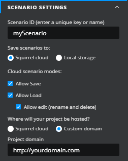
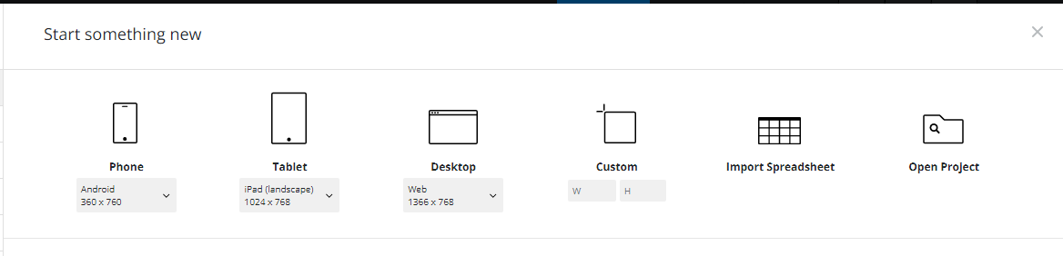
<figure><img src="/files/FhyTXoC6rI8MHufSSDaD" alt=""><figcaption></figcaption></figure>

{% hint style="warning" %}
**Note:** You can only use fine-tuned models created with your own API key. You **cannot** call someone else’s fine-tuned model unless they **share their API key** with you.
{% endhint %}

***

### STYLING

<figure><img src="/files/ewncMGVN12X2SzEATpdb" alt="" width="281"><figcaption></figcaption></figure>

* **Accent Colors** - Use the input to define a color hex code, or select the Color Picker to choose a color. When a color is selected, shades and tints are automatically determined on the component.
* **Opacity** - Set the opacity of the AI Chat component. This property can be bound to the properties panel.
* **Font** - select from the dropdown to define the font used by the AI Chat component.


# Scenario

This article describes the Scenario component and its properties.

**Scenario** provides a convenient graphical interface for a user to save and load different sets of data from spreadsheet ranges specified by the project designer into a running Squirrel project.

When placed on the canvas the scenario component adds two buttons:

![](https://addons.squirrel365.io/learn-assets/uploads/2022/03/scenario-on-canvas.png)

When these buttons are pressed the end-user is presented with a combination of dialogs to allow them to save, load, and edit their scenarios:

![](https://addons.squirrel365.io/learn-assets/uploads/2022/03/scenario-save.png)

![](https://addons.squirrel365.io/learn-assets/uploads/2022/03/scenario-edit.png)

## Scenario Properties

The **Scenario** component properties are organized into **LAYOUT & POSITIONING, SCENARIO SETTINGS, BUTTON GOUP** **STYLING, and DIALOG STYLING and SCENARIO RANGES** sections.

This guide will describe all sections besides the [**Layout & Positioning**](/components-functions-and-connections/overview/layout-and-positioning) and [**Dynamic Visiblity**](/getting-started/core-concepts/dynamic-visibility) sections, as these are generic to each component. A separate guide and tutorial for each can be found by clicking the links above.

The component properties are set and edited using different methods, some have multiple methods, some just one. See this [Set Property Values](https://squirrel365.io/knowledgebase/set-property-values/) article for more information on using the different methods.

***

### SCENARIO SETTINGS

This property section controls the overall function of the **Scenario** component. Initially, it looks like this:

![](https://addons.squirrel365.io/learn-assets/uploads/2022/03/scenario-property-general-local.png)

* **Scenario ID**
  * This property provides an identifier under which the scenarios will be saved.
  * When the end user saves a scenario it will be tagged with this identifier and only scenarios with this identifier will be shown to the end user when they choose to re-load a scenario.
  * You should use different identifiers for different projects.
  * In addition to this identifier, scenarios are also tagged with the unique ID of the project author, i.e. the person who initially added the **Scenario** component to the canvas, in case other authors select the same scenario identifier.
* Save scenario to
  * This property allows the designer to choose whether scenarios are saved to the Squirrel cloud or stored locally on the end-user’s machine.
  * Scenarios that are saved locally are not only specific to the local machine but also to the browser in which the project is viewed. As a result, scenarios saved in one browser (e.g. Microsoft Edge) will not appear when the project is run in another browser (e.g. Google Chrome). Additionally, scenarios saved from a project embedded in PowerPoint will only appear when the project is viewed in PowerPoint
  * Locally saved scenarios are saved in the “IndexedDB” database of the browser
  * Scenarios that are saved to the **Squirrel Cloud** will appear no matter which machine or browser is used to view the project.
  * Selecting to save scenarios to the Squirrel Cloud reveals several additional options:

![](https://addons.squirrel365.io/learn-assets/uploads/2022/03/scenario-property-general-cloud.png)

* **Cloud scenario modes –** This property controls the scenario actions that the end-user will be able to perform in the final project
  * ***Allow Save** –* if this option is deselected then the user will not see the “Add Scenario” button. This is useful to provide a project with several built-in scenarios but not allow further ones to be added by the user.
  * ***Allow Load*** – if this option is deselected then the user will not see the “View all scenarios” button. This can be useful to capture specific information from the user, for example in a lead capture form.
  * ***Allow edit** –* this option is only available if “Allow load” is checked and controls whether the end user is offered the menu option to rename and delete scenarios.
* Where will your project be hosted?
  * This is a security setting that ensures that the Squirrel cloud will only deliver scenario information to a genuine Squirrel project
  * If Squirrel Cloud is selected then there is nothing else to do, however, if “Custom domain” is selected then the domain on which the project will be hosted must be entered. This should be the high-level domain without any subdomains and care must be taken to exactly match the name of the hosting domain (including http or https at the start and any port number at the end, e.g. <https://somedomain:5000>).

<figure><img src="https://addons.squirrel365.io/learn-assets/uploads/2022/03/scenario-property-general-cloud-domain.png" alt=""><figcaption></figcaption></figure>

***

### BUTTON GROUP STYLING

The **BUTTON GROUP STYLING** properties are used to control the appearance of the save and load buttons on the canvas. The top section controls the options which are common to both buttons:

![](https://addons.squirrel365.io/learn-assets/uploads/2022/03/scenario-property-button-group-styling.png)

* **Font** – Choose a font style from the dropdown list.
* **Size** – Change the font size of the push button label.
* **B** ***I*****&#x20;U** – Use these toggle buttons (**bold**, *italic*, underline) to change the format of the button label. When any of these is toggled on, the button is blue:

![Bold Italics Underline selection panel](/files/J21b2RL3f3HSKsLMw3fF)

* **Corners** – This property determines the corner radius of the button borders. Use the slider to amend this property, or type a numerical value into the property field.
  * **Individual Corners** - selected this property to apply different radii to each of the component's corners. Each of these individual inputs can be manually edited or bound to the spreadsheet.

Each of the buttons can be independently styled by expanding the “**SAVE BUTTON**” and “**LOAD BUTTON**” sections to reveal the formatting options:

![](https://addons.squirrel365.io/learn-assets/uploads/2022/03/scenario-property-button-styling.png)

***

### DIALOG STYLING

The **DIALOG STYLING** properties are used to control the appearance of pop-up dialogs which are presented when the end-user chooses to save or load a scenario:

![](https://addons.squirrel365.io/learn-assets/uploads/2022/03/scenario-property-dialog.png)

* **Font** – Controls the font of the title and text in the main part of the dialogs.
* **Text Color** – Controls the color of the title and text in the main part of the dialog
* **Fill** – Controls the background color of the dialogs
* **Border** – Controls the border of the dialogs
* **Accent Color** – Controls the coloring of the buttons in the dialog

***

### SCENARIO RANGES

These properties specify the spreadsheet ranges that will be saved as part of the scenario.

{% hint style="info" %}
If a spreadsheet cell that is saved as part of a scenario contains a formula its values will be saved as part of the scenario and not the formula. This means that formulas will be overwritten with values when loading back saved scenarios. As a result, it is recommended to avoid specifying ranges that contain spreadsheet formulas.
{% endhint %}

Each scenario can consist of many saved ranges, new ranges can be added by clicking on the **+** icon at the top right of the list of ranges.

![](https://addons.squirrel365.io/learn-assets/uploads/2022/03/scenario-property-ranges.png)


# Add-ons


# Add-on Documentation

This article contains information on Squirrel add-ons, and documentation on how to develop your own

## Add-ons

### Getting Started with Add-ons

Are you interested in developing some add-ons for Squirrel? If so, watch this webinar about the add-on framework, developer program, documentation, and everything else you need to know to start developing your first add-on.\
\
The session covered:

* An overview of the add-on framework
* The developer program
* Where to find the Squirrel365 add-on documentation
* Setting up your environment and testing
* Building a function add-on
* Building a component add-on
* Publishing to the Squirrel365 Marketplace

{% hint style="info" %}
To get the most out of this session, a basic knowledge of HTML, CSS, and JavaScript is recommended.
{% endhint %}

{% embed url="<https://youtu.be/s6T587-6Pfk>" %}

### Add-on Documentation

Our documentation contains all of the detailed information you need to develop and publish an add-on, including:

* How to join the developer program
* Building the add-on
* Creating the property panel
* Publishing the add-on
* The review process

[**View the add-on documentation**](https://developer.squirrel365.io/)


# Window Size – Add responsive behavior to your components

{% hint style="info" %}
The Window-Size function is an add-on that can be downloaded from the Squirrel365 Marketplace.

Find more details about other available add-ons on the [Squirrel365 Marketplace](https://marketplace.squirrel365.io/) page.
{% endhint %}

## Adding responsive behavior to your components

Now that we have our Window Size add-on wired up, we can begin converting or building our application into something that responds as the canvas size changes. In this How-To, I will be constructing a project from scratch, applying the responsive behavior with the Window Size function applied.

If you haven’t seen the first article on this, check it out [here](https://squirrel365.io/knowledgebase/add-responsive-behavior-with-the-window-size-add-on/)

[#simple-example-setting-up-components-with-varying-sizes](#simple-example-setting-up-components-with-varying-sizes "mention")

[#intermediate-example-setting-up-components-with-varying-sizes-and-positions](#intermediate-example-setting-up-components-with-varying-sizes-and-positions "mention")

[#expert-example-adjusting-components-for-various-canvas-sizes](#expert-example-adjusting-components-for-various-canvas-sizes "mention")

### **Canvas size and component placement**

To begin with, we want to begin by placing our components. Depending on the type of application you are building, you may have different components and a different layout, but the principles remain the same. Another area that you will need to consider and explore is the size of the initial canvas. You could be looking to display your application in both desktop and mobile formats. In this instance, you will want to look at designing layouts that suit both of those environments.

Check out this external article, ‘[What Size Should Your Dashboard Be?](https://www.flerlagetwins.com/2023/01/blog-post.html)‘ for tips and tricks on getting started.

Once you have your canvas sizes ready, and your designs in place, now we just need to set up the components in Squirrel to become responsive to the transition between those sizes.

### **Setting up the canvas**

Determining the size of the canvas could be difficult as there are so many varying sizes to choose from that match certain screen sizes. To aid this decision, Squirrel offers a series of default canvas sizes that you can find in the product’s ‘Start Page’

<figure><img src="https://addons.squirrel365.io/learn-assets/uploads/2023/05/Screenshot-2023-05-30-090653.png" alt=""><figcaption></figcaption></figure>

For the sake of this article, we will be using these standard sizes just as a reference – feel free to use your own.

We will be exploring two canvas sizes in this article: Computer and Tablet.

Computer – **1366 x 768**

Tablet – **1024 x 768**

We are going to go ahead and place these values in the spreadsheet and wire up our Window Size component. See [this article](https://squirrel365.io/knowledgebase/add-responsive-behavior-with-the-window-size-add-on/) for more information on setting up the add-on.

<figure><img src="https://addons.squirrel365.io/learn-assets/uploads/2023/05/Screenshot-2023-05-30-091745.png" alt=""><figcaption></figcaption></figure>

### **Simple Example – Setting up components with varying sizes**

This simple example will demonstrate a foundation example of the formulas used across the rest of the project.

1. Place a **Rectangle component** on the canvas
2. Set the **XY position to 0,0**
3. **Bind the width** of the Rectangle to the width of the canvas on the spreadsheet

Tip: Highlight your cells to make them easier to discern in the spreadsheet. In this example, we will be highlighting cells that will be changing yellow (either through formula or insertion via the Window Size add-on) and static values will be highlighted green (these values will not change at all and will be used as references.

4. (Optional) Add an icon on top of the Rectangle to act as a reference.
5. **Publish and resize the browser window** to view the rectangle adjusting in size, and the icon maintaining its size on the canvas.

It should look like the example below

<figure><img src="https://addons.squirrel365.io/learn-assets/uploads/2023/05/Screenshot-2023-05-30-101445.png" alt=""><figcaption></figcaption></figure>

### **Intermediate Example – Setting up components with varying sizes AND positions**

Now we’ve established the fundamental principle of the Window Size add-on working with components, we can take this one step further with other components and more advanced positioning.

We will begin with placing our components and setting their original positions:

1. Place a **metric tile** on the canvas.
2. Decide the **distance** that you would like to position it from **the edge of the canvas** (in this example, **10px** will be enough)
3. Bind the component’s X position to this value in the spreadsheet (**label and highlight green** as it is a static value and will not change for the first component)
4. *(Optional)* Enter the Y position into the spreadsheet below the width as a fixed value (highlight green) and bind the Metric Tile’s height to this.
5. Decide the **spacing between the components** (in this example, we will use **10px** again to keep things easier, and we can use the same cell as the X position value)

As we will be using these numbers often, we can go ahead and place this number in a cell on the spreadsheet so we can easily reference it. I will highlight it in **green** as this will be a static number that doesn’t change.

6. Enter the following formula to calculate the **width of the component**.

> \= ( canvas size – ( spacing / distance x no. spaces ) ) / no. of components

7. The **no. of components** we will be placing is **4**, so we can calculate the number of spaces with this by adding the two spaces at either end and the spaces in between = **5 spaces total**
8. The formula will look something like this (remember to highlight the cell **yellow** as this is a changing value):

<figure><img src="https://addons.squirrel365.io/learn-assets/uploads/2023/05/Screenshot-2023-05-30-112617.png" alt=""><figcaption></figcaption></figure>

9. Now we have calculated the width, we can bind the Metric Tile to this value. As the Canvas size updates, the width of the component will adjust relative to the canvas’ width. Change the width value to give it a test, it should look something like this:

<figure><img src="https://addons.squirrel365.io/learn-assets/uploads/2023/05/Screenshot-2023-05-30-110547.png" alt=""><figcaption></figcaption></figure>

10. Add any preferred styling to the component and then **duplicate the Metric Tile 3 more times**.
11. Label 3 areas in the spreadsheet for new X positions
    1. Component 2 X
    2. Component 3 X
    3. Component 4 X

These will be the cells that we calculate the adjusting X values that will move as the canvas width changes.

With the following formulas, with each new cell, we will essentially read the matching component as the “new 0”. Let’s walk through it

12. Use the following formulas for ‘Component 2 X’

> \= canvas size – ( ( width \* no. of remaining components ) + ( spacing \* spaces after component ) )

It should look something like this.

<figure><img src="https://addons.squirrel365.io/learn-assets/uploads/2023/05/Screenshot-2023-05-30-112430.png" alt=""><figcaption></figcaption></figure>

13. We can now repeat this for the following X positions, reducing the ‘no. of remaining components’ and ‘spaces after component’ down by one each time.
14. Once you have those values calculated and highlighted, go ahead and bind the duplicate components to these new values. You’ll now have something like this:

<figure><img src="https://addons.squirrel365.io/learn-assets/uploads/2023/05/Screenshot-2023-05-30-114456.png" alt=""><figcaption></figcaption></figure>

Again, we can test if these work by changing the width value in cell **C3**.

This was the intermediate example where we can now calculate a width value that will adapt to the updated canvas width.

It’s now time to crank it up a bit. What if we shrunk down the width to a point where it would fit a tablet or mobile screen? We don’t want to risk our components becoming squished and impossible to read:

![](https://addons.squirrel365.io/learn-assets/uploads/2023/05/Screenshot-2023-05-30-154834.png)

Not want we want. The components are cramped and the text is undiscernible.

![](https://addons.squirrel365.io/learn-assets/uploads/2023/05/Screenshot-2023-05-30-154958-1.png)

What we want to see – the components are evenly distributed, the text is visible and it is pleasing to the eye.

### **Expert Example – Adjusting components for various canvas sizes**

As listed previously, we have ascertained various canvas sizes from Squirrel’s default sizes. In this example here, we will proceed with the preset Tablet Size (1024×768). A good place to begin is by placing this height and width in the canvas and labeling them with our static highlight color (green).

1. Enter the new height and width of the Tablet size canvas into the **yellow** height and width cells to change the size of the canvas. This will allow us to see the changes being made to the components as the calculations are made.

Now that we have the new sizes, we need to begin to add conditionals to the existing formulas. These conditionals will cause major changes to occur once the canvas reaches the new sizing. We will start with resizing the widths of the components to match the new canvas size.

2. In a new cell, label and highlight the following formula

> \= ( canvas width – ( spacing \* no. of spaces ) ) / no. of components

It should look like this.

![](https://addons.squirrel365.io/learn-assets/uploads/2023/05/Screenshot-2023-05-30-141715.png)

3. Now that we have our width for the components went the canvas is small enough, we need to apply a conditional to our current component width formula. In cell C7, adjust the formula to the following:

> \= IF ( canvas width > tablet canvas width , ( canvas width – (spacing x no. of spaces ) ) / no. of components , new formula )

It should look like this.

![](https://addons.squirrel365.io/learn-assets/uploads/2023/05/Screenshot-2023-05-30-141914.png)

Now we have applied the conditions to the widths of the components, you will notice that some of the components have overlapped with one another – we need to take this into account. With formulas, we can calculate the Y positions of the components that will need to be adjusted so they no longer overlap. But first, we can identify in the spreadsheet where we will put these formulas.

We will want to begin by highlighting and labeling the cells with ‘component # new X’ and ‘component # Y’. These new settings will only apply to some of the metric tiles, but we will go through that.

#### **‘Component # new X’**

This setting will only apply to the second, and fourth components we have placed as their X positions will be ones that will change as the canvas resizes.

4. Enter the following formula into the labeled cells for the corresponding components

> \= canvas width – ( component width + spacing )

It should look like this.

![](https://addons.squirrel365.io/learn-assets/uploads/2023/05/Screenshot-2023-05-30-150943.png)

5. We can now apply the same conditioning to the existing X position values. With similar principles to the previous, they will look like the following:

> \= IF ( canvas width > new canvas width, ( = canvas size – ( ( width \* no. of remaining components ) + ( spacing \* spaces after component ) ), new component X cell )

It should look like this.

![](https://addons.squirrel365.io/learn-assets/uploads/2023/05/Screenshot-2023-05-30-151030.png)

6. Repeat this for the cell containing calculations for ‘component 4 X’

We can not begin to calculate the new Y positions for the third and fourth components, as these will be the ones moving as the canvas width shrinks.

7. Label and highlight new cells for ‘component 3 Y’ and ‘component 4 Y’.
8. Enter the following formula layout into the cells

> \= IF ( canvas width > tablet canvas width , y position , ( y position + spacing ) + component height )

It should look like this.

<figure><img src="https://addons.squirrel365.io/learn-assets/uploads/2023/05/Screenshot-2023-05-30-152922.png" alt=""><figcaption></figcaption></figure>

9. We can now bind the third and fourth components to these new Y position values.

And voila! We have our components positioned as they should be. Now, you can publish and view in a browser, and resize the window to see the changes.

<figure><img src="https://addons.squirrel365.io/learn-assets/uploads/2023/05/Screenshot-2023-05-30-153645.png" alt=""><figcaption></figcaption></figure>

Using these principles, you can apply the Window Size add-on to all of your projects to have dynamically changing visuals and positions within your project.


# Window Size - Getting responsive behavior in the canvas

{% hint style="info" %}
The Window-Size function is an add-on that can be downloaded from the Squirrel365 Marketplace.

Find more details about other available add-ons on the [Squirrel365 Marketplace](https://marketplace.squirrel365.io/) page.
{% endhint %}

## Add responsive behavior to the canvas with the Window Size add-on

With the [Window Size](https://marketplace.squirrel365.io/addons/Window-Size-vUgyqgegEq8tXjMOzIhNw) function, you can connect the width and height of the browser to your displayed project. By binding these values to the spreadsheet, you can then bind the width and height of the main canvas to them. This gives the canvas size to be responsive to the size of the browser window, resizing as the window resizes.

Additionally, you can use these values to calculate the size and positions of onscreen components in the spreadsheet and bind their respective properties to those cells. This allows for dynamic sizing and positioning of onscreen components.

### **What does ‘responsive’ mean?**

The way the add-on works is by reading the pixel width and height of the browser after the project has been published. This then feeds back to the project via the Window Size function, and so when the browser window is resized, the canvas size of the project responds to match the resized window.

### **Setting up the Window Size add-on**

You want to begin by binding the width and Height properties of the canvas to the spreadsheet. Make sure to clearly label and highlight the bound cells so it’s easier to keep track of where they are.

<figure><img src="https://addons.squirrel365.io/learn-assets/uploads/2023/05/image-7.png" alt=""><figcaption></figcaption></figure>

**Locate and place the Window Size function**

Under the functions drawer, you will want to locate the Window Size function and press the “+” button to add it to the Object Browser. Once added, you will see that the function is simple in that it only has a Width and Height input box in its properties panel.

You are only able to bind these properties, so you will want to go ahead and bind the corresponding inputs to the same cells that you bound the canvas height and width to in the spreadsheet.

<figure><img src="https://addons.squirrel365.io/learn-assets/uploads/2023/05/Group-11-2.png" alt=""><figcaption></figcaption></figure>

Now these are bound to the same cells, they essentially become connected. The Window Size function will read the width and height of the browser of the published project, feed this back to the ‘behind-the-scenes’ spreadsheet, and dynamically update the canvas size to match.

We can see this in the example below.

As the browser’s size is adjusted, as seen by dragging the border of the window or switching between the ‘Fullscreen’ and ‘Windowed’ modes, we can observe the values that have been bound to the canvas width and height are also adjusting.

### Interacting with components on the canvas.

Now we have the Window Size add-on wired up to the canvas size properties, we can begin to place our components and calculate their positions based on the size of the canvas.

The process of wiring up the components to adjust for the updating canvas size can be quite complex, containing various conditional calculations, but once you have a grasp of the concepts, it all starts to fall into place.

Check out this article to [add responsive behavior to your components.](https://squirrel365.gitbook.io/learn/add-ons/window-size-add-responsive-behavior-to-your-components)


# PowerPoint PDF Generator

This article outlines how to use the PowerPoint PDF Generator add-on, its properties and generating an external output from Squirrel projects.

{% hint style="info" %}
The PowerPoint PDF Generator add-on is currently not publically available on the Squirrel Marketplace. If you are interested, or for more information, please get in touch.
{% endhint %}

As a means of generating highly visual and dynamic static outputs, the Squirrel team generated the PowerPoint PDF Generator add-on. Taking a created PPT Template and uploading it to the Squirrel Cloud, unique PDF, and PowerPoint outputs can be created, tailored to each use-case of your published projects.

## Creating your PowerPoint template

The add-on works by taking a previously created PowerPoint document, and outputting the generated data within the project into a PDF or back into PowerPoint.

The initial template is simply a means of controlling the output's properties, including styling, layout, branding, and other static text areas.

See the example below:

<figure><img src="/files/UTdkuD8LjmnMLIEmz39j" alt=""><figcaption></figcaption></figure>

## Uploading your PowerPoint Template to the Squirrel Cloud

For the add-on to connect to your template and generate an output, you will need to upload your PowerPoint to the Squirrel Cloud.

1. Login to your Squirrel account at <https://cloud.squirrel365.io/account/login>
2. Navigate to the 'External Documents' tab on the left-side panel
3. Select 'Add New File' in the top-left corner and upload your PowerPoint file

Once uploaded, your screen will look like this:

<figure><img src="/files/icHIVlnpFc7nh6NxYvWm" alt=""><figcaption><p>On the left side of the page, a generated list of the unique identifiers found throughout the uploaded PowerPoint template. On the right side of the page, a chart displaying usage analytics, including how many outputs have been generated from your project using this template.</p></figcaption></figure>

4. Click 'Back' at the top-left corner. You will return to the main 'External Documents' page, where all your uploaded PowerPoint files are listed.

Here you will see two keys - The **API** key, and the **GUID** key. These allow the add-on to connect to the template output.&#x20;

{% hint style="warning" %}
Make sure to have the correct keys and files to connect to the Squirrel Cloud. If these are incorrect, the output generation will fail. Always verify that the keys haven't changed with every template upload or update, as this will affect the generator.
{% endhint %}

Now to get the add-on wired up...

## Connecting the add-on to the template

1. In Squirrel, place the PDF & PowerPoint Generator add-on on the canvas. It can be found under the Add-ons menu on the left-hand panel.

<figure><img src="/files/EwzVMeUBiCTJs3pZIvfO" alt=""><figcaption></figcaption></figure>

Once placed, the properties panel will populate.

2. Under the GENERAL properties, you will see the following:

<figure><img src="/files/IK2VzCVn7Z1h99TIXyNO" alt=""><figcaption></figcaption></figure>

3. Back in the 'External Documents' page of your Squirrel account, select the 'copy to clipboard' icons beside both the **API** and **GUID** keys. Paste them in the respective properties above.

{% hint style="info" %}
You can also put these keys in a spreadsheet and link the properties to them. This way, if you ever need to update them, you can simply update the keys in the spreadsheet without having to find the add-on to make the updates.
{% endhint %}

4. Enter a 'Generated filename' - this will be the name of the project once it is outputted.
5. (Optional) Bind the 'Status message' property to the spreadsheet. This will input information and updates into the spreadsheet, letting the user know of the generation progress, or if there are any issues.
6. Select the desired 'Exported file format'. This can be either a **PowerPoint** or a **PDF**.

## Connecting the replacement data

A big part of the PDF & PowerPoint Generator is taking data from Squirrel, such as calculations, tables, images, and results, and pushing it into a connected template. However, there is quite a bit of preparation that needs to be done before the template is ready to receive that data.

### 1. Utilise 'unique identifiers' in the template

As seen earlier in this article, the PowerPoint template should have been prepared with what we call 'unique identifiers'. These are values, surrounded by **{{ double curly brackets }}** which are identifiable by the add-on.

{% hint style="info" %}
The term 'unique' is used because each value **must** be distinct to avoid duplicating values in the output. The only scenario where a 'unique identifier' is used in multiple places is when it is meant to return the **same** value.
{% endhint %}

While these 'identifiers' must be different, they do not need to be wildly different. For example, if you want to display two results that are from the same area in the project, they can be as follows:

*{{result\_1}}*

*{{result\_2}}*

Having the *'1'* and *'2'* is enough for the add-on to distinguish between them.

{% hint style="info" %}
It's possible to list all the values as result\_1, result\_2, and so on, but it's better to use keywords or abbreviations to easily identify their source.&#x20;

When dealing with numerous identifiers, it can be confusing if they all look too similar, especially when dealing with multiple of these values.
{% endhint %}

### 2. Create a new sheet specifically for the outputted values

As a tip, we recommend creating a new sheet in the Squirrel spreadsheet that will specifically contain the data for the output. This ensures that everything is organized, and it is not required to navigate across the sheet to make any alterations.

1. Create a new sheet and label it clearly as the PDF/ PowerPoint output values
2. Back in your Squirrel Cloud account, navigate to the uploaded template, and select it to open
3. In the list of found 'unique identifiers', select the 'copy to clipboard' icon and paste it within the Squirrel spreadsheet

{% hint style="info" %}
Section each of the values according to the associated area in the project to easily keep track.
{% endhint %}

### 3. Use the correct value format

For the data to be pushed into the output correctly, it **must** be in Text format. This means any value that is formatted as currency, percentage, DateTime, etc will return its numerical value and will have no formatting applied.

{% hint style="info" %}
We recommend using the TEXT() formula to reference any value that is to be bound to the add-on, e.g.

*$3.50 in cell A1 of 'Sheet 1' sheet*

*TEXT('Sheet 1'!A1,"$#.00") in cell B2 of 'OutputValues' sheet*

This will display the original value as though it was still in its currency format but will be read as text.

**If this step is missed, the value could come through as a numerical value leaving out the '$' dollar sign.**
{% endhint %}

<figure><img src="/files/62gdYIgiplYGoHoisyAm" alt=""><figcaption></figcaption></figure>

### 4. Know the types of 'Replacements'

Under the TEMPLATE REPLACEMENTS properties in Squirrel, you will notice multiple different types of template replacements. They all utilize the same 'unique identifiers', but in different ways.&#x20;

{% hint style="info" %}
For each 'Replacement' time to be active, you need to **check the checkbox beside each of the property dropdowns**. These are unchecked by default.
{% endhint %}

#### **SINGLE VALUES**

The simplest form of value replacement. These values can be identified standing alone in a text box, or within a sentence, e.g.

<figure><img src="/files/LhyIpfwX6VEKqz0fQCon" alt=""><figcaption><p>Values can be identified in a sentence...</p></figcaption></figure>

<figure><img src="/files/8kflG9g3z4R4xXxJ0Mca" alt=""><figcaption><p>...or as stand alone values</p></figcaption></figure>

<figure><img src="/files/Wel2YzrX61xeICgPh9AW" alt=""><figcaption></figcaption></figure>

**IMAGES**

Images can be updated by placing the 'unique identifier' within the ALT text of the image. In Squirrel, this will be bound to a cell containing an image URL.

<figure><img src="/files/OWXbvKywAV0dlgqYbOSI" alt=""><figcaption><p>Place the 'unique identifier' value in the Alt Text</p></figcaption></figure>

<figure><img src="/files/mPvTDWOpuXJNWM06Uqox" alt=""><figcaption></figcaption></figure>

{% hint style="info" %}
Images will be adjusted to match the size of the original image within the template. Ensure the 'Lock aspect ratio' option is set within PowerPoint to ensure the new image is not distorted if it is not the same size as the original.
{% endhint %}

**CHARTS**

Charts can be updated by placing the 'unique identifier' within the ALT text of the chart. This will be bound to a range in the Squirrel spreadsheet.

<figure><img src="/files/KnBhrMoHgbcPMsmsyaMY" alt=""><figcaption><p>Place the 'unique identifier' value in the Alt Text</p></figcaption></figure>

<figure><img src="/files/5ZbF4G4ewpBJUvtezIYU" alt=""><figcaption></figcaption></figure>

**TABLES**

Tables can be updated by placing the 'unique identifier' within the ALT text of the table. This will be bound to a range in the Squirrel spreadsheet.

<figure><img src="/files/fcYtblhQE9DvUQcg32u0" alt=""><figcaption><p>Place the 'unique identifier' value in the Alt Text</p></figcaption></figure>

<figure><img src="/files/2ljgjiyIfh1AjEGgJmn7" alt=""><figcaption></figcaption></figure>

**SHAPES**

Shapes can be updated by placing the 'unique identifier' within the ALT text of the shape. This will be bound to a 'Fill Color' and 'Outline Color'. There is also an option to 'remove' the shape if the condition is met.

{% hint style="warning" %}
You cannot change the chosen Shape in the template, just its color properties.
{% endhint %}

<figure><img src="/files/yi6Thwz3BWgfzek4fJuy" alt=""><figcaption><p>Place the 'unique identifier' value in the Alt Text</p></figcaption></figure>

<figure><img src="/files/JuyLi66TacBooqrv4YkK" alt=""><figcaption></figcaption></figure>

**LINES**

Line components can be updated by placing the 'unique identifier' within the ALT text of the Line. This will be bound to a 'Line Color'. There is also an option to 'remove' the Line if the condition is met.

<figure><img src="/files/Bl4ka6bMTy69r1asSCvm" alt=""><figcaption><p>Place the 'unique identifier' value in the Alt Text</p></figcaption></figure>

<figure><img src="/files/BPNKfX5T9rXunVEeSCAE" alt=""><figcaption></figcaption></figure>

**REMOVE SLIDES**

The PDF & PowerPoint Generator also can remove certain slides from the output. This could be done in instances where certain slides are not required as part of the end report.

To do this:

1. Enter a comma-delimited list into the 'Remove Slides' input, defining the slides to remove.
2. Bind the 'Remove Slides' input to a cell containing the comma-delimited list

{% hint style="info" %}
Binding the property enables more dynamic control over which slides are removed. For example, this might involve a cell containing a concatenated list of slides to remove based on previous project inputs.
{% endhint %}

## Styling the Component

As with all components in Squirrel, the PDF & PowerPoint Generator buttons can be styled to match the project, or your branding. These are the styling properties:

### GENERAL STYLING

* **Generate PPTX text** - this property defines the default text displayed on the button before interaction. This property can be bound to the spreadsheet.
* **Generating PPTX text** - this property defines the text displayed on the button once it has been selected. This property can be bound to the spreadsheet.

### FONT

* **Font** - Choose a font style from the dropdown list
* **Size** - Change the font size of the label in 3 ways:
  * Using the spinner buttons
  * Typing in a value
  * Binding to a value in a spreadsheet cell
* **B*****I*****U** - Use these toggle buttons (**bold**, *italic*, underline) to change the format of the **Text Label**. When toggled on, the button is blue:

<figure><img src="/files/3O85Ob5Mo3k8dd3hUZiy" alt=""><figcaption></figcaption></figure>

* **Text Color** - The input text will be shown in the color that matches the value entered in the property field.
* **Opacity** - This determines the transparency of the input text.
* **Text Alignment** - Choose to align the text to the left, right, or center. The blue button indicates the current selection:

<figure><img src="/files/Wwb6RnVUzfOIgjFcphcv" alt=""><figcaption></figcaption></figure>

* **Capitalization** - Change the letter case of the label text content to either uppercase first letter, all uppercase letters, or all lowercase. Unselecting all of the buttons will return the content to its original case format.

<figure><img src="/files/YNcqd5tq7EvYSrlxjudK" alt=""><figcaption></figcaption></figure>

### BORDER

* **Border weight** - Adjusts the weight of the component border. This can be bound to the spreadsheet.&#x20;
* **Border radius** - Applies corner rounding the the component border. This can be bound to the spreadsheet.

### DEFAULT STATE

Each of these properties needs to be checked to take effect.

* **Button Color** - adjusts the default button color. This can be bound to the spreadsheet.
  * **Opacity** - adjusts the default button opacity. This can be bound to the spreadsheet.
* **Border Color** - adjusts the default button border color. This can be bound to the spreadsheet.
  * **Opacity** - adjusts the default button border opacity. This can be bound to the spreadsheet.

### HOVER STATE

Each of these properties needs to be checked to take effect. These can be disabled to inherit their properties from the default styling options above.

* **Button Color** - adjusts the hover state button color. This can be bound to the spreadsheet.
  * **Opacity** - adjusts the hover state button opacity. This can be bound to the spreadsheet.
* **Border Color** - adjusts the hover state button border color. This can be bound to the spreadsheet.
  * **Opacity** - adjusts the hover state button border opacity. This can be bound to the spreadsheet.
* **Font Color** - adjusts the hover state text color. This can be bound to the spreadsheet.
  * **Opacity** - adjusts the hover state text color opacity. This can be bound to the spreadsheet.

### PRESSED STATE

Each of these properties needs to be checked to take effect. These can be disabled to inherit their properties from the default styling options above.

* **Button Color** - adjusts the pressed state button color. This can be bound to the spreadsheet.
  * **Opacity** - adjusts the pressed state button opacity. This can be bound to the spreadsheet.
* **Border Color** - adjusts the pressed state button border color. This can be bound to the spreadsheet.
  * **Opacity** - adjusts the pressed state button border opacity. This can be bound to the spreadsheet.
* **Font Color** - adjusts the pressed state text color. This can be bound to the spreadsheet.
  * **Opacity** - adjusts the pressed state text color opacity. This can be bound to the spreadsheet.

{% hint style="info" %}
This guide will not describe the dynamic visibility properties as these are generic to each visible component; a separate guide and tutorial on dynamic visibility can be found [**here**](https://squirrel365.gitbook.io/learn/getting-started/dynamic-visibility).
{% endhint %}


# Word PDF Generator

This article outlines how to use the Word PDF Generator add-on, its properties, and how to generate Word document outputs from your Squirrel365 projects.

{% hint style="info" %}
The Word PDF Generator add-on is currently not publicly available on the Squirrel Marketplace. If you're interested, or would like more information, please get in touch.
{% endhint %}

The Word PDF Generator add-on lets you produce dynamic Word (.docx) and PDF outputs directly from your published Squirrel365 apps. You design a template in Microsoft Word, upload it to the Squirrel Cloud, and map placeholders in the template to data in your Squirrel spreadsheet. When an end user clicks the generate button, the add-on injects live data into the template and downloads the finished file — all in real time, with no data stored on the server.

***

### Creating your Word template

The add-on works by taking a previously created Word document and injecting data from your Squirrel365 project into it at runtime. The template controls the output's layout, styling, branding, and static content — everything that doesn't change between generated documents.

Like the PowerPoint PDF Generator, the Word PDF Generator uses **placeholder syntax** — `{{value_name}}` — to mark where dynamic data should be injected. Placeholders can be placed inline within text (e.g. `Dear {{client_name}}, your total is {{total_amount}}`), or in the **Alt Text** field of non-text objects like images and tables.

**A few things to keep in mind when designing your template:**

* **Placeholders must be unique.** Each placeholder name should appear only once in the template, unless you intentionally want the same value to appear in multiple places.
* **Use clear, descriptive names.** While placeholders like `{{result_1}}` and `{{result_2}}` are technically fine, using descriptive names like `{{client_name}}` or `{{total_revenue}}` makes the template much easier to maintain.
* **Format your static content.** Any formatting, branding, headers, footers, and static text in the template will be preserved exactly as designed in the output.

<figure><img src="/files/bikw2JxrHRTuCf3SV1ZC" alt=""><figcaption></figcaption></figure>

#### Adding placeholders as alt text

**To add alt text on tables**&#x20;

1. Right click on the table and select Table Properties
2. Navigate to the Allt Text tab in the table proprties dialog
3. Add the `{{placeholder}}` name in the **Title** field

<figure><img src="/files/Nb7PMla6T6DtqykcyILl" alt="" width="563"><figcaption></figcaption></figure>

**To add alt text on images**

1. Right click on the image and select View alt text
2. Add the `{{Placeholder}}` in the alt text panel&#x20;

<figure><img src="/files/Iw28zVCcYnbaiVjx294Y" alt="" width="298"><figcaption></figcaption></figure>

***

### Uploading your Word template to the Squirrel Cloud

For the add-on to connect to your template and generate an output, you'll need to upload your Word file to the Squirrel Cloud.

1. Log in to your Squirrel account at <https://cloud.squirrel365.io/account/login>
2. Navigate to the **External Documents** tab on the left-side panel.
3. Select **Add New File** in the top-left corner and upload your Word (.docx) file.

Once uploaded, your screen will display a list of the placeholders found within the template on the left side, and usage analytics on the right.

4. Click **Back** at the top-left corner to return to the main External Documents page, where all your uploaded files are listed.

Here you'll see two keys — the **API key** and the **GUID key**. These allow the add-on to connect to your uploaded template.

{% hint style="warning" %}
**Important:** Make sure you have the correct keys when connecting the add-on. If they're incorrect, the output generation will fail. Always verify that the keys haven't changed whenever you upload or update a template, as this will affect the generator.
{% endhint %}

***

### Connecting the add-on to the template

1. In the Squirrel365 designer, place the **Word PDF Generator** add-on on the canvas. You'll find it under the **Add-ons** menu on the left-hand panel.
2. Under the **GENERAL** properties, you'll see the following fields:

* **Squirrel API Key** — paste the API key from your External Documents page.
* **Document GUID** — paste the GUID key from your External Documents page.
* **Generated filename** — this will be the name of the downloaded file. This property can be bound to a cell in the spreadsheet.
* **Status message** — (optional) bind this to a cell in the spreadsheet to receive progress updates and error messages during generation.
* **Exported file format** — choose whether the output should be a **Word document (.docx)** or a **PDF**.

<figure><img src="/files/0cbF5d3pNJ4GIoNCYRRW" alt="" width="252"><figcaption></figcaption></figure>

{% hint style="info" %}
**Tip:** You can put both keys in your Squirrel spreadsheet and bind the properties to those cells. That way, if you ever need to update them, you can simply change the values in the spreadsheet without having to find the add-on component.
{% endhint %}

***

### Connecting the replacement data

To produce dynamic outputs you need to take data from your Squirrel project — calculations, text, images, and tabular data — and inject it into the template. The replacement data is configured under the **TEMPLATE REPLACEMENTS** section of the properties panel.

<figure><img src="/files/R9O4U7p0CV3Cse8mpdec" alt="" width="252"><figcaption></figcaption></figure>

#### Replacement types

Under the **TEMPLATE REPLACEMENTS** section in the properties panel, you'll find four types of replacement. Each one uses placeholders, but in different ways.

{% hint style="info" %}
**Note:** For each replacement type to be active, you need to **check the checkbox** beside the section heading. These are unchecked by default.
{% endhint %}

***

**SINGLE VALUES**

The simplest form of value replacement. Single value placeholders are placed directly in the body text of your Word template — either standalone or within a sentence.

For example, in the template:

`Dear {{client_name}}, your total is {{total_amount}}.`

At generation time, each placeholder is replaced with the corresponding value from the Squirrel spreadsheet.

For each single value replacement, configure:

* **Template** — the placeholder name as it appears in the Word template (without the curly brackets). For example, if the template contains `{{client_name}}`, enter `client_name`.
* **Value** — the cell in the Squirrel spreadsheet containing the data to inject. This can be bound using the cell-binding icon.&#x20;

{% hint style="info" %}
Cell formatting is not preserved. Values formatted as currency, percentage, date/time, or similar will be passed to the soument without formatting. We recommend using the `TEXT()` funtion to format any value bound to the add-on.&#x20;
{% endhint %}

To add more single value replacements, click the **+** button at the top of the list.

***

**IMAGES**

Images can be dynamically replaced by placing the placeholder in the **Alt Text** field of an image in the Word template. In Squirrel, the replacement is bound to a cell containing an image URL.

For each image replacement, configure:

* **Template** — the placeholder name as it appears in the image's Alt Text in the Word template (without the curly brackets).
* **Image URL** — the cell in the Squirrel spreadsheet containing the URL of the image to inject. This can be bound using the cell-binding icon.

{% hint style="info" %}
**Note:** The output image will be adjusted to match the size of the original image in the template. Make sure the "Lock aspect ratio" option is set in Word to prevent distortion if the replacement image is a different size to the original.
{% endhint %}

To add more image replacements, click the **+** button at the top of the list.

***

**TABLES**

Tables allow you to inject tabular data from your Squirrel spreadsheet into a table in the Word template. The generator uses the table's structure as a guide — keeping header and footer rows intact, and filling the rows in between with your data.

{% hint style="info" %}
Remember, to set up a table replacement in the word document, add the placeholder to the **Table Properties > Alt Text.**
{% endhint %}

For each table replacement, configure:

* **Table Alt Tag** — the placeholder name as it appears in the table's Alt Text in the Word template (without the curly brackets).
* **New Table Data** — the range in the Squirrel spreadsheet containing the data to inject. This can be bound using the cell-binding icon.
* **Does the table data contain header** — check this if the first row of your spreadsheet data is a header row. When checked, the generator maps the first row of the data to the first row of the template table (the header), and populates the remaining rows below it.
* **How many footer rows** — enter the number of rows at the bottom of the template table that should be preserved as static footer rows. The generator will keep these intact and only inject data into the rows above them.

The generator takes your template table, preserves the header row (if flagged) and any footer rows you specify, and fills or expands the rows in between with data from the spreadsheet range.

To add more table replacements, click the **+** button at the top of the list.

***

**REPEAT TABLES**

Repeat Tables work differently from standard table replacements. Instead of filling rows within a single table, the generator **duplicates the entire table** once for each row of data in the bound spreadsheet range. This is useful when you need to produce a repeating block of content — for example, a service summary, a detail card, or a per-record section that should appear once for each item in your data.

Repeat Tables use a two-part syntax:

**1. In the table's Alt Text**, use the `{{RT|name}}` syntax to identify the table as a repeat table. For example: `{{RT|services}}`.

**2. Inside the table cells**, use `[[name|column_header]]` placeholders to mark where individual data values should be injected. The `name` must match the name used in the Alt Text, and the `column_header` must match a column header in the first row of the bound data range.

For example, a template table might look like this:

| `[[services\|ServiceName]]`              |
| ---------------------------------------- |
| **Description:** `[[services\|desc]]`    |
| **Timescale:** `[[services\|timescale]]` |

With `{{RT|services}}` in the table's Alt Text.

In Squirrel, the **Repeat Table Data** is bound to a spreadsheet range where the first row contains column headers that match the placeholder names. For example, if the data range is `Sheet1!J10:L14`:

<figure><img src="/files/4PTWdzI37YNSh9dXDFUp" alt="" width="563"><figcaption></figcaption></figure>

The generator matches each `[[services|column_header]]` placeholder to the corresponding column in the data, and produces one copy of the table for each data row. In this example, the output would contain four copies of the table — one for each service.

For each repeat table replacement, configure:

* **Repeat Table Alt Tag** — the name used in the `{{RT|name}}` syntax in the table's Alt Text. For example, if the Alt Text contains `{{RT|services}}`, enter `services`.
* **Repeat Table Data** — the range in the Squirrel spreadsheet containing the data, including the header row. The first row must contain column headers that match the placeholder names used inside the table cells. This can be bound using the cell-binding icon.

To add more repeat table replacements, click the **+** button at the top of the list.

**Images in repeat tables**

You can also include dynamic images inside a repeat table. Use the `[[IMG|tableID|placeholder]]` syntax in the table cell where you want the image to appear.

For example, if your repeat table is identified as `EQUIP` (i.e. the Alt Text is `{{RT|EQUIP}}`), and you want to inject an image called `photo`, place the following in the relevant cell:

`[[IMG|EQUIP|photo]]`

The `tableID` must match the name used in the repeat table's Alt Text, and the `placeholder` should correspond to a column in the data range that contains the image URL.

**Repeat counter shortcode**

If you need to display the current repeat number (e.g. "Item 1", "Item 2", etc.), use the `[[#]]` shortcode inside the table. This is automatically replaced with the count of the current repeat — starting at 1 for the first copy of the table, 2 for the second, and so on.

For example, placing `Item [[#]]` in a cell would produce "Item 1", "Item 2", "Item 3", etc. across the generated tables.

***

### Styling the component

As with all components in Squirrel365, the Word PDF Generator button can be styled to match your project or branding. The styling properties are identical to those of the PDF & PowerPoint Generator.

#### General styling

* **Generate DOCX text** — the default text displayed on the button before interaction. This property can be bound to the spreadsheet.
* **Generating DOCX text** — the text displayed on the button while the document is being generated. This property can be bound to the spreadsheet.

#### Font

* **Font** — choose a font style from the dropdown list.
* **Size** — change the font size using the spinner buttons, by typing a value, or by binding to a spreadsheet cell.
* **B / I / U** — toggle bold, italic, and underline formatting for the button text.
* **Text Colour** — set the colour of the button text.
* **Opacity** — adjust the transparency of the button text.
* **Text Alignment** — align the text to the left, right, or centre.
* **Capitalisation** — change the letter case to uppercase first letter, all uppercase, or all lowercase. Deselecting all options returns the text to its original case.

#### Border

* **Border weight** — adjusts the weight of the component border. This can be bound to the spreadsheet.
* **Border radius** — applies corner rounding to the component border. This can be bound to the spreadsheet.

#### Default state

Each of these properties needs to be checked to take effect.

* **Button Colour** — adjusts the default button colour. This can be bound to the spreadsheet.
  * **Opacity** — adjusts the default button opacity. This can be bound to the spreadsheet.
* **Border Colour** — adjusts the default border colour. This can be bound to the spreadsheet.
  * **Opacity** — adjusts the default border opacity. This can be bound to the spreadsheet.

#### Hover state

Each of these properties needs to be checked to take effect. These can be disabled to inherit from the default styling options above.

* **Button Colour** — adjusts the hover state button colour. This can be bound to the spreadsheet.
  * **Opacity** — adjusts the hover state button opacity. This can be bound to the spreadsheet.
* **Border Colour** — adjusts the hover state border colour. This can be bound to the spreadsheet.
  * **Opacity** — adjusts the hover state border opacity. This can be bound to the spreadsheet.
* **Font Colour** — adjusts the hover state text colour. This can be bound to the spreadsheet.
  * **Opacity** — adjusts the hover state text colour opacity. This can be bound to the spreadsheet.

#### Pressed state

Each of these properties needs to be checked to take effect. These can be disabled to inherit from the default styling options above.

* **Button Colour** — adjusts the pressed state button colour. This can be bound to the spreadsheet.
  * **Opacity** — adjusts the pressed state button opacity. This can be bound to the spreadsheet.
* **Border Colour** — adjusts the pressed state border colour. This can be bound to the spreadsheet.
  * **Opacity** — adjusts the pressed state border opacity. This can be bound to the spreadsheet.
* **Font Colour** — adjusts the pressed state text colour. This can be bound to the spreadsheet.
  * **Opacity** — adjusts the pressed state text colour opacity. This can be bound to the spreadsheet.

{% hint style="info" %}
**Note:** This guide does not cover the dynamic visibility properties, as these are common to all visible components. A separate guide on dynamic visibility can be found [here](https://learn.squirrel365.io/getting-started/core-concepts/dynamic-visibility).
{% endhint %}


# Excel file generator

This article outlines how to use the Excel Generator add-on, its properties, and how to generate Excel outputs from your Squirrel365 projects.

{% hint style="info" %}
**Note:** The Excel Generator add-on is currently not publicly available on the Squirrel Marketplace. If you're interested, or would like more information, please get in touch.
{% endhint %}

The Excel Generator add-on lets you produce dynamic Excel (.xlsx) outputs directly from your published Squirrel365 apps. You design a template in Microsoft Excel, upload it to the Squirrel Cloud, and map ranges in the template to data in your Squirrel spreadsheet. When an end user clicks the generate button, the add-on injects live data into the template and downloads the finished file — all in real time, with no data stored on the server.

***

### Creating your Excel template

The add-on works by taking a pre-designed Excel workbook and injecting data from your Squirrel365 project into specific cell ranges at runtime.

Your template is where you control the output's structure, styling, branding, and any static content (headings, labels, formatting, logos, and so on). Everything outside the ranges you define as replacements is preserved exactly as it appears in the template.

Unlike the PDF & PowerPoint Generator, the Excel Generator does not use `{{placeholder}}` syntax. Instead, you define replacements by specifying **target cell ranges** in the template and mapping them to data ranges in your Squirrel spreadsheet. This means your template is simply a well-designed Excel file — ready to receive data in the areas you specify.

**A few things to keep in mind when designing your template:**

* **Structure your sheets clearly.** Think about which sheets the output needs, where the data will land, and where static content (headers, labels, branding) should sit.
* **Format the target ranges.** Any formatting you apply to the target cells in the template (number formats, fonts, colours, borders, conditional formatting) will be preserved in the output. Style it how you want the final document to look.
* **Keep it tidy.** If certain sheets in the template are only used for working calculations or staging data, you can remove them from the output using the Remove Sheets feature (covered below).

***

### Uploading your Excel template to the Squirrel Cloud

For the add-on to connect to your template and generate an output, you'll need to upload your Excel file to the Squirrel Cloud.

1. Log in to your Squirrel account at <https://cloud.squirrel365.io/account/login>
2. Navigate to the **External Documents** tab on the left-side panel.
3. Select **Add New File** in the top-left corner and upload your Excel (.xlsx) file.

Once uploaded, you'll be taken to the template detail page.

4. Click **Back** at the top-left corner to return to the main External Documents page.

Here you'll see two keys — the **API key** and the **GUID key**. These allow the add-on to connect to your uploaded template.

{% hint style="warning" %}
**Important:** Make sure you have the correct keys when connecting the add-on. If they're incorrect, the output generation will fail. Always verify that the keys haven't changed whenever you upload or update a template, as this will affect the generator.
{% endhint %}

***

### Connecting the add-on to the template

1. In the Squirrel365 designer, place the **Excel Generator** add-on on the canvas. You'll find it under the **Add-ons** menu on the left-hand panel.
2. Under the **GENERAL** properties, you'll see the following fields:

<figure><img src="/files/LlFYNzbEnfcGWfhZMJR3" alt="" width="250"><figcaption></figcaption></figure>

* **Squirrel API Key** — paste the API key from your External Documents page.
* **Document GUID** — paste the GUID key from your External Documents page.
* **Generated filename** — this will be the name of the downloaded file. This property can be bound to a cell in the spreadsheet.
* **Status message** — (optional) bind this to a cell in the spreadsheet to receive progress updates and error messages during generation.

{% hint style="info" %}
**Tip:** You can put both keys in your Squirrel spreadsheet and bind the properties to those cells. That way, if you ever need to update them, you can simply change the values in the spreadsheet without having to find the add-on component.
{% endhint %}

***

### Connecting the replacement data

The core of the Excel Generator is mapping data from your Squirrel spreadsheet into specific cell ranges in the template. This is done through **Range Replacements**.

#### How range replacements work

Rather than using placeholder syntax, the Excel Generator works with a direct range-to-range mapping:

* You define a **target range** in the template (a sheet name and a cell range, e.g. `Sheet1`, `C6:E24`).
* You map it to a **value range** in the Squirrel spreadsheet that contains the data to inject (e.g. `Data!J8:L26`).

At generation time, the add-on takes the data from the Squirrel spreadsheet range and writes it into the corresponding range in the template. Everything else in the template remains untouched.

#### Setting up a range replacement

Under the **RANGE REPLACEMENTS** section in the properties panel, you can add one or more cell range mappings.

<figure><img src="/files/Cz1P3ZKEY6cDEFAT3CE2" alt="" width="250"><figcaption></figcaption></figure>

For each range replacement, configure the following:

* **Name** — a friendly label for your own reference (e.g. "Revenue Data", "Summary Table"). This doesn't affect the output — it's just to help you stay organised.
* **Sheet name** — the name of the sheet in the Excel template where the data should be injected (e.g. `Sheet1`).
* **From** — the starting cell of the target range in the template (e.g. `C6`).
* **To** — the ending cell of the target range in the template (e.g. `E24`).
* **Value** — the cell or range in the Squirrel spreadsheet that contains the data to inject (e.g. `Data!J8:L26`). This can be bound to the spreadsheet using the cell-binding icon.

To add more range replacements, click the **+** button at the top of the Cell Ranges list. Each mapping appears as a named item in the list, and you can select any item to view or edit its properties.

{% hint style="info" %}
**Tip:** For a single cell replacement, set the **From** and **To** fields to the same cell (e.g. From: `A1`, To: `A1`).
{% endhint %}

#### What happens if the ranges don't match in size?

The Squirrel spreadsheet range and the template target range don't need to be exactly the same size. Here's how mismatches are handled:

* **If the Squirrel data range is larger than the target range** — the data is truncated to fit. Only the data that falls within the target range dimensions will appear in the output.
* **If the Squirrel data range is smaller than the target range** — the cells in the target range that don't receive new data remain unchanged. Whatever was already in those cells in the template will stay in the output.

This is worth keeping in mind when designing your template. If you want a clean output, make sure the target range either matches your expected data size or that any "leftover" cells in the template contain appropriate default values (or are left empty).

#### Use the correct value format

For data to appear correctly in the output, replacement values **must be in Text format**. Any value formatted as currency, percentage, date/time, or similar will lose its formatting and return as a raw number if not converted to text first.

We recommend using the `TEXT()` formula to reference any value that will be mapped to a range replacement. For example:

* `$3.50` in cell `A1` of the `Sheet 1` sheet
* `TEXT('Sheet 1'!A1, "$#.00")` in cell `B2` of your output values sheet

This preserves the display formatting while ensuring the value is read as text by the generator.

> **If this step is missed, values could come through as raw numbers — losing currency symbols, percentage signs, or date formatting.**

#### Best practice: create a dedicated output sheet

As a tip, we recommend creating a new sheet in your Squirrel spreadsheet specifically for the output values. This keeps everything organised in one place and makes it easier to manage your range mappings.

1. Create a new sheet and label it clearly (e.g. "ExcelOutputValues").
2. Use this sheet to gather and format all the values that will be mapped to your template ranges.
3. Section the values according to the associated areas in your template to keep things easy to track.

***

### Removing sheets from the output

The Excel Generator can remove specific sheets from the output. This is useful when your template contains sheets that are only needed for structure or staging, and shouldn't appear in the final downloaded file.

Under the **REMOVE SHEETS** section in the properties panel:

<figure><img src="/files/nhgUQawFWQE0IfyYI5A9" alt="" width="250"><figcaption></figcaption></figure>

* Enter a **comma-separated list of sheet names** to exclude from the output (e.g. `sheet1, A New Sheet`).
* This property can be bound to a cell in the spreadsheet for dynamic control — for example, a cell containing a concatenated list of sheet names to remove based on previous inputs in the app.

{% hint style="info" %}
**Note:** Unlike the PowerPoint PDF Generator (which uses slide numbers), the Excel Generator uses **sheet names** to identify which sheets to remove. Make sure the names match exactly, including any spaces.
{% endhint %}

***

### Styling the component

As with all components in Squirrel365, the Excel Generator button can be styled to match your project or branding. The styling properties are identical to those of the PDF & PowerPoint Generator.

#### General styling

* **Generate XLSX text** — the default text displayed on the button before interaction. This property can be bound to the spreadsheet.
* **Generating XLSX text** — the text displayed on the button while the document is being generated. This property can be bound to the spreadsheet.

#### Font

* **Font** — choose a font style from the dropdown list.
* **Size** — change the font size using the spinner buttons, by typing a value, or by binding to a spreadsheet cell.
* **B / I / U** — toggle bold, italic, and underline formatting for the button text.
* **Text Colour** — set the colour of the button text.
* **Opacity** — adjust the transparency of the button text.
* **Text Alignment** — align the text to the left, right, or centre.
* **Capitalisation** — change the letter case to uppercase first letter, all uppercase, or all lowercase. Deselecting all options returns the text to its original case.

#### Border

* **Border weight** — adjusts the weight of the component border. This can be bound to the spreadsheet.
* **Border radius** — applies corner rounding to the component border. This can be bound to the spreadsheet.

#### Default state

Each of these properties needs to be checked to take effect.

* **Button Colour** — adjusts the default button colour. This can be bound to the spreadsheet.
  * **Opacity** — adjusts the default button opacity. This can be bound to the spreadsheet.
* **Border Colour** — adjusts the default border colour. This can be bound to the spreadsheet.
  * **Opacity** — adjusts the default border opacity. This can be bound to the spreadsheet.

#### Hover state

Each of these properties needs to be checked to take effect. These can be disabled to inherit from the default styling options above.

* **Button Colour** — adjusts the hover state button colour. This can be bound to the spreadsheet.
  * **Opacity** — adjusts the hover state button opacity. This can be bound to the spreadsheet.
* **Border Colour** — adjusts the hover state border colour. This can be bound to the spreadsheet.
  * **Opacity** — adjusts the hover state border opacity. This can be bound to the spreadsheet.
* **Font Colour** — adjusts the hover state text colour. This can be bound to the spreadsheet.
  * **Opacity** — adjusts the hover state text colour opacity. This can be bound to the spreadsheet.

#### Pressed state

Each of these properties needs to be checked to take effect. These can be disabled to inherit from the default styling options above.

* **Button Colour** — adjusts the pressed state button colour. This can be bound to the spreadsheet.
  * **Opacity** — adjusts the pressed state button opacity. This can be bound to the spreadsheet.
* **Border Colour** — adjusts the pressed state border colour. This can be bound to the spreadsheet.
  * **Opacity** — adjusts the pressed state border opacity. This can be bound to the spreadsheet.
* **Font Colour** — adjusts the pressed state text colour. This can be bound to the spreadsheet.
  * **Opacity** — adjusts the pressed state text colour opacity. This can be bound to the spreadsheet.

{% hint style="info" %}
**Note:** This guide does not cover the dynamic visibility properties, as these are common to all visible components. A separate guide on dynamic visibility can be found [here](https://learn.squirrel365.io/getting-started/core-concepts/dynamic-visibility).
{% endhint %}


# Functions

Functions are invisible background components that process and move data in your Squirrel365 app. Learn what they are, how to add them, and which functions are available.

Functions are components that work behind the scenes in your app. Unlike charts or input controls, they have no visual presence on your canvas. Instead they process, transform, and move data through your spreadsheet, for example sorting a list, combining text values, or exporting data to Excel. You add and configure them in the same way as any other component.

### Adding a function

To access the Functions panel, select the function <img src="/files/t1OkOvBsNr5qGKFg1ufp" alt="" data-size="line"> icon in the Sidebar.&#x20;

To add a new function click the add <img src="/files/K48o6WkTeyxDiEEVVBq9" alt="" data-size="line"> icon to open the Function Library where you can browse that available functions and select the one you need.

<figure><img src="/files/wfpi9P3vDwtjNeAL4MpD" alt="" width="375"><figcaption></figcaption></figure>

Functions added to your project will appear as a list in the functions panel.

<figure><img src="/files/QopTbbcRXTqXKSE4mMbB" alt=""><figcaption></figcaption></figure>

***

## Looking for something in particular?

<table data-view="cards"><thead><tr><th></th><th></th><th></th><th data-hidden data-card-cover data-type="files"></th><th data-hidden data-card-target data-type="content-ref"></th></tr></thead><tbody><tr><td>AI Builder</td><td>Create your own AI tool that writes directly into the spreadsheet</td><td></td><td><a href="/files/yVjgckgvDcubd7ZOzivS">/files/yVjgckgvDcubd7ZOzivS</a></td><td><a href="/pages/uCvPFIFmGS44Jpaidc07">/pages/uCvPFIFmGS44Jpaidc07</a></td></tr><tr><td><strong>Browser Info</strong></td><td>Capture information from the browser including OS, the browser agent and the language locale.</td><td></td><td><a href="/files/FRm4xlDmoWIZW0uGESSc">/files/FRm4xlDmoWIZW0uGESSc</a></td><td><a href="/pages/yaYo3CmAPfXChftPmF5N">/pages/yaYo3CmAPfXChftPmF5N</a></td></tr><tr><td><strong>Data Mover</strong></td><td>Trigger advanced data movements behind the scenes.</td><td></td><td><a href="/files/eFbb0cUbo5YkZRnFAOpx">/files/eFbb0cUbo5YkZRnFAOpx</a></td><td><a href="/pages/bvmtNsOzpBIsyI6v8URb">/pages/bvmtNsOzpBIsyI6v8URb</a></td></tr><tr><td><strong>Export to Excel</strong></td><td>Export contents in the spreadsheet to an Excel Spreadsheet</td><td></td><td><a href="/files/izXeJkCZdeA3Gxb6E4nH">/files/izXeJkCZdeA3Gxb6E4nH</a></td><td><a href="/pages/EfNOuyMz8QGdND2Nea7m">/pages/EfNOuyMz8QGdND2Nea7m</a></td></tr><tr><td><strong>External Parameters</strong></td><td>Connect between projects, using a Parent/Child relationship?</td><td></td><td><a href="/files/ZYOpQVt6CcD1IDmc01Rz">/files/ZYOpQVt6CcD1IDmc01Rz</a></td><td><a href="/pages/LgGD77b6nIC7G2fz92YD">/pages/LgGD77b6nIC7G2fz92YD</a></td></tr><tr><td><strong>Export to PDF</strong></td><td>Capture data in the spreadsheet and format it as an external PDF.</td><td></td><td><a href="/files/q5uXTwQQo7LrPO915hVc">/files/q5uXTwQQo7LrPO915hVc</a></td><td><a href="/pages/GsoSxscnDYk0cpY8fhqS">/pages/GsoSxscnDYk0cpY8fhqS</a></td></tr><tr><td><strong>Tableau Parameters</strong></td><td>Wire a project up to Tableau, allowings for cross platform integration.</td><td></td><td><a href="/files/jyK7Url8pq4IaXCfpjO2">/files/jyK7Url8pq4IaXCfpjO2</a></td><td><a href="/pages/VPaeF1lMNUushQtmgfop">/pages/VPaeF1lMNUushQtmgfop</a></td></tr><tr><td><strong>Text Join</strong></td><td>Take lists of data and combine them into a single string, in a single cell</td><td></td><td><a href="/files/udxtGJ6oh8Rxa3g7dwT7">/files/udxtGJ6oh8Rxa3g7dwT7</a></td><td><a href="/pages/2Y5BZssL5fNgxn7gYmmh">/pages/2Y5BZssL5fNgxn7gYmmh</a></td></tr><tr><td><strong>Timer</strong></td><td>Delay data movements and triggers, moving data blocks or creating loops.</td><td></td><td><a href="/files/h3Kh2wBcBRwOIiyfpERQ">/files/h3Kh2wBcBRwOIiyfpERQ</a></td><td><a href="/pages/y4L8RxD820I3SoeIGQJA">/pages/y4L8RxD820I3SoeIGQJA</a></td></tr><tr><td><strong>Unique List</strong></td><td>Take a list of values and return a list of all unique values, removing duplications</td><td></td><td><a href="/files/KTfkMaLmu1xVtX5lbL6E">/files/KTfkMaLmu1xVtX5lbL6E</a></td><td><a href="/pages/JQBZdNKmA6Cz9NKQK9jd">/pages/JQBZdNKmA6Cz9NKQK9jd</a></td></tr></tbody></table>


# Spreadsheet & Data

The Spreadsheet & Date category contains functions that are responsible for moving data around the spreadsheet behind the scenes within Squirrel. From the Data Mover, able to move single blocks of data to filter through rows and rows to return desired results, to the Unique List function that can take a list of data with duplicated values and return the unique values.

### Functions

{% content-ref url="/pages/bvmtNsOzpBIsyI6v8URb" %}
[Data Mover](/components-functions-and-connections/overview-1/spreadsheet-and-data/data-mover)
{% endcontent-ref %}

{% content-ref url="/pages/2Y5BZssL5fNgxn7gYmmh" %}
[TextJoin](/components-functions-and-connections/overview-1/spreadsheet-and-data/textjoin)
{% endcontent-ref %}

{% content-ref url="/pages/y4L8RxD820I3SoeIGQJA" %}
[Timer](/components-functions-and-connections/overview-1/spreadsheet-and-data/timer)
{% endcontent-ref %}

{% content-ref url="/pages/JQBZdNKmA6Cz9NKQK9jd" %}
[Unique List](/components-functions-and-connections/overview-1/spreadsheet-and-data/unique-list)
{% endcontent-ref %}


# Data Mover

{% hint style="success" %}
**Who can use this feature?**

All Squirrel365 plans include the Data Mover function.&#x20;

For more details, see our [**pricing comparison matrix**](https://squirrel365.io/pricing/).
{% endhint %}

The **Data Mover** is a powerful Squirrel function that enables data to move around the spreadsheet; it underpins many of the key interactive features of Squirrel projects. The following video explains how to use the **Data Mover**:

{% embed url="<https://www.youtube.com/watch?t=11s&v=IjO5SC5cEvE>" %}


# TextJoin

This article describes the TextJoin function and all its properties

The TextJoin functionality allows for concatenation of values in cells, with the ability to set a custom list delimiter.

<figure><img src="/files/dWpcyEAmSCP1sj256gBa" alt="" width="283"><figcaption></figcaption></figure>

***

## TextJoin Properties

### GENERAL

The TextJoin function contains one property section with 4 inputs, two of which require binding to the spreadsheet.

The **Series** table displays a list of existing TextJoin functionalities. Each of these are titled according to the value in the selected series' **Name** input.

The **Name** input can have data manually inserted into it, or it can be bound to a text string in a spreadsheet cell.

The **Data** input must be bound to a range of cells in the spreadsheet. Select the **Bind** button when hovering over the input, and select the range in the expanded spreadsheet. Once selected, click Confirm in the top-right.

The **Delimiter** input can have data manually inserted into it, or it can be bound to a value in a spreadsheet cell. The nature of this input means that the delimeter can be something more than just a comma, or quotation marks.

The **IgnoreBlank** check mark will read through a bound range and ignore all blank cells that exist in that range.

The **Output** input is the cell in the spreadsheet where you would like our delimited list to display. This must be bound to the spreadsheet.&#x20;

<figure><img src="/files/BY44DRtfmavuHi3WzhzG" alt=""><figcaption><p>Oh, my!</p></figcaption></figure>


---

[Next Page](/llms-full.txt/1)