

Label Based Menu
This article describes the Label Based Menu component and its properties.
Who can use this feature?
All Squirrel365 plans include the Label Based Menu component.
For more details, see our pricing comparison matrix.
Squirrel 1.12 introduced a “Quick Set-up” tab on many property panels. The properties described on this page are available on the “All Properties” tab of the property panel. For more details on “Quick Set-Up” properties see this article
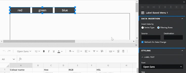
The Label Based Menu component allows for a set of related labels to be grouped. Label selection is mutually exclusive as only one label can be selected at any one time. The following example shows two Label Based Menu components, one laid out vertically and the other horizontally:

Label Based Menu Properties
The Label Based Menu properties consist of LAYOUT & POSITIONING, GENERAL, DATA INSERTION, STYLING, INTERACTIVITY, and DYNAMIC VISIBILITY sections.
This guide will describe all sections besides the Layout & Positioning and Dynamic Visiblity sections, as these are generic to each component. A separate guide and tutorial for each can be found by clicking the links above.
The component properties are set and edited using different methods, some have multiple methods, some just one. See this Set Property Values article for more information on using the different methods.
GENERAL

List Items – This property can only be set by binding to a range of cells in the spreadsheet. The number of labels in the Label Based Menu will depend upon the number of cells that are bound to this property, the captions of the labels will correspond to the data in those cells.
Ignore Blank Cells – Checked by default. If you bind the List Items property to a range of 10 cells, but only the first 8 contain data, then 8 labels will be added to the component. If this property is unchecked, 10 labels will be added to the component, but the captions of the last two labels (9 and 10) will be blank.
Orientation – By default, this property places the labels in a vertical line. Selecting Horizontal will change the same labels to a horizontal layout. (See the examples shown above.)
Spacing – This property, measured in pixels, is the amount of space between each label item.
DATA INSERTION
Data insertion is triggered when a label selection is made by the user. Data insertion is one of the core concepts within Squirrel, if you aren’t sure what it is, take a look at the Getting Started: Data Insertion tutorial for more information.
Insert data by – Choose between the radio button options of Series Type or Filtering Rows:
Series Type – If you select this option the Label Based Menu component allows you to insert more than one series of data. This means that when a user selects a label, one or more series of data can be inserted into the spreadsheet. Series 1 could add Position data to a destination in the spreadsheet, Series 2 could copy a whole row of data from the spreadsheet and paste it into a destination row, Series 3 could insert a label, and so on, all triggered by one selection from the Label Based Menu.
Series – This property lists all of the series for the Label Based Menu component. Add a new series by clicking on the plus button above the property field. Delete a series by selecting it and then clicking the trash icon.
Name – Rename the series if you wish by editing the name within the property field or by binding the name property to a cell in the spreadsheet. In both cases, the name of the series in the Series property field will be updated accordingly.
Type – Choose a data insertion type from the dropdown box. For more information about the types, take a look at Series Data Insertion in the Step-by-Step section of this article on Data Insertion.
Source – If the type selected requires a source, this property will become enabled. Bind to a cell or range of cells in the spreadsheet that will supply the source data.
Destination – Bind to a cell or range of cells where the data will be inserted.

Filtering Rows – Selecting this option of the Insert data by property will change the appearance of the DATA INSERTION section. This option only allows for one series of data insertions to happen on the selection of a label from the Label Based Menu.

Source – Select a range of rows as the source property.
Destination – Select a row for the selected source row to be pasted into. If label 1 is selected from the Label Based Menu, the first row will be pasted into the destination, if label 2 then the second row will be pasted in, and so on.
Refresh On Data Change – Enabled by default, this will apply any changes in the source data to data that has been already inserted into cells bound to the Destination property. Uncheck if you don’t wish this to happen.
STYLING
The appearance of the Label Based Menu component can be altered to suit a theme or particular style by using the STYLING properties.
LABEL TEXT
These properties apply to the text of the labels in the Label Based Menu component.

Font – Choose a font style for the labels
Size – Change the font size of the labels
B I U – Apply Bold, Italic, and Underline text styling to the Label Based Menu. When any of these is toggled on, the button is blue:

Text Color – The labels will be shown in the color that matches the value entered in the property field.
Opacity – This determines the transparency of the labels.
Padding - Applies padding between the button border and the button text.
Individual Padding - selected this property to apply different amounts of padding to each of the component's edges. Each of these individual inputs can be manually edited or bound to the spreadsheet.
DEFAULT STYLE
These formatting properties apply to the background of the Label Based Menu component labels.

Fill – When checked, the background of each label will be filled with a color that matches the value entered in the property field.
Opacity – This determines the transparency of the background of each label. This is only available when the Fill checkbox is checked.
Border – This property is checked by default. Set the border color and opacity properties as desired. Uncheck to remove the border.
Weight – This property determines the line thickness of the border in pixels.
Individual Weight - selected this property to apply different widths to each of the component's borders. Each of these individual inputs can be manually edited or bound to the spreadsheet.
Corners – This property determines the corner radius of the border. Use the slider to amend this property, or type a numerical value into the property field.
Individual Corners - selected this property to apply different radii to each of the component's corners. Each of these individual inputs can be manually edited or bound to the spreadsheet.
HOVER STATE
These formatting properties can be used to apply a different style to any label that the mouse is positioned over.

Hover Text Color – This property sets the text color of the label that the mouse is positioned over.
Opacity – This changes the opacity of the text.
Fill – This property sets the background color of the label that the mouse is positioned over.
Opacity – This changes the opacity of the background
SELECTED STATE
These formatting properties apply to any selected label of the Label Based Menu component.

Selected Text Color – This property sets the text color of the currently selected label.
Opacity – This changes the opacity of the selected label text.
Fill – This property sets the background color of the currently selected label.
Opacity – This changes the opacity of the background of the currently selected label.
INTERACTIVITY
SELECTED ITEM
A new Label Based Menu component will by default not have any label initially selected. It is possible to make one of the labels selected by default.
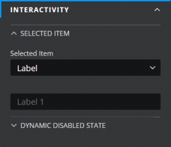
Selected Item – select Label or Position from the dropdown. Then bind the blank property field underneath to one of the following:
Label – one of the cells containing the label captions previously bound to the List Items property. This will become the default selection. You cannot select more than one label by default.
Position – a cell in the spreadsheet that contains a number equal to the label that is to be selected by default i.e. 1 will select the first label bound to the List Items property, 2 will select the second label and so on. Again, only one label can be selected by default.
DYNAMIC DISABLED STATE
It is possible to disable the Label Based Menu component if you want to limit the user’s access to it.

The DYNAMIC DISABLED STATE property utilizes Conditional Logic. For more information on Conditional Logic and its uses, see this article.
Last updated
Was this helpful?