

Text Input
This article describes how to configure the Text Input component and each of its properties.
The Text Input component enables the user to add text information to a Squirrel project, this could be personal details, statistical data, etc.
Text Input Properties
The Text Input properties consist of LAYOUT & POSITIONING, DATA INSERTION, STYLING, and DYNAMIC VISIBILITY sections.
This guide will describe all sections besides the Layout & Positioning and Dynamic Visiblity sections, as these are generic to each component. A separate guide and tutorial for each can be found by clicking the links above.
The component properties are set and edited using different methods, some have multiple methods, some just one. See this Set Property Values article for more information on using the different methods.
DATA INSERTION

Destination – Bind this property to a cell in the spreadsheet. Any Text Input by the user will then be stored in that cell.
INPUT OPTIONS
Treat Input As Text – Checking this option ensures that all input, including numeric data, is inserted in the spreadsheet as a text string.
Input type - a dropdown containing multiple ways that the input information can be classified
Text - This option will treat your input as default text. On a mobile, this will display the default keyboard layout.
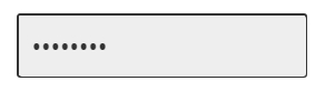
Password – Checking this option will ensure that data entered into this input field will be masked/obscured.
Email Address - This option will treat your input as an email address. On a mobile keyboard, the '@' symbol, and various email affixes will be available for quick input.
URL - this option will treat your input as a URL. On a mobile keyboard, there will be multiple URL affixes available as quick input.
Telephone Number - this option will treat your input as a telephone number. On mobile, the keyboard displayed will be in a keypad format, displaying values 0-9, the '#' and '*' keys.
Disable Autocomplete - Check this option to disable autocomplete when typing.
Update value realtime - Check this option to have the value input into the spreadsheet as it is typed, rather than upon hitting return or clicking out of the input.
Characters allowed – Restrict the characters that the user can input. Either bind to a cell in the spreadsheet that contains a set of characters to be used or type the characters into the property field. Adding 1234567890 to this property will restrict the user to only being able to type numbers into the input field; typing an uppercase alphabet will restrict the user to only entering uppercase letters and so on.
Set max number of characters – Check this property to restrict the number of characters that a user can input.
STYLING

INPUT TEXT
Placeholder text – This is the text that will be displayed in the Text Input component before the user inputs a different value. The default is Enter text.
Font – Choose a font style from the dropdown list
Size – The size of the font of the labels.
B I U – Apply Bold, Italic, and Underline text styling to the Text Input. When any of these is toggled on, the button is blue:

Text Color – The input text will be shown in the color that matches the value entered in the property field. This can be set in 3 ways:
Clicking the colored rectangle and using the color picker
Typing in a color value
Binding to a color value in a spreadsheet cell
Opacity – This determines the transparency of the input text. This property can be set in 3 different ways:
Using the spinner buttons
Typing in a value
Binding to value in a spreadsheet cell

Padding – This property defines the space between the input text border and the input text. It can be set in 3 ways:
Using the spinner buttons
Typing in a value
Binding to value in a spreadsheet cell
Individual Padding - selected this property to apply different amounts of padding to each of the component's edges. Each of these individual inputs can be manually edited or bound to the spreadsheet.
BACKGROUND

Fill – When checked, the background of the input text will be filled with a color that matches the value entered in the property field. This can be set in 3 ways:
Clicking the colored rectangle next to the Fill checkbox and using the color picker
Typing in a color value
Binding to a color value in a spreadsheet cell
Opacity – This determines the transparency of the background of the input text. This is only available when the Fill checkbox is checked. Opacity can be set in 3 different ways:
Using the spinner buttons
Typing in a value
Binding to value in a spreadsheet cell
Border – This property is checked by default. Set the border color and opacity properties as desired. Uncheck to remove the border.
Weight – This property determines the line thickness of the Dropdown component border in pixels.
Individual Weight - selected this property to apply different widths to each of the component's borders. Each of these individual inputs can be manually edited or bound to the spreadsheet.
Line style – Select a borderline style. The options are solid and dashed:

Corners – This property determines the corner radius of the text label border. Use the slider to amend this property or type a numerical value into the property field.
Individual Corners - selected this property to apply different radii to each of the component's corners. Each of these individual inputs can be manually edited or bound to the spreadsheet.
DYNAMIC DISABLED STATE
It is possible to disable the dropdown component if you want to limit the user’s access to the dropdown list.

Last updated
Was this helpful?