

URL Button
This article describes the URL Button component and its properties.
Who can use this feature?
All Squirrel365 plans include the URL Button component.
For more details, see our pricing comparison matrix.
Clicking a URL Button allows the user to open and view a web page outside the Squirrel project.

Select URL Button from the controls category of the component library. Move the mouse over the canvas and click to add a URL Button to your project:

URL Button Properties
The URL Button properties consist of GENERAL, BUTTON STYLING, INTERACTIVITY, and DYNAMIC VISIBILITY drawers. This guide will describe the data insertion, button styling, and interactivity properties only; the dynamic visibility properties are generic to each component and a separate guide and tutorial on dynamic visibility can be found here.
GENERAL
The general property section allows the designer to change the URL to which the button links.
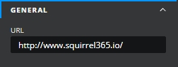
URL – This property contains the web link which the button will open. The value can either be typed into the property text box or bound to a value in the spreadsheet
BUTTON STYLING
The appearance of the button can be altered to suit a theme or particular style by using the BUTTON STYLING properties:
DEFAULT TEXT
The DEFAULT TEXT property is checked by default. Uncheck the checkbox adjacent to the DEFAULT TEXT section title to hide the default button label.
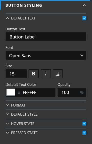
Button Text – This property contains the text that will be shown in the button label.
Font – Choose a font style from the dropdown list.
Size – Change the font size of the button label.
B I U – Use these toggle buttons (bold, italic, underline) to change the format of the button label. When any of these is toggled on, the button is blue:
Default Text Color – The button label will be shown in the color that matches the value entered in the property field.
Opacity – This determines the transparency of the button label.
FORMAT
These formatting properties apply to the default button label.
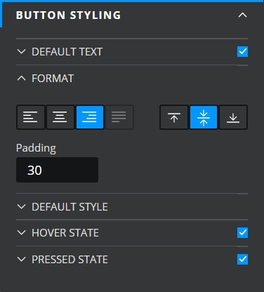
Text alignment – Choose to align the button label to the left, right, or center. The current selection is indicated by the blue button:
Content alignment – Choose to vertically align the button label to the top, center, or bottom of the button component. The current selection is indicated by the blue button:
Padding – This property defines the space between the button label and the button border.
Individual Padding - selected this property to apply different amounts of padding to each of the component's edges. Each of these individual inputs can be manually edited or bound to the spreadsheet.
DEFAULT STYLE
In this section, you can set the color, border, and drop shadow properties of the button.

Fill – This property sets the background color of the checkbox. Uncheck if a fill color is not required.
Opacity – This changes the opacity of the checkbox.
Border – This property sets the border color of the checkbox.
Weight – This changes the line thickness of the checkbox border.
Individual Weight - selected this property to apply different widths to each of the component's borders. Each of these individual inputs can be manually edited or bound to the spreadsheet.
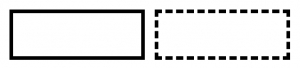
Line style – Select a checkbox border line style. The options are Solid and Dashed. (see image)
Corners – This property determines the corner radius of the button border. Use the slider to amend this property, or type a numerical value into the property field.
Individual Corners - selected this property to apply different radii to each of the component's corners. Each of these individual inputs can be manually edited or bound to the spreadsheet.
Effects – Choose between None and Drop Shadow from the dropdown box. If Drop Shadow is selected, further drop shadow properties are shown.
Color - This property sets the color of the shadow
Opacity - this property changes the opacity of the shadow
X Offset - This property adjusts the X offset of the shadow, moving it left or right depending on a positive or negative value
Y Offset - This property adjusts the Yoffset of the shadow, moving it up or down depending on a positive or negative value
Blur - This property adjusts the blur percentage of the shadow
HOVER STATE
The HOVER STATE property is checked by default. Uncheck this if you wish to disable the hover state properties.

Hover Text Color – As the mouse moves over the button, the button label text will change to the color value entered in this property field.
Opacity – As the mouse moves over the button, the opacity of the button label text will change to the value entered in this property field.
Hover Fill – As the mouse moves over the button, the button background color will change to the color value entered in this property field.
Opacity – As the mouse moves over the button, the opacity of the button will change to the value entered in this property field.
PRESSED STATE
The PRESSED STATE property is checked by default. Uncheck this if you wish to disable the pressed state properties.

Pressed Text Color – As the button is clicked, its label text will change to the color value entered in this property field.
Opacity – As the button is clicked, the opacity of its label text will change to the value entered in this property field.
Hover Fill – As the button is clicked, its background color will change to the color value entered in this property field.
Opacity – As the button is clicked, its opacity will change to the value entered in this property field.
INTERACTIVITY
It is possible to disable the button:

Last updated
Was this helpful?