LogoLogo
FeaturesHelp & ResourcesShowcasePricingLogin
Learn Section
Learn Section
  • Introduction
  • Getting Started
    • Finding your way around
    • Core concepts
      • Data Binding
      • Data Insertion
      • Dynamic Visibility
    • Creating and managing projects
      • Creating a Project
      • Saving a Project
      • Opening a Project
      • Version History
    • Templates
  • Components
    • Overview
    • Layout & Positioning
    • Charts
      • Line Chart
      • Column Chart
      • Bar Chart
      • Pie Chart
      • Combination Chart
      • Area Chart
      • Spline Chart
      • Step Chart
    • DataViz
      • Gauge
      • Word Cloud
      • Chord Diagram
      • Sankey Diagram
      • Schedule (Gantt)
      • Metric Tile
      • Progress Bar
      • Trend Icon
      • Mapbox
      • Loading Animation
    • Tables
      • Scorecard
      • Data Table
    • Controls
      • Push Button
      • Dropdown
      • Multi Select Dropdown
      • Listbox
      • Label Based Menu
      • Checkbox
      • Radio Button
      • Slider
      • Value Input
      • Print Button
      • URL Button
      • Screenshot
      • Hotspot
      • Date Picker
      • Toggle Switch
      • Scenario
    • Text
      • Text Label
      • Text Input
      • Text Area
    • Shapes
      • Rectangle
      • Ellipse
      • Line
    • Media
      • Image
      • Icon
    • Containers
      • Container
      • Web View
      • Repeat Container
      • Row Layout
      • Column Layout
  • Functions
    • Overview
    • Data Mover
    • External Parameters
    • Export to Excel
    • Export to PDF
    • Timer
    • Tableau Parameters
    • Browser Info
    • TextJoin
    • Unique List
  • Connections
    • Overview
    • Excel One Drive
      • Excel One Drive Read
      • Excel One Drive Writeback
    • Google Sheets
      • Google Sheets Read
      • Google Sheets Writeback
    • Ninox Connections
    • Smartsheets
    • CSV Connector
    • SAP Webi Connector
    • XDC Connections
    • Database Connections
    • Zapier Trigger
  • Spreadsheet
    • Overview
    • Spreadsheet functionality
    • Supported Spreadsheet Functions
    • Spreadsheet performance
  • Best practices for the Squirrel spreadsheet
  • Publishing & Sharing
    • Overview
    • Project Settings
    • Publishing to Squirrel Cloud
    • Publishing Locally
    • Using the Project Manager
    • Adding projects to PowerPoint
    • Adding projects to Tableau
    • Progressive Web Apps (PWA)
  • SETTINGS
    • Image Library
    • Custom Fonts
  • Account Management
    • Manage your account Profile
    • Understanding your Squirrel plan usage
    • Changing your Plan
    • Billing
    • How do I delete my account?
  • Frequent Questions
    • What data do you keep and for how long?
  • How-Tos
    • Overview
    • Add-ons
      • Add-on Documentation
      • Window Size – Add responsive behavior to your components
      • Window Size - Getting responsive behavior in the canvas
    • Adding your own Google Fonts
    • Chart title and Checkbox label text case formatting
    • Deleting functions and connections
    • Find & Replace Fonts
    • Getting a Mapbox API access token
    • Renaming a component, function or connection
    • Seeing Data from a Connector at Design time
    • Troubleshooting Projects in the Console
    • Using colors and color values
  • Tutorials
    • Create a temperature conversion app
    • Create a revenue growth app from an existing spreadsheet
    • Whack-A-Squirrel Game
    • Filtered Rows Insertion: Building a Filtered Selection
Powered by GitBook
LogoLogo

Explore

  • Home
  • Features
  • Pricing
  • Download Squirrel

Help

  • Learn
  • Community
  • Support
  • FAQ's

Updates

  • Blog
  • Events
  • Release Notes

Company

  • Contact Us
  • Privacy Policy
  • Terms of Use

Copyright © 2019 - 2024 InfoSol Ltd. All rights reserved.

On this page
  • Ellipse Properties
  • STYLING

Was this helpful?

  1. Components
  2. Shapes

Ellipse

This article describes the Ellipse component and its properties.

PreviousRectangleNextLine

Last updated 11 months ago

Was this helpful?

Squirrel 1.12 introduced a “Quick Set-up” tab on many property panels. The properties described on this page are available on the “All Properties” tab of the property panel. For more details on “Quick Set-Up” properties see

The Ellipse is a graphical component that can be styled to suit a Squirrel project theme.

Select an Ellipse from the Shapes category of the component library. Move the mouse cursor over the canvas and click to add an ellipse to your project.

Select Ellipse from Shapes category in Component Library

Ellipse Properties


STYLING

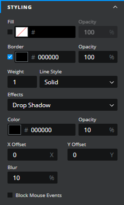
  • Fill – When checked, the Ellipse will be filled with a color that matches the value entered in the property field. This can be set in 3 ways:

    • Clicking the colored rectangle next to the Fill checkbox and using the color picker

    • Typing in a color value

    • Binding to a color value in a spreadsheet cell

  • Opacity – This determines the transparency of the Ellipse. This is only available when the Fill checkbox is checked. Opacity can be set in 3 different ways:

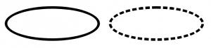
  • Effects – Select an option from the dropdown box. The options are none and Drop Shadow. With Drop Shadow selected the following properties appear:

    • Color – this determines the color of the shadow

    • Opacity – this determines the opacity of the shadow

    • X-Offset – determines the horizontal position of the shadow (positive values move to the right, negative values move to the left)

    • Y-Offset – determines the vertical position of the shadow (positive values move down, negative values move up)

    • Blur – determines the blur of the shadow

  • Block mouse events – Checking this option will stop mouse interactions with components positioned on layers beneath the Ellipse, e.g. a slider component sitting on a layer beneath the rectangle would not function. A partially covered component may still have some functionality. This option is unchecked by default which means that components positioned beneath the rectangle will respond to mouse events.

The Ellipse properties consist of a STYLING drawer and a DYNAMIC VISIBILITY drawer. This guide will describe the styling properties only; the dynamic visibility properties are generic to each visible component and a separate guide and tutorial on dynamic visibility can be found .

Ellipse Solid and Dashed Line Styles
here
this article