

Listbox
This article describes the listbox component and its properties.
Who can use this feature?
All Squirrel365 plans include the Listbox component.
For more details, see our pricing comparison matrix.
The Listbox component allows the user to select one or multiple items from a list.
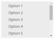
Select Listbox from the controls category of the component library. Move the mouse over the canvas and click to add a Listbox component to your project:

Listbox Properties
The Listbox properties consist of GENERAL, DATA INSERTION, LIST STYLING, INTERACTIVITY, and DYNAMIC VISIBILITY drawers. This guide will describe the general, data insertion, list styling, and interactivity properties only; the dynamic visibility properties are generic to each component and a separate guide and tutorial on dynamic visibility can be found here.
The component properties are set and edited using different methods, some have multiple methods, some just one. See this Set Property Values article for more information on using the different methods.
GENERAL

List Items – This property can only be set by binding to a range of cells in the spreadsheet. The content of those cells will be added as items in the Listbox list.
Ignore Blank Cells – Checked by default. If you bind the List Items property to a range of 10 cells, but only the first 8 contain data, then only the first 8 items will be listed. If this property is unchecked, 10 items will be listed, but the last two items (9 and 10) will be blank.
Allow Multiple Selection – Unchecked by default, this means that initially the Listbox only allows for a single item to be selected. Checking this property allows for multiple items to be selected.
Include ALL Option – This option is only available if the Allow Multiple Selection property has been checked. Checking this property will add an extra item, ALL, to the top of the Listbox list. When the user clicks this item, all items in the list become selected, clicking it again will deselect all items in the list.
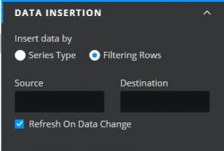
DATA INSERTION
Data insertion is triggered when a selection is made by the user. Data insertion is one of the core concepts within Squirrel, if you aren’t sure what it is, take a look at the Getting Started: Data Insertion tutorial for more information.
Insert data by – Choose between the radio button options of Series Type or Filtering Rows:
Series Type – If you select this option the Listbox component allows you to insert more than one series of data. This means that when a user selects an item from the Listbox list, one or more series of data can be inserted into the spreadsheet. Series 1 could add Position data to a destination in the spreadsheet, series 2 could copy a whole row of data from the spreadsheet and paste it into a destination row, series 3 could insert a label, and so on, all triggered by one selection from the Listbox list.

Insertion Types:
Series – This property lists all of the Series for the Listbox component. Add a new series by clicking on the plus button above the property field. Delete a series by selecting it and then clicking the trash icon.
Name – Rename the series if you wish by editing the name within the property field or by binding the name property to a cell in the spreadsheet. In both cases, the name of the series in the Series property field will be updated accordingly.
Type – Choose a data insertion type from the drop-down box. For more information about the types, take a look at Series Data Insertion in the Step-by-Step section of this article on Data Insertion.
Source – If the Type is “row” or “column”, this property will become enabled. Bind to a cell or range of cells in the spreadsheet that will supply the source data. This range should contain as many rows or columns as there are items in the Listbox. For each item selected in the Listbox by the user, a row or column from the source will be inserted into the destination range.
Destination – Bind to a cell or range of cells where the data will be inserted. When an item is selected in the Listbox, its value, position, row or column will be inserted into the destination. If “Allow Multiple Selection” has been enabled, this range should have as many rows (or columns in the case where the type is “columns”) as there are items in the Listbox. Multiple items will be inserted in the order they appear in the Listbox.
Filtering Rows – Selecting this option of the Insert data by property will change the appearance of the DATA INSERTION drawer. This option only allows for one series of data insertions to happen on the selection of an item from the Listbox list.
Insertion Types:
Source – Select a range of rows as the source property.
Destination – Select a row for the selected source row to be pasted into. If item 1 is selected from the listbox list, the first row will be pasted into the destination, if item 2 then the second row will be pasted in and so on.
Refresh On Data Change – Enabled by default, this will apply any changes in the source data to data that has been already inserted into cells bound to the Destination property. Uncheck if you don’t wish this to happen.

LIST STYLING
The appearance of the Listbox component can be altered to suit a theme or particular style by using the STYLING properties:
Show Checkbox – This property is unchecked by default. When checked a square box is added to the front of each item in the listbox list.
LIST ITEM TEXT
These properties apply to the text of the list items in the Listbox component.

Font – Choose a font style for the list items from the dropdown list
Size – Change the font size of the list items

Text Color – The list items will be shown in the color that matches the value entered in the property field.
Opacity – This determines the transparency of the list items.
Padding – Increasing the value of this property increases the amount of space around each of the list items in the Listbox.
Individual Padding - selected this property to apply different amounts of padding to each of the component's edges. Each of these individual inputs can be manually edited or bound to the spreadsheet.
DEFAULT BOX STYLE
These formatting properties apply to the style of the Listbox component.

Fill – When checked, the background of the Listbox component will be filled with a colour that matches the value entered in the property field.
Opacity – This determines the transparency of the background of the Listbox component. This is only available when the Fill checkbox is checked.
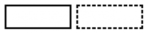
Border – This property is unchecked by default. Check to add a border, then set the border colour and opacity properties as desired.
Weight – This property determines the line thickness of the border in pixels.
Individual Weight - selected this property to apply different widths to each of the component's borders. Each of these individual inputs can be manually edited or bound to the spreadsheet.
Line style – Select a borderline style. The options are solid and dashed:
Line styles Corners – This property determines the corner radius of the border. Use the slider to amend this property, or type a numerical value into the property field.
Individual Corners - selected this property to apply different radii to each of the component's corners. Each of these individual inputs can be manually edited or bound to the spreadsheet.
HOVER STATE
These formatting properties can be used to apply a different style to the item that the mouse is positioned over in the Listbox list.

Hover Text Color – This property sets the colour that the text will change to when the mouse is positioned over that item.
Opacity – This changes the opacity of the hover text.
Fill – This property sets the background colour of the item that the mouse is positioned over.
Opacity – This changes the opacity of the background.
SELECTED STATE
These formatting properties apply to any selected item in the Listbox component.

Selected Text Color – This property sets the text colour of the currently selected item.
Opacity – This changes the opacity of the selected item text.
Fill – This property sets the background colour of the currently selected item.
Opacity – This changes the opacity of the background.
INTERACTIVITY
SELECTED ITEM
A new listbox component will by default not have any items selected. It is possible to make one or more of the listed items selected by default.
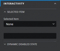
Selected Item – select Label or Position from the dropdown. Then bind the blank property field underneath to one of the following:
Label –
One item: If you just want one item to be selected by default, bind this property to a cell that contains the label of the list item (the easiest method is to bind to one of the cells included in the cells bound to the List Items property).
Two or more items: If the labels are in adjacent cells in the spreadsheet, for example, items 1 and 2, then you can just bind to those cells directly. If however, the list items that you want to select are, for example, items 3 and 5 of the list, then you will need to copy the labels into two cells that are adjacent to each other and then bind to those instead:

Position –
One item: bind to a cell in the spreadsheet that contains a number equal to the item that you want to be default i.e. 1 will select the first item bound to the List Items property, 2 will select the second item, and so on.
Two or more items: you will need to bind to two or more cells, adjacent to each other that each contain a number relative to the item that is to be selected:

DYNAMIC DISABLED STATE
It is possible to disable the Listbox component if you want to limit the user’s access to the Listbox list.

Last updated
Was this helpful?