LogoLogo
FeaturesHelp & ResourcesShowcasePricingLogin
Learn Section
Learn Section
  • Introduction
  • Getting Started
    • Finding your way around
    • Core concepts
      • Data Binding
      • Data Insertion
      • Dynamic Visibility
    • Creating and managing projects
      • Creating a Project
      • Saving a Project
      • Opening a Project
      • Version History
    • Templates
  • Components
    • Overview
    • Layout & Positioning
    • Charts
      • Line Chart
      • Column Chart
      • Bar Chart
      • Pie Chart
      • Combination Chart
      • Area Chart
      • Spline Chart
      • Step Chart
    • DataViz
      • Gauge
      • Word Cloud
      • Chord Diagram
      • Sankey Diagram
      • Schedule (Gantt)
      • Metric Tile
      • Progress Bar
      • Trend Icon
      • Mapbox
      • Loading Animation
    • Tables
      • Scorecard
      • Data Table
    • Controls
      • Push Button
      • Dropdown
      • Multi Select Dropdown
      • Listbox
      • Label Based Menu
      • Checkbox
      • Radio Button
      • Slider
      • Value Input
      • Print Button
      • URL Button
      • Screenshot
      • Hotspot
      • Date Picker
      • Toggle Switch
      • Scenario
    • Text
      • Text Label
      • Text Input
      • Text Area
    • Shapes
      • Rectangle
      • Ellipse
      • Line
    • Media
      • Image
      • Icon
    • Containers
      • Container
      • Web View
      • Repeat Container
      • Row Layout
      • Column Layout
  • Functions
    • Overview
    • Data Mover
    • External Parameters
    • Export to Excel
    • Export to PDF
    • Timer
    • Tableau Parameters
    • Browser Info
    • TextJoin
    • Unique List
  • Connections
    • Overview
    • Excel One Drive
      • Excel One Drive Read
      • Excel One Drive Writeback
    • Google Sheets
      • Google Sheets Read
      • Google Sheets Writeback
    • Ninox Connections
    • Smartsheets
    • CSV Connector
    • SAP Webi Connector
    • XDC Connections
    • Database Connections
    • Zapier Trigger
  • Spreadsheet
    • Overview
    • Spreadsheet functionality
    • Supported Spreadsheet Functions
    • Spreadsheet performance
  • Best practices for the Squirrel spreadsheet
  • Publishing & Sharing
    • Overview
    • Project Settings
    • Publishing to Squirrel Cloud
    • Publishing Locally
    • Using the Project Manager
    • Adding projects to PowerPoint
    • Adding projects to Tableau
    • Progressive Web Apps (PWA)
  • SETTINGS
    • Image Library
    • Custom Fonts
  • Account Management
    • Manage your account Profile
    • Understanding your Squirrel plan usage
    • Changing your Plan
    • Billing
    • How do I delete my account?
  • Frequent Questions
    • What data do you keep and for how long?
  • How-Tos
    • Overview
    • Add-ons
      • Add-on Documentation
      • Window Size – Add responsive behavior to your components
      • Window Size - Getting responsive behavior in the canvas
    • Adding your own Google Fonts
    • Chart title and Checkbox label text case formatting
    • Deleting functions and connections
    • Find & Replace Fonts
    • Getting a Mapbox API access token
    • Renaming a component, function or connection
    • Seeing Data from a Connector at Design time
    • Troubleshooting Projects in the Console
    • Using colors and color values
  • Tutorials
    • Create a temperature conversion app
    • Create a revenue growth app from an existing spreadsheet
    • Whack-A-Squirrel Game
    • Filtered Rows Insertion: Building a Filtered Selection
Powered by GitBook
LogoLogo

Explore

  • Home
  • Features
  • Pricing
  • Download Squirrel

Help

  • Learn
  • Community
  • Support
  • FAQ's

Updates

  • Blog
  • Events
  • Release Notes

Company

  • Contact Us
  • Privacy Policy
  • Terms of Use

Copyright © 2019 - 2024 InfoSol Ltd. All rights reserved.

On this page
  • Screenshot Properties
  • BUTTON STYLING
  • INTERACTIVITY

Was this helpful?

  1. Components
  2. Controls

Screenshot

This article describes the Screenshot component and its properties.

PreviousURL ButtonNextHotspot

Last updated 11 months ago

Was this helpful?

Squirrel 1.12 introduced a “Quick Set-up” tab on many property panels. The properties described on this page are available on the “All Properties” tab of the property panel. For more details on “Quick Set-Up” properties see

Clicking a Screenshot in a project the user to save a screenshot of the current view of the project.

Select Screenshot from the controls category of the component library. Move the mouse over the canvas and click to add a Screenshot button to your project:

Screenshot Properties


BUTTON STYLING

The button styling section allows the designer to change the style of the button, the filename the screenshot is saved as, and the type of image file generated.

  • Filename – This property determines the name of the local file containing the screenshot which is saved on the user’s machine.

  • File type – This property determines whether the file is saved as a “png” or “jpeg” file format.

DEFAULT STYLE

In this section, you can set the color, border, and drop shadow properties of the button.

  • Icon color – this determines the color of the camera icon in the button, to hide the icon set this color to the same as the background

  • Fill – When checked, the background of the button will be filled with a color that matches the value entered in the property field.

    • Opacity – This determines the transparency of the background of the text label. This is only available when the Fill checkbox is checked.

  • Border – This property is unchecked by default. Check to add a border to the button and set the border color and opacity properties as desired.

    • Weight – This property determines the line thickness of the button border in pixels.

      • Individual Weight - selected this property to apply different widths to each of the component's borders. Each of these individual inputs can be manually edited or bound to the spreadsheet.

    • Line style – Select a borderline style from the dropdown box. The options are solid and dashed:

  • Corners – This property determines the corner radius of the button border. Use the slider to amend this property, or type a numerical value into the property field.

    • Individual Corners - selected this property to apply different radii to each of the component's corners. Each of these individual inputs can be manually edited or bound to the spreadsheet.

  • Effects – Choose between None and Drop Shadow from the dropdown box. If Drop Shadow is selected, further drop shadow properties are shown.

HOVER STATE

The HOVER STATE property is checked by default. Uncheck this if you wish to disable the hover state properties.

  • Hover Text Color – As the mouse moves over the button, the button label text will change to the color value entered in this property field.

    • Opacity – As the mouse moves over the button, the opacity of the button label text will change to the value entered in this property field.

  • Hover Fill – As the mouse moves over the button, the button background color will change to the color value entered in this property field.

    • Opacity – As the mouse moves over the button, the opacity of the button will change to the value entered in this property field.

PRESSED STATE

The PRESSED STATE property is checked by default. Uncheck this if you wish to disable the pressed state properties.

  • Pressed Text Color – As the button is clicked, its label text will change to the color value entered in this property field.

    • Opacity – As the button is clicked, the opacity of its label text will change to the value entered in this property field.

  • Hover Fill – As the button is clicked, its background color will change to the color value entered in this property field.

    • Opacity – As the button is clicked, its opacity will change to the value entered in this property field.
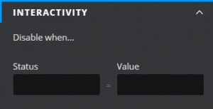
INTERACTIVITY

It is possible to disable the button:

The Screenshot properties consist of BUTTON STYLING, INTERACTIVITY, and DYNAMIC VISIBILITY drawers. This guide will describe the data insertion, button styling, and interactivity properties only; the dynamic visibility properties are generic to each component and a separate guide and tutorial on dynamic visibility can be found .

Line styles

The INTERACTIVITY property utilizes Conditional Logic. For more information on Conditional Logic and its uses, see .

here
this article
this article