Create a revenue growth app from an existing spreadsheet
Sometimes when faced with a spreadsheet full of data it can be difficult to know where to start. The aim of this project is to give you some ideas about how you can pull out sections of data, display it in an easily understood way and even apply variables to that data to demonstrate the effect of differing conditions.
There are 3 sections to this step-by-step tutorial:
Section 1: Import the spreadsheet and add the components
Section 2: Working with the spreadsheet
Section 3: Connect the components to the data
What we are aiming for
Revenue Growth Model App
It’s handy to start with an idea of what our app is going to look like. So here is the finished version:
See how the data is initially displayed in the chart, but then if you move the sliders, watch how those factors affect the data in the chart and also the Annual Retention Rate percentage KPI at the top.
You can refer back to this as you add your components to the project canvas, but positioning values will be provided for each item if you want to be more precise.
Step-by-Step Instructions
This tutorial will take approximately 40 minutes to complete (or 25 minutes if you use the starter file linked below).
Section 1: Import the spreadsheet and add the components
Either follow the instructions in this section to import the spreadsheet and add all of the required components to the canvas, OR download a starter file* from here and jump straight to Section 2: Working with the spreadsheet.
* The starter file contains all of the components (configured ready for use) and the RevenueData.xls spreadsheet already imported.
Import the spreadsheet
To make sure that we’re all singing from the same spreadsheet, download a copy of the RevenueData.xls file that will be used in this project.
Open up a brand new Squirrel file.
In the File menu, select Spreadsheet > Import
Locate the RevenueData.xls file (if you haven’t already downloaded it, you can download it from here)
See that the Squirrel spreadsheet has now been populated with the data from the RevenueData.xls file.
Add the components
In case you haven’t seen the ‘Find your way around’ tutorial, the following image identifies the different sections of the Squirrel interface:

To add components to your project, choose from the component library located on the left hand side of the Squirrel interface. Click on a category and a list of components will be shown. Choose a component and add it to the canvas in one of two ways:
Click and drag it onto the canvas
Click to select it, then click on the canvas to place the object
Every object added to a Squirrel project is then listed in the object browser which is located between the components library and the canvas. Here, objects are given a default name, but this can be changed by double clicking on the object’s name and typing in a new one.
Select an object either by clicking it on the canvas, or clicking on it in the object browser. When selected, a blue bounding box will appear around the object. Click and drag the object around the canvas to reposition it, or click and drag the blue, square handles around the bounding box to resize the object.
Every object in Squirrel has properties and these are shown in the properties panel located on the right hand side of the canvas. Select any object to view or edit its properties in the properties panel.
Now that you know how to add objects, select them and view or edit their properties, let’s start building the app!
Canvas:
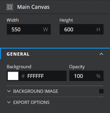
 The default canvas size for a new Squirrel project is larger than we need. Click on the empty canvas (the white rectangle in the centre of the screen) to select it. At the top of the properties panel it will say Main Canvas.
In the properties panel, resize the canvas by changing the width and height values to the following:
Width: 550
Height: 600
Main title:
Add a project title.
From the Text category in the components library, select and drag a Text Label to the canvas.
In the object browser, double click on the name area of the Text Label and rename it to Main Title.
Change the following properties in the properties panel:
Position it:
X Position: 50
Y Position: 25
Resize it:
Width: 450
Height: 50
Change the text inside the LABEL TEXT drawer of the properties panel:
Text To Display: Delete This is a text label, and instead type in Revenue Growth Model
Style it inside the TEXT STYLING drawer of the properties panel:
Size: 30
Text formatting: Select the B button to make the text bold (the B button will change to blue)
Add a bottom border inside the BACKGROUND drawer of the properties panel:

Tip: If you can’t see the BACKGROUND drawer, either close some of the expanded property drawers or use your mouse wheel to scroll down to the bottom of the properties panel.
Border: Switch this property on by checking the checkbox
Border Color: Change color to CCCCCC
Weight: Use the spinner buttons to increase this value to 3, or type 3 into the property field
Border Edges: Select Bottom from the dropdown options
KPI tile:
Working our way down the project, the next item to add is a KPI tile. This is actually made up of three components: a background rectangle, a text label title and then a second text label to display the KPI.
KPI background:
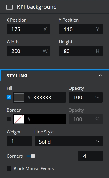
From the Shapes category in the components library, select and drag a Rectangle to the canvas.
In the object browser, double click on the name area of the rectangle (where it says Rectangle 1), rename to KPI background.

Change the following properties in the properties panel:
Position it:
X Position: 175
Y Position: 110
Resize it:
Width: 200
Height: 80
Style it inside the STYLING drawer of the properties panel:
Fill: Switch this property on by checking the checkbox
Fill: Change to 333333 or click the colour square and use the picker instead.
Corners: Move the slider to 4 or type 4 into the property field.
KPI label:
From the Text category in the components library, select and drag a Text Label to the canvas.
In the object browser, double click on the name area of the Text Label and rename it to KPI label.

Change the following properties in the properties panel:
Position it:
X Position: 175
Y Position: 110
Resize it:
Width: 200
Height: 30
Style it inside the TEXT STYLING drawer of the properties panel:
Size: 12
Text Color: Change to FFFFFF or click the colour square and use the picker instead.
KPI output:
From the Text category in the components library, select and drag a Text Label to the canvas.
In the object browser, double click on the name area of the Text Label and rename it to KPI output.

Change the following properties in the properties panel:
Position it:
X Position: 175
Y Position: 140
Resize it:
Width: 200
Height: 40
Change the text inside the LABEL TEXT drawer of the properties panel:
Text To Display: Delete This is a text label, and instead type in 0%
Style it inside the TEXT STYLING drawer of the properties panel:
Size: 30
Text formatting: Bold (Select the B button)
Text Color: Change color to CCCCCC or click the color square and use the picker instead.
Number Format: Percentage
Decimal Places: 1
Revenue chart:
This chart will be the main focal point of this project. It will eventually display the recurring revenue data contained in the spreadsheet.
From the Charts category in the components library, select and drag a column chart to the canvas.
In the object browser, double click on the name area of the column chart and rename it to Revenue.

For now, we’ll just add it to the project and amend it’s properties to make it suitable for use in the project:
Position it:
X Position: 50
Y Position: 200
Resize it:
Width: 450
Height: 250
Change the chart title inside the TITLE section of the GENERAL drawer of the properties panel:
Size: 16
Horizonal Text Alignment: Select the centered option
Check the Auto size bars checkbox to switch that on
Turn off the subtitle by unchecking the SUBTITLE checkbox
Set the X-Axis properties in the X-AXIS drawer of the properties panel:
Size: 8
Label Orientation: 45°
Remove the x-Axis title by unchecking the checkbox on the TITLE section.
Set the Y-Axis properties in the Y-AXIS drawer of the properties panel:
Check the Manual Scale property to on
In the LABELS section:
Number Format: Currency
Currency Symbol: USD ($)
Remove the y-Axis title by unchecking the checkbox on the TITLE section.
In the GRIDLINES drawer of the properties panel:
Uncheck the Axis Lines property
There are some other properties that we’ll need to adjust on this chart, but we’ll only be able to do this once we’ve connected the chart to the data – which we will do in Section 3 of this tutorial.
Assumptions:
From the Text category in the components library, select and drag a Text Label to the canvas.
In the object browser, double click on the name area of the Text Label and rename it to Assumptions label.

Change the following properties in the properties panel:
Position it:
X Position: 150
Y Position: 450
Resize it:
Width: 250
Height: 30
Change the text inside the LABEL TEXT drawer of the properties panel:
Text To Display: Delete This is a text label, and instead type in Assumptions
Style it inside the TEXT STYLING drawer of the properties panel:
Size: 16
Text formatting: Select the B button to make the text bold
Add a bottom border inside the BACKGROUND drawer of the properties panel:
Border: Switch this property on by checking the checkbox
Border Color: Change color to CCCCCC
Weight: Use the spinner buttons to increase this value to 1, or type 1 into the property field
Border Edges: Select Bottom from the dropdown options
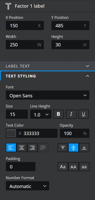
Factor 1 label:
From the Text category in the components library, select and drag a Text Label to the canvas.
In the object browser, double click on the name area of the Text Label and rename it to Factor 1 label.
Change the following properties in the properties panel:
Position it:
X Position: 150
Y Position: 485
Resize it:
Width: 250
Style it inside the TEXT STYLING drawer of the properties panel:
Horizonal Text Alignment: Select the left option

Factor 1 slider:
From the Controls category in the components library, select and drag a slider to the canvas.
In the object browser, double click on the name area of the slider and rename it to Factor 1.

Change the following properties in the properties panel:
Position it:
X Position: 150
Y Position: 500
Resize it:
Width: 235
Height: 55
Inside the GENERAL drawer of the properties panel:
Number Format: Percentage
Max: 20
Inside the STEPS section:
Increment: 1
Style it inside the STYLING drawer of the properties panel:
Track Color: FFFFFF
MIN MAX VALUES: uncheck
Factor 2 Label and Factor 2 Slider:
Select both Factor 1 Label and Factor 1 slider.
Copy and paste them.
Reposition the copied components beneath the first slider.
Rename to Factor 2 label and Factor 2 respectively.
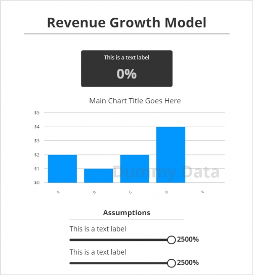
Ok, so after all of that you should have all of the components that you need added to the canvas. At this stage it should look something like this:

Section 2: Working with the spreadsheet
Get to know the data
Whether you have chosen to use the starter file or have worked your way through section 1 and have imported the RevenueData.xls file yourself, this is a good opportunity to look at the data to see what we’ve got to work with.
In the Main model worksheet is a good amount of data relating to revenue over a period of time. Column A tells us the type of data that has been captured and columns B to MM lists that data on a monthly basis over years 2020 and 2021. The remaining content of the worksheet collates that data and/or produces more data from it.
The Factors worksheet contains a number of variables that affect the data in the Main model worksheet. In this project, we’ll use a couple of these factors to manipulate the data at runtime. All will become clear as we go along.
What we’ll be adding
In this section of the build, we’ll add some additional logic and data to the spreadsheet. It is important that this is entered into the cell addresses given in the instructions as these same cell addresses will be used for making connections to components in Section 3.
The additional data will be used to build and style the app. We’ll add colours for the KPI tile text that will indicate a good (green), average (orange), or bad result (red) and a calculation that will work out the appropriate colour to apply to the KPI tile text. We’ll also add a colour that can be used as a main colour accent throughout the app.
Add content to Sheet 3 of the Spreadsheet:
Firstly lets rename the Sheet 3 tab of the spreadsheet to something more appropriate:
Right click on the tab of the spreadsheet called Sheet 3.
Select Rename from the menu.
Type App into the name field instead.
Press Enter.
Now we’ll start adding some more content and data that we can use within the app. Add the following to the App sheet:
A1: KPI text colour
B1: Threshold 1
B2: 0.9
C1: Threshold 2
C2: 0.95
A4: Colours
A5: Good
B5: mediumseagreen
A6: Average
B6: orange
A7: Bad
B7: tomato
A9: Main colour
B9: 53C8CA
Finally paste the following formula into cell A2:
=if('Main model'!B4<B2,B$7,if('Main model'!B4<C2,B$6,B$5))
This formula checks to see what the KPI Annual Retention Rate value is in cell B4 of the Main Model tab of the spreadsheet. Then using a nested IF statement it will return one of the colours from B5, B6 or B7 accordingly. In section 3 we will bind this value to the text color property of the KPI output text field.
The spreadsheet should now look like this:

Section 3: Connect the components to the data
Now that we have our components added to the canvas and the calculations and logic added to the spreadsheet, the final part of this build is to bring it all together. So let’s start bringing this project to life!
Connect the KPI tile components
KPI label:
Select the KPI label component.
In the LABEL TEXT drawer of the properties panel, move your mouse over the Text To Display property field. As you do so, a data binding icon appears above the property field. Click it!
The spreadsheet will open in binding mode – you can’t edit any of the spreadsheet data while it’s in this mode but you can select a cell to bind to the Text To Display property of the KPI label component.
Click the Main model tab of the spreadsheet at the bottom.
Select cell A4 OR type ‘Main model’!A4 into the Select your range field at the top of the spreadsheet.
Click the Confirm button.

The KPI label component’s text should now say Annual Retention Rate.
KPI output:
Select the KPI output component.
Click the data binding icon above LABEL TEXT drawer of the properties panel. (As you did in step 2 above).
Ensure that the Main model tab of the spreadsheet is still selected.
Select cell B4 OR type ‘Main model’!B4 into the Select your range field at the top of the spreadsheet.
Click the Confirm button.
The KPI output component’s text should now display the same value as cell B4 of the Main model sheet. Next we’ll change the colour of the KPI text according to the value that it is displaying:
In the TEXT STYLING drawer of the properties panel, click the data binding icon above the Text Color property.
Click the App tab of the spreadsheet at the bottom.
Select cell A2 OR type App!A2 into the Select your range field at the top of the spreadsheet.
Click the Confirm button.
The KPI output’s text colour will now update according to the value that it is currently displaying.
Connect the Revenue Chart
Select the Revenue chart.
In the GENERAL drawer of the properties panel, click the data binding icon above the Chart Title property.
Select the Main model tab of the spreadsheet.
Select cell A20 OR type ‘Main model’!A20 into the Select your range field at the top of the spreadsheet.
Click the Confirm button.

See that the title of the chart has updated to say ‘Recurring Revenue’.
In the DATA drawer of the properties panel, select the radio button Bind individual series.
Delete Dummy Data from the Name property field and rename it to Series 1.
Click the data binding icon above the Values property field.
Select cells B20 to Y20 in the Main model sheet OR type ‘Main model’!B20:Y20 into the Select your range field at the top of the spreadsheet.
Click the Confirm button.
Well the data has been added to the chart, but we need to change some of the chart properties to make it legible to the user.
First let’s add some labels to the chart:
Still in the DATA drawer of the properties panel, click the data binding icon above the Category Labels property field.
Select cells B6 to Y6 in the Main model sheet OR type ‘Main model’!B6:Y6 into the Select your range field at the top of the spreadsheet.
Click the Confirm button.
Next we’ll change the color of the columns in the chart to the Main color that we added into the App sheet in the spreadsheet:
Next expand the STYLING – SERIES 1 section of the properties panel.
Click the data binding icon above the Line Color property.
Click the App tab of the spreadsheet.
Select cell B9 OR type App!B9 into the Select your range field at the top of the spreadsheet.
Click the Confirm button.
Currently the data being shown within the chart isn’t being displayed correctly. We need to change the Y-Axis scale to accommodate the data being shown in the chart, so we’ll bind it to the maximum revenue data in the spreadsheet:
Expand the Y-Axis drawer of the properties panel.
Click the data binding icon above the Max property field.
Select the Main model tab in the spreadsheet
Select cell Y21 OR type ‘Main model’!Y21 into the Select your range field at the top of the spreadsheet.
Click the confirm button.
Changing the Max value should have given a little more meaning to the data being displayed in the chart and it should now look something like this:

Connect the Assumptions sliders
The final components that we’ll connect to the data are the sliders at the bottom. The purpose of these is to manipulate data in the factors tab of the spreadsheet. The data in the factors tab is already linked to the data in the Main model tab because that is how this spreadsheet was built. By manipulating the factors data, we’ll be able to see the knock-on effect that has on the data in the chart.
Factor 1 label:
Select Factor 1 label.
In the LABEL TEXT drawer of the properties panel, click the data binding icon above the Text To Display property.
Click the Factors tab of the spreadsheet.
Select cell A8 (Monthly churn) OR type Factors!A8 into the Select your range field.
Click Confirm.
Factor 1 slider:
Select the Factor 1 slider component.
In the GENERAL drawer of the properties panel, click the data binding icon above the Value property.
Ensure that the Factors tab of the spreadsheet is still selected.
Select cell B8 OR type Factors!B8 into the Select your range field.
Click Confirm.
In the STYLING drawer of the properties panel, click the data binding icon above the Selected Range Color property.
Click the App tab of the spreadsheet.
Select cell B9 OR type App!B9 into the Select your range field at the top of the spreadsheet.
Click the Confirm button.
Factor 2 label:
Select Factor 2 label.
In the LABEL TEXT drawer of the properties panel, click the data binding icon above the Text To Display property.
Click the Factors tab of the spreadsheet.
Select cell A12 (Referral conversion rate) OR type Factors!A12 into the Select your range field.
Click Confirm.
Factor 2 slider:
Select the Factor 2 slider component.
In the GENERAL drawer of the properties panel, click the data binding icon above the Value property.
Ensure that the Factors tab of the spreadsheet is still visible.
Select cell B12 OR type Factors!B12 into the Select your range field.
Click Confirm.
In the STYLING drawer of the properties panel, click the data binding icon above the Selected Range Color property.
Click the App tab of the spreadsheet.
Select cell B9 OR type App!B9 into the Select your range field at the top of the spreadsheet.
Click the Confirm button.
And that’s it. With all of the components linked to the relevant data, switch to DEBUG or PREVIEW mode and see how you’ve changed a working spreadsheet into an interactive app!
Last updated
Was this helpful?