

Create a temperature conversion app
As this is one of the first projects that you’ll build in Squirrel, this How To guide will not only tell you what to do but will also explain why it needs to be done. Once you’ve completed the project you will have a better idea of how Squirrel works and how you can use it to build your amazing projects.
There are three core concepts for building projects within Squirrel: data binding, data insertion, and dynamic visibility. We’ll use each of these while building this temperature converter app, so look out for them as we go along.
There are 3 sections to this step-by-step tutorial:
Section 1: Add the components to the canvas
Section 2: Add data and logic to the spreadsheet
Section 3: Connect the components to the data
What we are aiming for?
Temperature Converter
It’s handy to start with an idea of what our app is going to look like. So here is the finished version:
The app works by allowing the user to select the initial temperature scale using the radio buttons: Celsius or Fahrenheit. The user then adds a numerical temperature value into the grey box, this value will be converted to the opposite temperature scale and displayed to the right of the equals sign. The graphic on the right will change according to the temperature.
You can refer back to this as you add your components to the project canvas, but positioning values will be provided for each item if you want to be more precise.
Step-by-Step Instructions
This tutorial will take approximately 40 minutes to complete (or 20 minutes if you use the starter file linked below).
Section 1: Add the components to the canvas
Either follow the instructions in this section to add all of the required components to the canvas, OR download a starter file from here and jump straight to Section 2: Add data and logic to the spreadsheet.
Open Squirrel and start with a brand new project.
In case you haven’t seen the ‘Find your way around’ tutorial, the following image identifies the elements of the Squirrel interface:

To add components to your project, choose from the components library located on the left-hand side of the Squirrel interface. Click on a category and a list of components will be shown. Choose a component and add it to the canvas in one of two ways:
Click and drag it onto the canvas
Click to select it, then click on the canvas to place the object
Every object added to a Squirrel project is then listed in the object browser which is located between the components library and the canvas. Here, objects are given a default name, but this can be changed by double-clicking on the object’s name and typing in a new one.
Select an object either by clicking it on the canvas, or clicking on it in the object browser. When selected, a blue bounding box will appear around the object. Click and drag the object around the canvas to reposition it, or click and drag the blue, square handles around the bounding box to resize the object.
Every object in Squirrel has properties and these are shown in the properties panel located on the right-hand side of the canvas. Select any object to view or edit its properties in the properties panel.
Now that you know how to add objects, select them, and view or edit their properties, let’s start building the app!
Canvas:
At the moment, the canvas is larger than needed. Click on the empty canvas (the white rectangle in the center of the screen) to select it. At the top of the properties panel, it will say Main Canvas. In the properties panel:
Resize the canvas by changing the width and height values to the following:
Width: 730
Height: 300
In the GENERAL drawer set the Background property to #CCCCCC or choose a color by clicking on the color square and use the color picker instead.

Border:
This is a rectangle we’ll use as a border around the app.
From the Shapes category in the components library, select and drag a Rectangle to the canvas.
In the object browser, double-click on the name area of the rectangle (where it says Rectangle 1), and rename it to Border.
Change the following properties in the properties panel:
Position it:
X Position: 28
Y Position: 20
Resize it:
Width: 675
Height: 260
Style it inside the STYLING section of the properties panel:
Fill: Switch this property on by checking the checkbox
Border: Change color to #333333 or click the color square and use the picker instead.
Weight: Use the spinner buttons to increase this value to 5, or type 5 into the property field.
Corners: Move the slider to 5 or type 5 into the property field.

Title:
Add a project title.
From the Text category in the components library, select and drag a Text Label to the canvas.
In the object browser, double-click on the name area of the Text Label and rename it to Title.
Change the following properties in the properties panel:
Position it:
X Position: 60
Y Position: 42
Resize it:
Width: 300
Height: 40
Change the text inside the LABEL TEXT drawer of the properties panel:
Text To Display: Delete "This is a text label", and instead type in Temperature Converter
Style it inside the TEXT STYLING drawer of the properties panel:
Size: 25
Text formatting: Select the B button to make the text bold (the B button will change to blue)
Horizontal Text Alignment: Select the left option

Instruction Text:
Add another text label.
Double-click From the Text category in the components library, select and drag a Text Label to the canvas.
In the object browser, double-click on the name area of the Text Label and rename it to Convert instruction.
Change the following properties in the properties panel:
Position it:
X Position: 60
Y Position: 110
Change the text inside the LABEL TEXT drawer of the properties panel:
Text To Display: Delete This is a text label, and instead type in Convert from:
Style it inside the TEXT STYLING drawer of the properties panel:
Horizontal Text Alignment: Select the left option

Radio Button:
This is a control component. For this app, it will be used to allow the user to toggle the temperature conversion between Celsius and Fahrenheit.
From the controls category in the component library, select a Radio Button and drag it to the canvas.
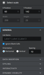
In the object browser, double-click on the name area of the Radio Button and rename it to Select Scale.
Change the following properties in the properties panel:
Position it:
X Position: 60
Y Position: 142
In the GENERAL drawer of the properties panel, change the Orientation property to Horizontal.
Although there is more that we need to do to make this radio button look and behave as it should, that will all come later when we bind the component to the data and logic in the spreadsheet. So we’ll just leave it as it is for now.
Text Input:
The text input component allows the user to enter a value into the app.
From the Text category in the component library, select a Text Input component and drag it to the canvas.
In the object browser, double-click on the name area of the Text Input and rename it to Enter value.
Change the following properties in the properties panel:
Position it:
X Position: 60
Y Position: 175
Resize it:
Width: 190
Height: 40

Equals:
This is another text label that sits between the Enter value field and the Results field.
From the Text category in the components library, select and drag a Text Label to the canvas.
In the object browser, double click on the name area of the Text Label and rename it to Equals.
Change the following properties in the properties panel:
Position it:
X Position: 254
Y Position: 178
Resize it:
Width: 32
Height: 32
Change the text inside the LABEL TEXT drawer of the properties panel:
Text To Display: Delete This is a text label, and instead type in =
Style it inside the TEXT STYLING drawer of the properties panel:
Size: 25
Text formatting: Select the B button to make the text bold (the B button will change to blue)

Result title:
This is another text label that sits above the Results field.
From the Text category in the components library, select and drag a Text Label to the canvas.
In the object browser, double click on the name area of the Text Label and rename it to Result title.
Change the following properties in the properties panel:
Position it:
X Position: 281
Y Position: 140
You’ll see that this text label overlaps the third option of the radio button, but don’t worry that will all be sorted out shortly!

Result:
This text label will display the results of the temperature conversion.
From the Text category in the components library, select and drag a Text Label to the canvas.
In the object browser, double click on the name area of the Text Label and rename it to Result.
Change the following properties in the properties panel:
Position it:
X Position: 290
Y Position: 175
Resize it:
Width: 190
Height: 40
Change the text inside the LABEL TEXT drawer of the properties panel:
Text To Display: Delete This is a text label, and instead type in 0 for now
Style it inside the TEXT STYLING drawer of the properties panel:
Size: 19
Number Format: Number
Inside the BACKGROUND drawer of the properties panel:
Check the Border property to show a border around the text field.
Change the Border color to EEEEEE or click the color square and use the color picker instead
In the Border Edges dropdown box, select Bottom

Images:
The final items that we need to add to the canvas are the images that will show as the temperature changes.
From the Media category in the components library, select and drag an Image component to the canvas.
In the object browser, double-click on the name area of the image component and rename it to Cold.
Change the following properties in the properties panel:
Position it:
X Position: 510
Y Position: 75
Resize it:
Width: 150
Height: 150
In the GENERAL drawer of the properties panel:
In the Image URL field, paste this URL: https://squirrel365.io/wp-content/uploads/2020/11/cold.png
Click the Resize image to Component checkbox
Repeat steps 1 to 5 except:
Rename this image to Warm.
Repeat steps 1 to 5 except:
Rename this image to Hot.

Phew! After all of that, you should have all of the components that you need added to the canvas. At this stage, it should look something like this:

Section 2: Add data and logic to the spreadsheet
this must beIn this section we’ll add some logic and data to the spreadsheet, this must be entered into the cell addresses given in the instructions; these addresses will be referred to when making connections to components in Section 3: Connect the components to the data.
Radio Button Labels:
Add a heading to the B column. Style the heading so that it can be distinguished from the data that will be placed in rows situated beneath it:
B2: Radio Btn Labels
Press the Enter key on your keyboard.
With the cell still selected, use the formatting options at the top of the spreadsheet to change the font size to 14 and also make the text bold.
Increase the size of the column so that the contents of cell B2 are fully visible, by clicking and dragging the borderline between the B and C column headers in the spreadsheet.

Next, add the data beneath the heading:
B3: Celsius
B4: Fahrenheit
As the heading suggests, the data in B3 and B4 is to be used as labels for the radio buttons, but we’ll come to that when we get to Section 3!
Data Insertion:
Columns D and E are reserved for all data insertion activities.

Add the following:
D2: Data Insertion
Style the heading for column D: font size 14 and bold
D3: Insert Celsius/Fahrenheit selection here ==>
D4: Insert temp here ==>
D6: Conversion result goes here ==>
Increase the size of the column so that the contents of these cells are fully visible, by clicking and dragging the borderline between the D and E column headers at the top of the spreadsheet.
It is good practice to change the color of a cell that will have data inserted into it. This tells you that this cell has been reserved for this purpose and reminds you not to add other data to the cell.
Change the color of cells E3, E4, and E6 to yellow by selecting them and using the paint options at the top of the spreadsheet.
Then add the following values to the same cells:
E3: 1
E4: 0
E6: 0
Calculations and Logic:
Columns G and H are reserved for all Calculation and Logic purposes.

Add the following:
G2: Calcs and Logic
Style the heading for column G: font size 14 and bold
Increase the size of the column so that the contents of cell G2 are fully visible, by clicking and dragging the border line between the G and H column headers in the spreadsheet.
G3: CtoF
G4: FtoC
G6: Converting to
G8: Image to display
Now we’ll start to add the logic and calculations into column H…
The conventional formula to convert Celsius to Fahrenheit is:
(0°C × 9/5) + 32 = 32°F>
To make this work for us we need to replace the 0°C with the temperature value that will eventually be inserted into cell E4 (we’ll set this up in Section 3) and also structure the formula so that it will work in the spreadsheet.
The formula that needs to be added to H3 is:
=SUM(((E4/5)*9)+32)
The conventional formula to convert Fahrenheit to Celsius is:
(32°F − 32) × 5/9 = 0°C
To make this work for us we need to replace the 32°F with the temperature value that will eventually be inserted into cell E4 and structure the formula so that it will work in the spreadsheet.
The formula that needs to be added to H4 is:
=SUM(((E4-32)*5)/9)
Format both cells:

Select cells H3 and H4.
Select the Number from the format dropdown at the top of the spreadsheet.
This will limit the number of decimal places shown in the results of these formulas.
The next piece of logic determines the contents of the Results title text field. If the user has selected Celsius as the input temperature, then the Results title text field should display Fahrenheit, and vice versa if the user selects Fahrenheit.
To do this, we’ll use an IF statement to check the value of cell E3. Currently, there is a value of 1 in cell E3, but in Section 3 when we bind the radio button component to this cell, it will store whichever is the currently selected radio button option.
The formula that needs to be added to cell H6 is:
=IF(E3=1,CONCATENATE(B4,':'),CONCATENATE(B3,':'))
The syntax of an IF statement can be described as: If this is true, do this, otherwise do this.
This particular formula is essentially saying: that if the value of E3 equals 1, then the content of this cell should be ‘Fahrenheit:’ otherwise the content of this cell should be ‘Celsius:’.
The final piece of logic that we’ll add, will calculate which of the three images should be shown e.g. when higher than 25°C (77°F) the hot image will show, below 25°C (77°F) but warmer than 10°C (49°F) warm will be shown, and then finally if the temperature is below 10°C (49°F) the cold image will show.
The formula that needs to be added to cell H8 is:
=IF(E3=1,IF(E4>=25,'C',IF(E4>=10,'B','A')),IF(E4>=77,'C',IF(E4>=50,'B','A')))
Now this formula probably looks quite complex, but we can break it down:
=IF(E3=1,IF(E4>=25,'C',IF(E4>=10,'B','A')),IF(E4>=77,'C',IF(E4>=50,'B','A')))
The green section is the first IF statement which says, that if the value of cell E3 is equal to 1 (Celsius), then calculate the value according to the Celsius temperature conditions in the yellow section, otherwise, calculate the value according to the Fahrenheit conditions in the pink section.
Breaking it down further, inside each of the yellow and pink sections is another set of IF statements that check the temperature value that’s been entered and output a letter according to that value.
Section 3: Connect the components to the data
Now that we have our components added to the canvas and the calculations and logic added to the spreadsheet, the final part of this build is to bring it all together. This is where the magic happens!
Subsection 3.1 – Data Binding
Now for the first of our core concept super moves. Data binding links the properties of a component to data in the spreadsheet.
Connect the Select scale radio button
Bind to List items:
In the following four steps, you will bind the Select scale radio button component to the two cells containing the radio button labels that were added to the spreadsheet in Section 2.
Select the Select scale radio button component
In the GENERAL drawer of the properties panel move your mouse over the List Items property field. As you do so, a data binding icon appears above the property field. Click it!

The spreadsheet will open in ‘Binding Mode’ – you can’t edit any of the spreadsheet data while it’s in this mode but you can select a cell or range of cells to bind to the List Items property of the radio button.
Select cells B3 and B4. You can do this in three ways:
Click on cell B3 and drag your mouse down to also include cell B4.
Click in cell B3 then while holding down the shift button, also click in cell B4
Type Sheet1!B3:B4 into the Select your range field

Click the Confirm button.
Your radio button component should now contain only two items: the first ‘Celsius’, which is bound to the data in cell B3, and the second ‘Fahrenheit’, which is bound to the data in cell B4. Pretty good huh?
Note: Although the default number of options for the radio button was previously three because the radio button’s List Items property was only bound to two cells, the number of radio button options has now reduced to two.
Set a default value/selection:
You can set a default selection for a radio button, this means that when the app is run, one of the radio button options is pre-selected rather than none.
Ensure the Select scale radio button component is still selected.
In the INTERACTIVITY drawer of the properties panel, expand the SELECTED ITEM section.
Select Position from the Selected Item dropdown box.
Click the data binding icon above the property field below and select cell E3.
Click the Confirm button.

Because the value in cell E3 is currently 1, this will ensure that the first option of the radio button is selected when the app is run (if the value in the cell was 2, then the second option would be selected).
But, cell E3 has a second purpose. Not only can it be used to tell the radio button which option should be initially selected, but this cell can also be updated with a new value each time a radio button is selected…
Subsection 3.2 – Data Insertion
Now for the second of our core concept super moves. Data insertion allows us to add data to the spreadsheet or to copy data from one area of the spreadsheet into another at runtime. Data insertion can be triggered in several ways e.g. the clicking of a button, by a timer, or even by data values. In this instance, data insertion will be triggered each time the user selects one of the radio button options.
A data insertion action is called a series. Some components have the option to trigger multiple series so that two or more sets of data can be inserted or moved around the spreadsheet following the same trigger.
Set the data insertion properties:
With the Select scale radio button component still selected, expand the DATA INSERTION drawer in the properties panel.
The radio button is one of the components that allows you to have more than one series. And we will need to do that in a moment, but for now, we’ll finish setting the properties for the first series.
Series 1 should already be selected.
The Type property should already be Position.
Bind the Destination property to cell E3.

A Type property set to Position means that the radio button will insert a numerical position when a radio button is selected (1 for option 1 – Celsius, 2 for option 2 – Fahrenheit).
So now, cell E3 will initially store the default value for the radio button, but once the user selects a radio button option, it will then subsequently store the selected value thanks to this process of data insertion.
Now we’ll add that second data insertion series:
Click the + button above the Series property field.
A new Series (Series 2) will be added to the Series property.
Set the Series 2 Type to Value.
Bind the Source property to cells H3 and H4.
Bind the Destination property to cell E6.

So, how does this work? Setting the Type property to Value means that the radio button will return a numerical value when a radio button is selected (1 for option 1 – Celsius, 2 for option 2 – Fahrenheit). As the source property is pointing to a range of two cells, clicking option 1 will copy the value from the first cell in the source range (H3) and will paste it into the destination cell, but clicking option 2 will copy the value from the second cell in the source range (H4) and will instead paste that into the destination cell (E6).
Now, because of these two data insertion series, two things will happen when either radio button option is clicked:
Firstly, 1 or 2 will be inserted into cell E3
Secondly, the contents of cell H3 or H4 will be copied and inserted into cell E6
Connect the Enter value text input field
We want whatever value the user enters into the Enter value text input field to be added to the spreadsheet so that it can be used and converted to the opposite temperature scale. Again, we can add a data insertion function to do this.
Select the Enter value text input field
Expand the DATA INSERTION drawer in the properties panel.

The data insertion properties for the text input component only allow for one data insertion series, so it looks slightly different from a component that allows multiple series (such as the radio button above).
Click the data binding icon above the Value property field.
Select cell E4 or type Sheet1!E4 into the Select your range field
Click Confirm
Next, we are going to ensure that only a numerical value is entered into the field by specifying that only numerical characters are allowed. We’re also going to include a – (minus) character:
Expand the INPUT OPTIONS section within the DATA INSERTION drawer. In the Characters Allowed property field type in -1234567890
Now when a user enters a value into the field, that value will be stored in cell E4.
Note: Remember that both cells H3 and H4 use the value of cell E4 within their conversion formulas.
Set the result title:
This will change the contents of the Results title text field so that it changes according to the input type. If the user is inputting a Celsius temperature, we want the result title to say Fahrenheit: and vice versa.
Select the Result title text field
Expand the LABEL TEXT drawer in the properties panel
Click the data binding icon above the Text to Display property.
Select cell H6.
Click confirm.

Display the result:
When one of the Select scale radio buttons is clicked, the contents of H3 or H4 (depending on the option selected) are copied into cell E6. It’s this value that we want to display in the Result text field.
Select the Result text field.
Expand the LABEL TEXT drawer of the properties panel.
Click the data binding icon above the Text To Display property.
Select cell E6.
Click confirm.

Show the appropriate image:
The formula that we placed into cell H8 will return a value of A, B, or C, depending on the temperature entered into the converter. We can use this returned value to show the appropriate graphic.
Subsection 3.3 – Dynamic Visibility
Now for the third of our core concept super moves. Each component that we add to the canvas has dynamic visibility properties that work in the same way.
Select the Cold image.
Expand the DYNAMIC VISIBILITY drawer of the properties panel.
Click the data binding icon above the Status property field.
Select cell H8.
In the Value property enter the letter A

If the value of cell H8 (bound to the Status property field) is equal to the Value property, the image will be visible and conversely will be invisible if they are not equal. In this case, if the value entered is less than 10°C (50°F) the cold image will be visible, otherwise it will be invisible.
If you leave these two properties empty, the component will always be visible because both properties are equally empty.
Follow the same process for the other two images but notice the different letters entered into the Value properties.
Select the Warm image.
Expand the DYNAMIC VISIBILITY drawer of the properties panel.
Click the data binding icon above the Status property field.
Select cell H8.
In the Value property enter the letter B

In this case, if the value entered is equal to or greater than 10°C (50°F) and less than 25°C (77°F) the warm image will be visible, otherwise it will be invisible.
Select the Hot image.
Expand the DYNAMIC VISIBILITY drawer of the properties panel.
Click the data binding icon above the Status property field.
Select cell H8.
In the Value property enter the letter C

In this case, if the value entered is equal to or greater than 25°C (77°F) the hot image will be visible, otherwise it will be invisible.
And that’s it! Switch to DEBUG mode or PREVIEW mode to view the temperature conversion app in action!
In this project you’ve used each of the core concepts for building projects within Squirrel – data binding, data insertion, and dynamic visibility. Hopefully, this has given you some ideas for other projects that you can build within Squirrel. Do share them with us, we’d love to see what you create!
Last updated
Was this helpful?